

Overview
The purpose of this project was to familiarize ourselves with comping. The steps included are research & brainstorming, sketches & doodles, and the final step: tight thumbnails. The purpose of working out your ideas on paper is so that once you get to designing digitally, you've worked out all the kinks.
Research & Brainstorming
For my research, I first researched column layouts to get a feel for what works and what doesn't. I quickly learned that the possibilities have quite a high ceiling. Specifically, I was closely observing type size, line space, vertical/horizontal alignment, type weight, non-illustrative art elements, and how different typefaces make different kinds of impressions. Then I chose the styles I was drawn to. Additionally, I researched different newspapers from different decades.
I also went down a lengthy rabbit hole looking at "The Daily Propet" newspapers from the Harry Potter films. Those had me pretty captivated because they are so eclectic and just put a million ways of formatting into one page. Finally, since the number "1984" is kind of the star of the show in this assignment, I looked up several different typefaces for lettering numbers.
Brain-map
Brain mapping was a great process to start getting ideas and concepts out of my head and onto a page in a non-intimidating way.
At first, I got hung up on the idea of matching the design to the theme of "1984" the novel. After some critiques, I learned that might be too literal for this assignment and I could expand further by being more experimental with themes.
My goal after that was to get as much variety as possible. and the design brain mapping as pictured in the right-hand corner was the start.
Preliminary Sketches
I drew and photo-copied a template roughly in proportion with the columns for my sketches. From there, I tried to push my imagination. It was difficult at first, but ideas kept coming once I got going. It was nice to do these tiny sketches without the pressure of making it perfect. From that point, I narrowed it down to my top 18 and fleshed out those designs a little bit more specifically.
Tight Sketches
I made a larger, more proportionally accurate template for my "almost final" picks. This is where I nailed down more specifically what I wanted the layouts to look like, with more emphasis on craftsmanship.
Technically I think it was an extra step but I felt like I needed it. The last thing I did was go to five different people and ask them to put stars on their top 8 just to get some outside perspective. Ultimately I chose what I liked best, but it's always good to have some fresh eyes.
tight thumbnails
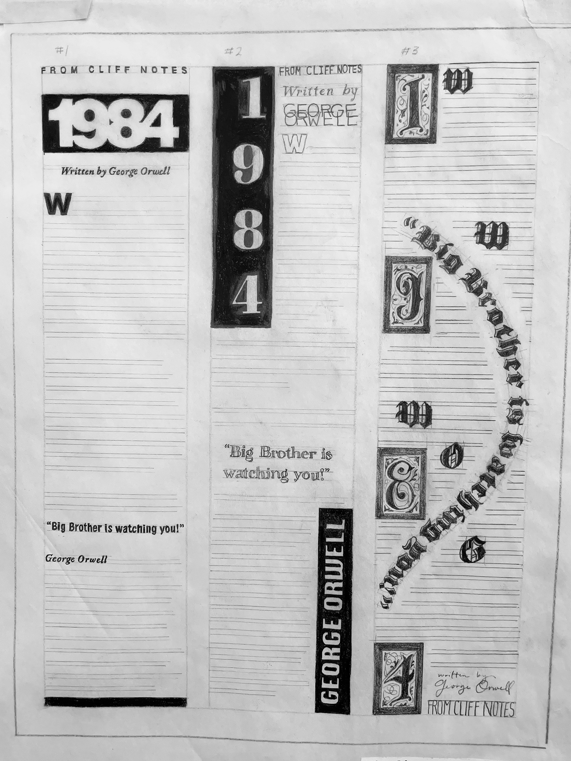
#1
Traced provided image. Justified header, reverse type title, bold ital subheader
#2 Specs:
Reverse type headline and author name, overlapping subheading, Type arrangement: FLRR, and varying typestyles.
To balance negative space, added reverse type in opposite corners on top and bottom.
#3 Specs:
Old English style type and lettering with embellishments, Type arrangement: F-JUST, contour type, and a drop cap in lieu of paragraph break w/line spacing. Subheading is on bottom.
#4 Specs:
Western-inspired, variety of typestyles, variety of serifs, lines and dots to break up text. Type arrangement: F-JUST. One drop cap at the beginning of the body.
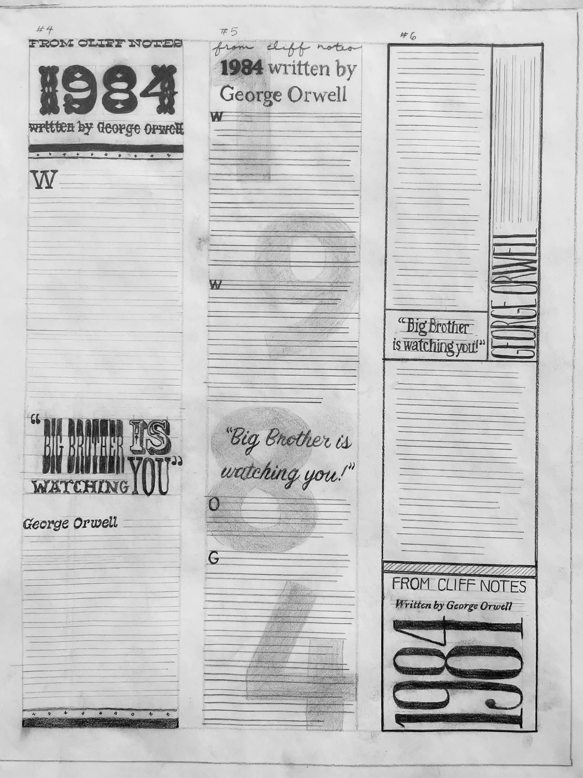
#5 Specs:
A more basic design with a 20% tint title in the background. Type arrangement: FLRR. Mostly serif with script typefaces as well. Bold title bold first letter paragraph indications.
#6 Specs:
Sections separated by boxes. Mostly serif fonts but one instance of sans-serif. Formatted bottom to top. Vertical and horizontal running text. Type arrangement: FLRR, and small type size for the author box.
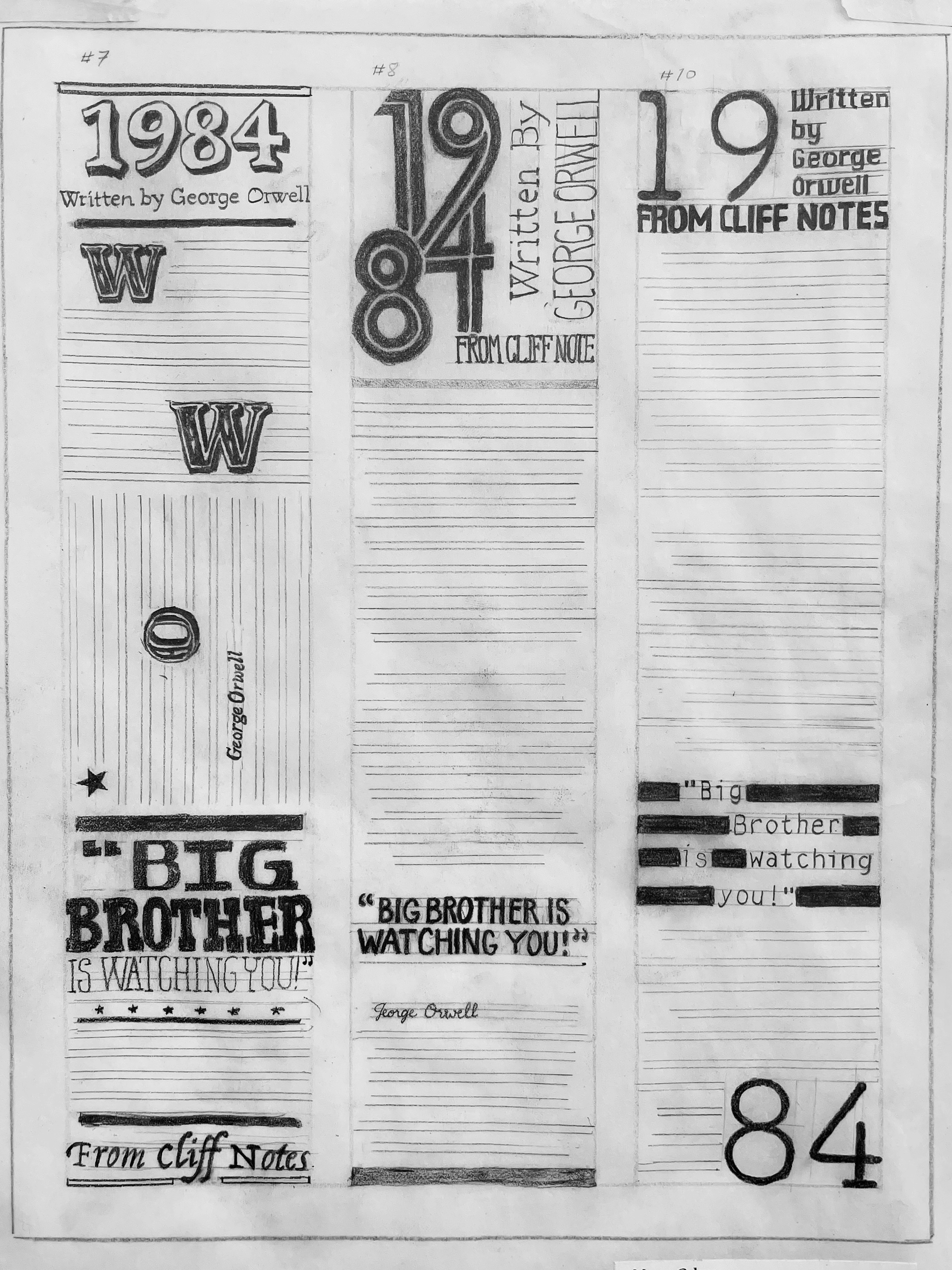
#7 Specs:
Circus layout with lots of line division. All serif type in wide variety. Paragraphs divided by drop initial. Type arrangement: F-JUST. Random horizontal and vertical body text.
#8 Specs:
Main attraction: inline title. Vertical subtitle. Type arrangement: CENT. Line divisions in varying tints. Italic author name.
#9 Specs:
Title split into top and bottom opposite corners. Fake censor bars on quote. Type arrangement: FRRL. All sans-serif typefaces.
Overall I had a lot of fun pushing limits and I learned a lot during the process. The specific typeface wasn't important in this process but I had fun inventing my own and getting creative in that way. When I was in high school, hand lettering in all kinds of variety was very popular. I never thought that would be important but it has come in handy for this class.
I learned there is so much you can do with even just one column and I could have pushed it even more. For this project I focused a lot on tightness and craftsmanship to help myself later down the road.
