Overview
This project is a direct mail advertisement for an international fashion show with the target audience being women in the Wasatch front ages 30 through 55. It should have some kind of international feel but still appeal to the target audience. This was the first time we brought our design to the digital design stage. It was cool to see how all the handwork turned out.
Research & Brainstorming
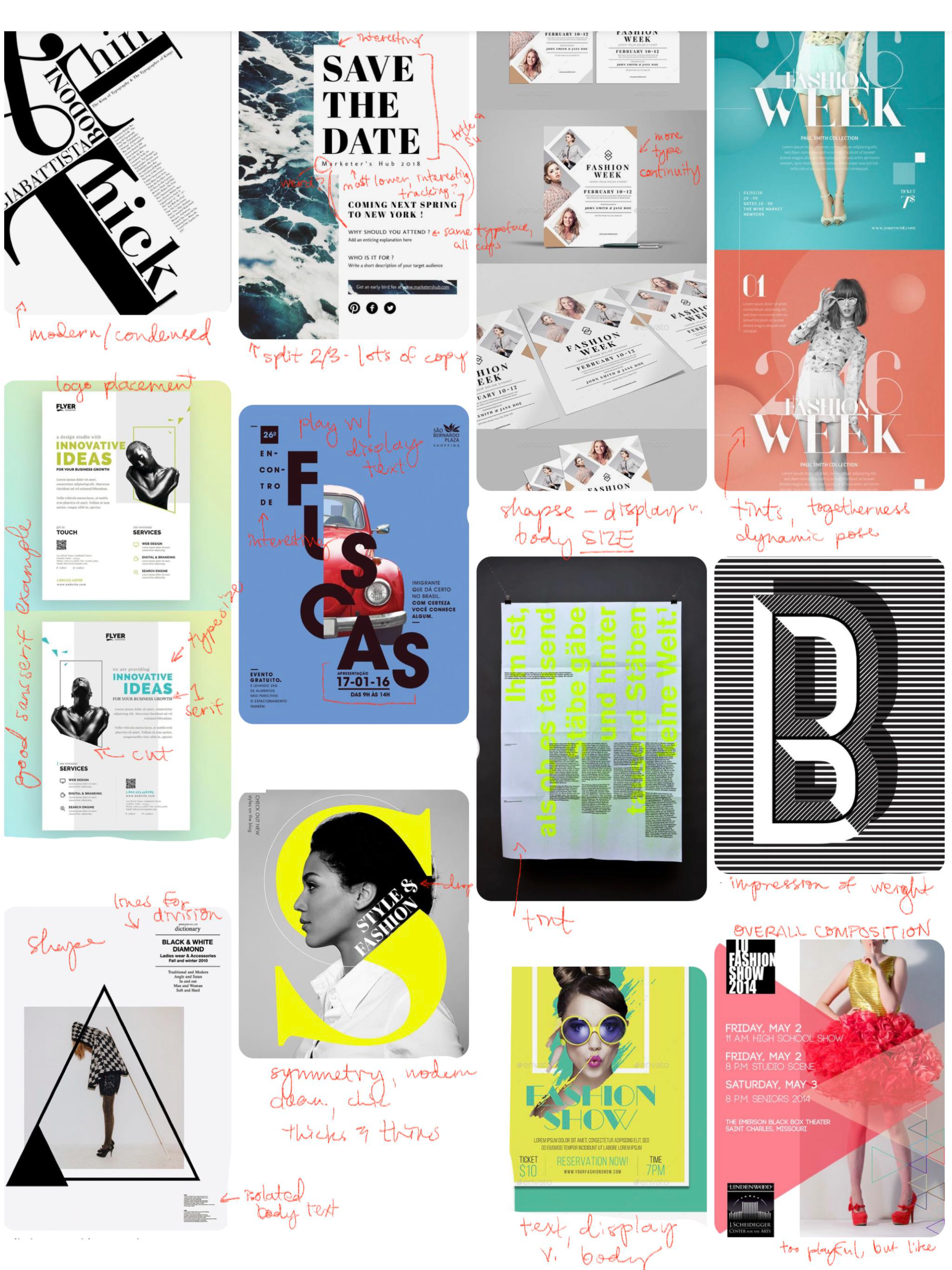
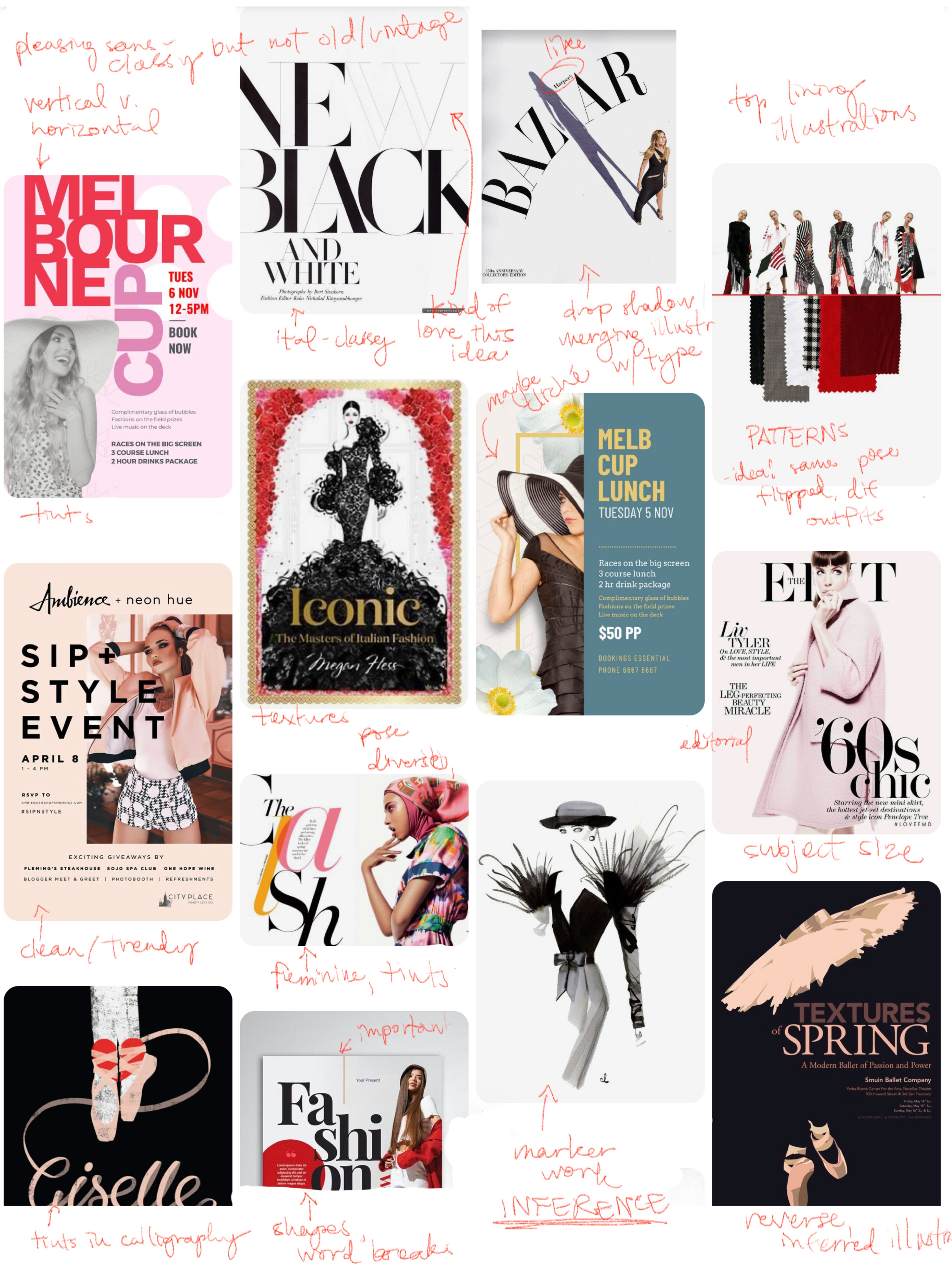
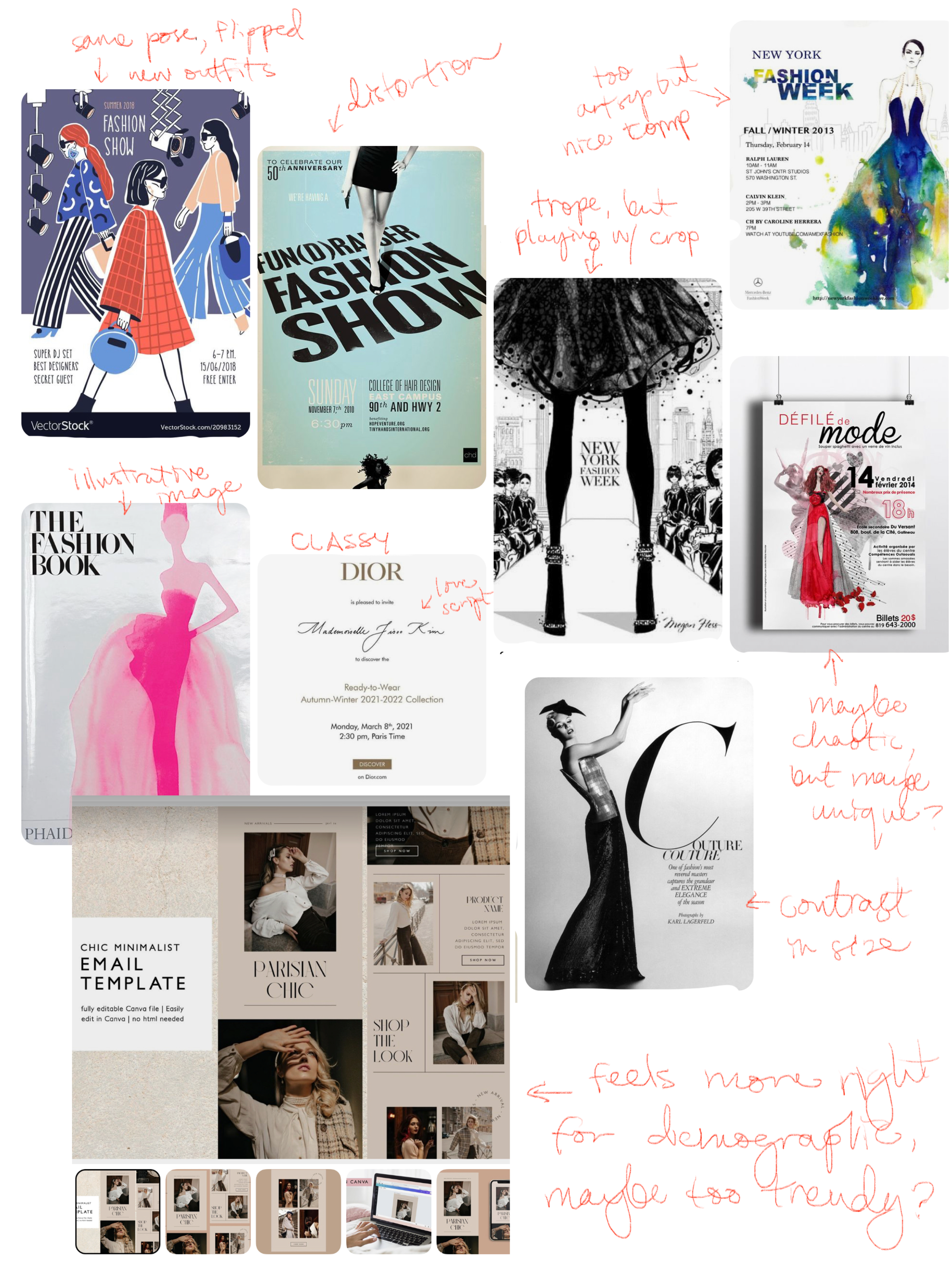
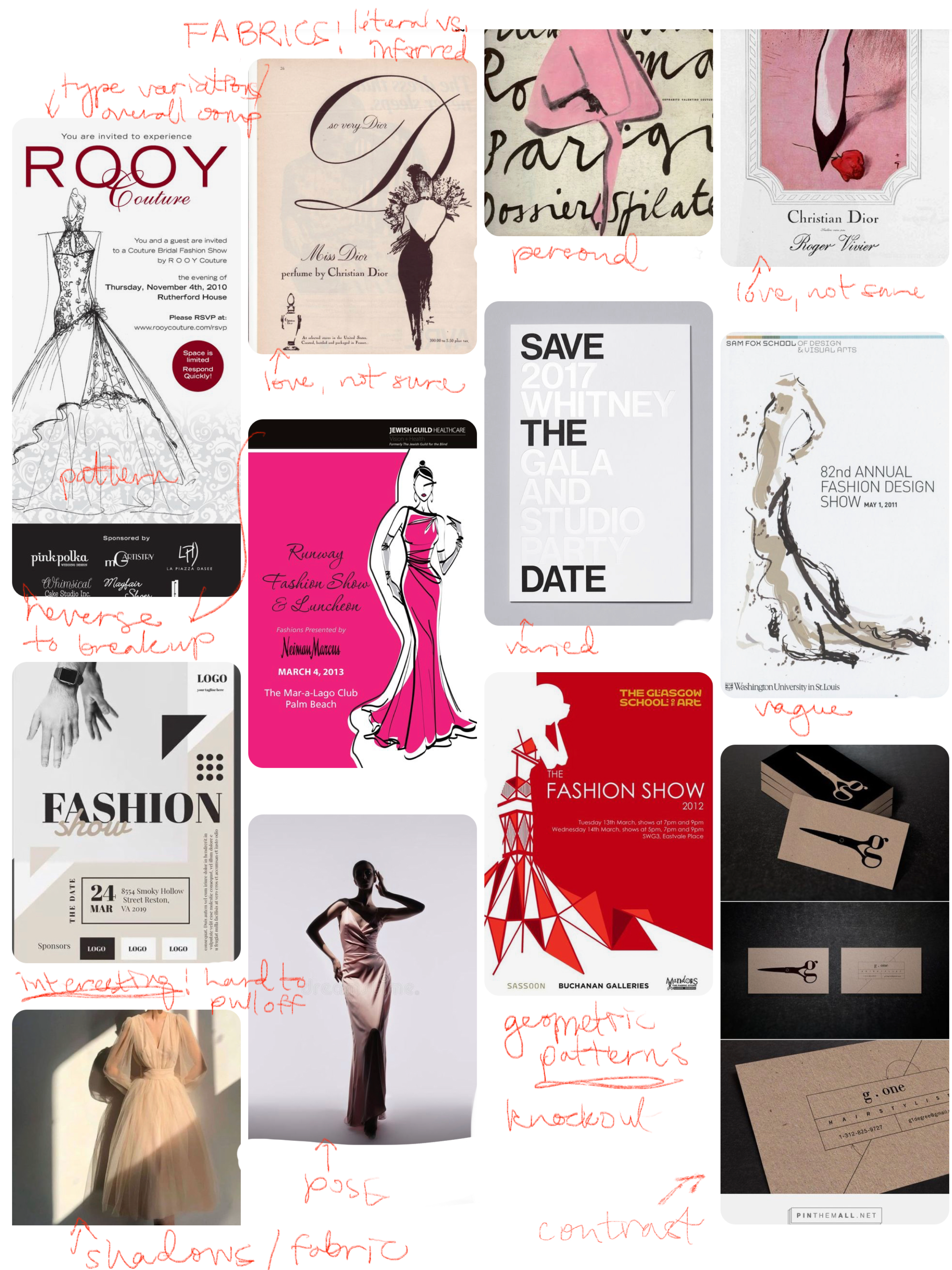
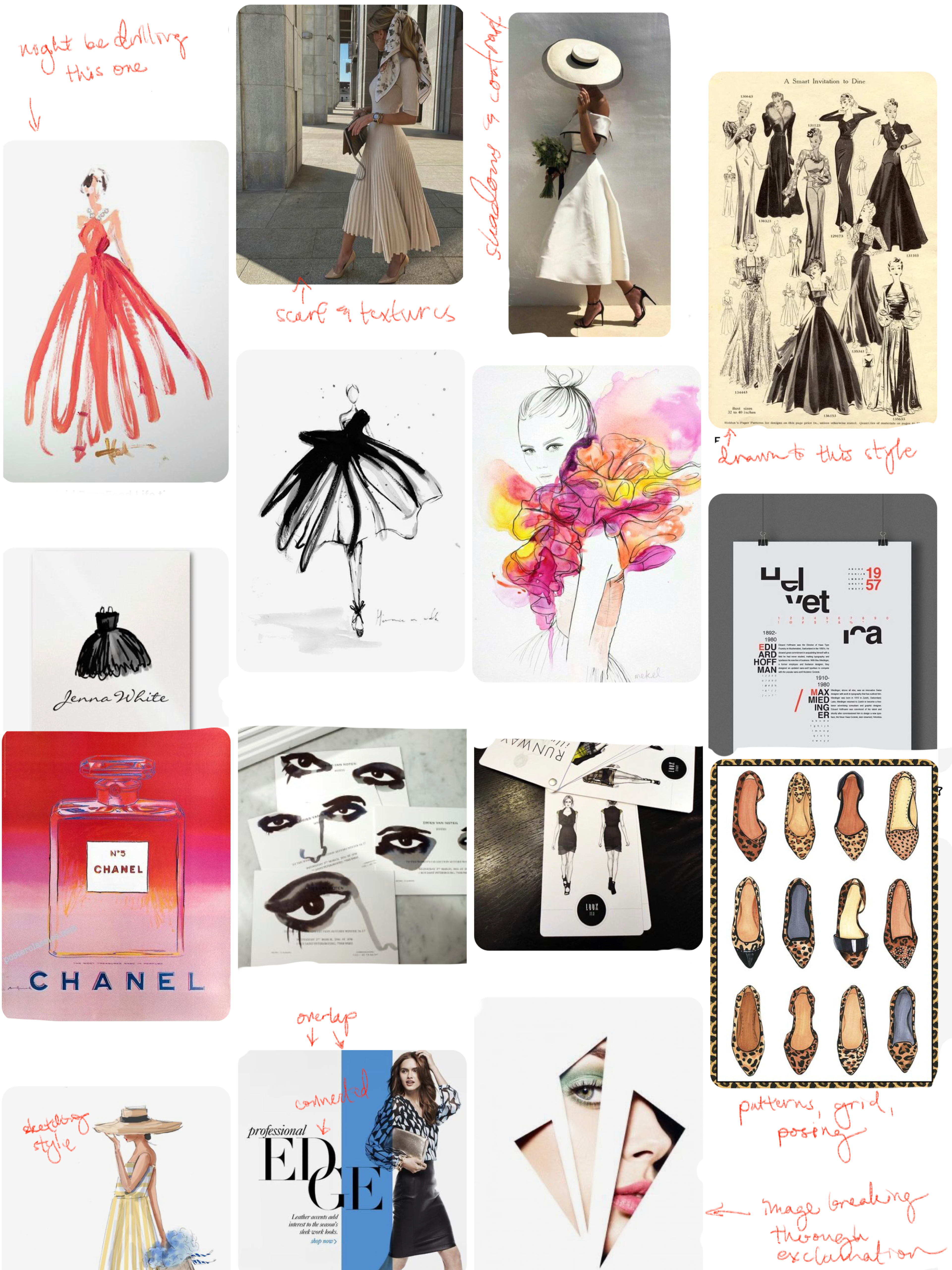
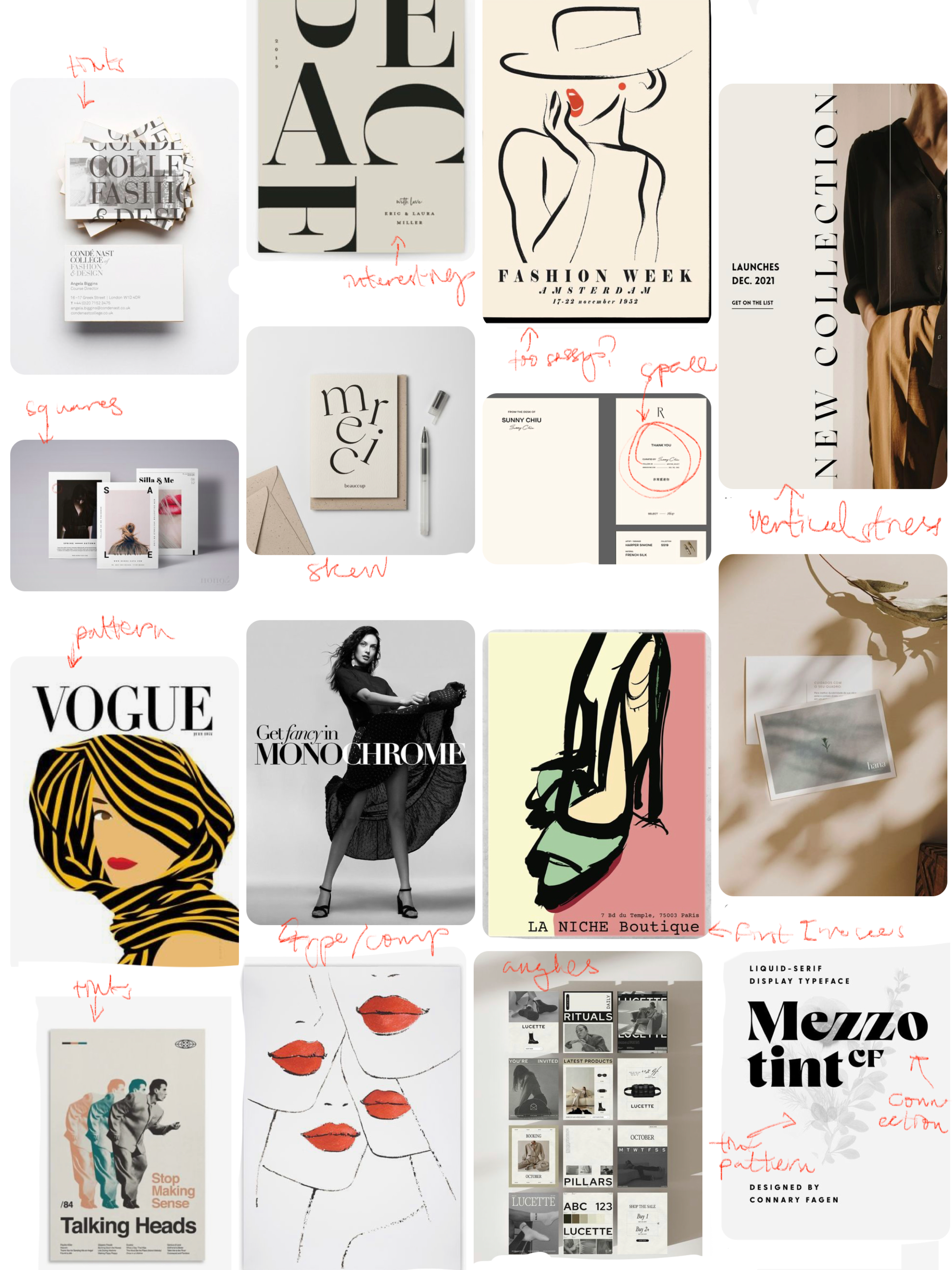
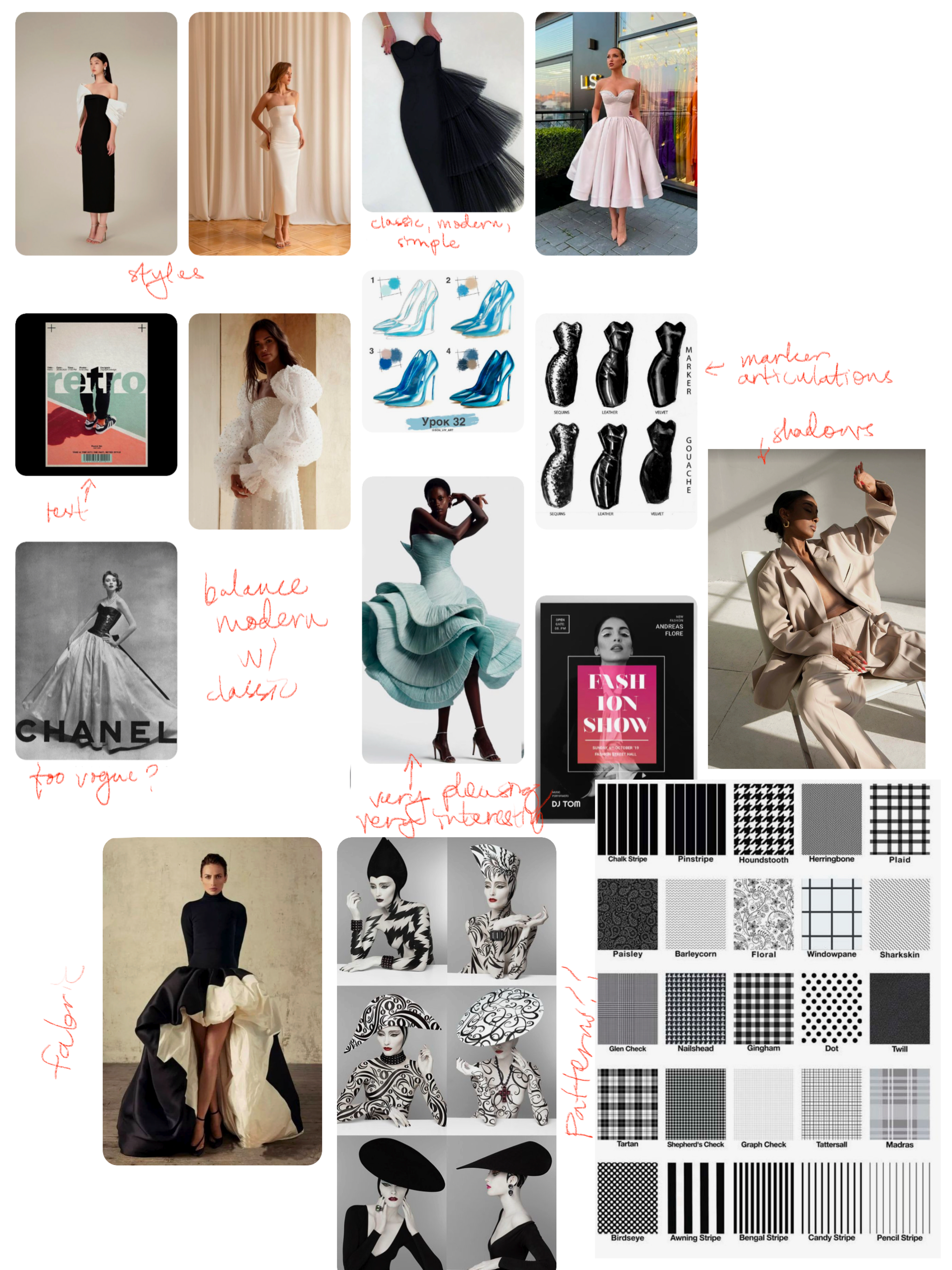
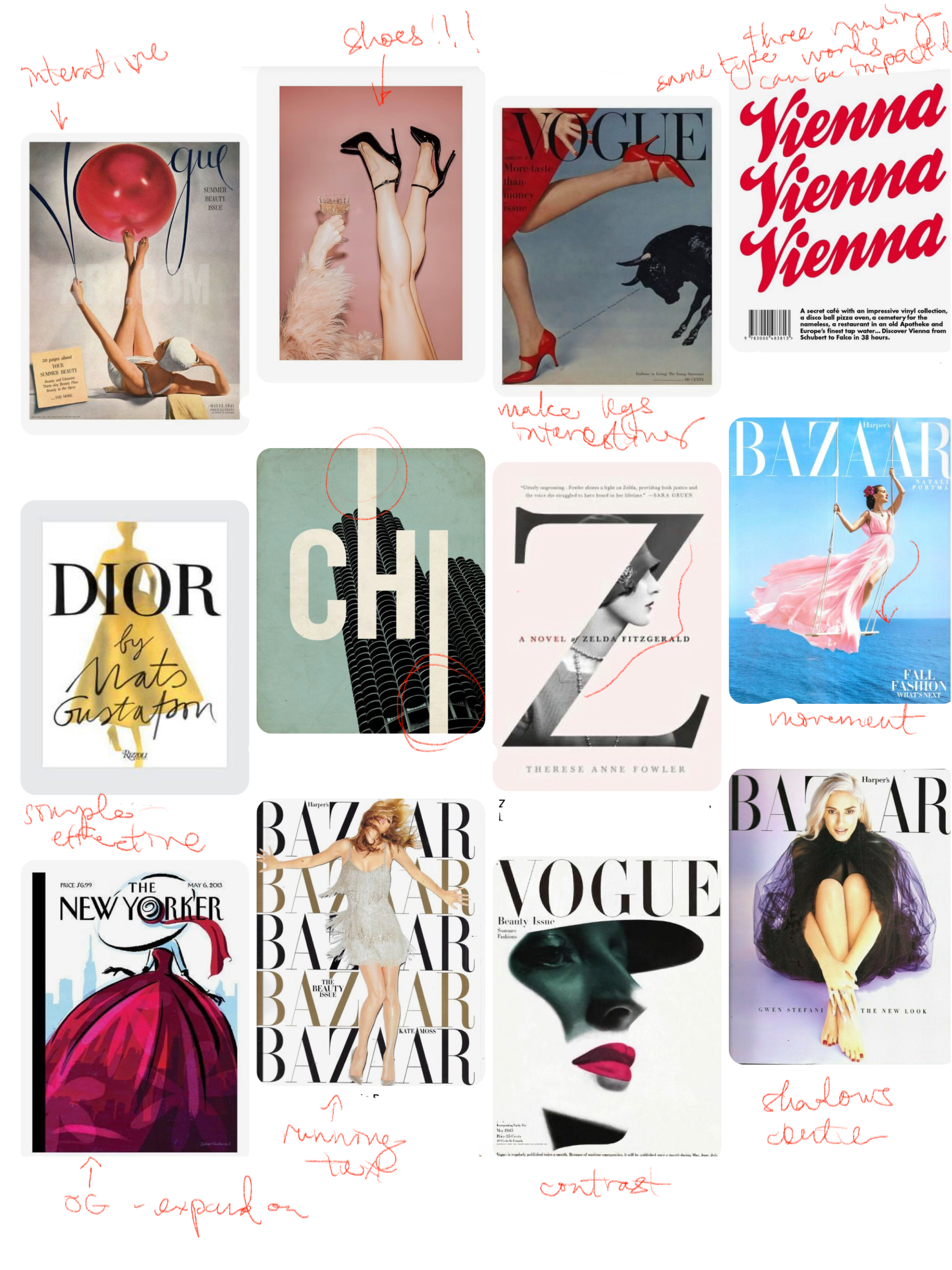
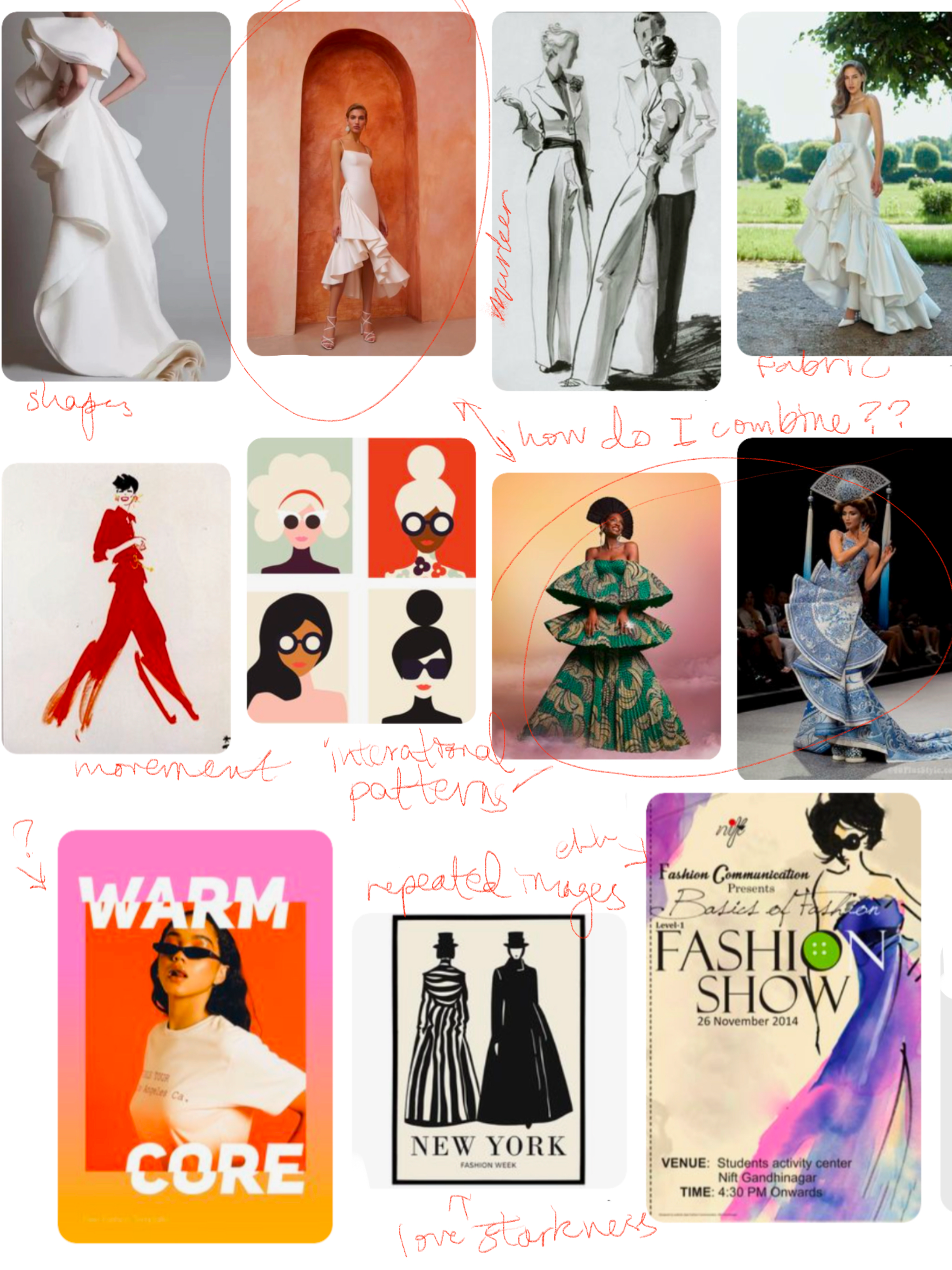
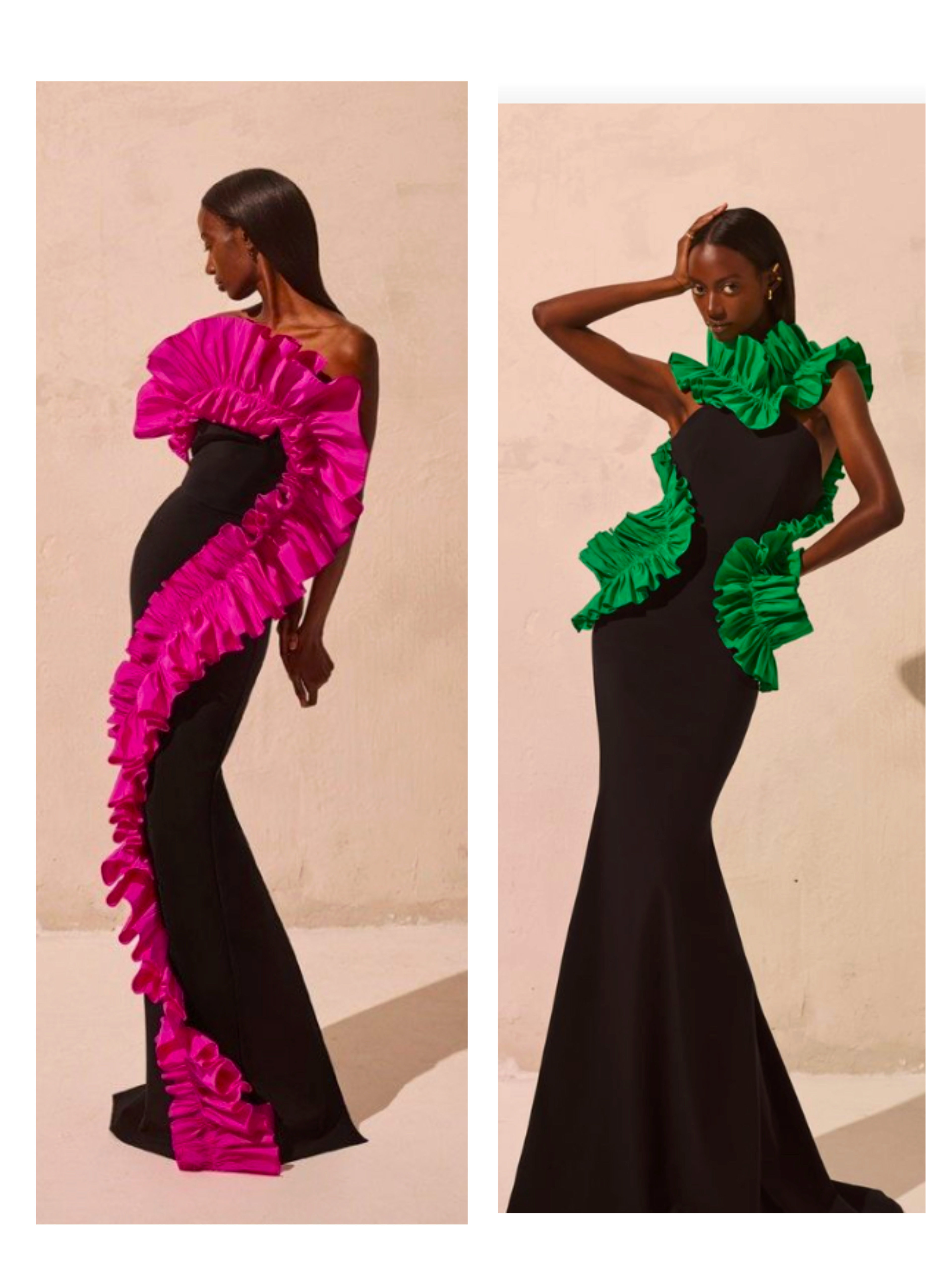
This looks chaotic, but my process was pretty simple:
Print inspiration and annotate to start the brainstorming process.
The last image on the bottom right is my pose inspiration.
Brain Mapping
After some research, I use brain mapping to start organizing my thoughts but also as a means of brainstorming new ideas.
You can see my two main sections concern the type & layout, and the fashion profile. Thought there is more to consider, these are the biggest design "problems" to solve right off the bat.
Sketches & Doodles
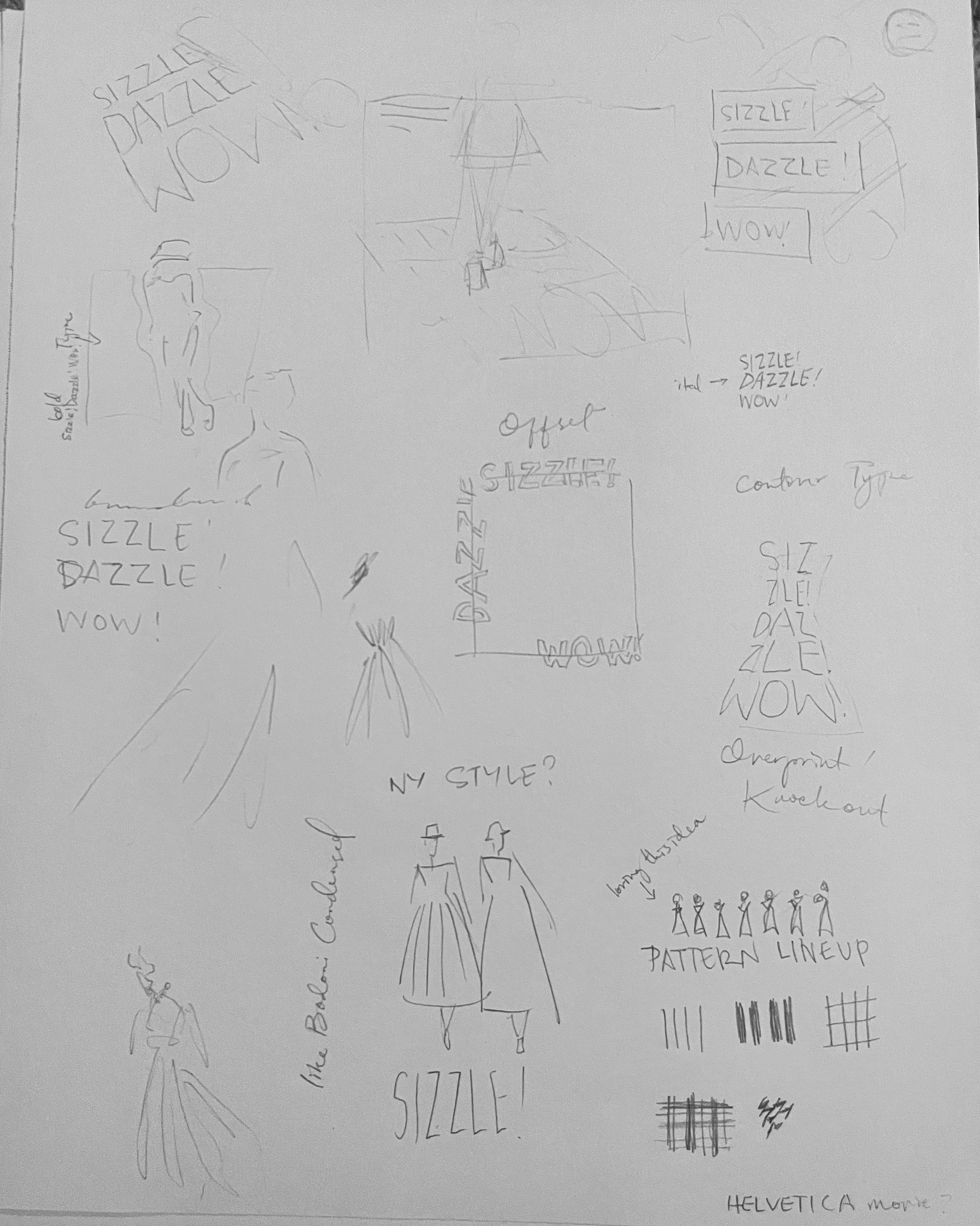
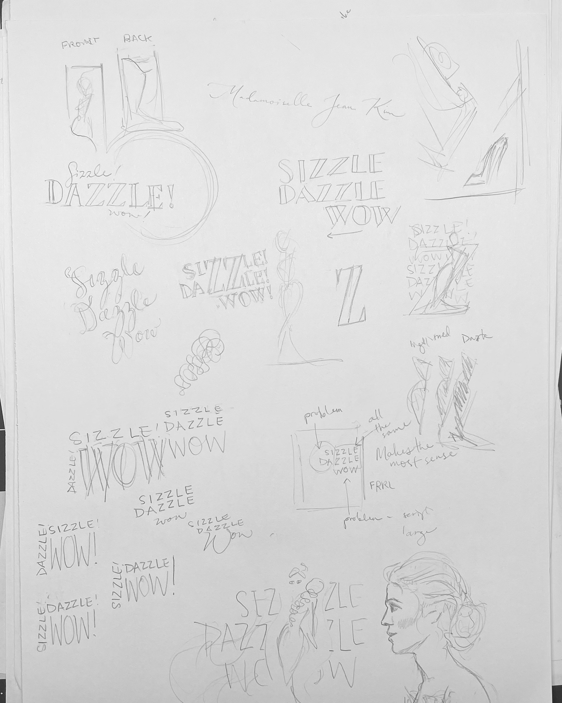
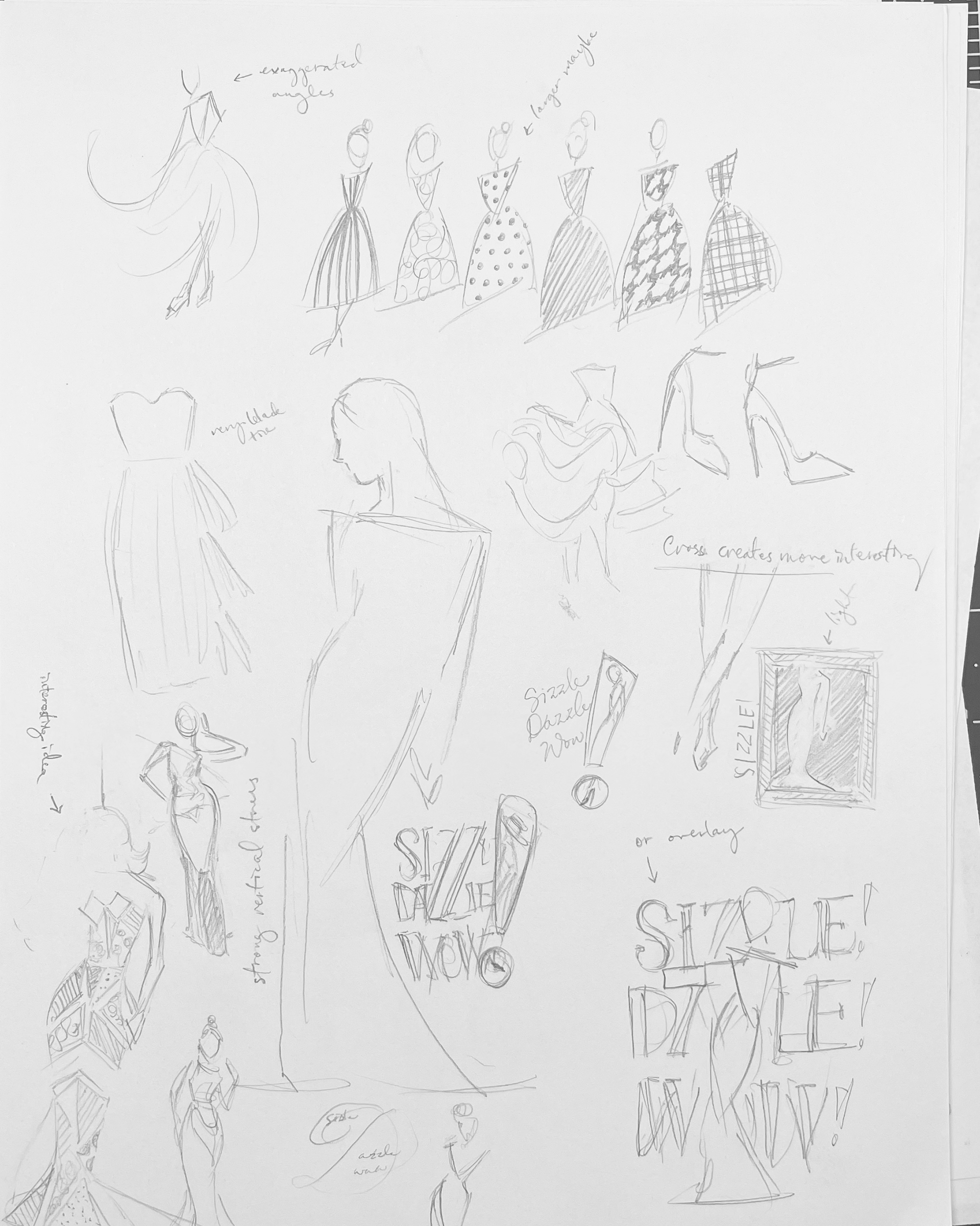
The initial ideas start to roll. At this point, I'm thinking of patterns and posing a lot, and only a little bit about the type and layout.
Sketches
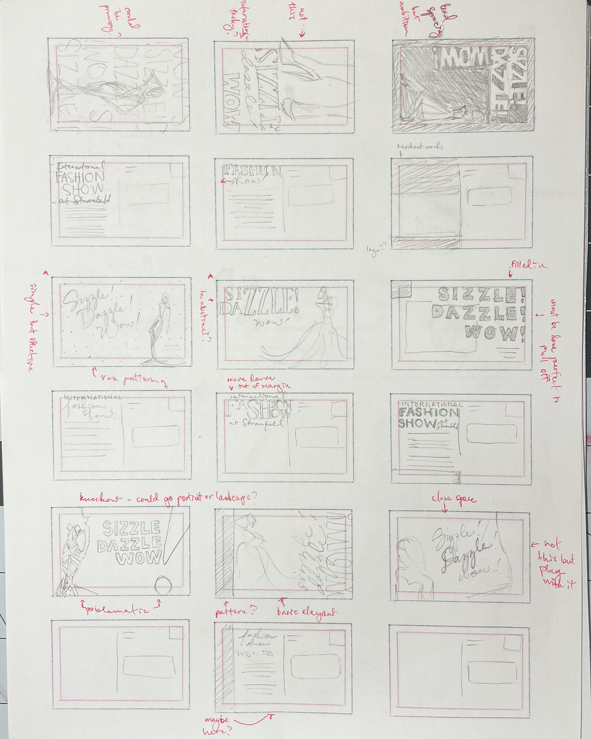
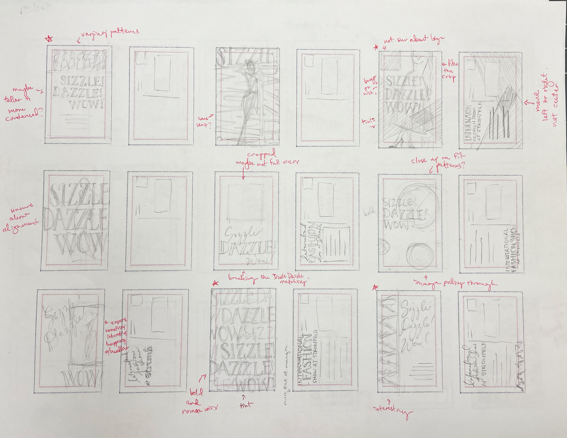
At this point I start to tackle the layout.
This type of layout sketching really works for me to get a bunch of ideas out of my head. From there, I choose aspects of my favorites and decide what to do for my initial tight thumbnails.
**Side Note**
AHH!
Sometimes you get off track and you have to make a detailed schedule mid-project to keep you on track.
Tight Thumbnails
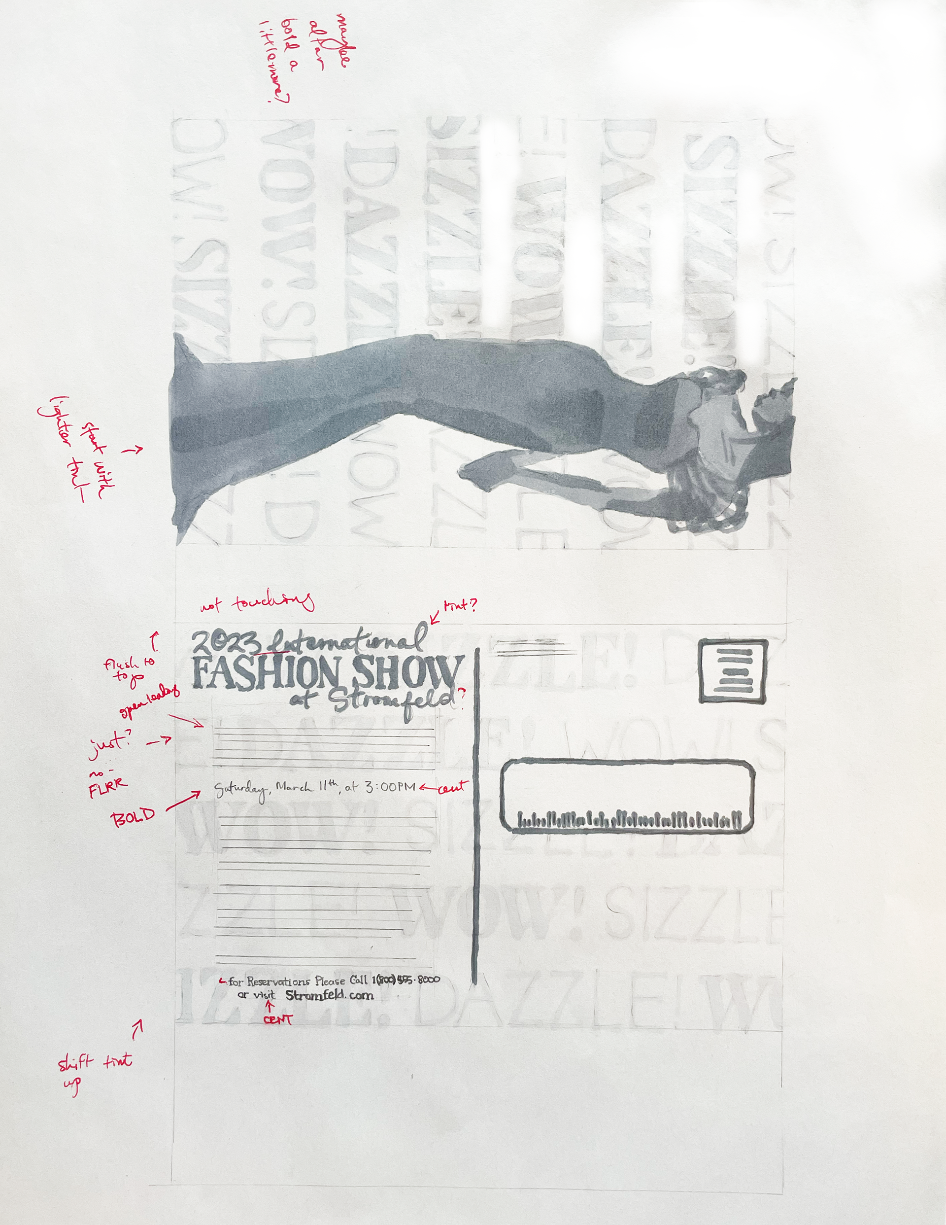
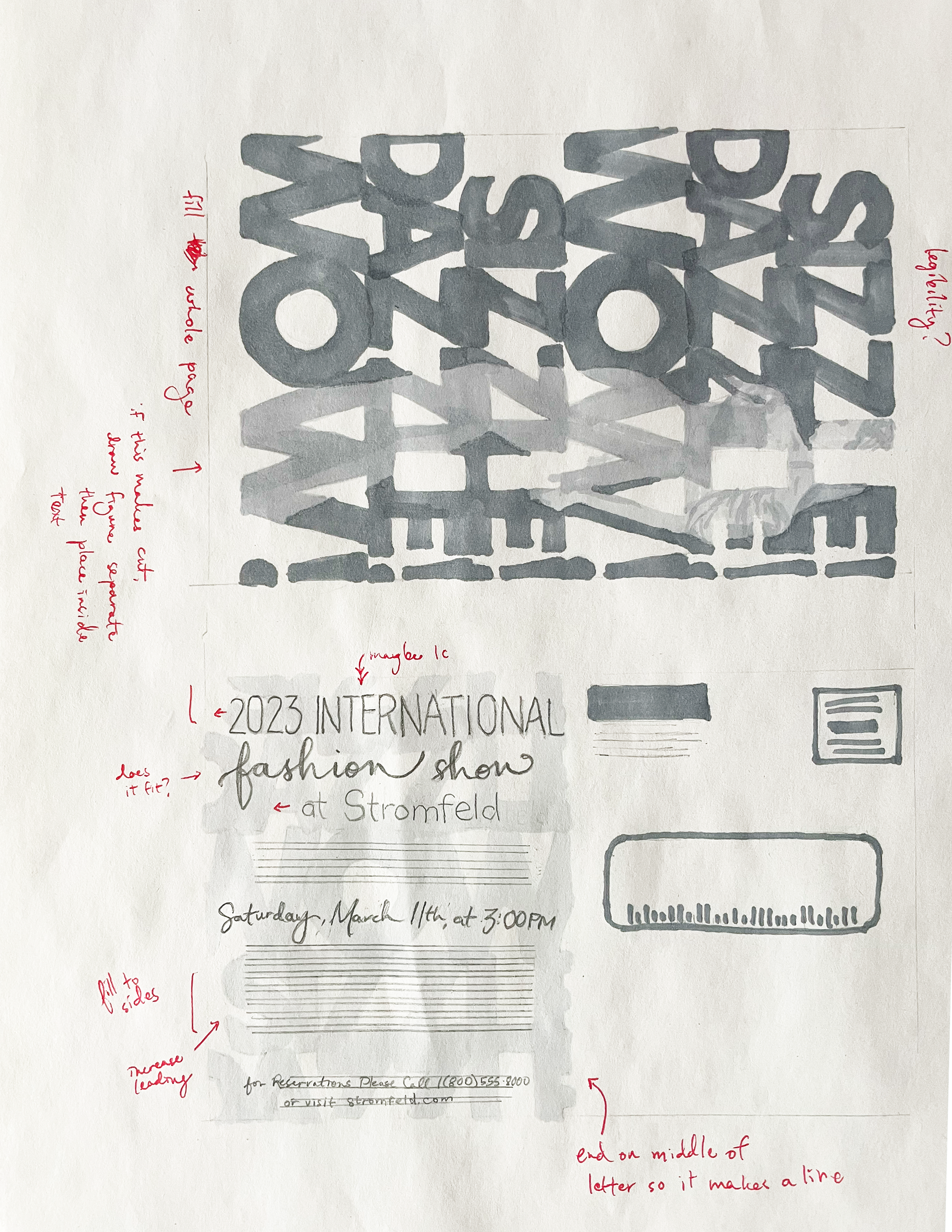
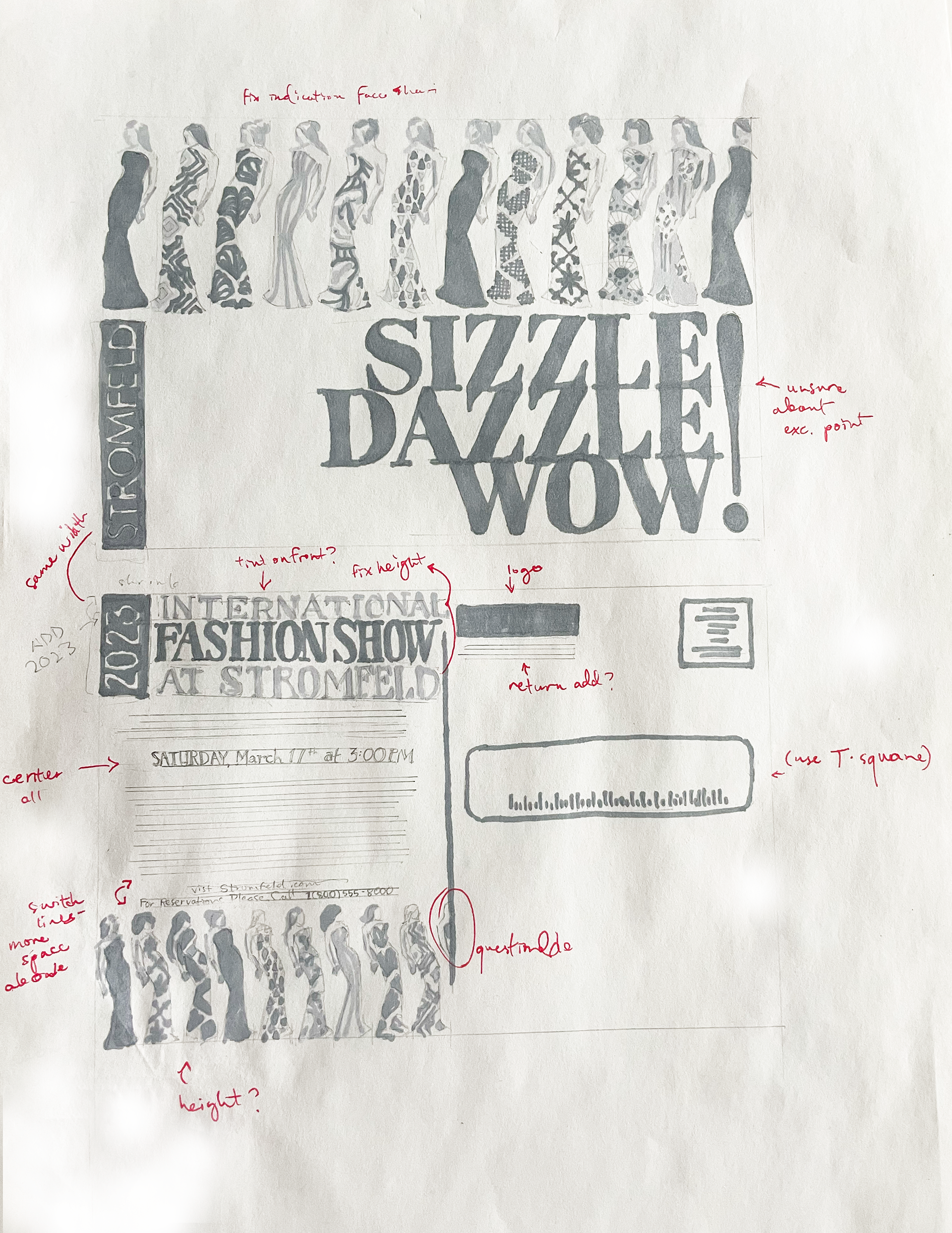
These were variations of my top three picks from my sketches. The one in the middle was an idea I was excited to try but was difficult and muddy in execution. There are things I like about the backs of all of them that I may mix and match for my final draft.
Tight InterMediates
Thumbnail Option 1:
I made some major changes to this design at this step and I'm not really sure about the result.
The biggest change was changing it from landscape to portrait for the front image. The other major change was the headline. I felt like it made the composition breathe a little better but I don't totally love the result and can't put my finger on it.
The biggest disappointment about this was the difficulty of the marker application. I should have used my pencil for a lot more and it would have looked cleaner.
The concept on this one was fun and originally what I thought would be my first choice, but ultimately feels a little bit overwhelming to me.
Thumbnail Option 2:
The changes on this one were not as dramatic as the last, but I did shift in ways I felt were positive to the design. First, the dress design incorporates more notes of internationality.
The logo on the front is a bold move and it may be overemphasizing. It's something I will workshop on the tight final hand.
I felt better about the marker indications on here and didn't use markers for as much of the text.
I changed the back headline and it feels a little better to me. I may make the "fashion show" a little thicker as well as the line underneath the whole title part.
This may be my final choice.
Tight Final Hand
Front
This design was my final choice. It was not the one I thought I would end up with, so I'm glad we were required to start with multiple choices. This is the last stage by hand before going into computer design.
I got some advice from my instructor about emphasizing the headline words and creating more harmony between the back and the front.
For the back, I decided not to use small caps anymore and do a bold italic instead to tie into the script.
I also had to add the logo somewhere on the back and work on some centering issues presented by having that 2023 block on the left side.
Black & White computer progessions w/markups
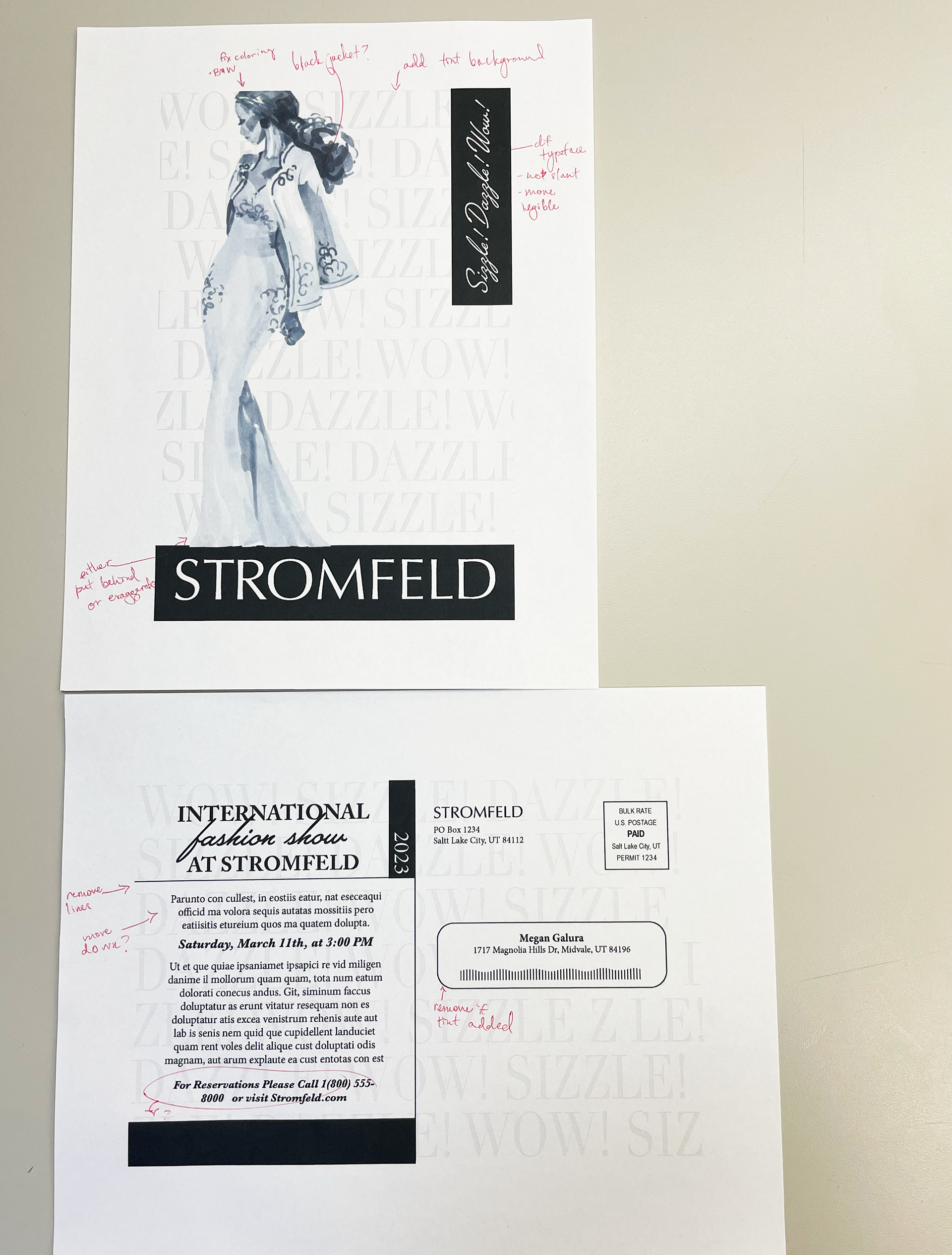
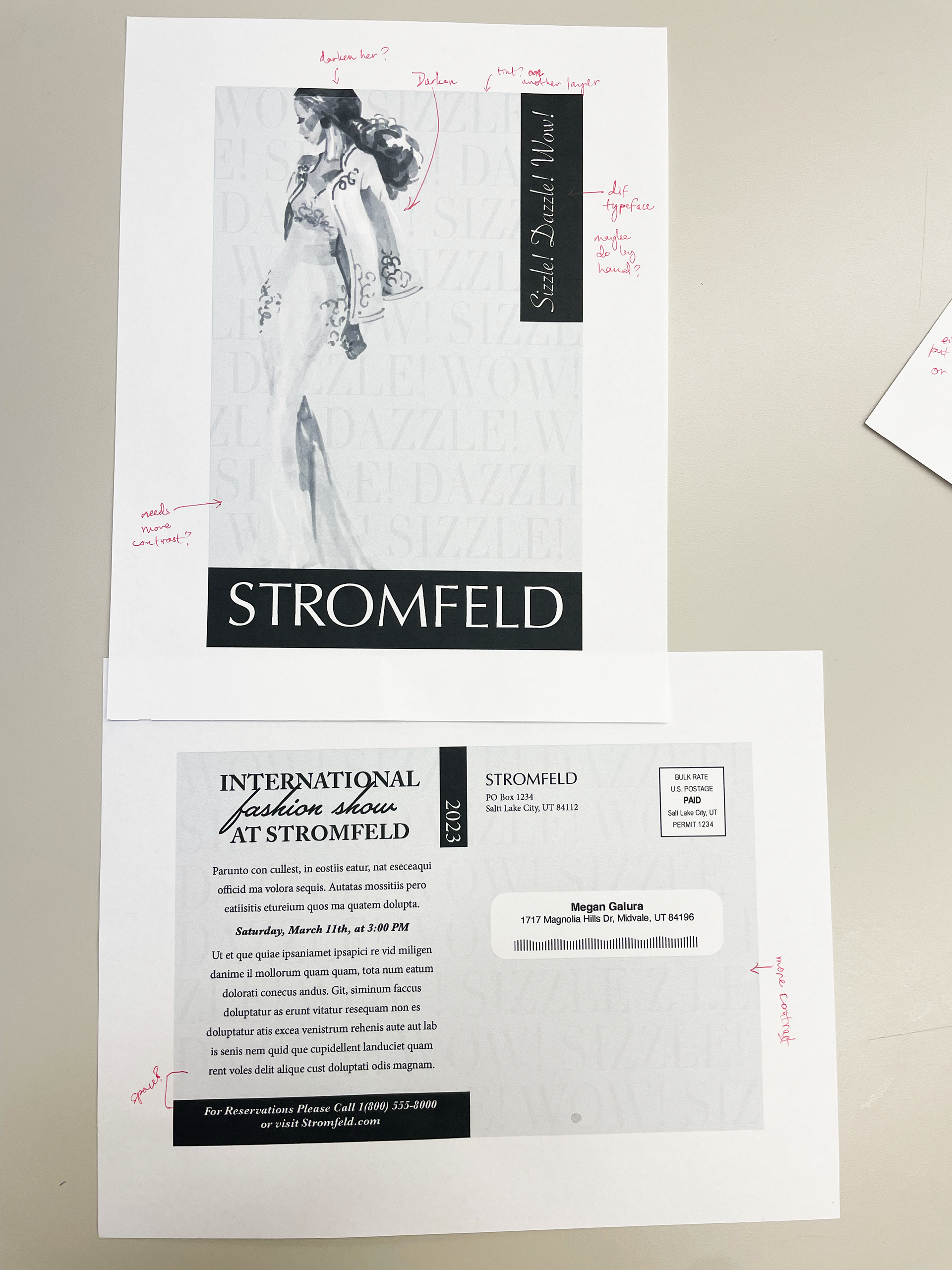
The changes here were not too drastic, but I definitely benefitted from feedback in class. From left to right you can see the progression including changing the background to a tint, adjusting the tints, changing the typeface on the script on the front cover, moving the reservation info to balance the black, etc.
Computer Final Dummy
Here is my final design. I changed the illustration up a bit to be darker and draw your eye in to the design while making more contrast with the background. Then we have to make a dummy to see what it would actually look to the consumer. It was satisfying to see it trimmed and clean and flip it over to see each side.
Computer Final/Composite
Above is our first time printing a composite for this class. It's complete with all printers marks including trim marks, registration marks, color bars, bleed settings on, and a slug.
Final Clean Digital Version
Here is the final result! Overall, I learned a lot about the design process from start to finish. It took a lot of work and thought and at times I felt a little lost in it from staring at my design too much, but I think I'm happy with how it turned out. I wish I had changed a few things including changing the thickness of the black sidebar on the front with the headline.
