Overview
The Zine project is a semester-long project that we had to juggle along with our other projects this year. It is supposed to be about something surrounding the 2020 pandemic. It had to be sixteen pages minimum and I went slightly over... you know... like 60 pages over.
This was a very personal narrative. I was thinking about what the pandemic was for me and I just couldn't avoid that that was a very dark time for me. I've never really talked about it or had a platform to do so. This was very tough to write but it felt really important to me. It's really helped me both as a designer and an individual.
It was amazing to get to be in control of every single aspect of this project. From the design, to the paintings, illustrations, and writing-- all of it was done 100% authentically from me.
It's scary to put this out there but I think vulnerability is important.
_____________________
Research & Brainstorming
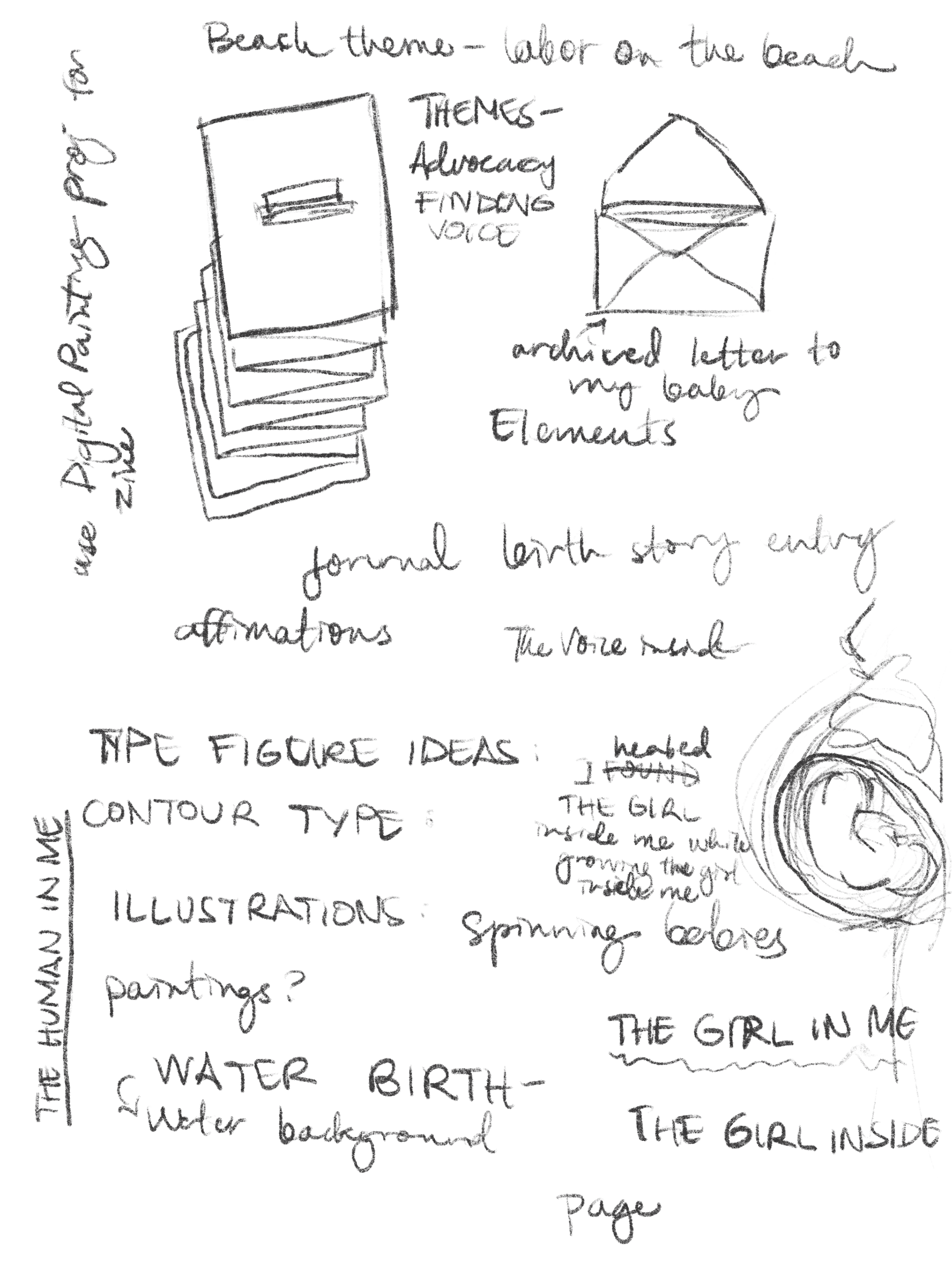
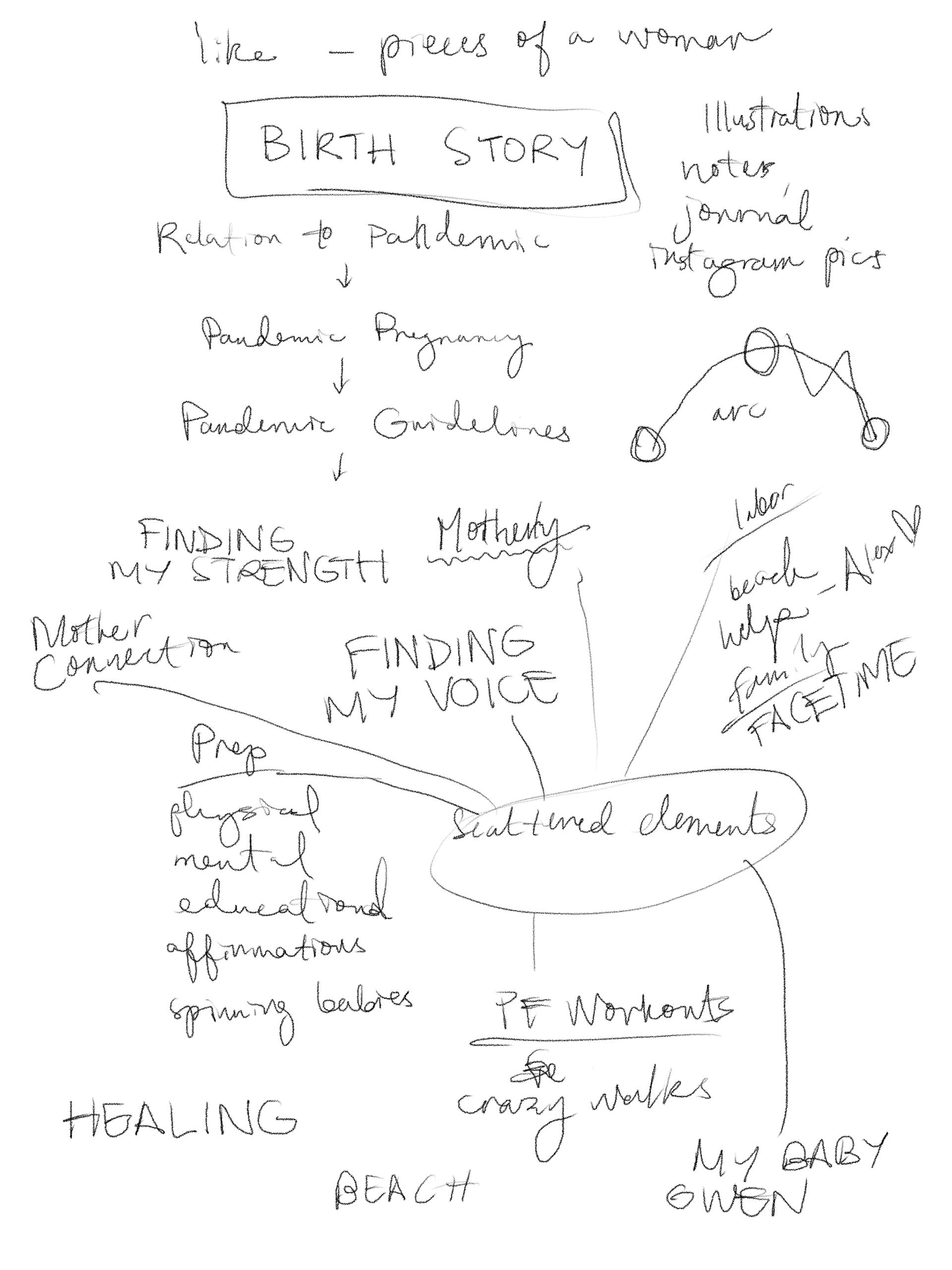
We have time starting at the beginning of the semester to decide the theme for our Zine. It has to have something to do with the 2020 Covid-19 pandemic. Honestly, at first, I did not want to do something about the pandemic. But when I thought about it, I realized I did have a pretty compelling story to tell and I might as well be honest about it.
_____________________
Sketches & Doodles
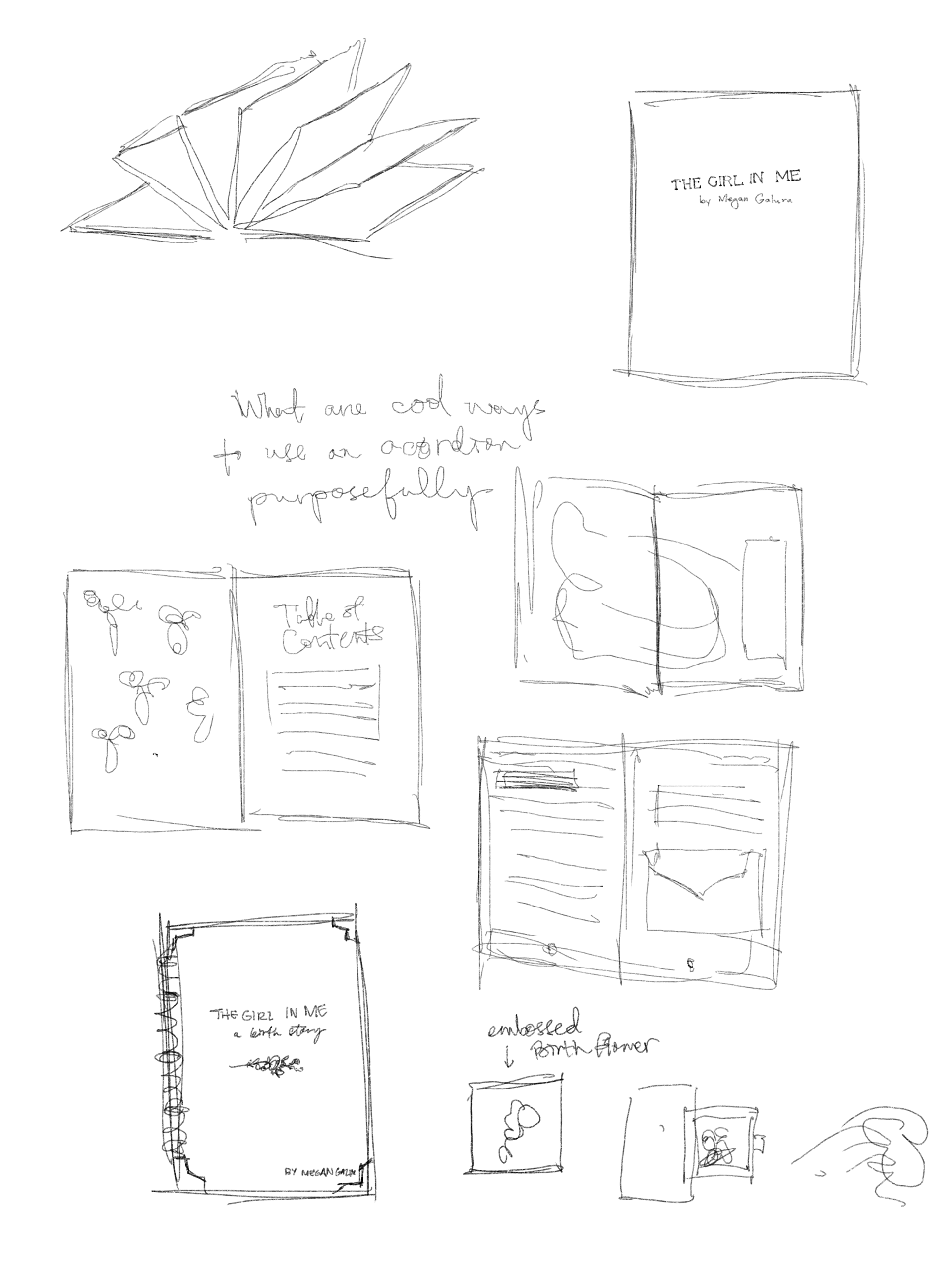
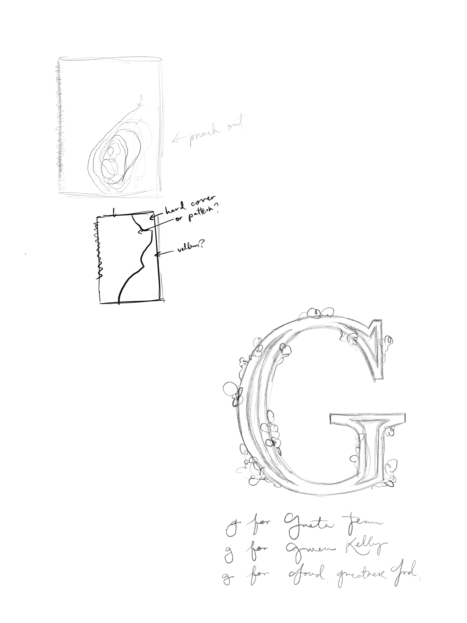
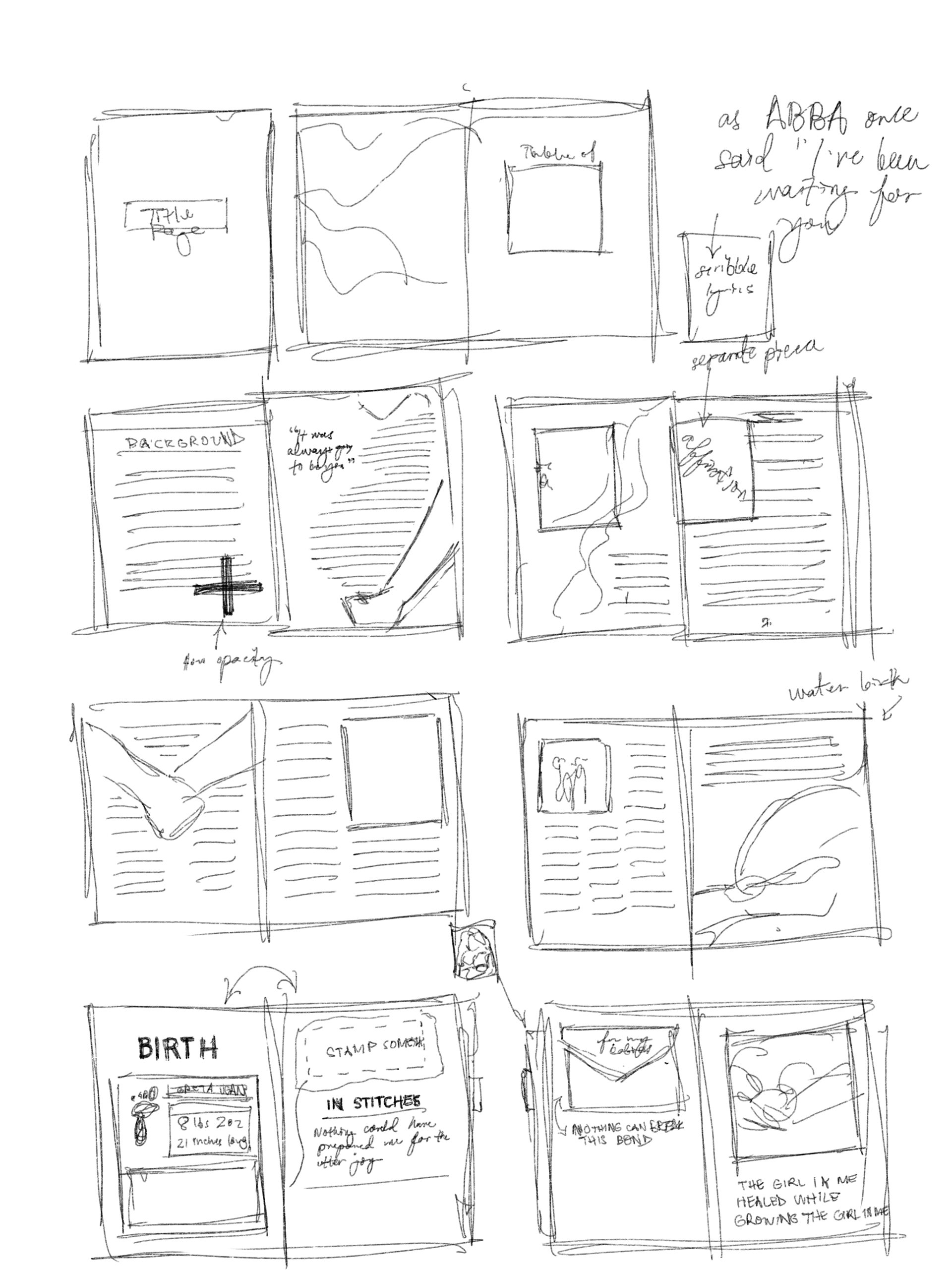
For the sketches and doodles, I honestly feel like I had a pretty clear vision from the start so I was pretty ready to jump in after a few sketches.
_____________________
Story Outline
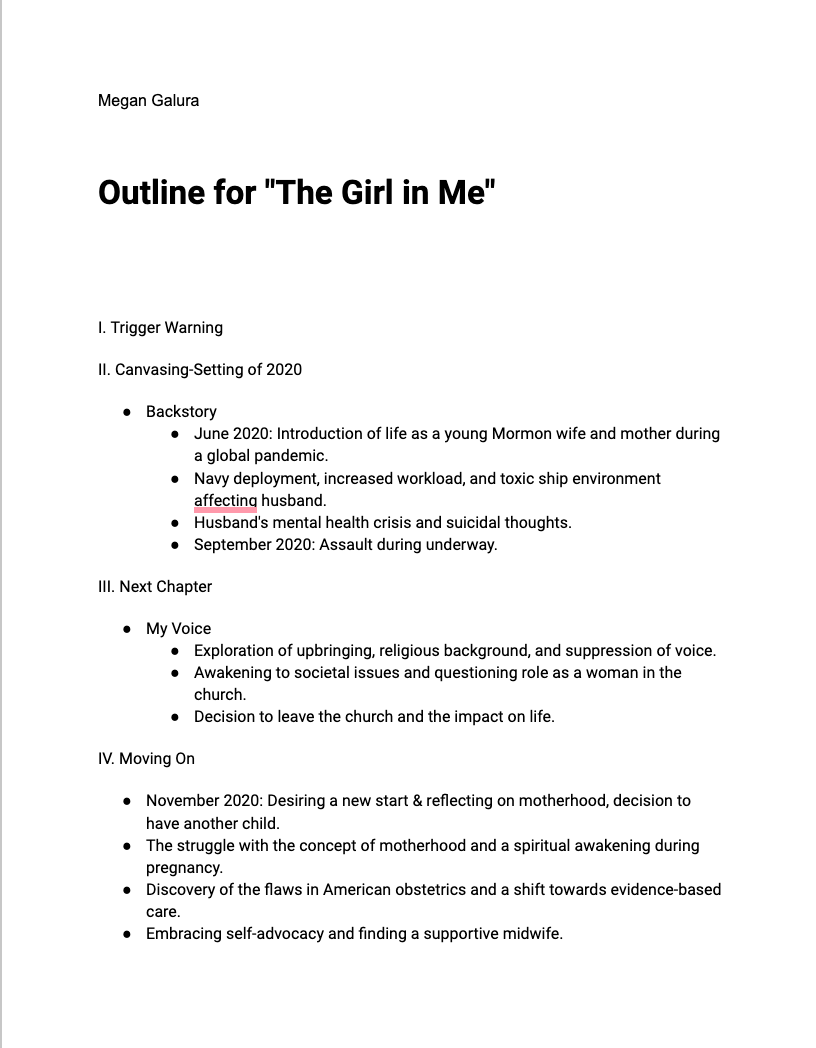
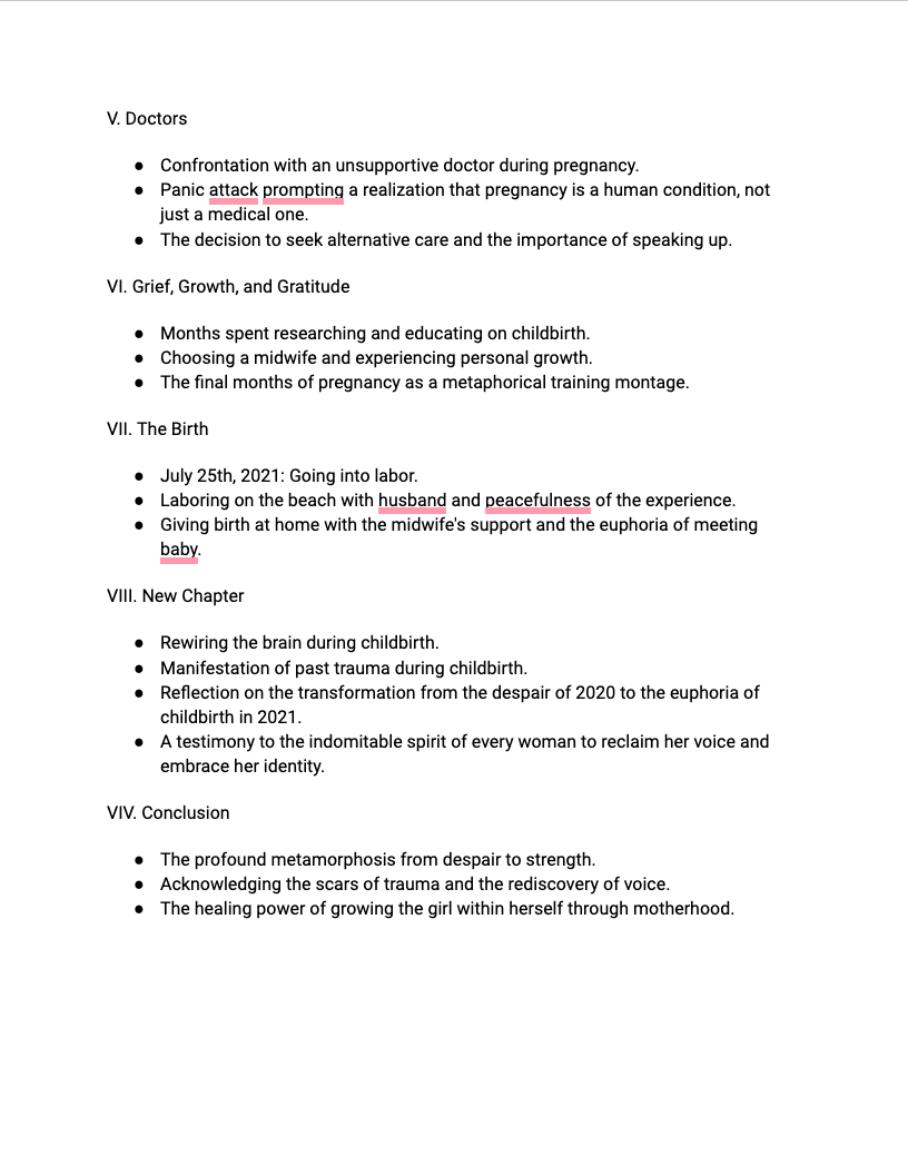
My story outline took a lot of thought and I ended up changing it around a lot to have less of the birth story and a lot more about the lead up to it and the personal growth I experienced in between.
_____________________
Mini Readers Spreads
This is where I start finding out how big this project is about to be. Uh oh!
_____________________
Initial Dummy
_____________________
Intermediate Reader Spreads
Intermediate Dummy
_____________________
Final Hand Reader Spreads
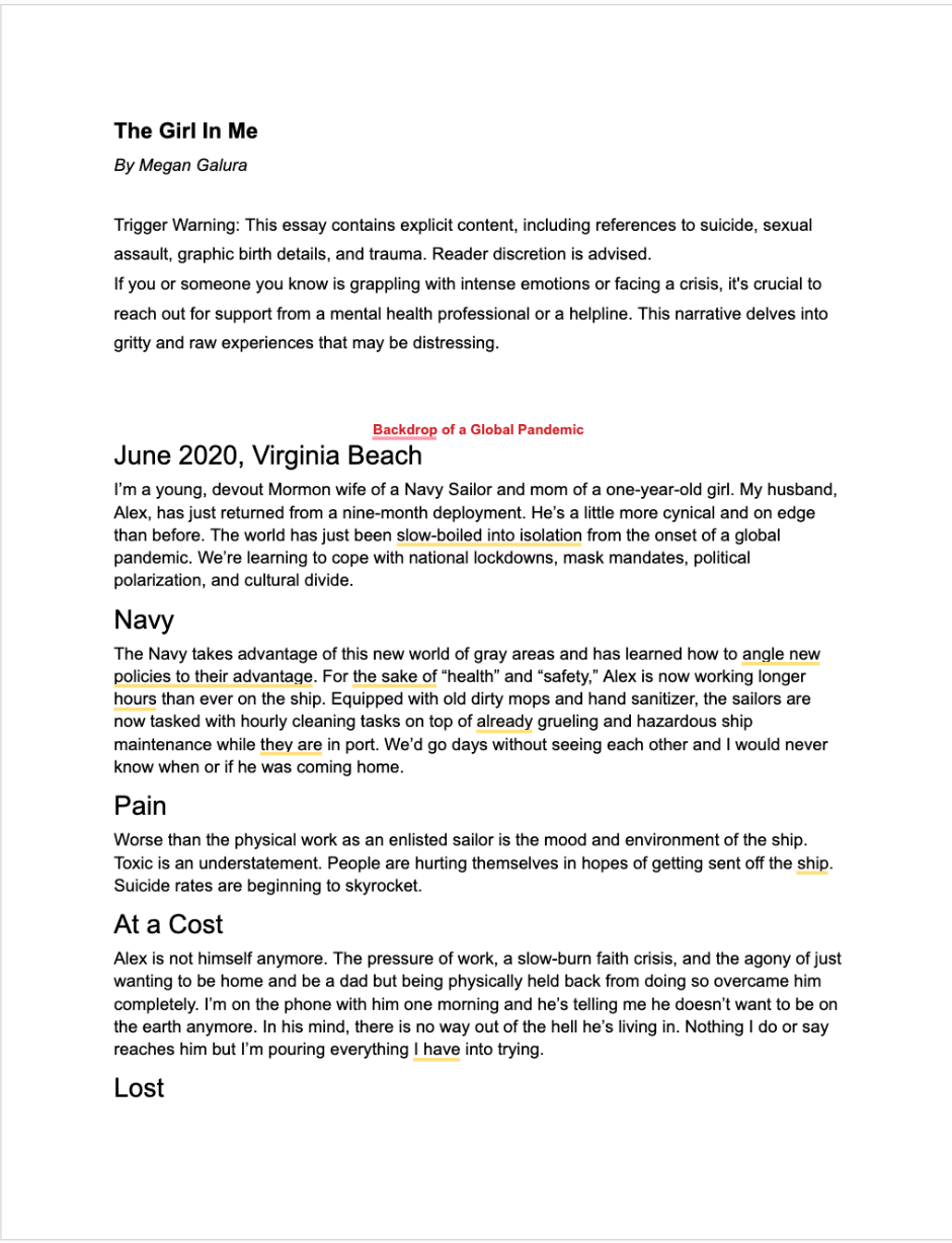
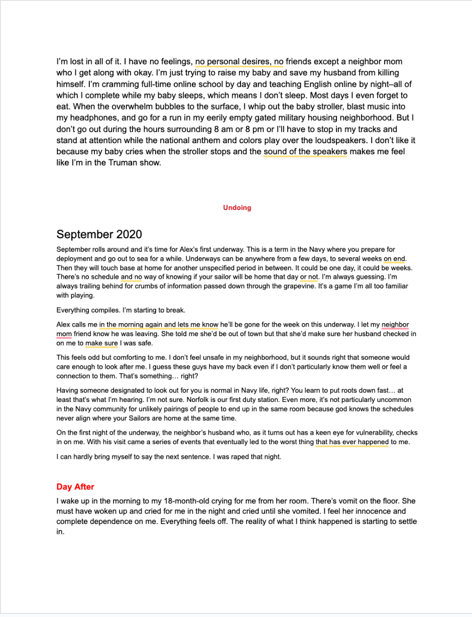
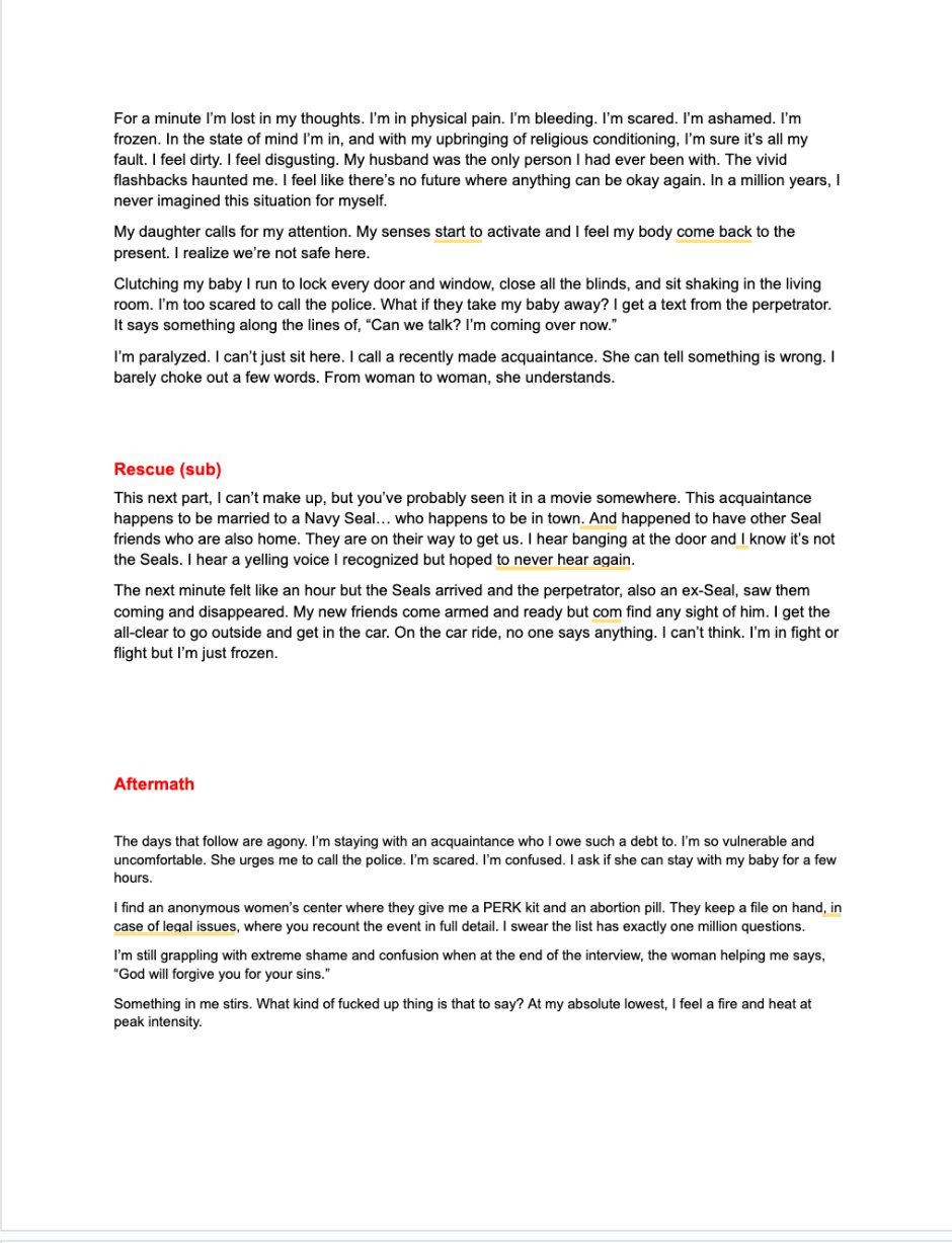
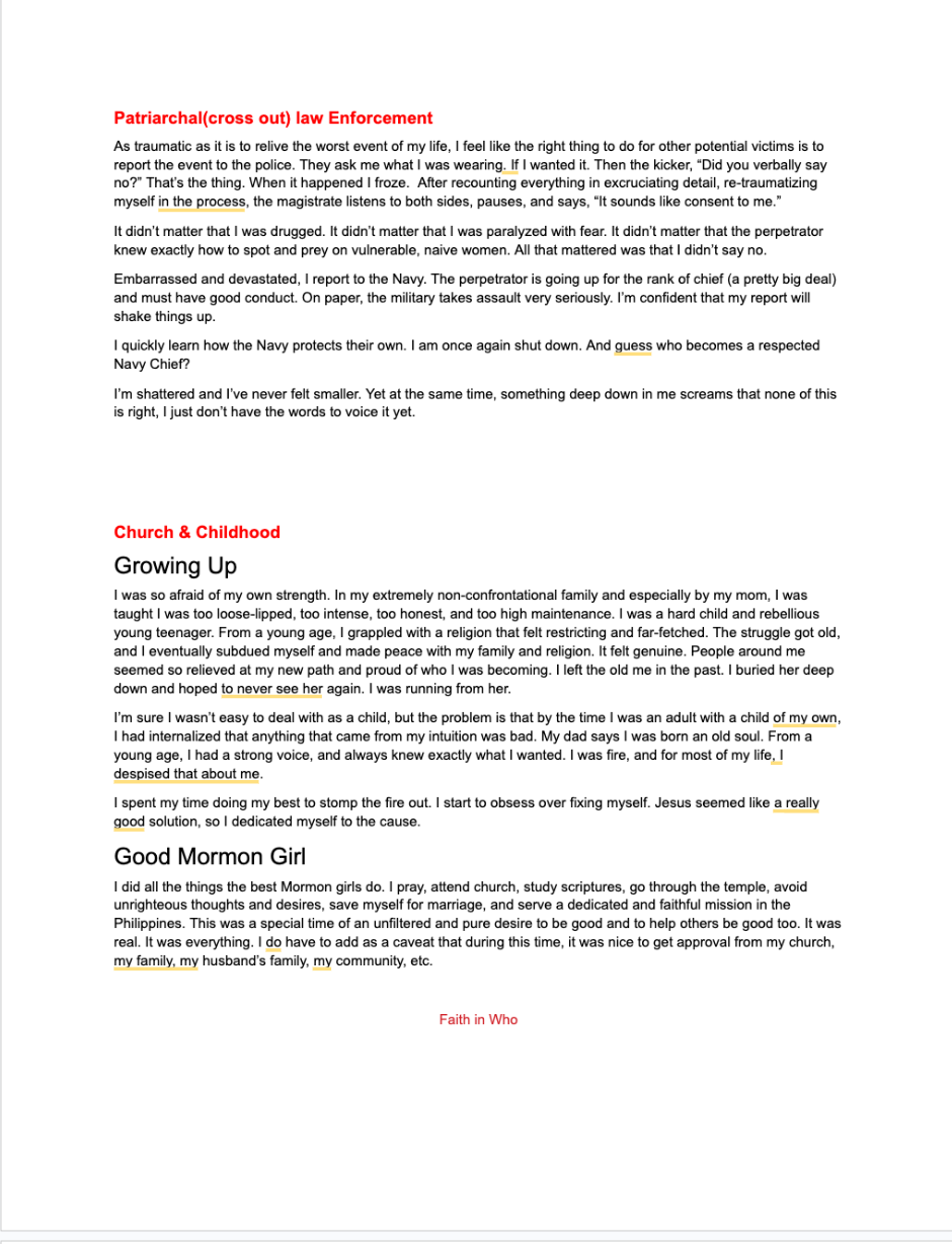
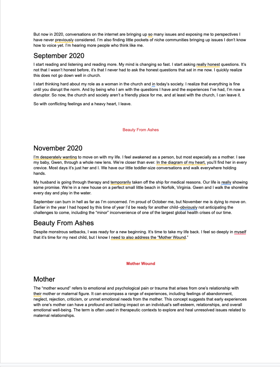
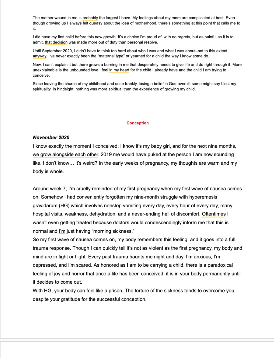
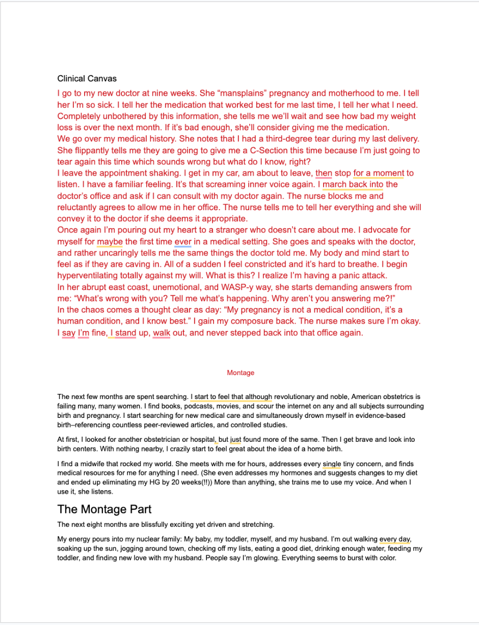
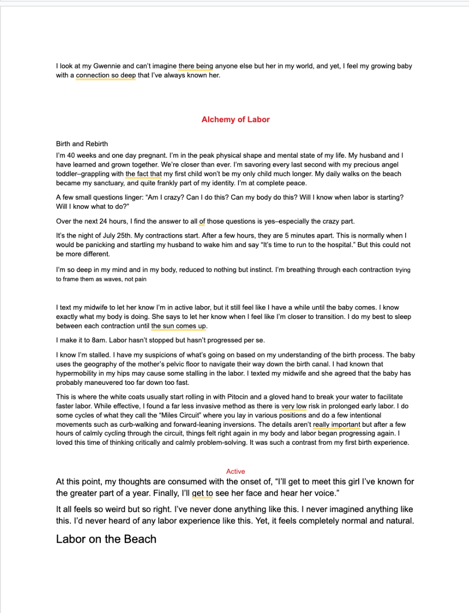
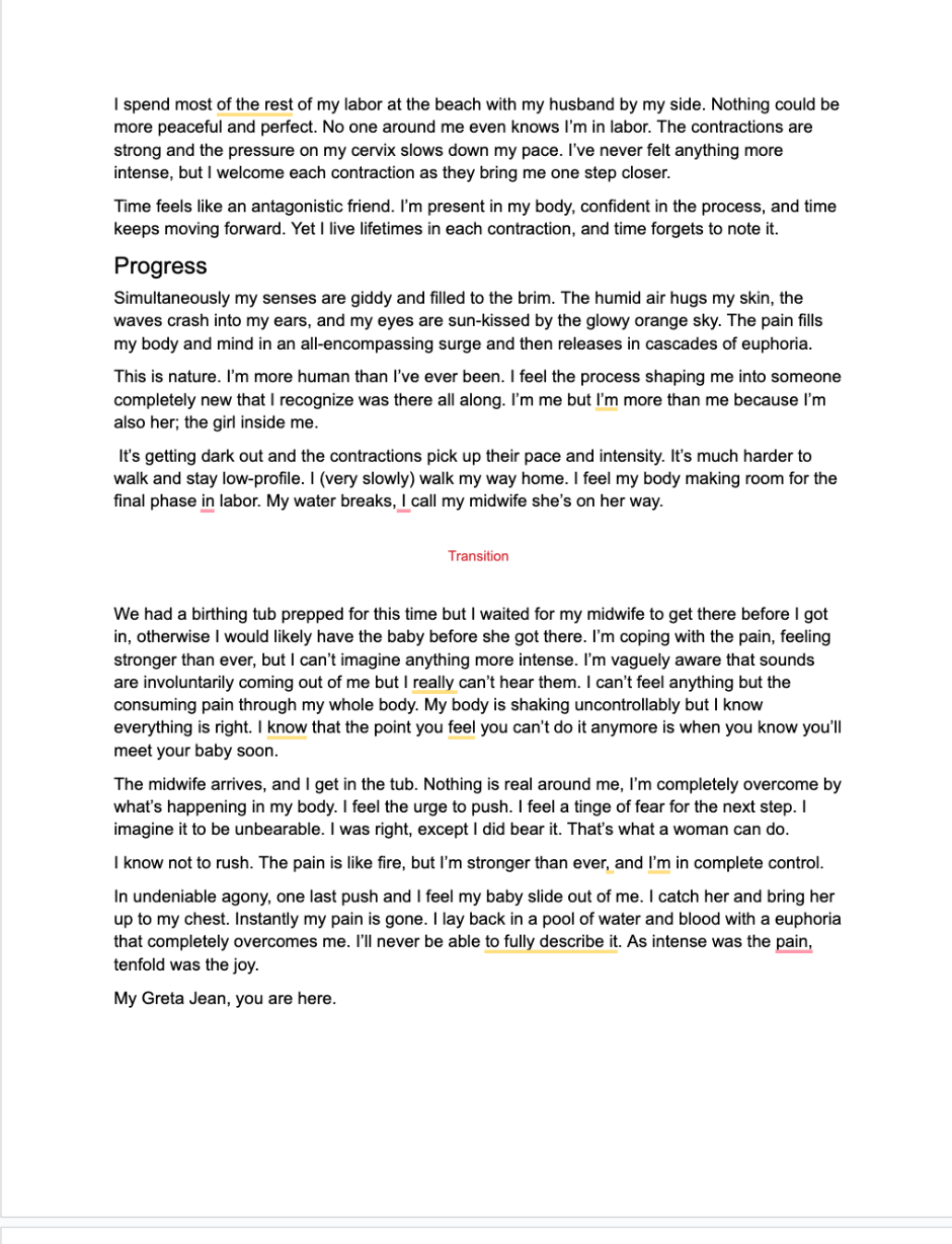
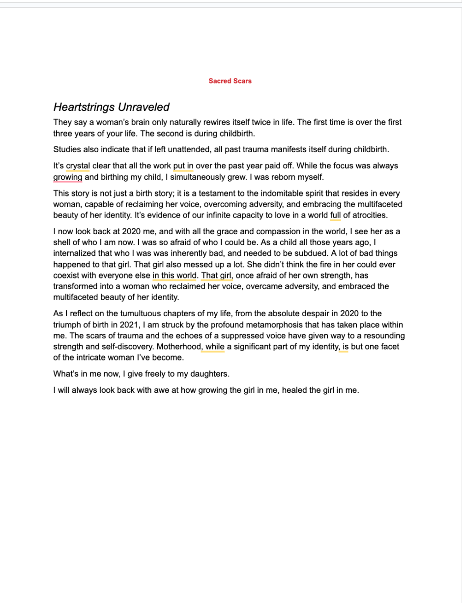
Before my hand work, I have my final draft here. It was so much copy but I consulted a lot of people and I came to the conclusion that it would feel wrong to cut out any of the story.
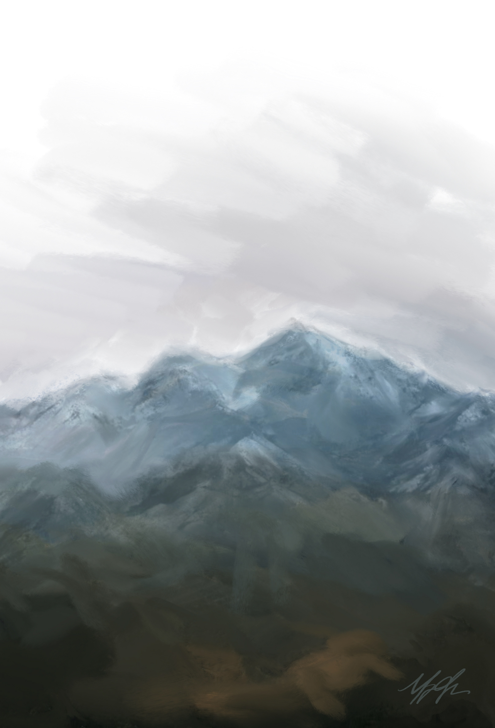
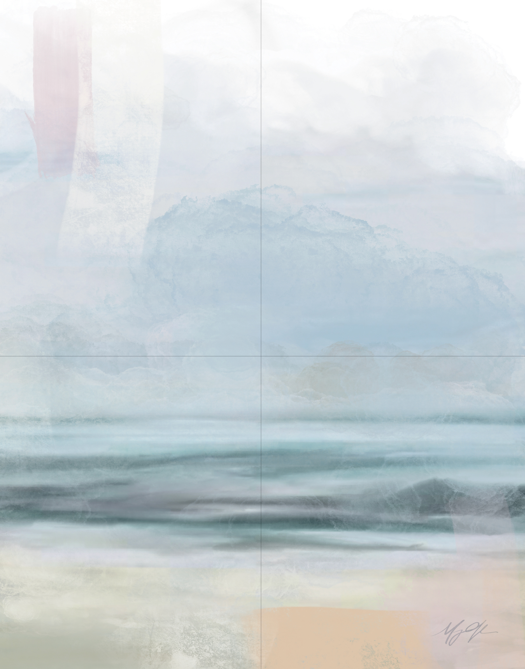
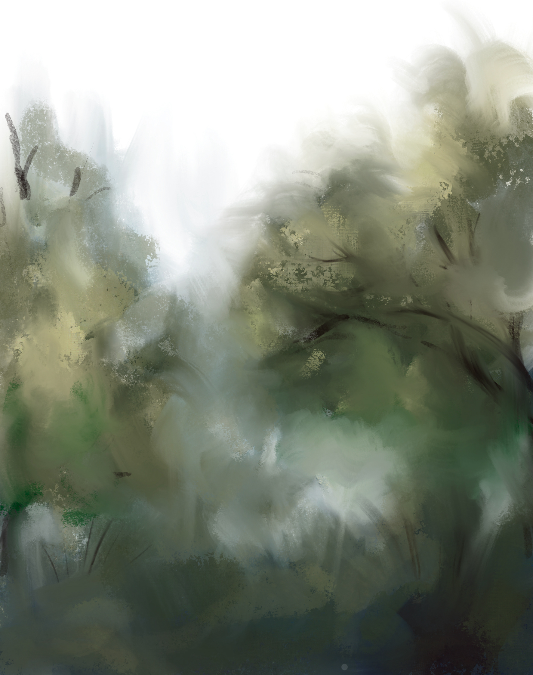
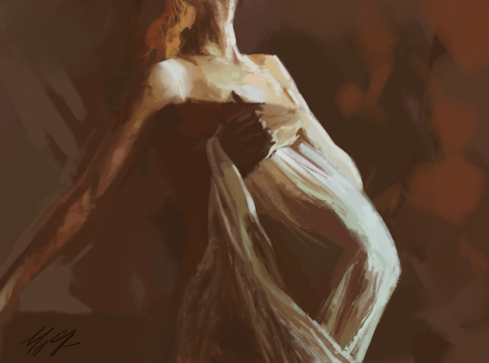
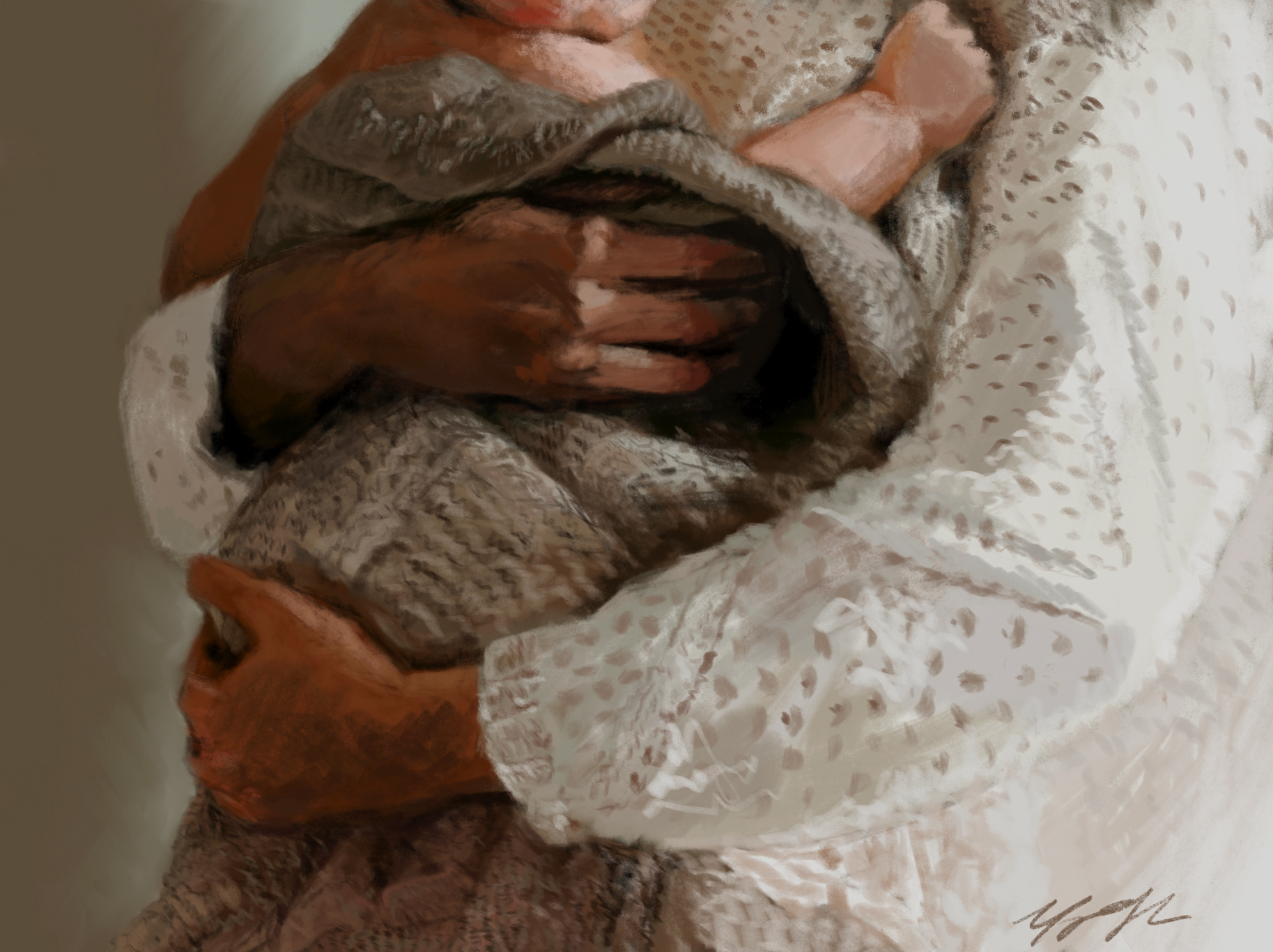
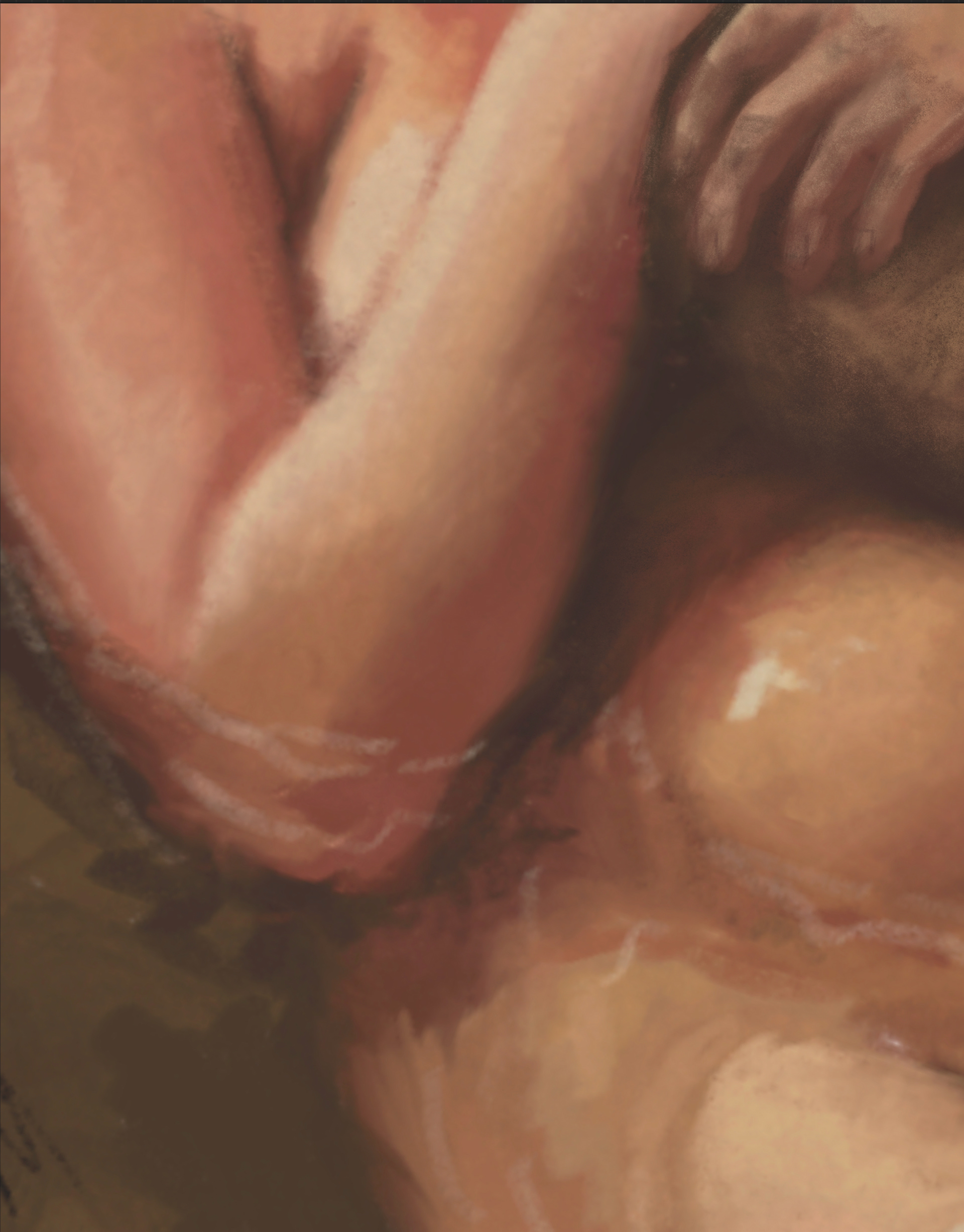
I did my paintings first to be honest.... just went with my heart on them. They came to me while I was getting lost in memories. So I laid out the paintings and thumbnails separately but did have some light indications.
_____________________
B&W Computer Progressions
Okay I'll be honest, I turned my paintings to black and white for this because it was pretty much impossible to do them twice in different colors, but it was great to see the overall layout and balance of the heavy and light.
_____________________
Final Hand Dummy
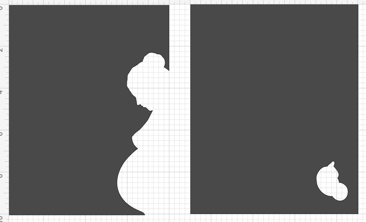
For my final hand dummy, I made a little diecut with chipboard for the cover and decided for sure on a wirebind as my binding method solely so that I could lay my images flat that spanned pages. It also was nice not to have to make a spine for the book since I was planning on doing some kind of covered chipboard cover.
_____________________
Color Studies
I experimented with some two-three-color Color Studies and I really just wanted to simplify and stay within the warm color scheme. I quickly decided on mainly red as a theme and then the paintings are warm because I feel like red can be both alarming and comforting depending on how it's used. I play into it as I move through the narrative. It made it easier to keep it simple too with such a large project.
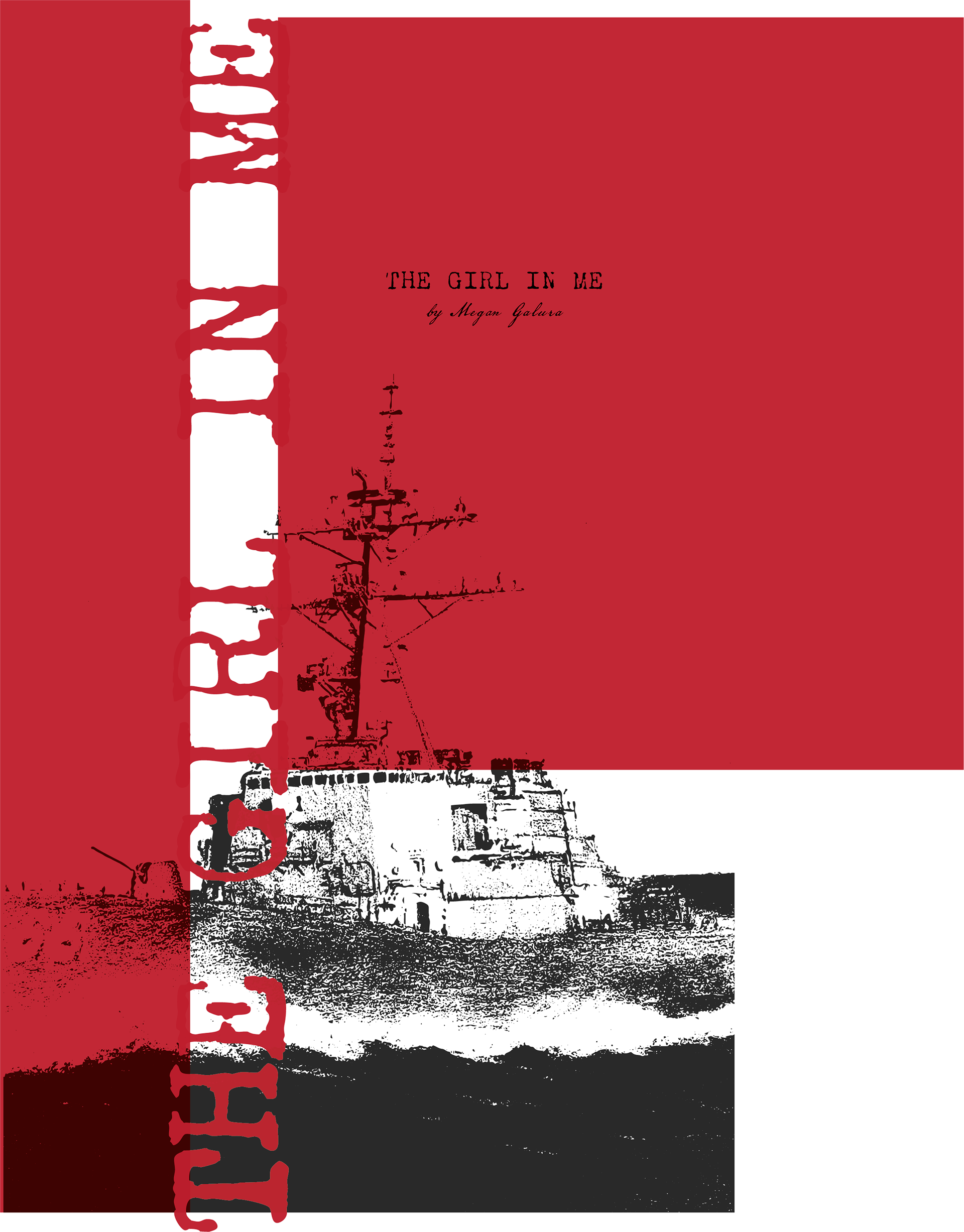
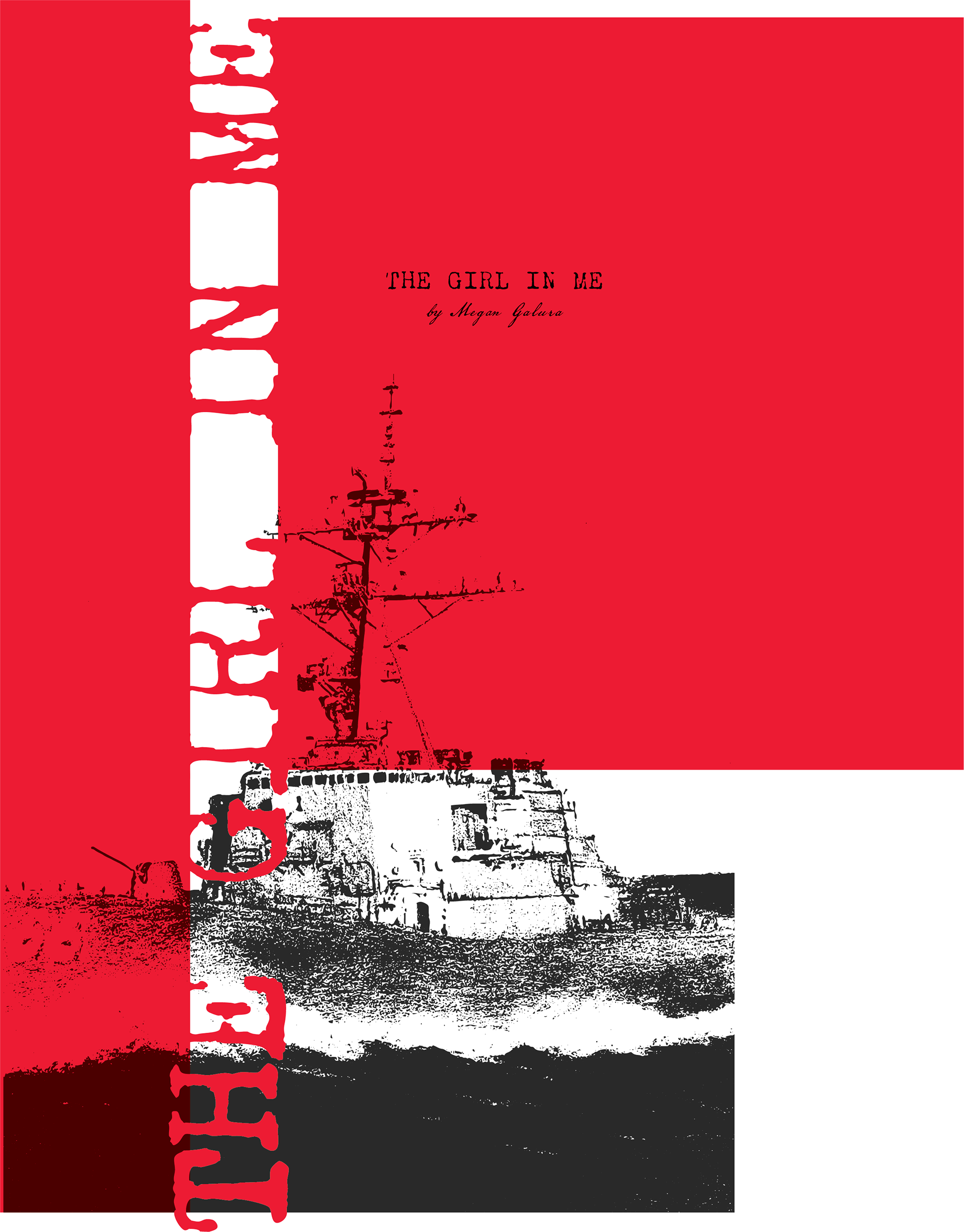
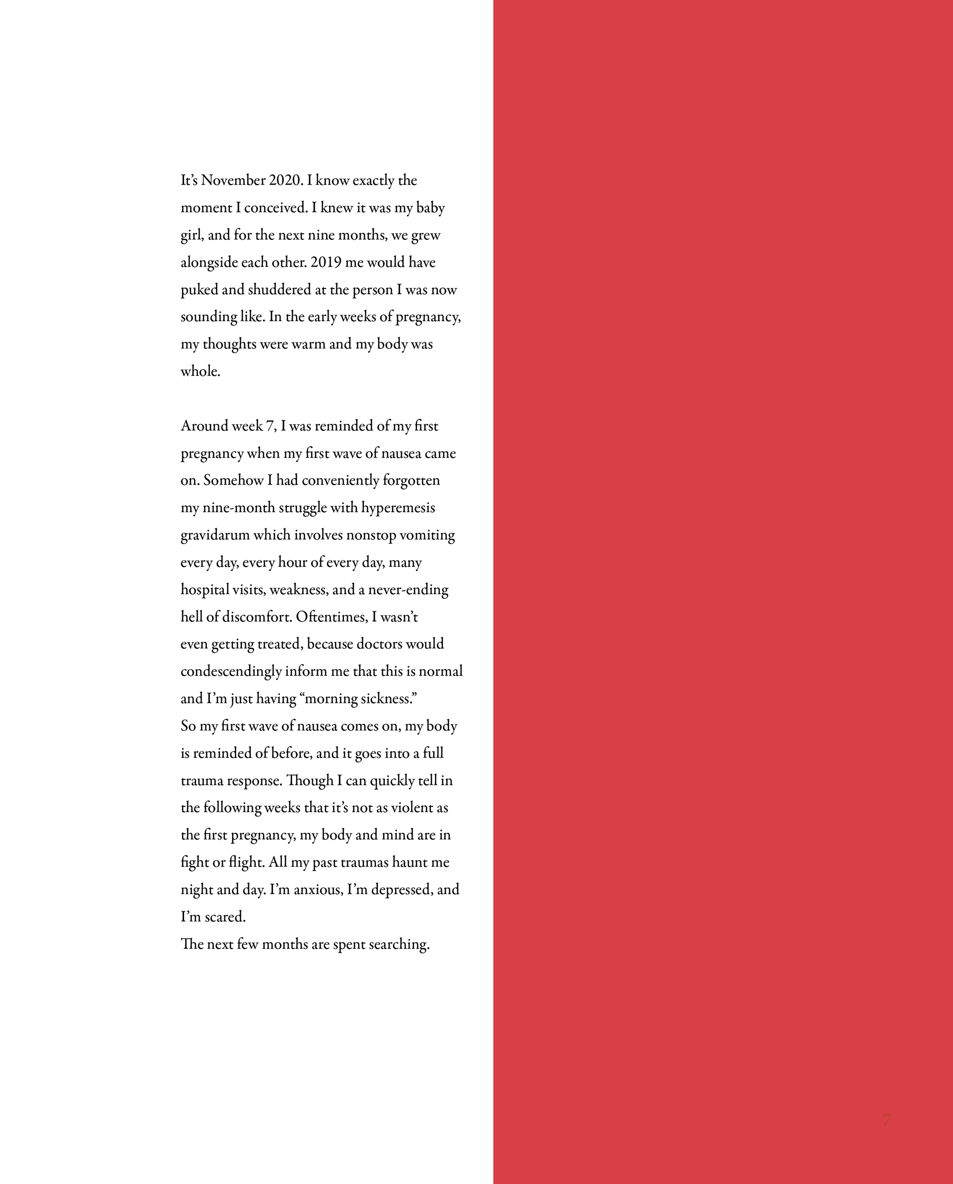
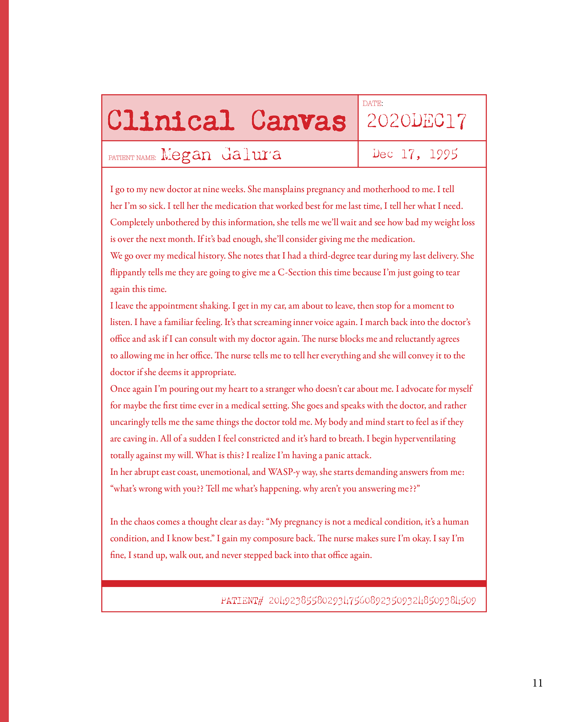
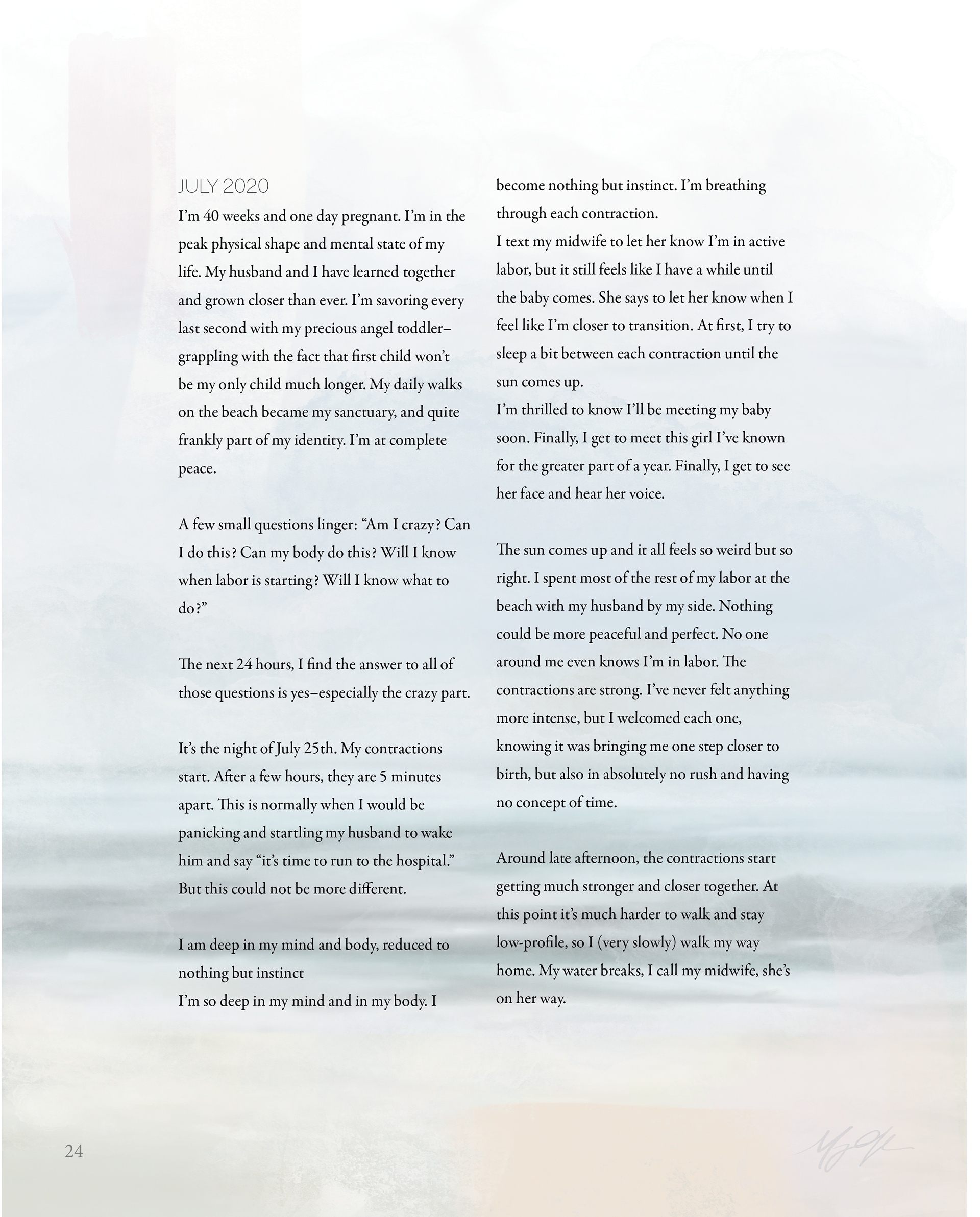
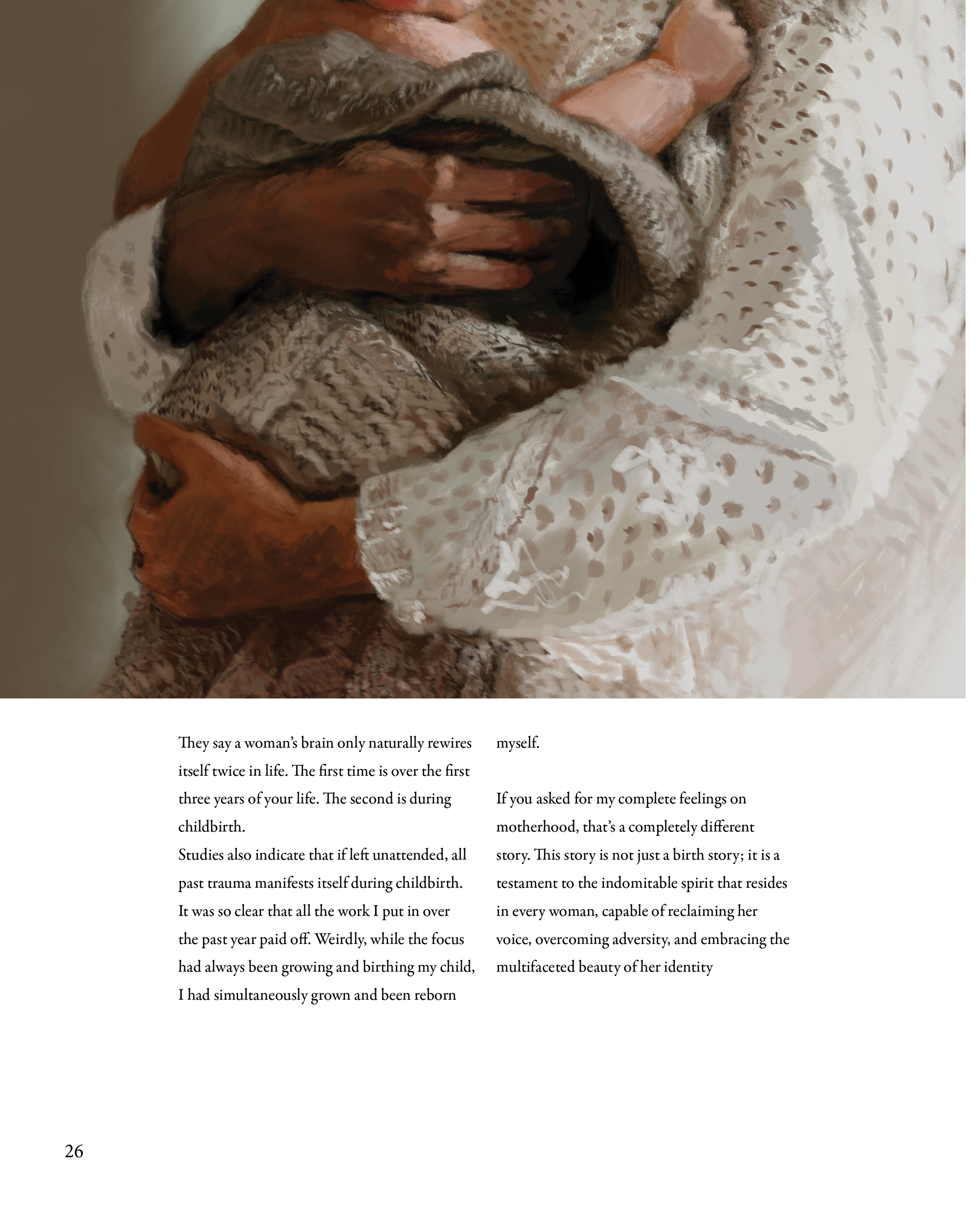
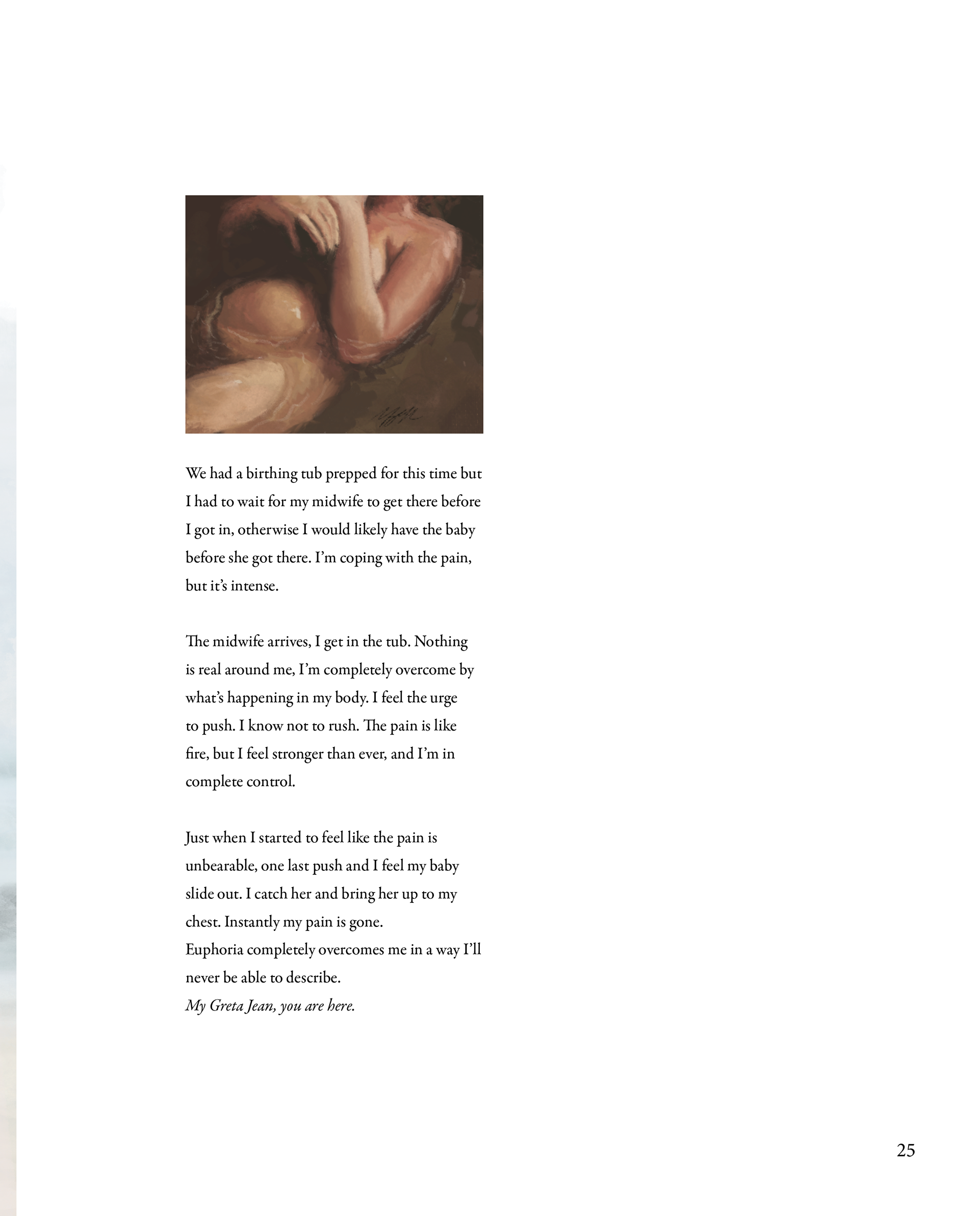
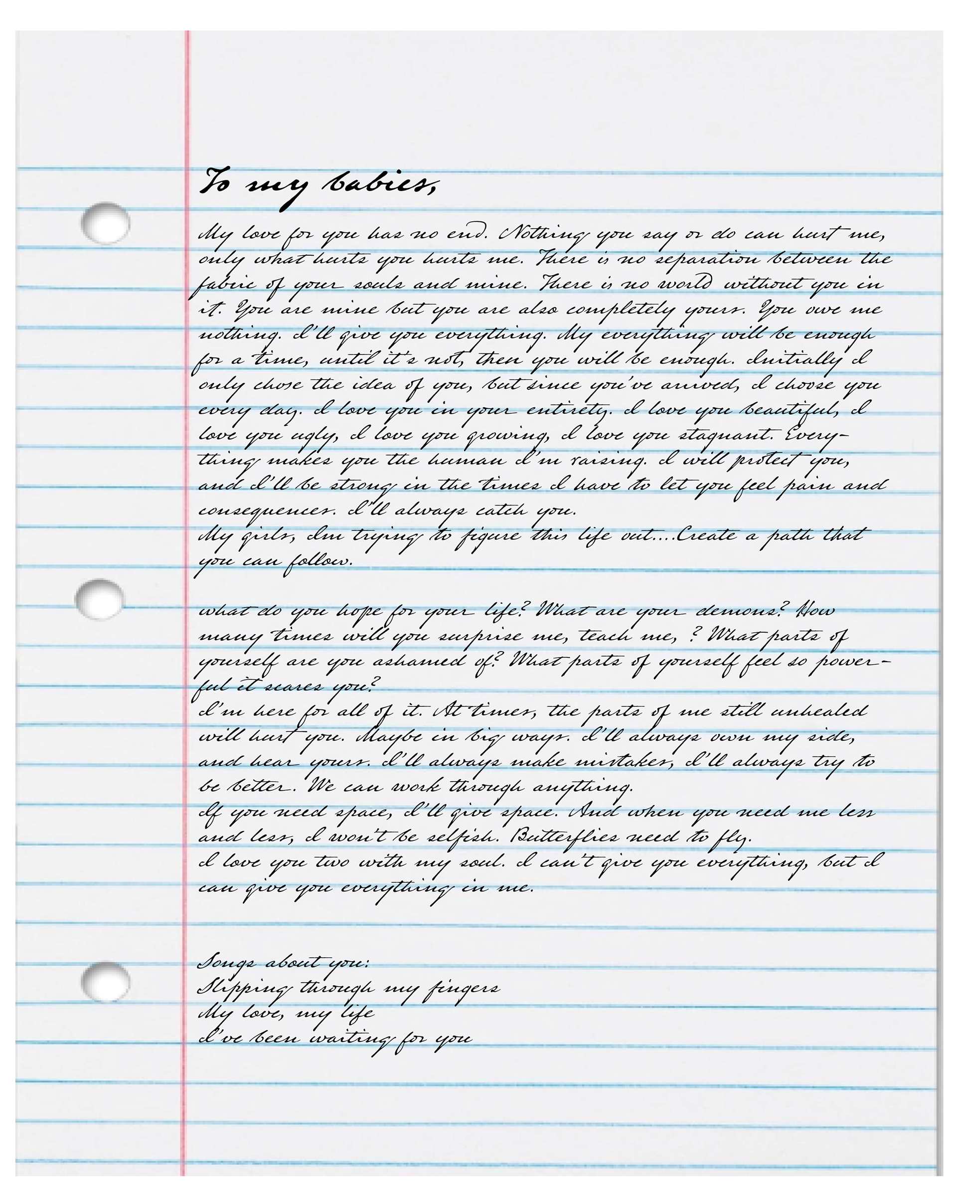
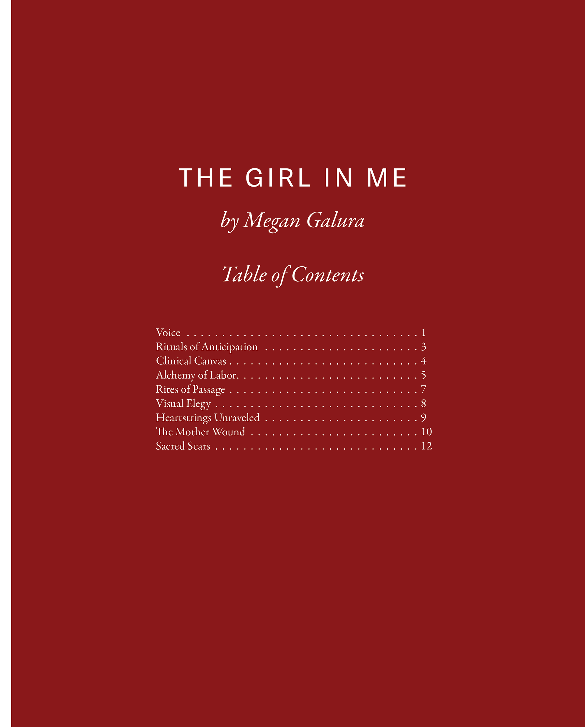
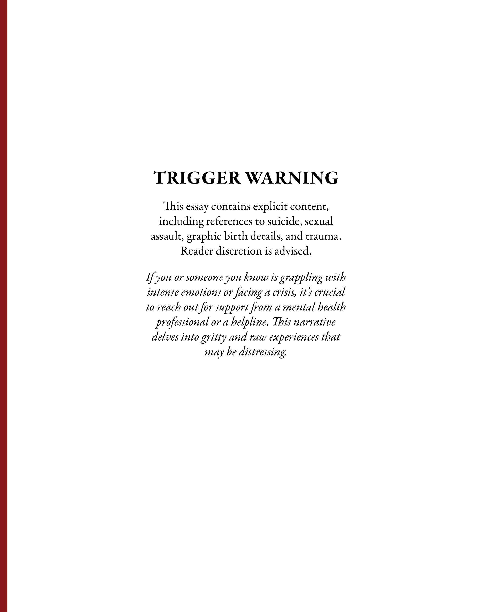

These are some of the red samples I tried and I liked them immediately.
_____________________
Color Computer Dummy
_____________________
Color Computer Reader Spreads
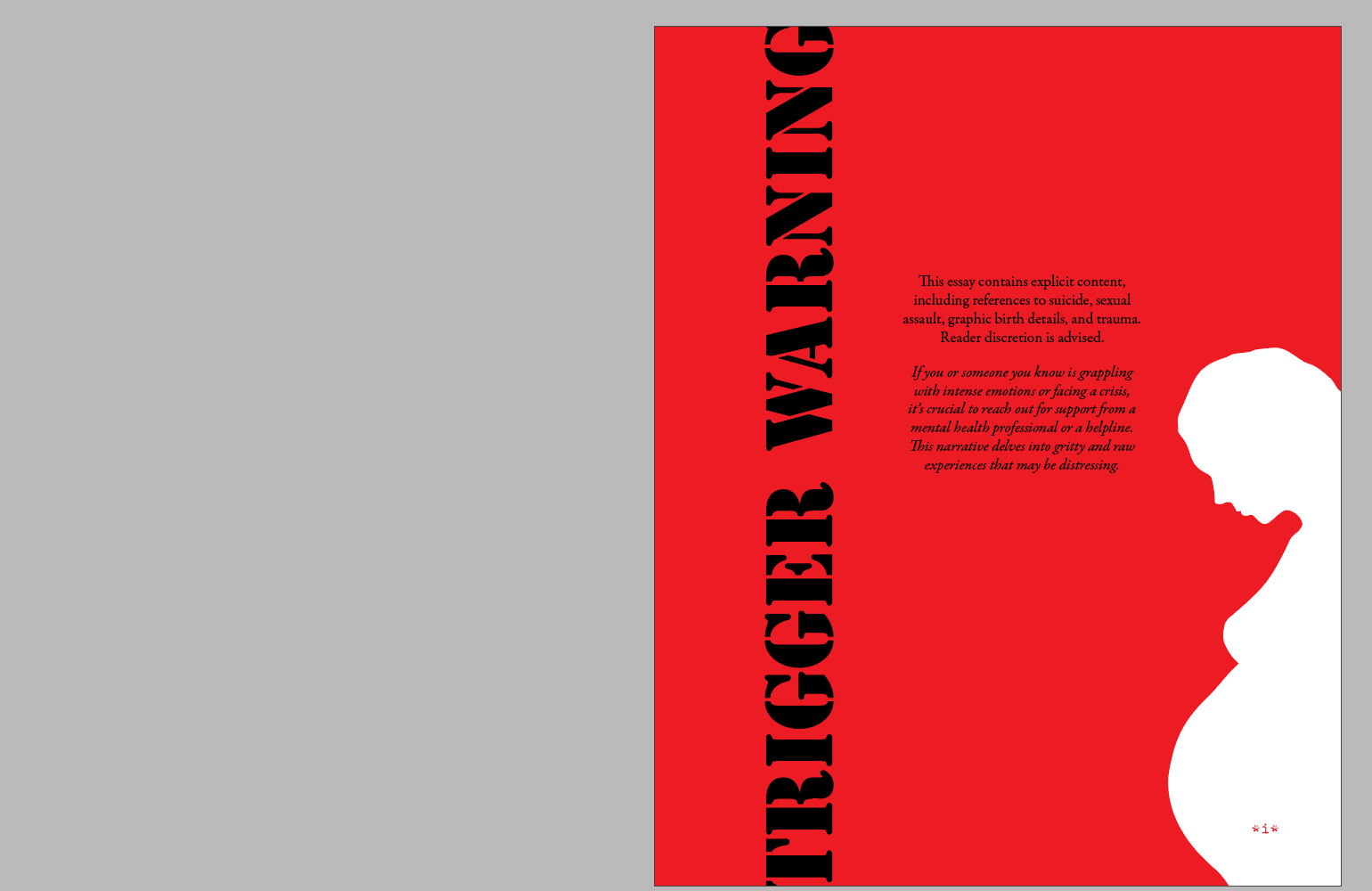
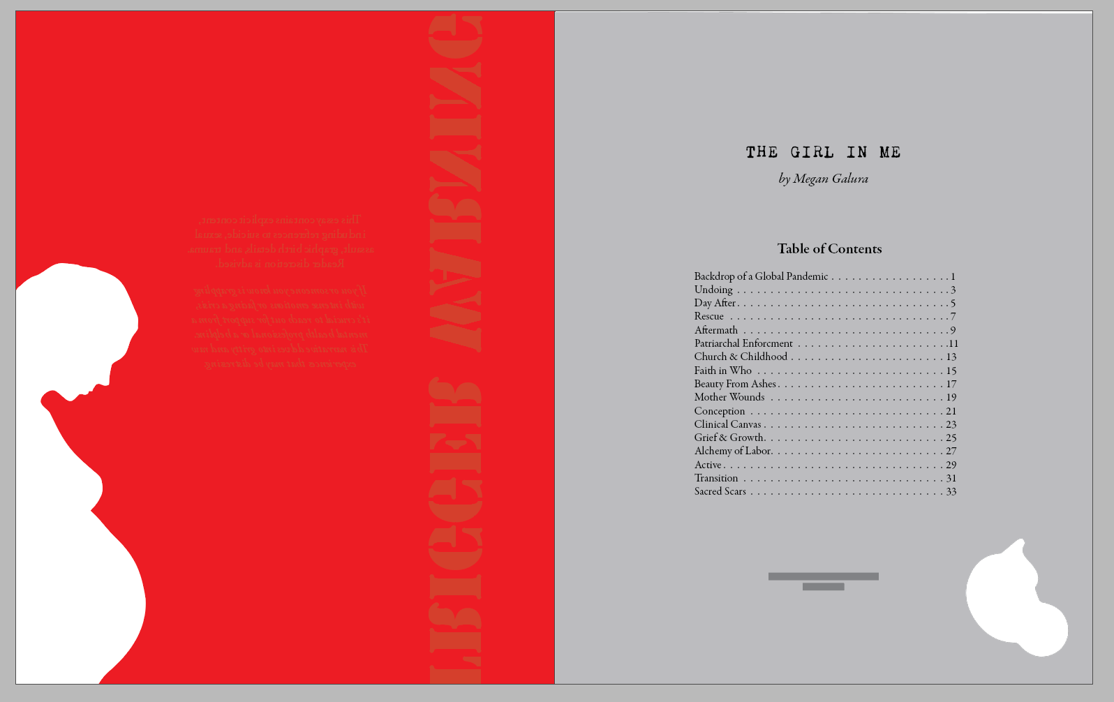
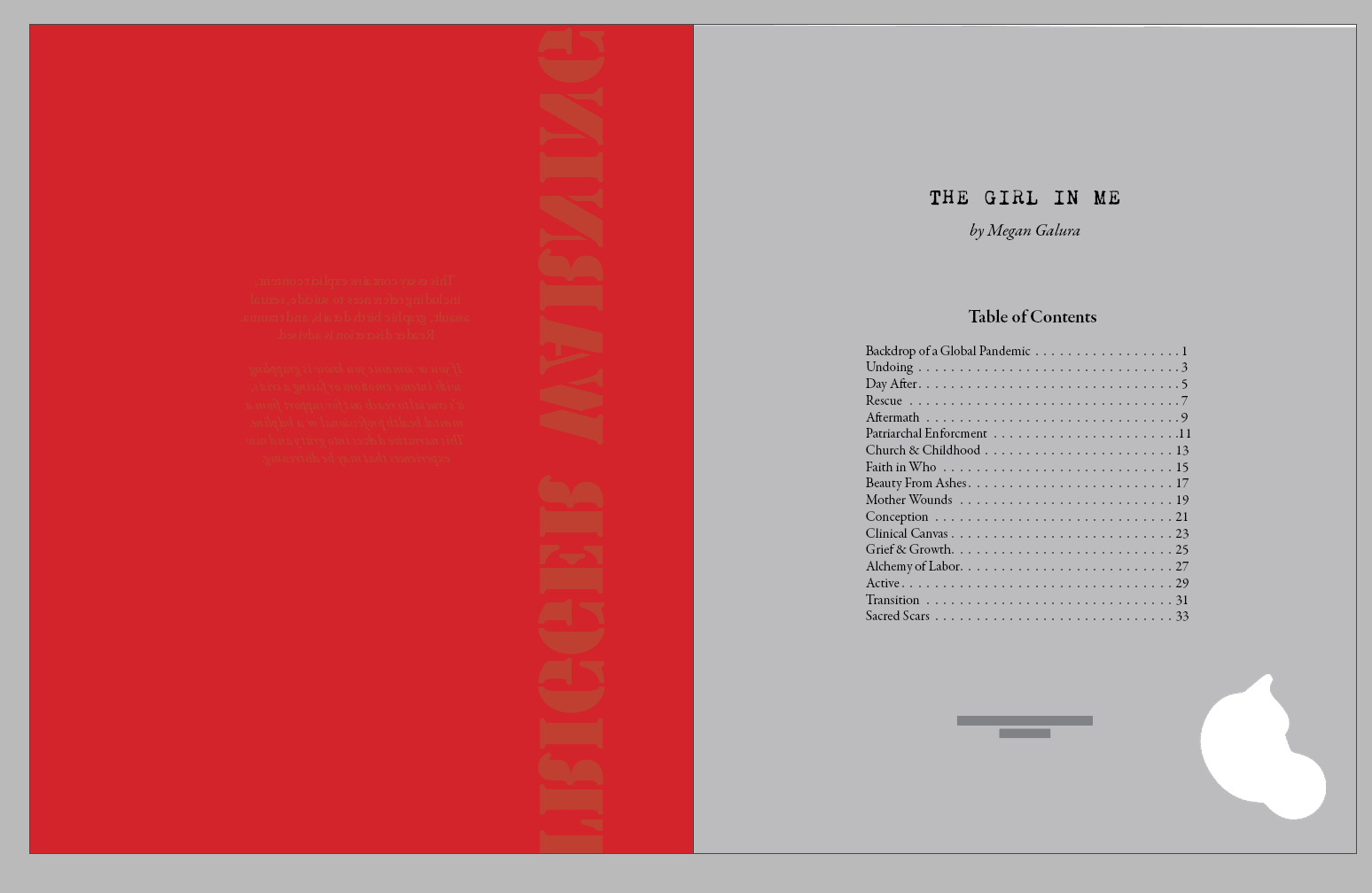
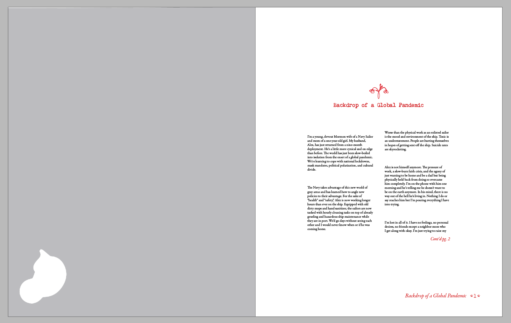
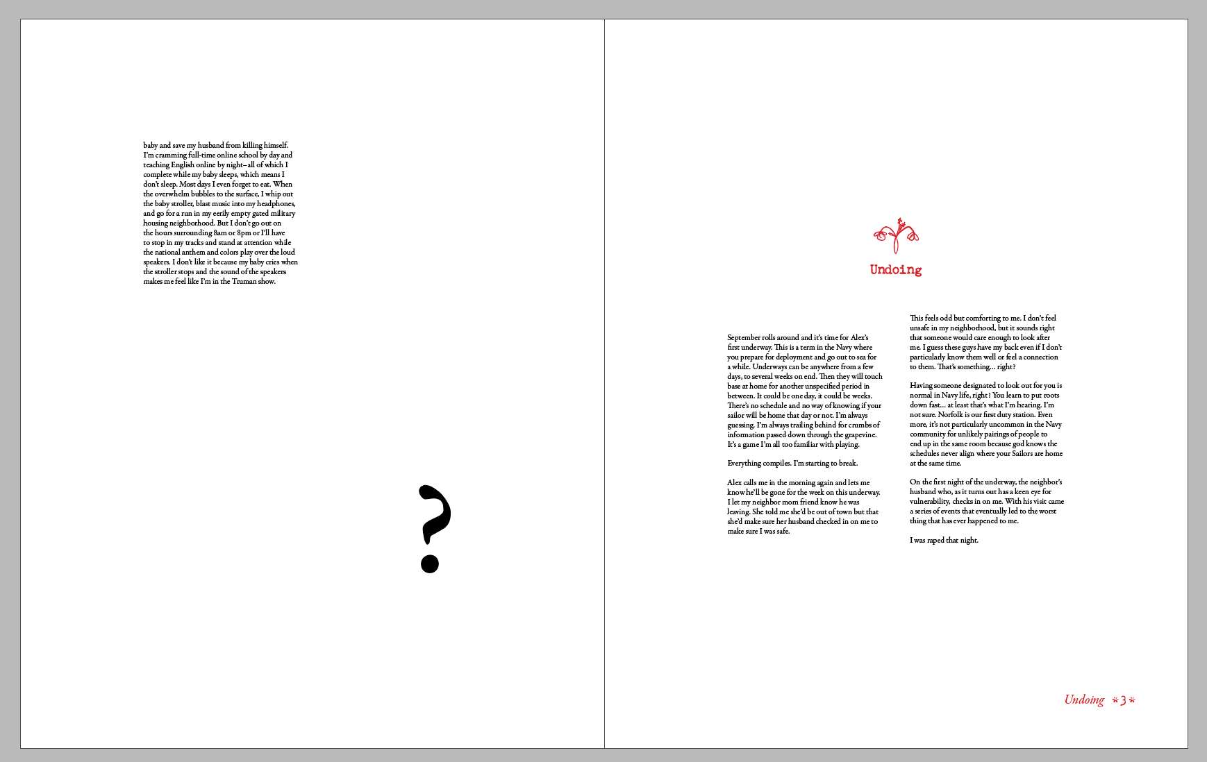
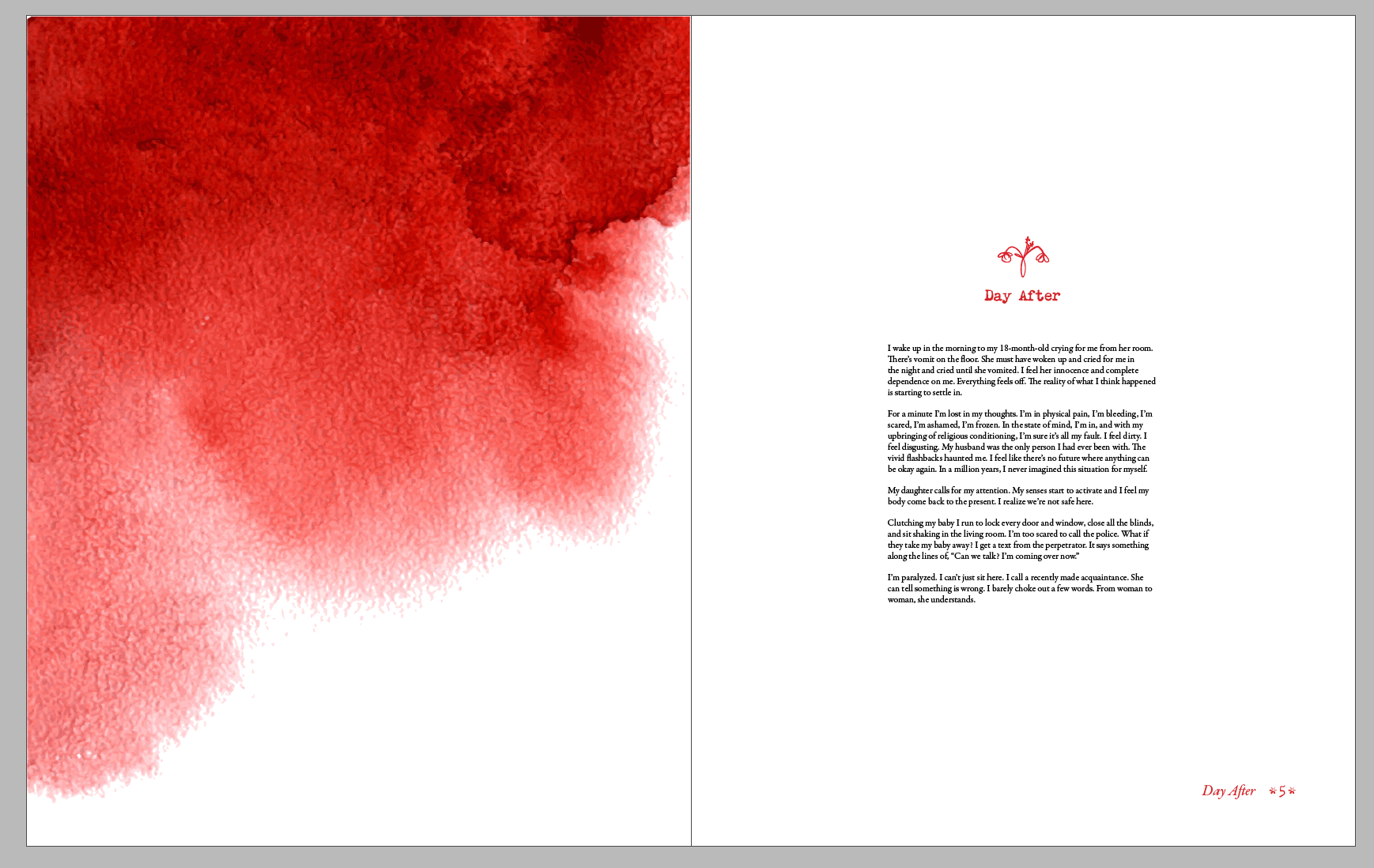
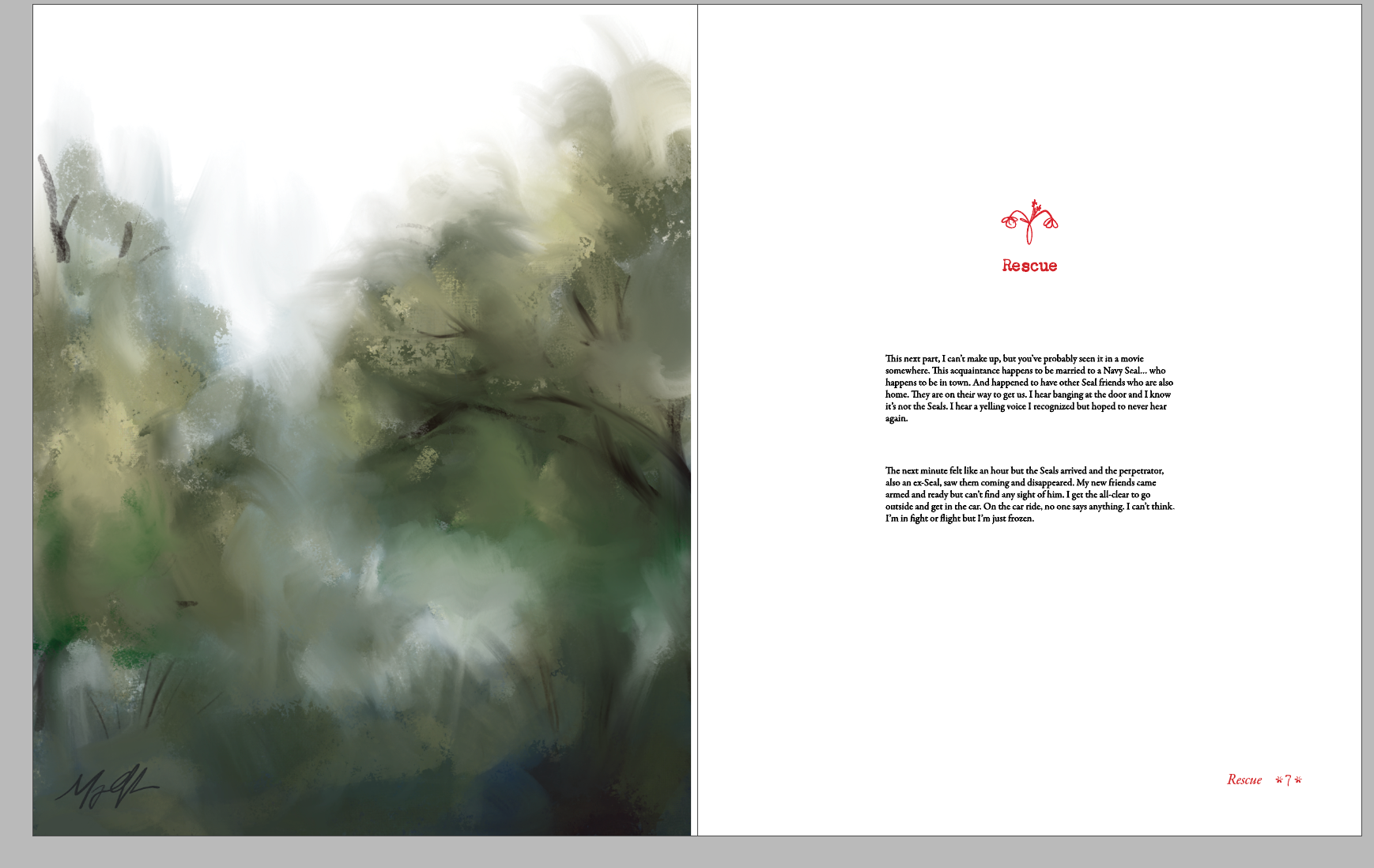
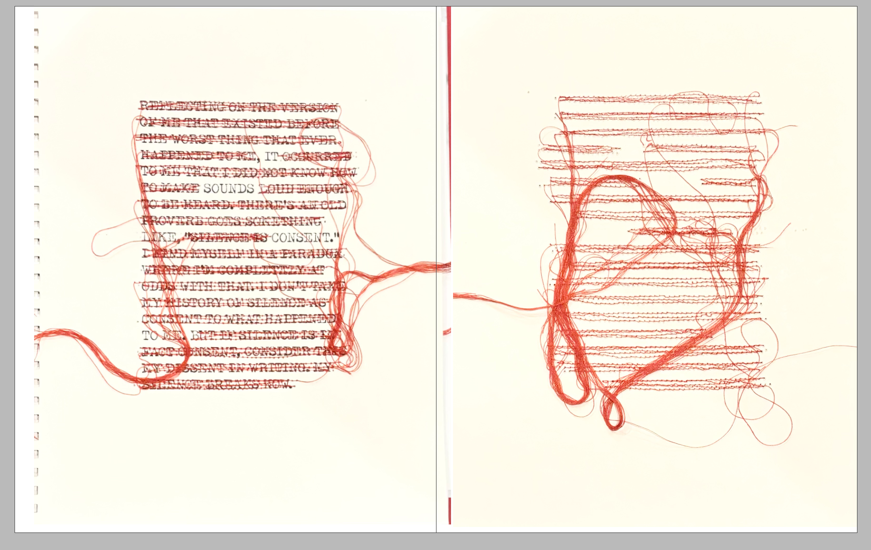
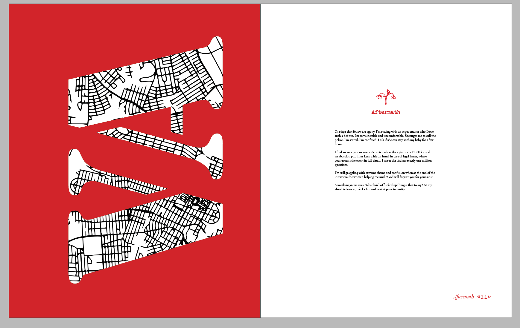
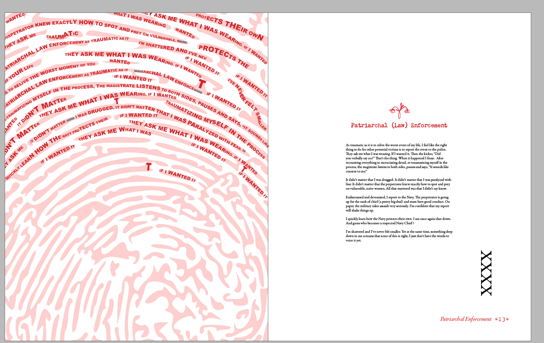
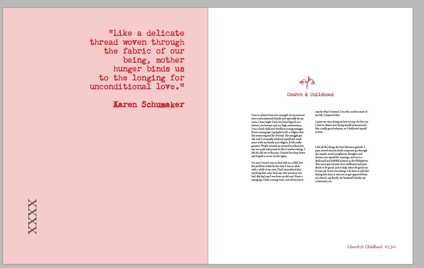
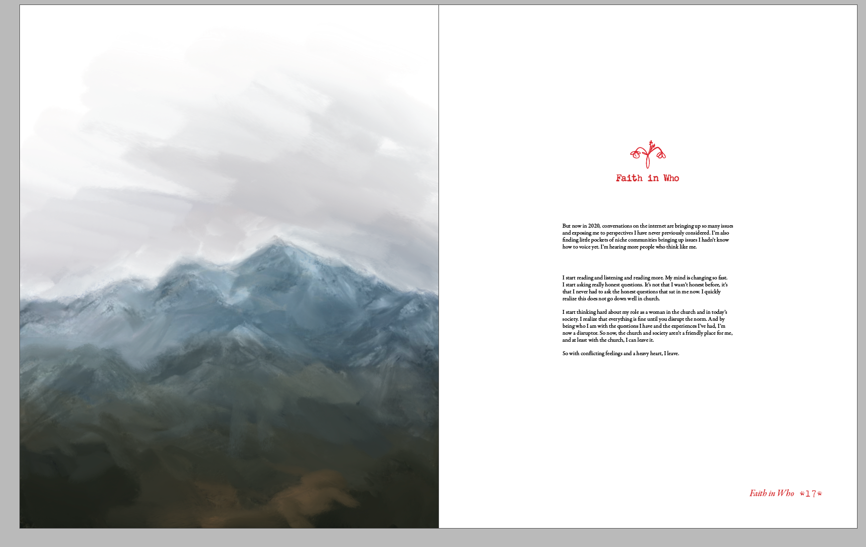
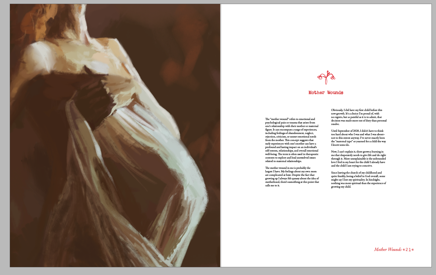
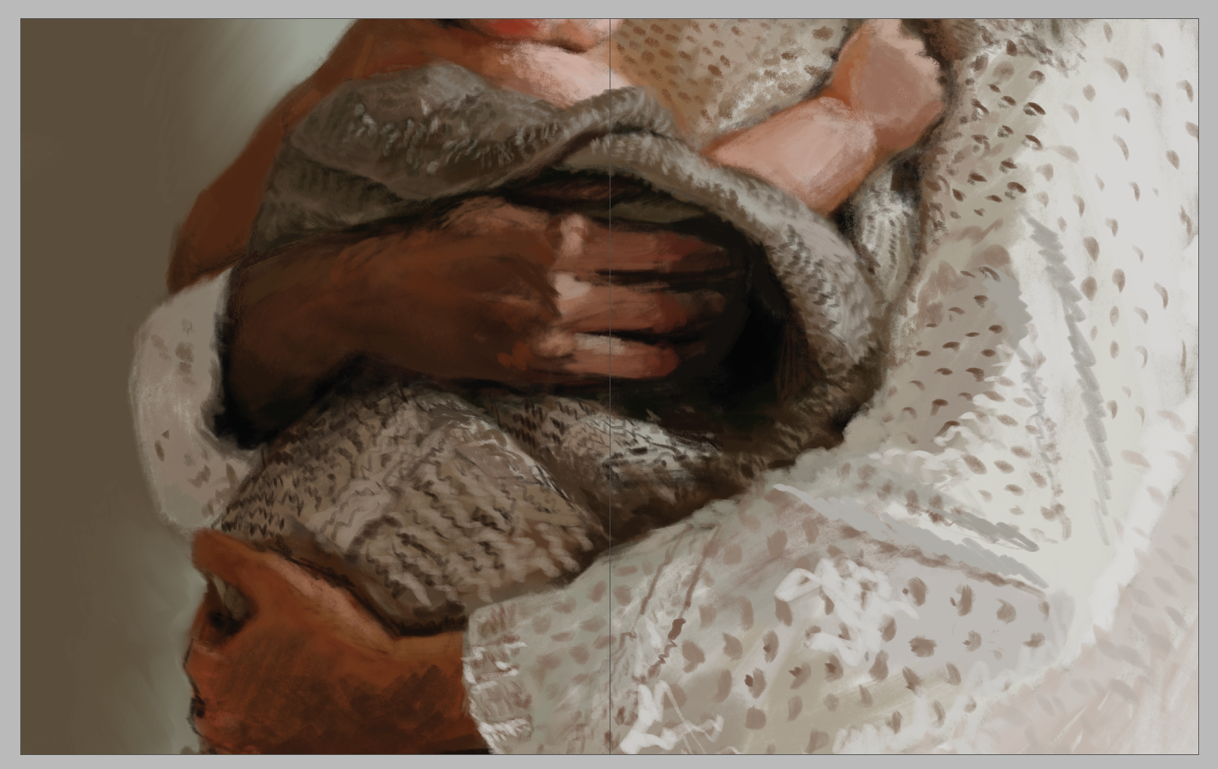
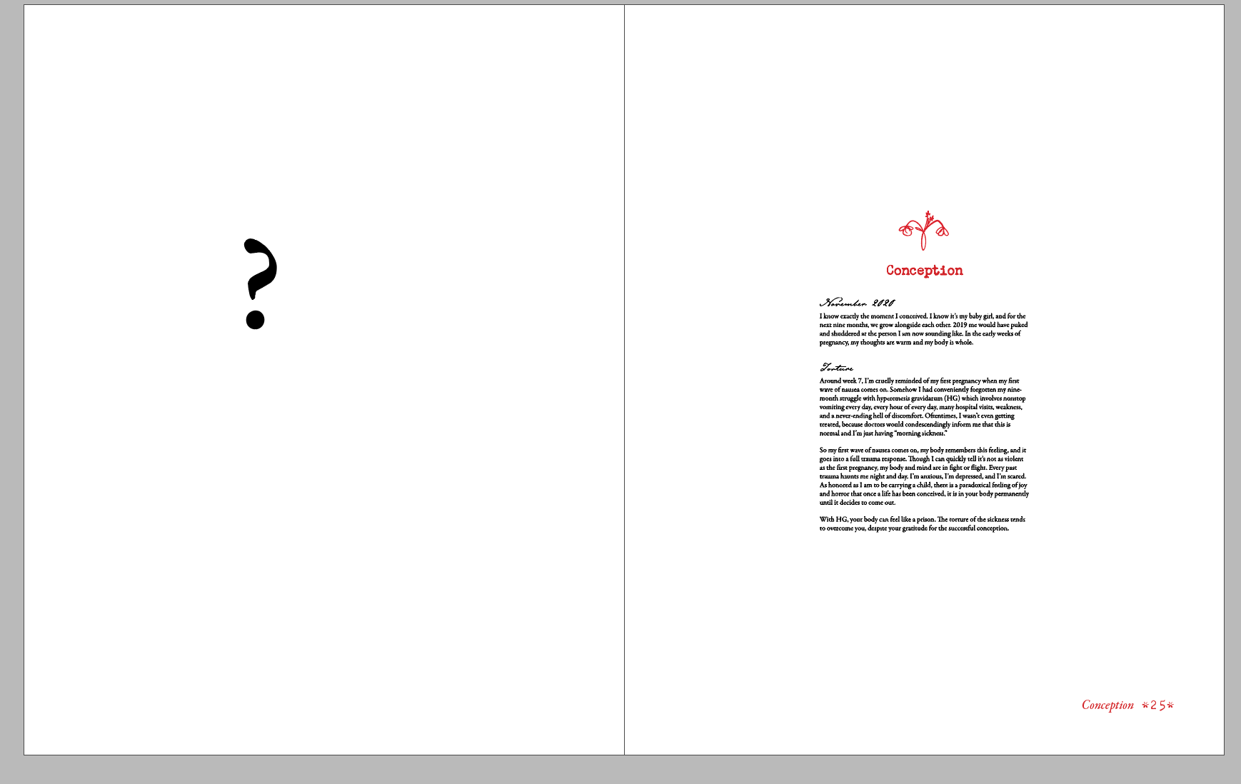
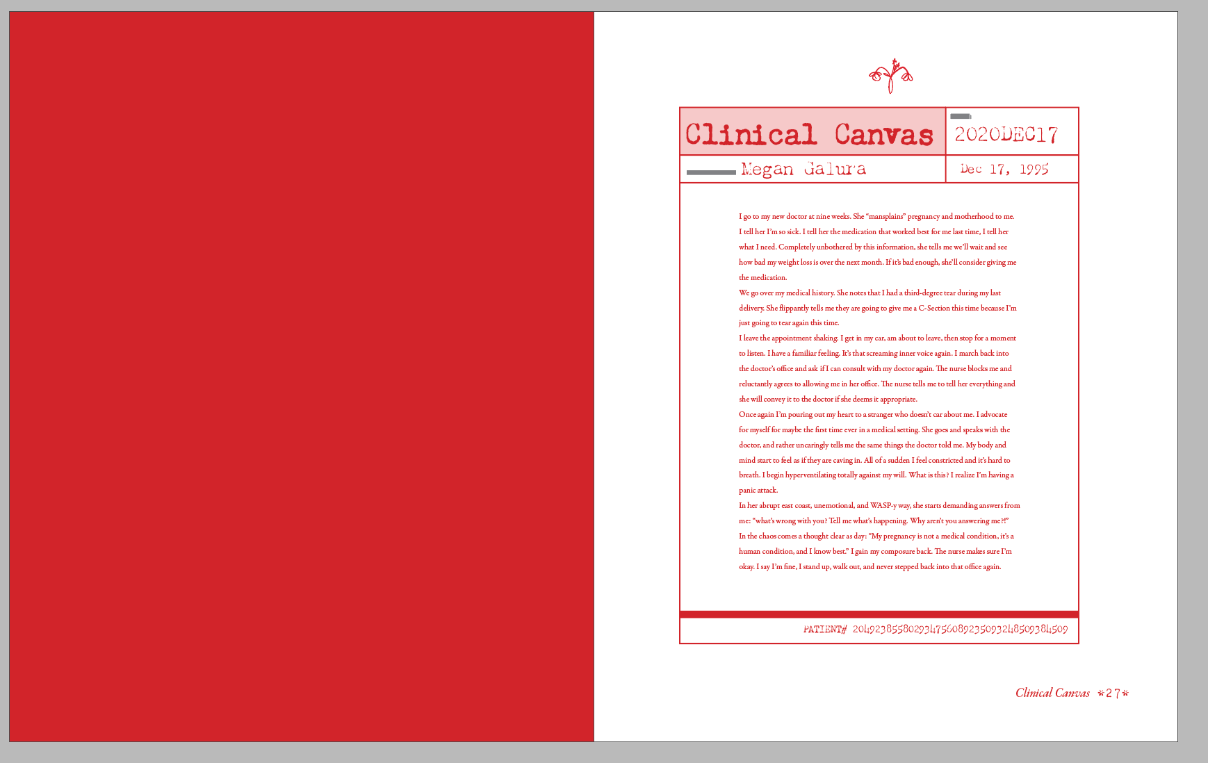
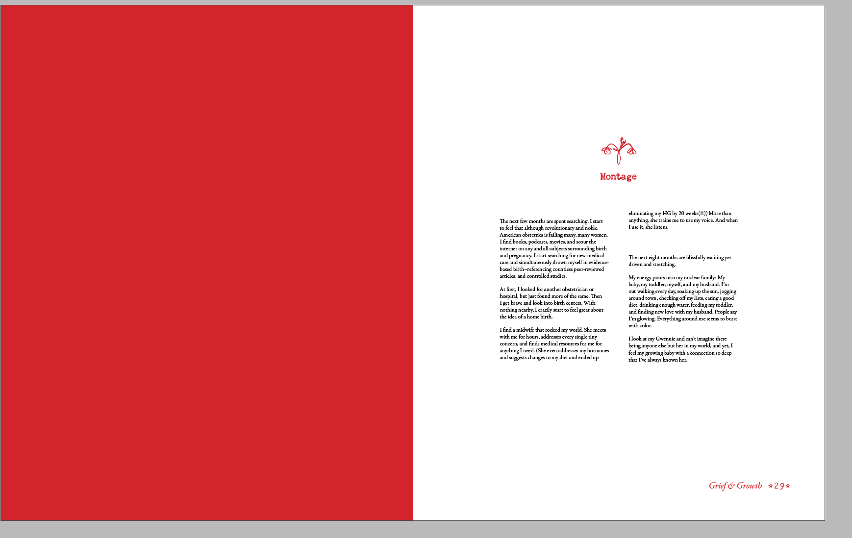
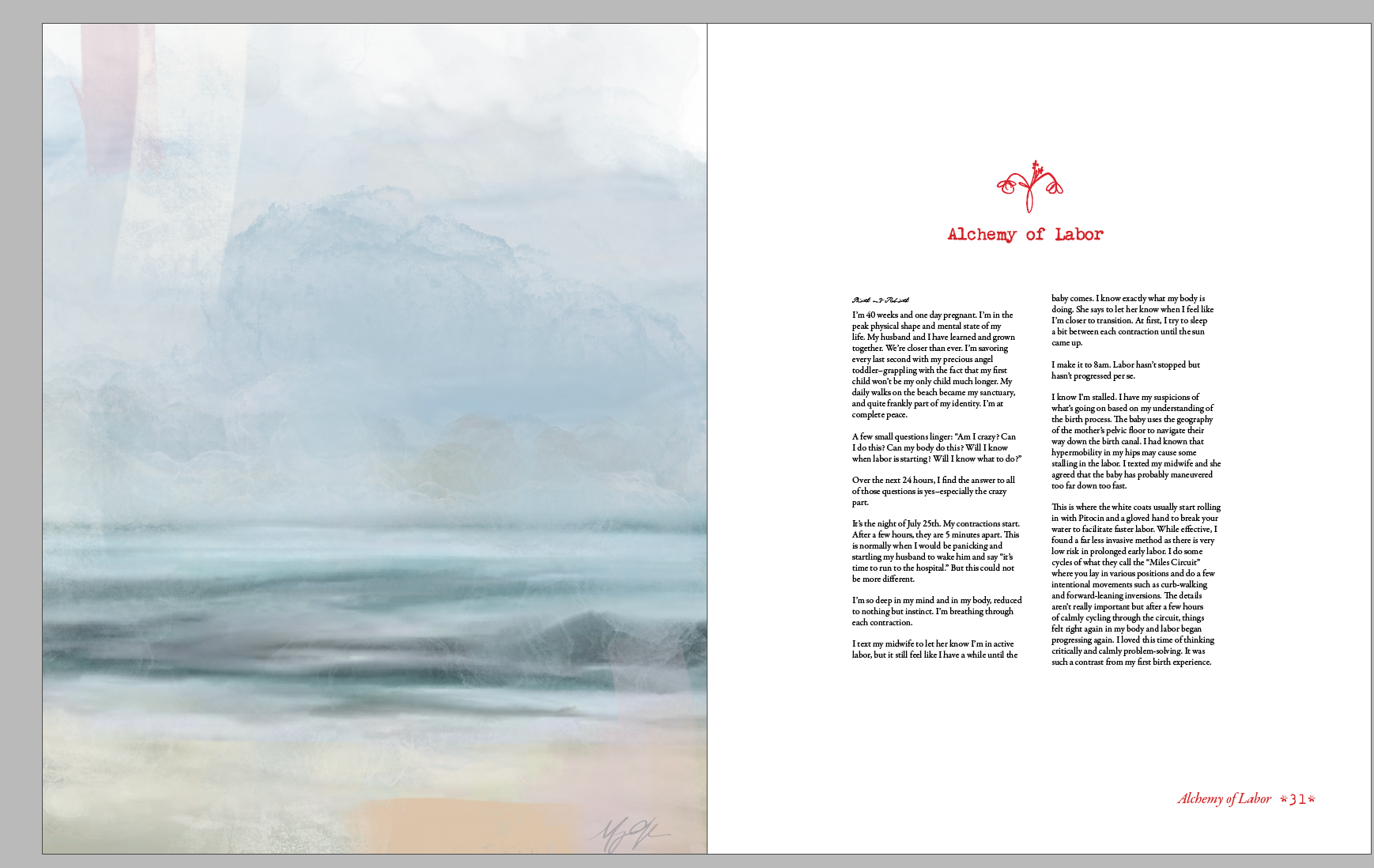
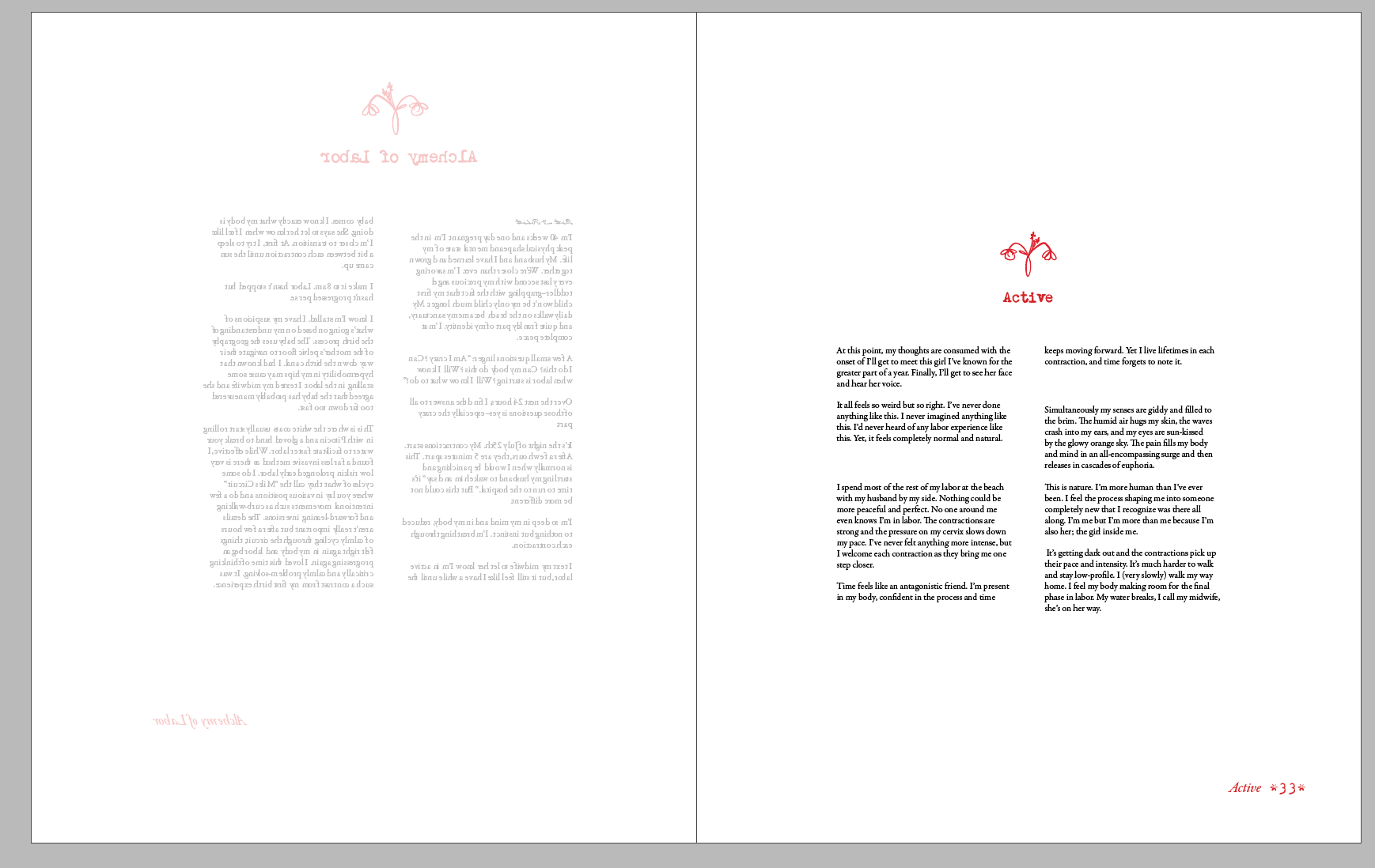
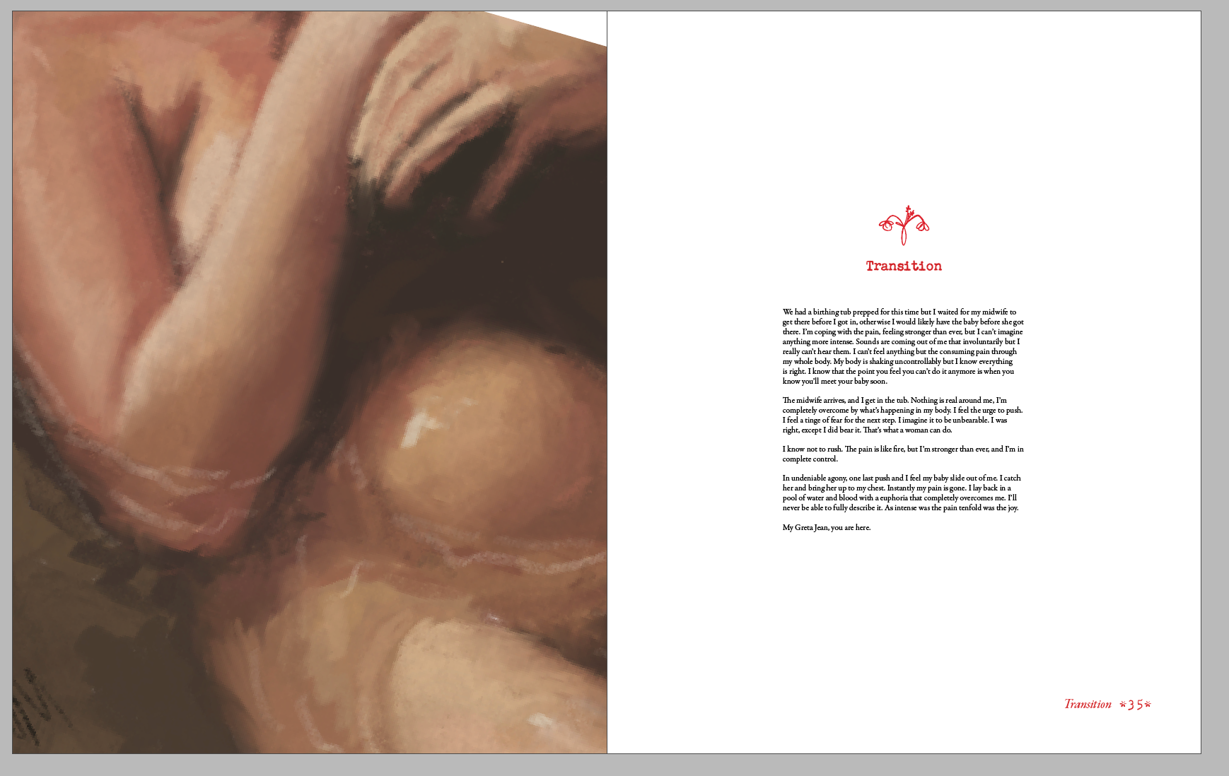
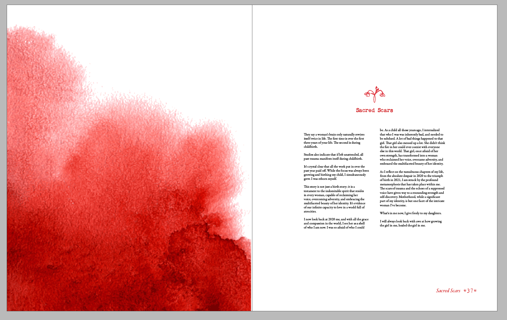
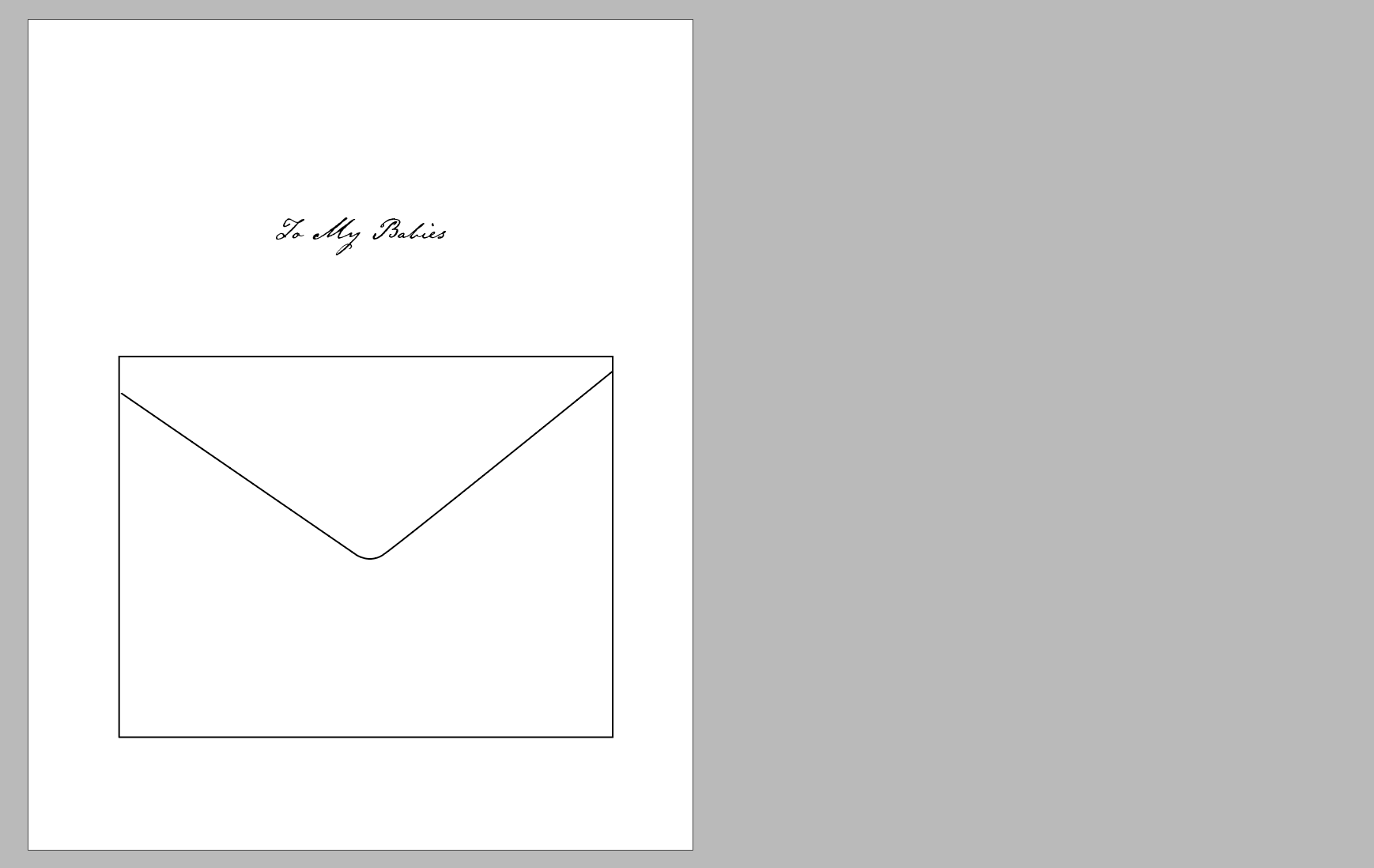
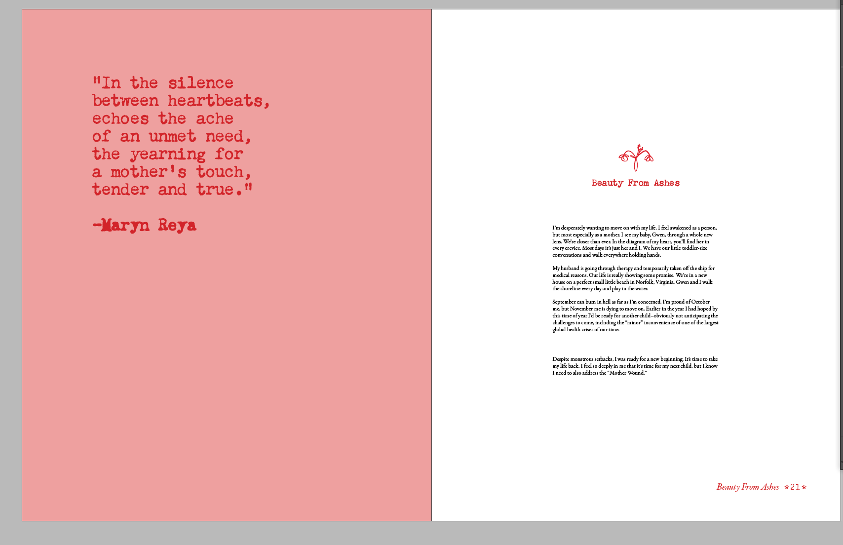
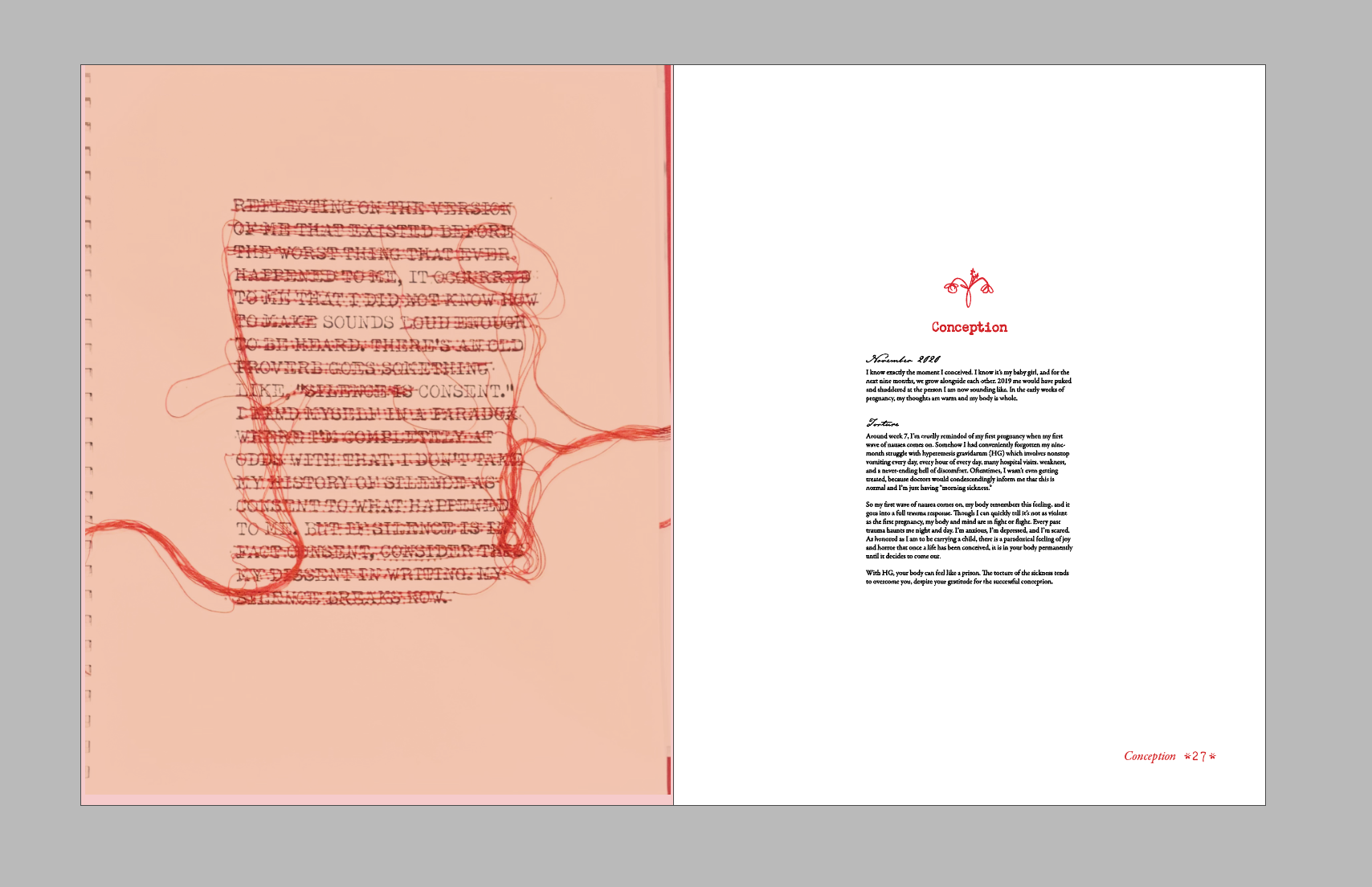
At this stage there are a few loose ends but it's basically there! I'm feeling good about it.
_____________________
Work in Progress
Just posting this to keep it real. My house is trashed from this project.
Final Color
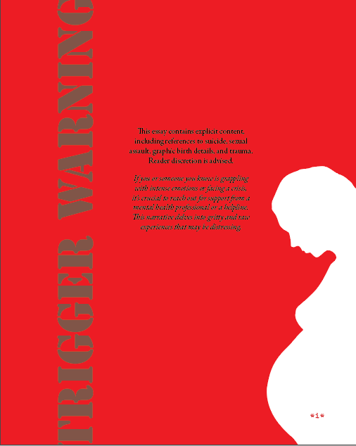
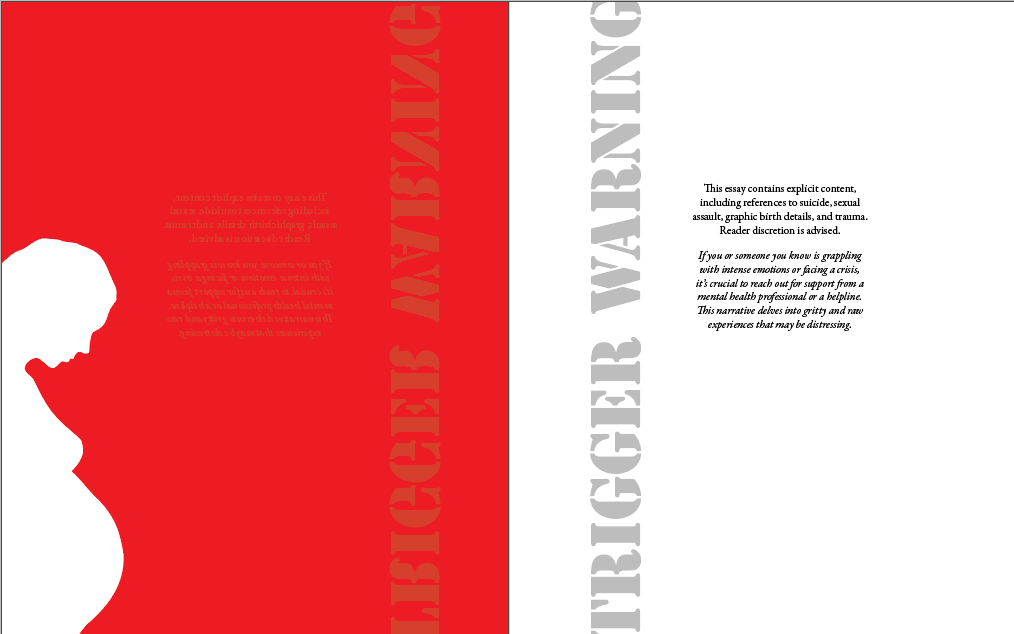
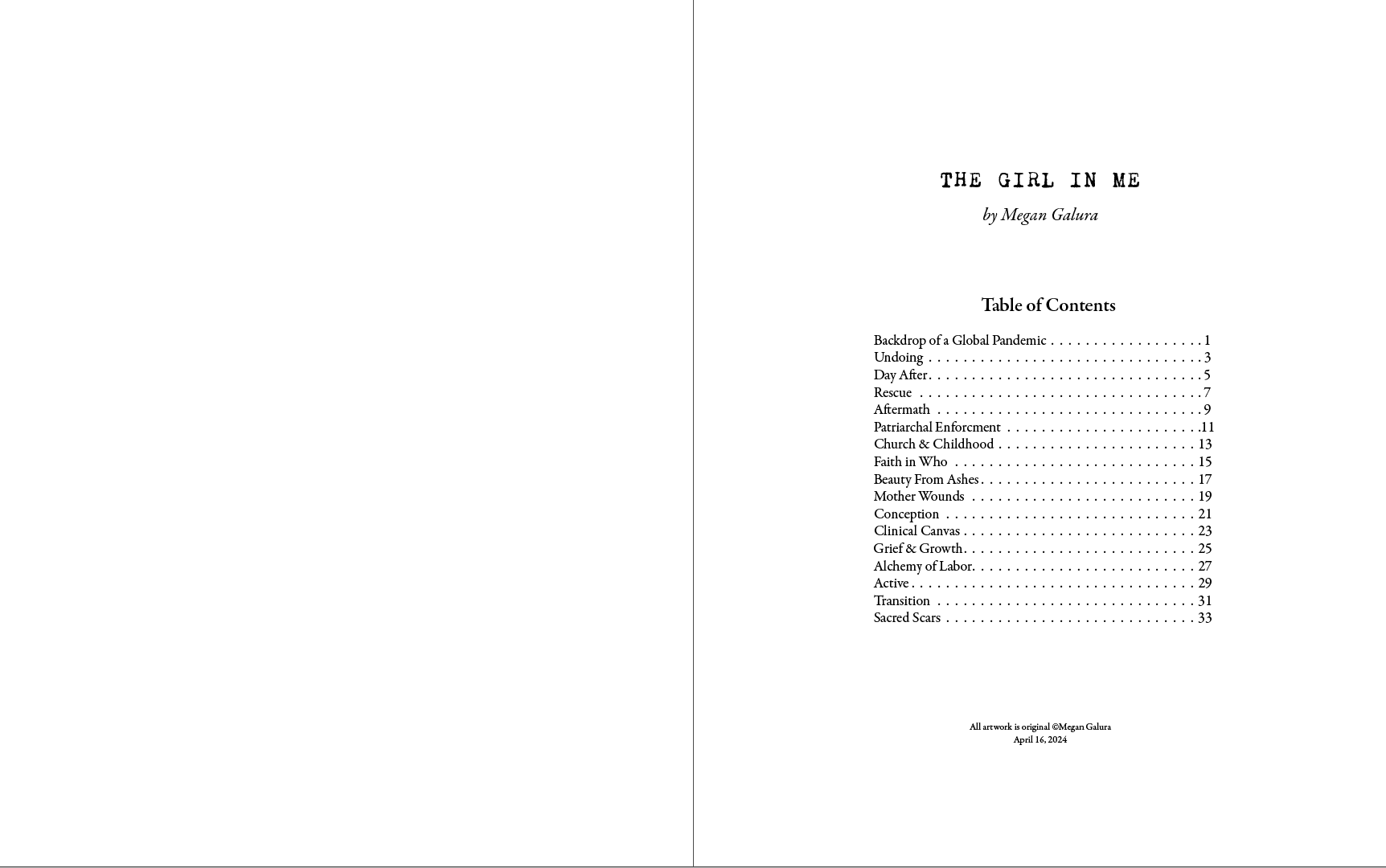
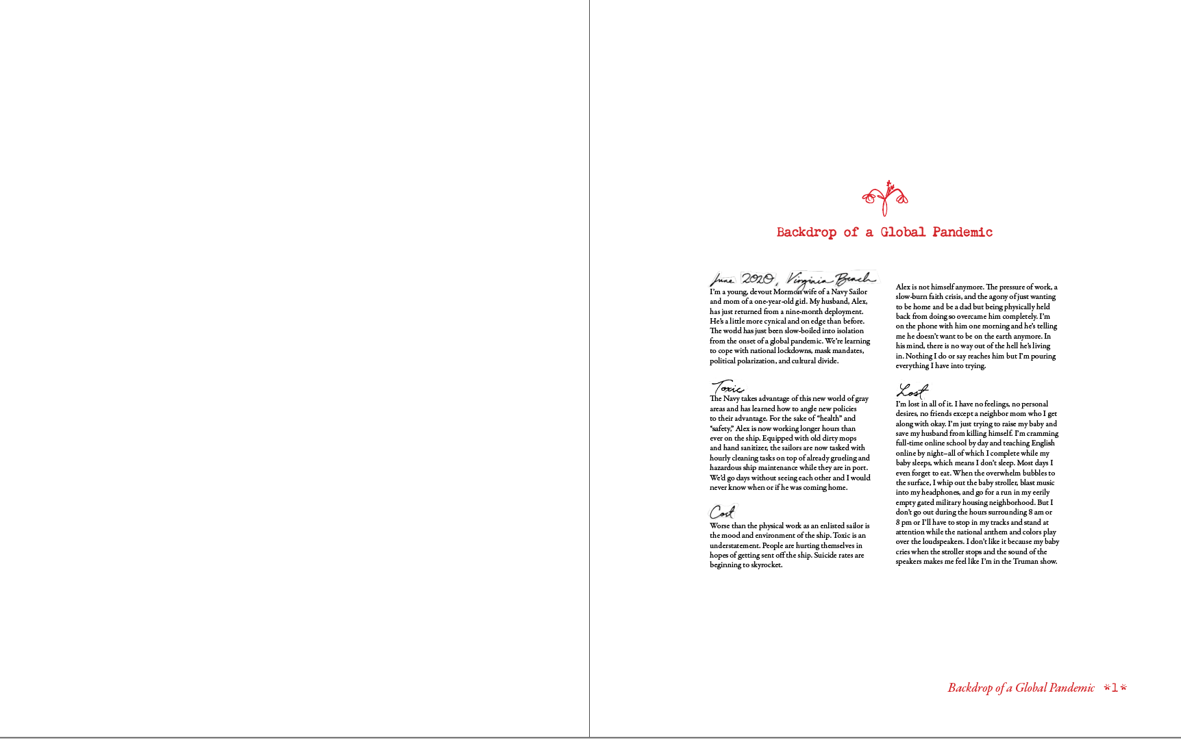
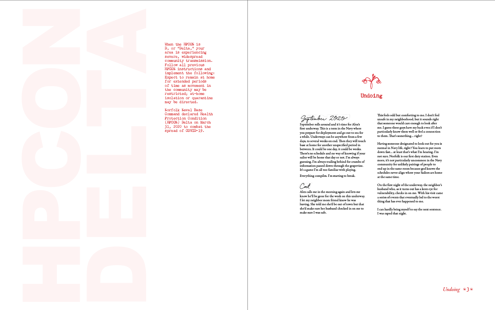
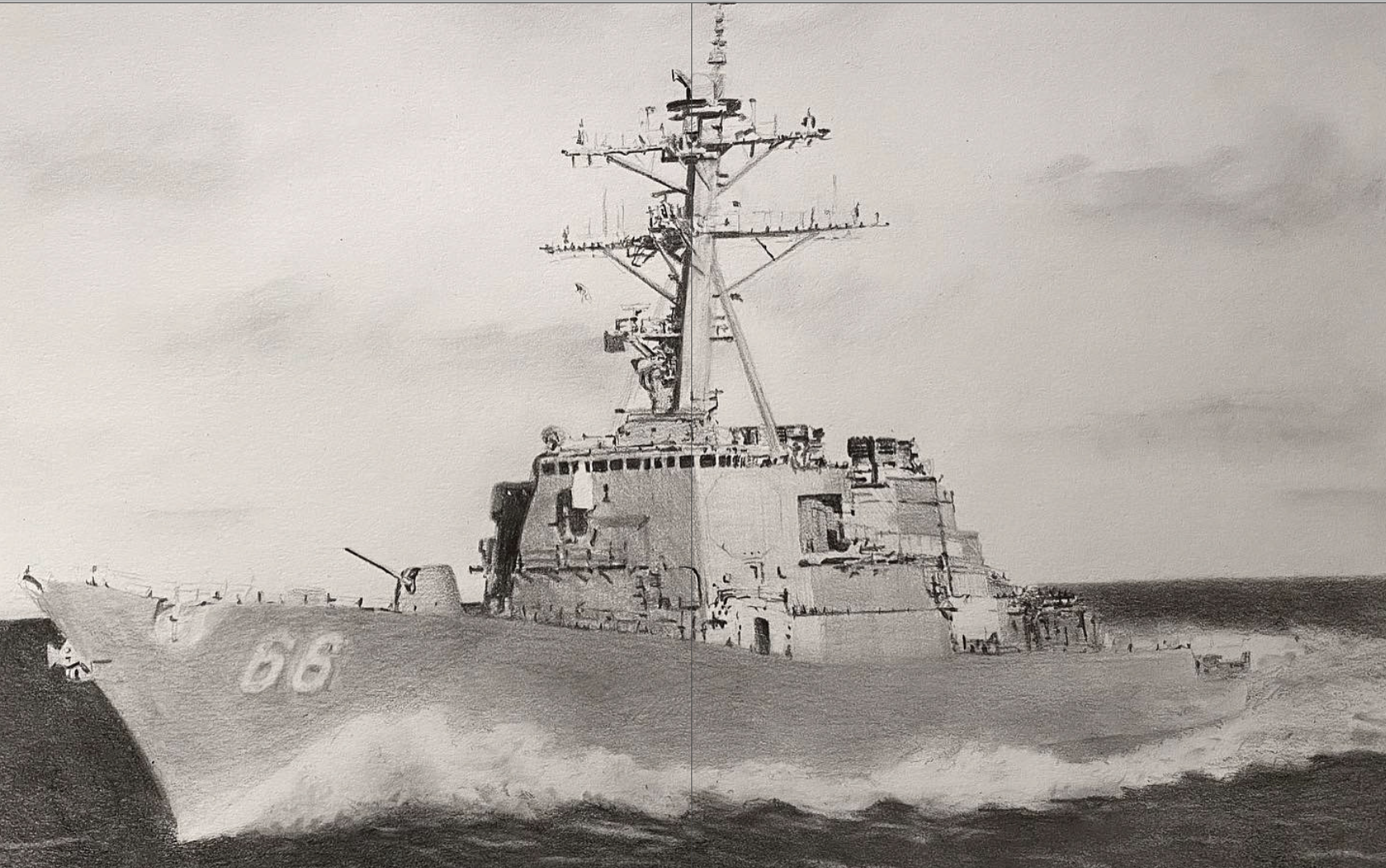
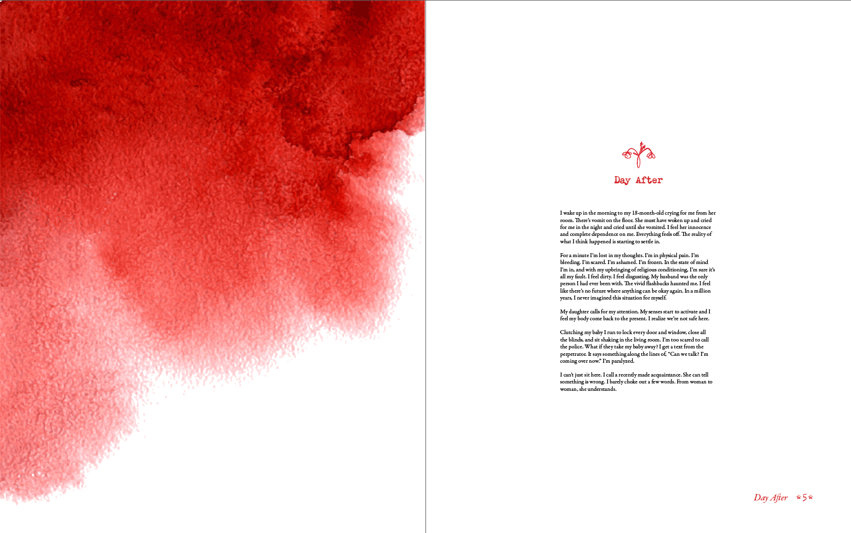
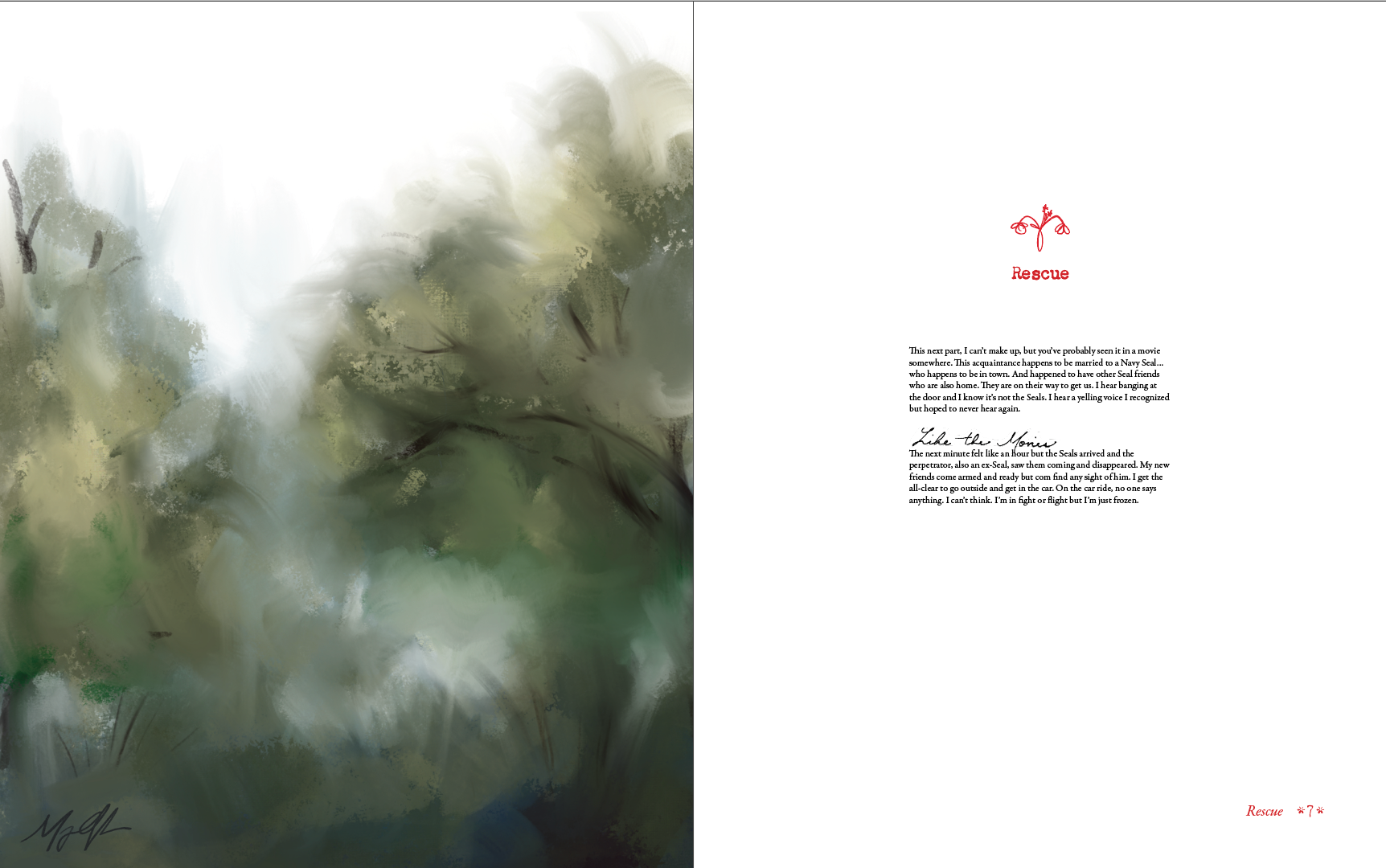
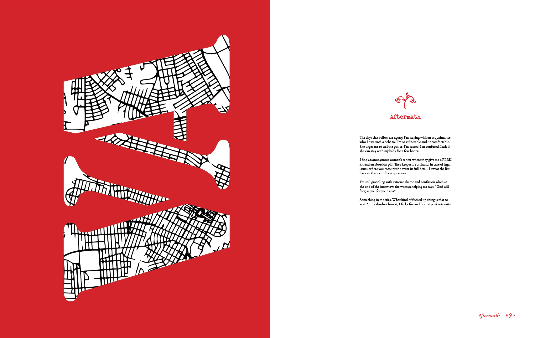
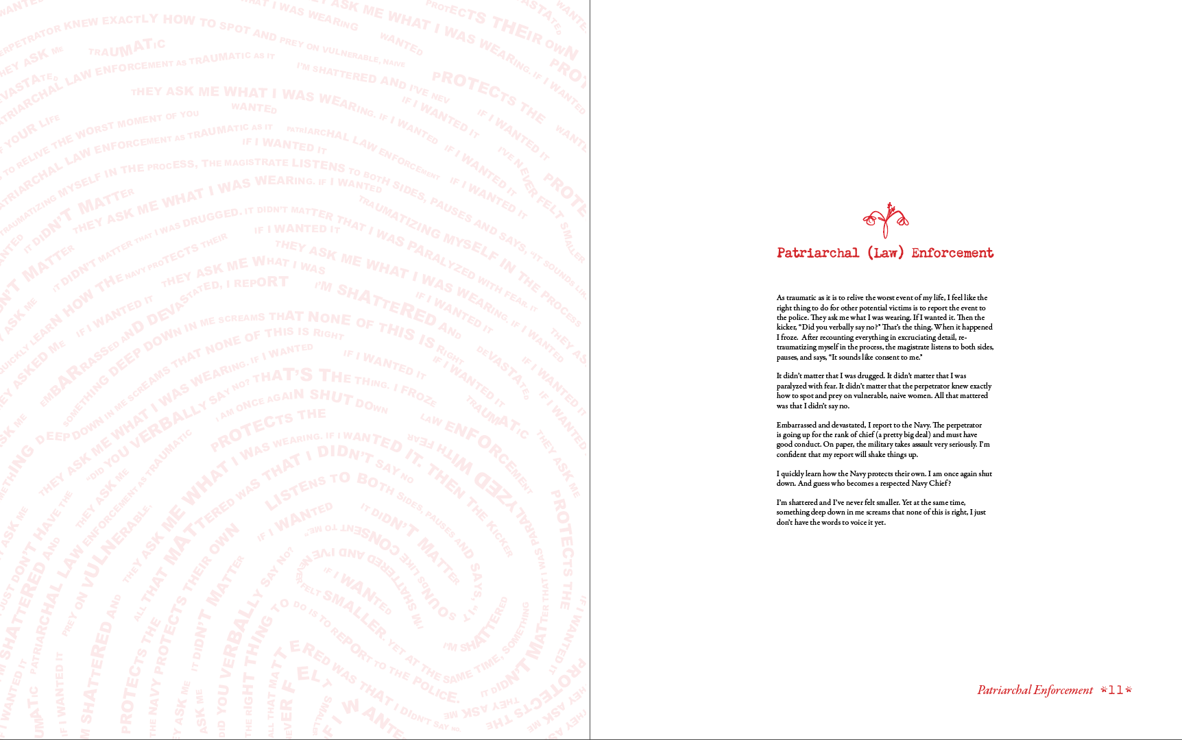
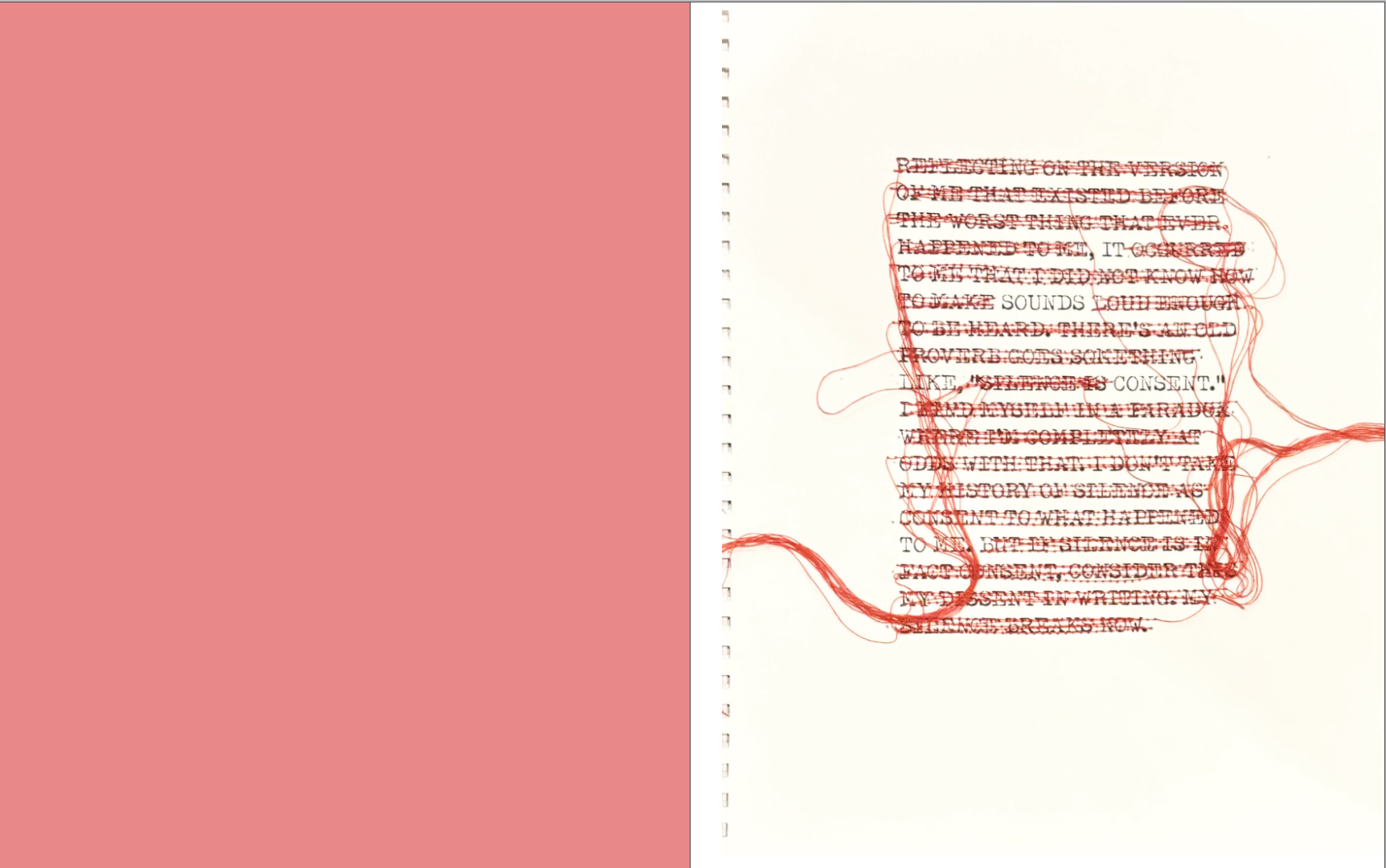
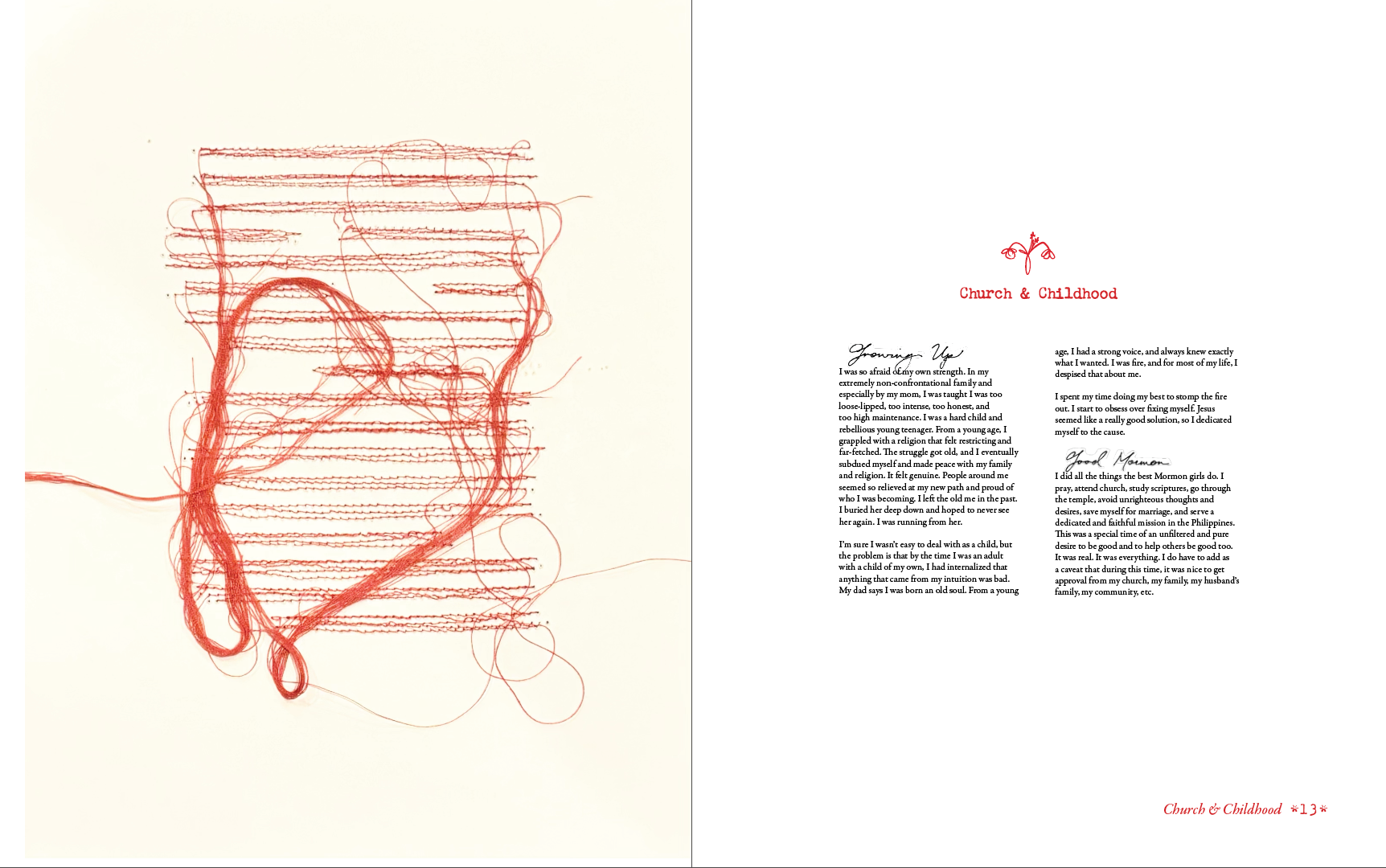
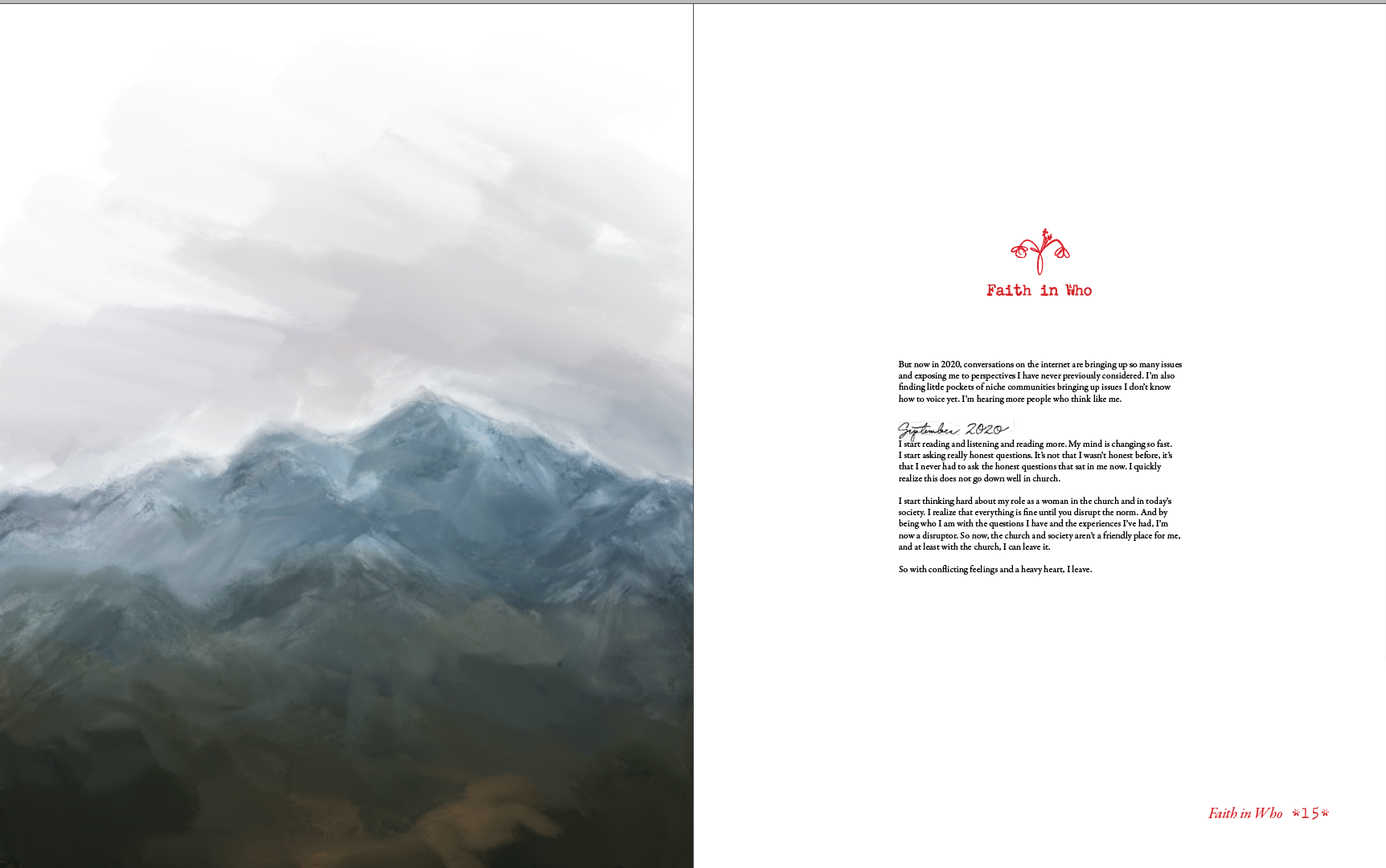
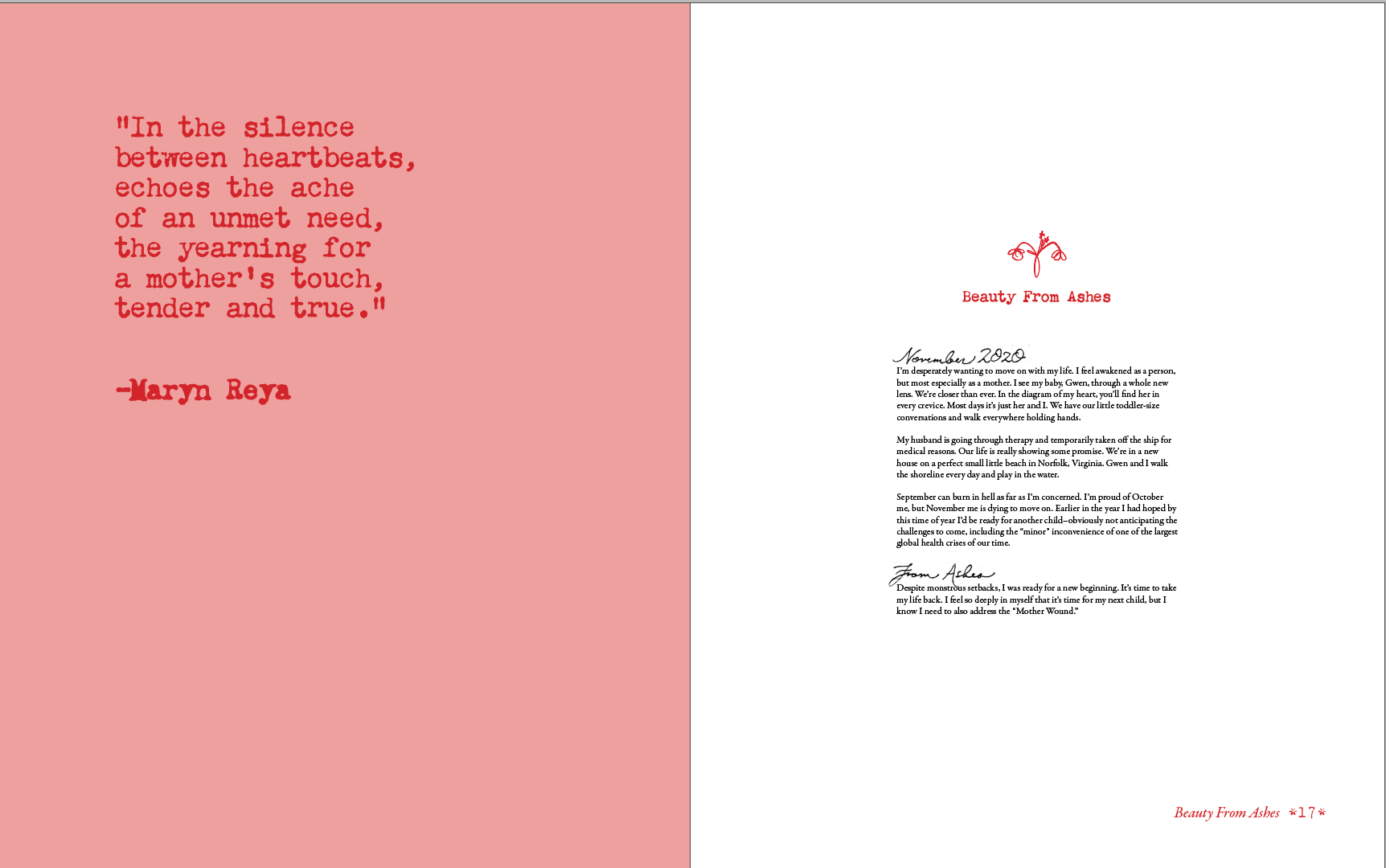
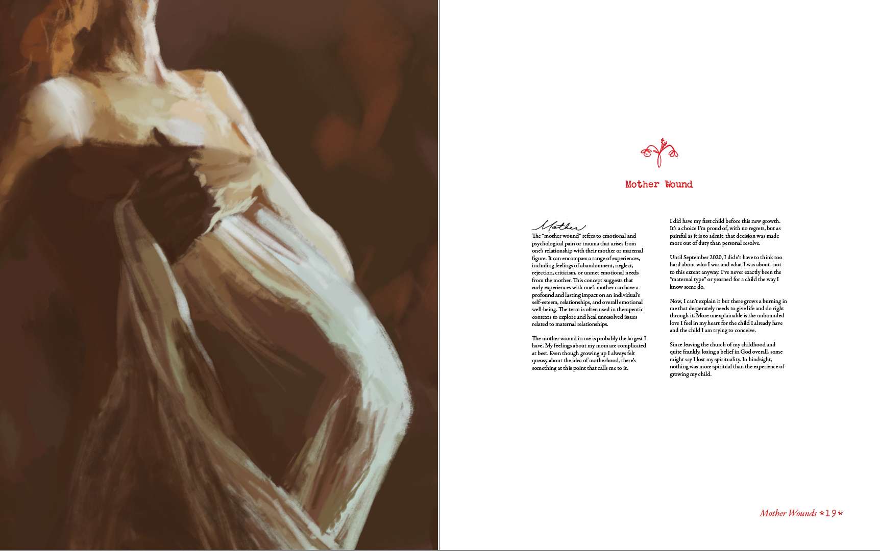
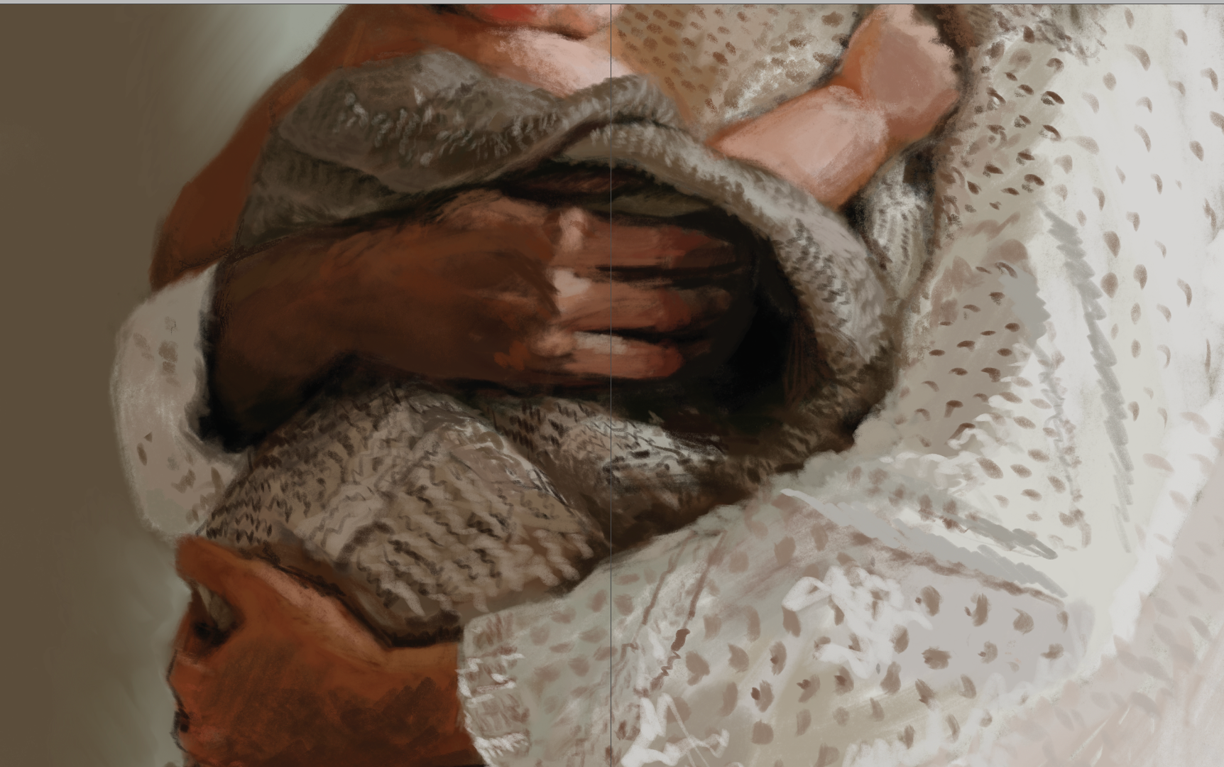
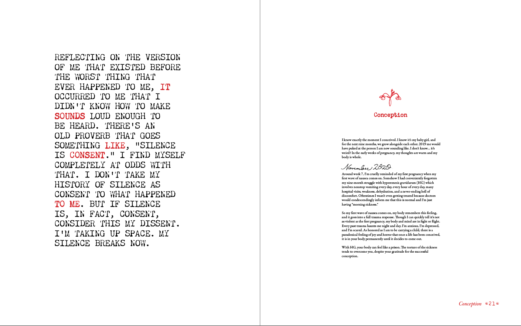
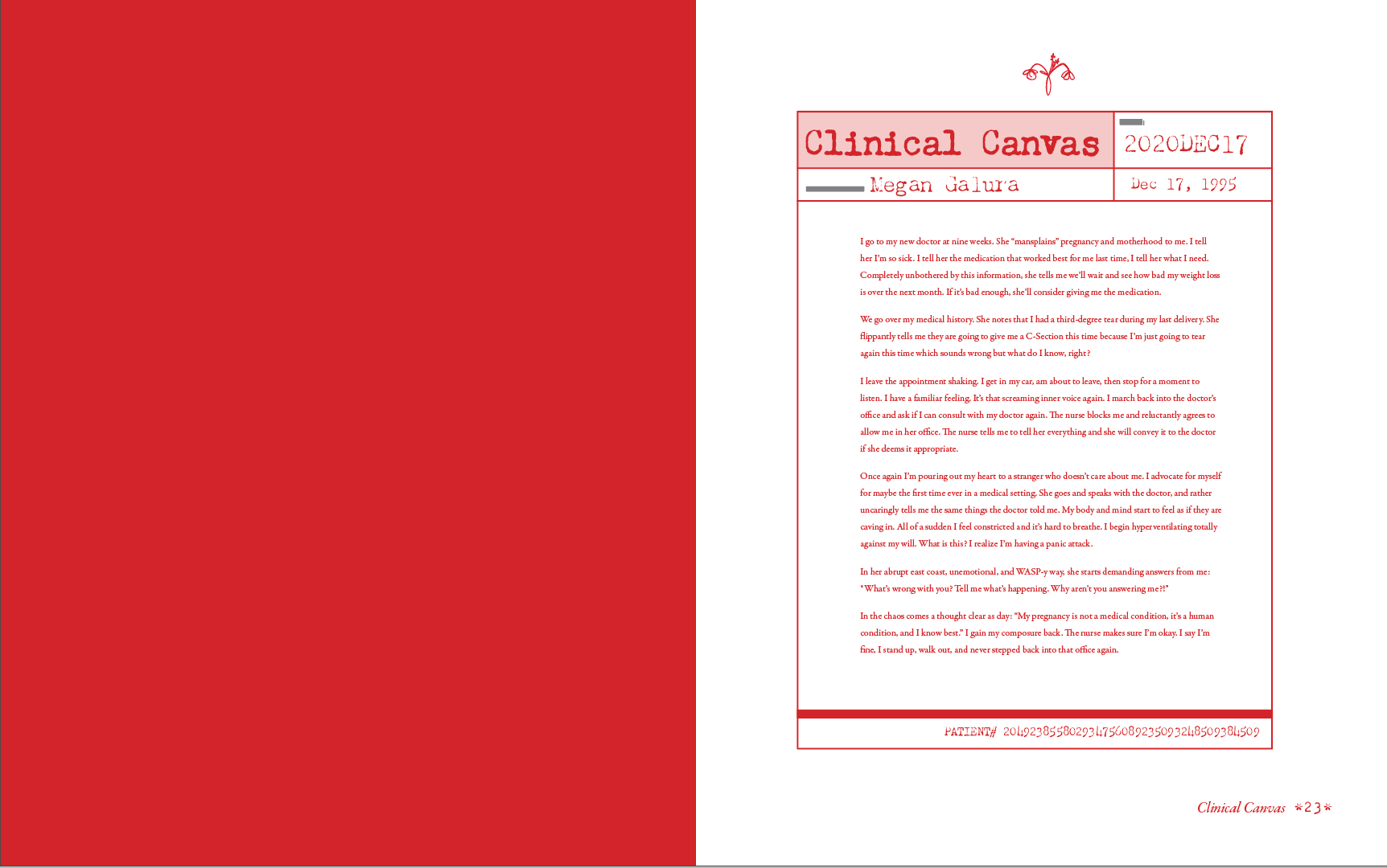
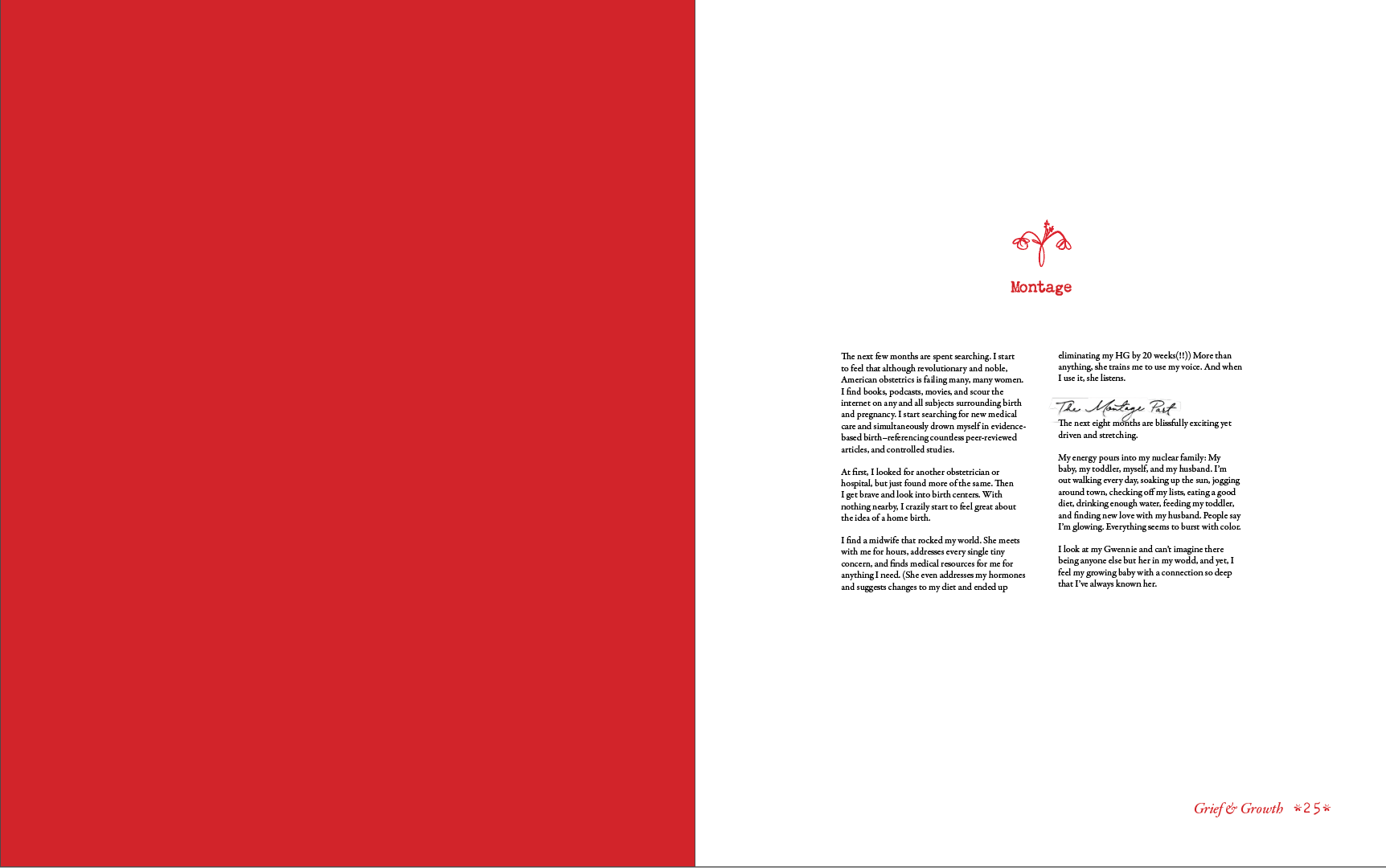
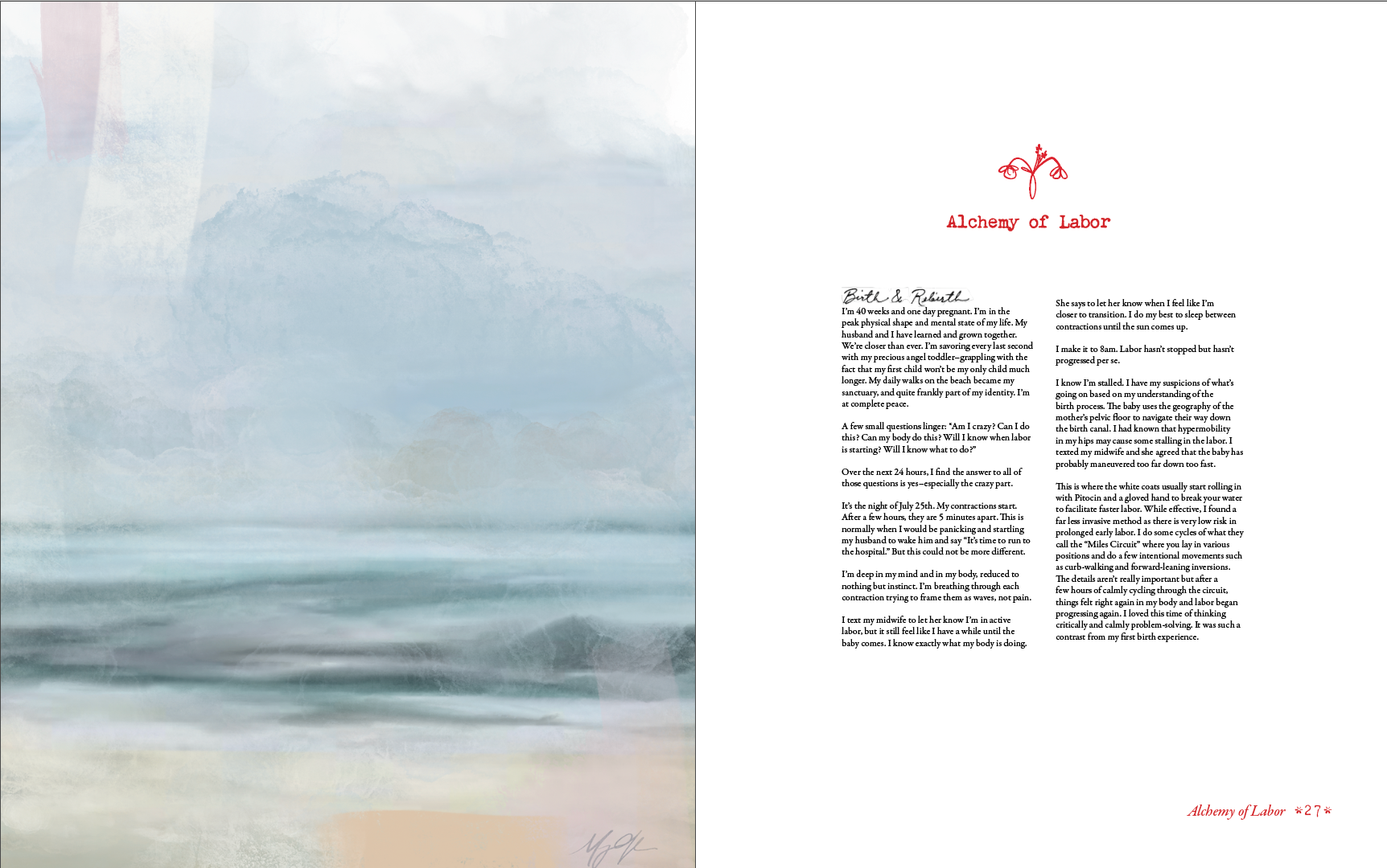
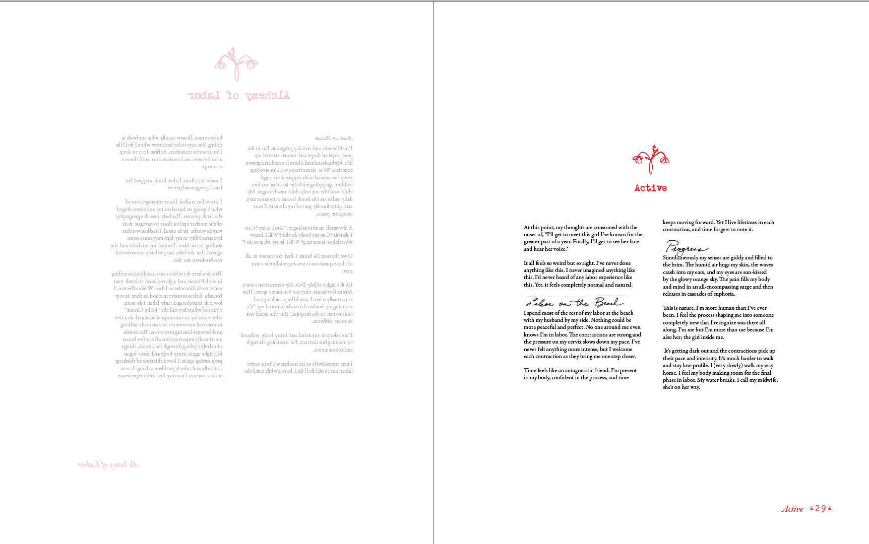
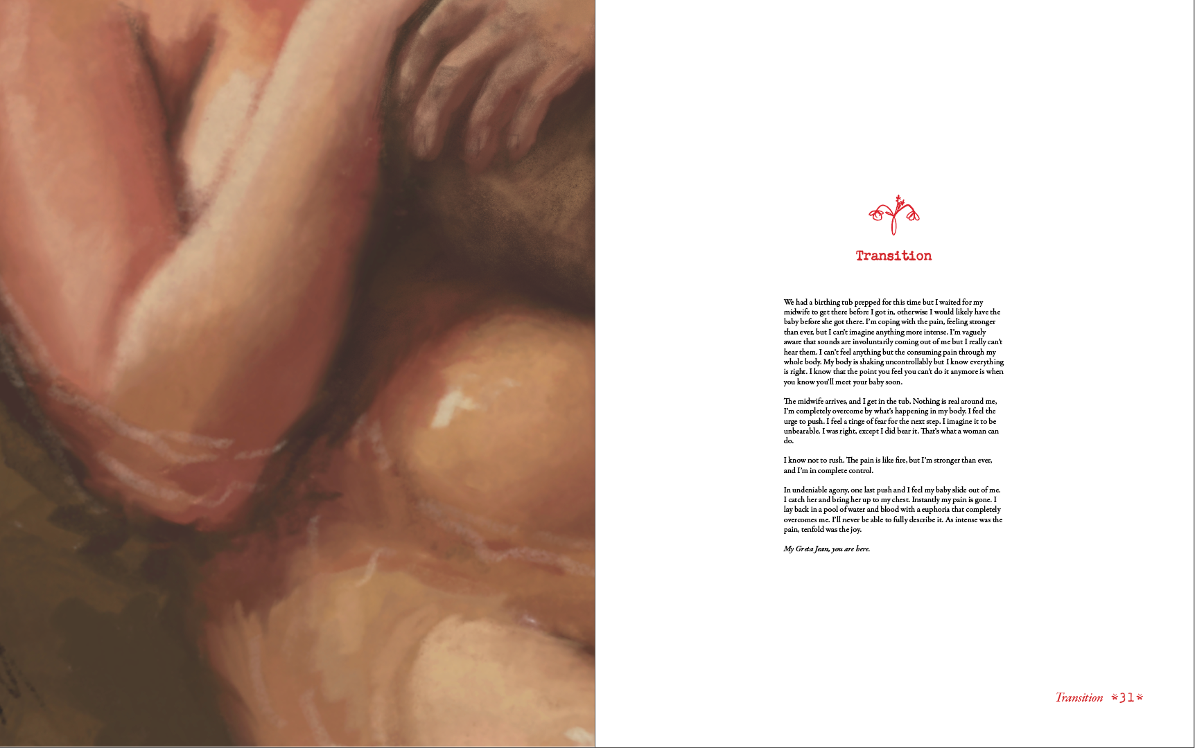
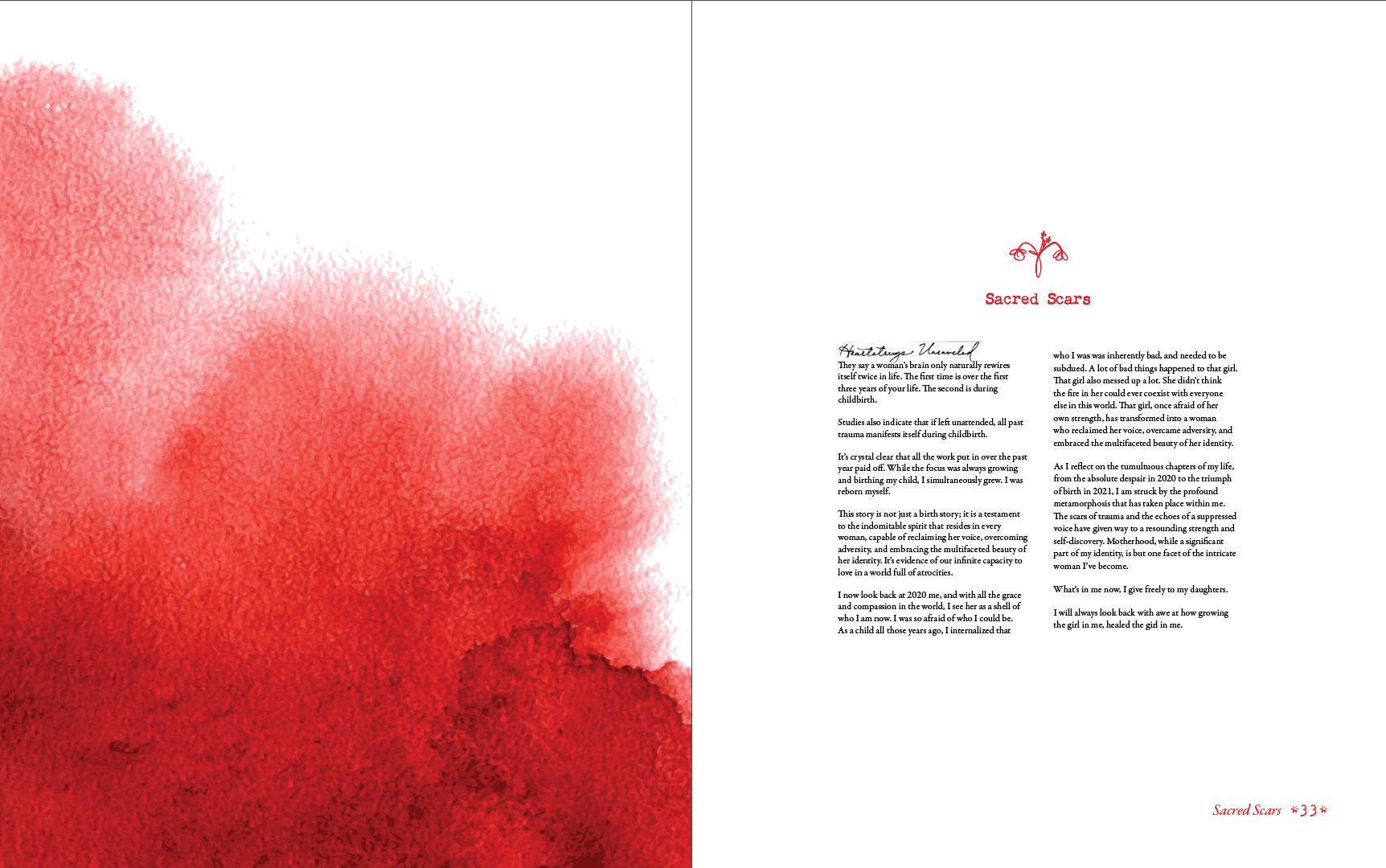
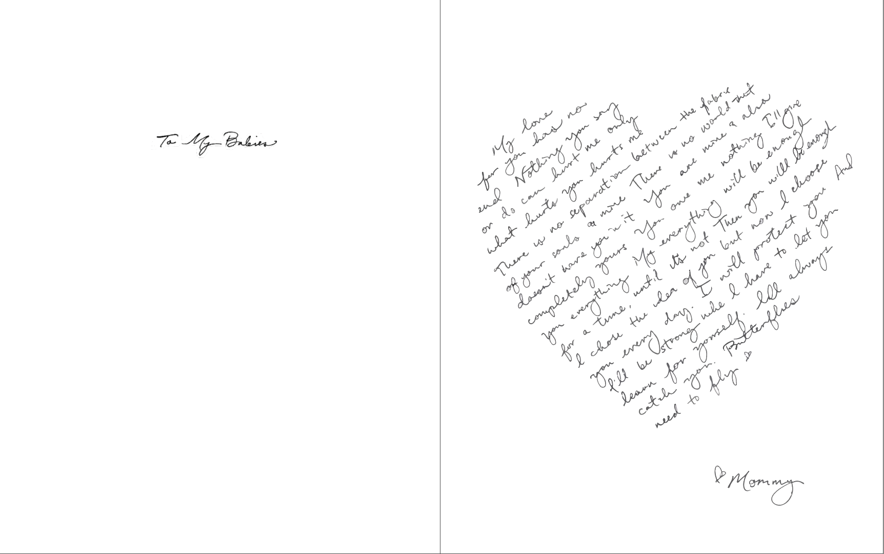
It's very hard to capture my Zine with just these photos. But this is the final thing and I feel pretty good about it. I put everything I could into it and that's something!
