Overview
For the Type Figure project, we were required to create a figure out of type without distorting the type. We are encouraged to get creative with the use of typeface, size, and line placement. The text used for the art is a repeated line. We are allowed to use any part of that line but cannot use it out of order when typing on a path.
I decided to do a seahorse because of all the fun vertebrae and cool shapes I could create.
Research & Brainstorming

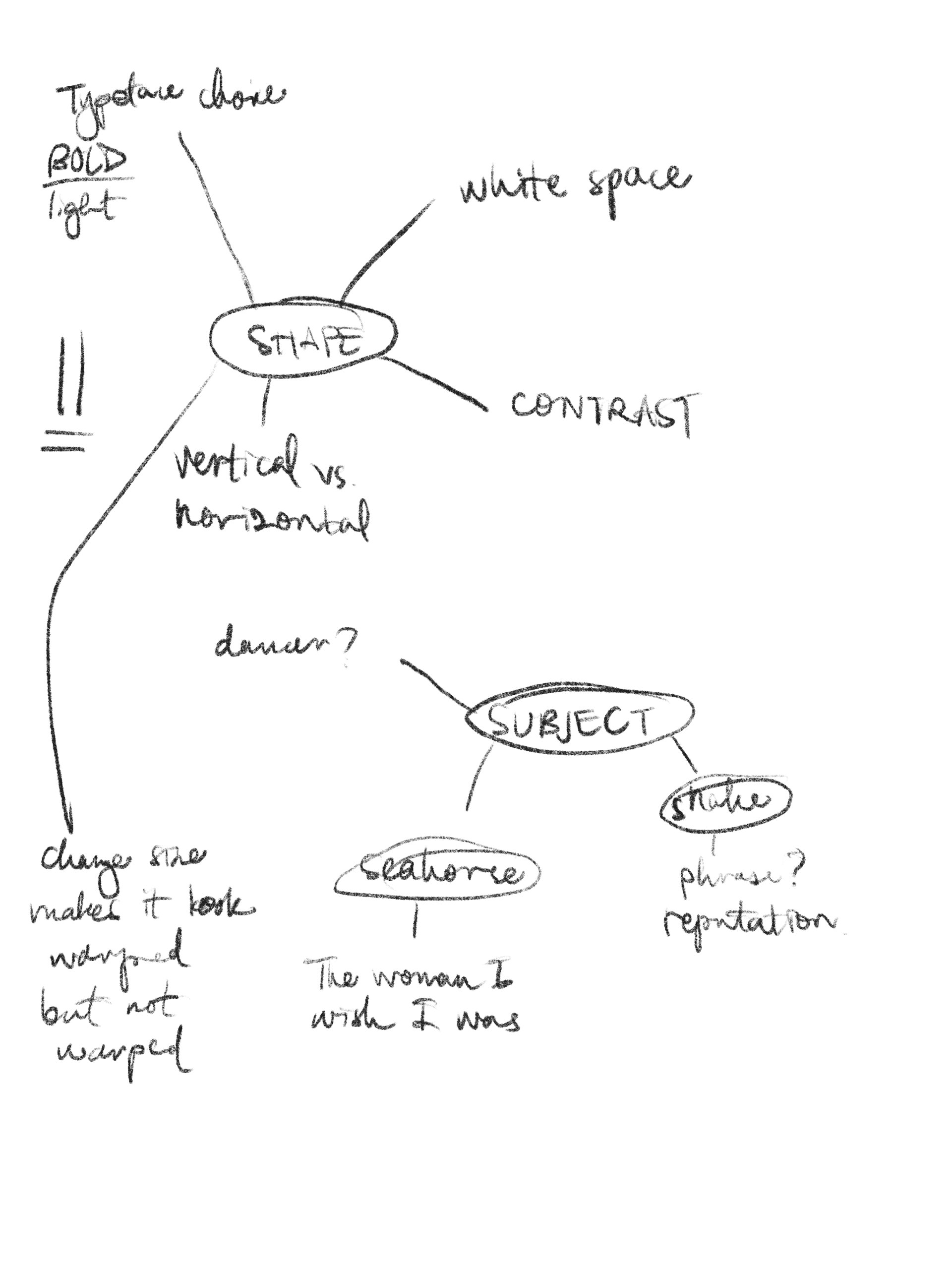
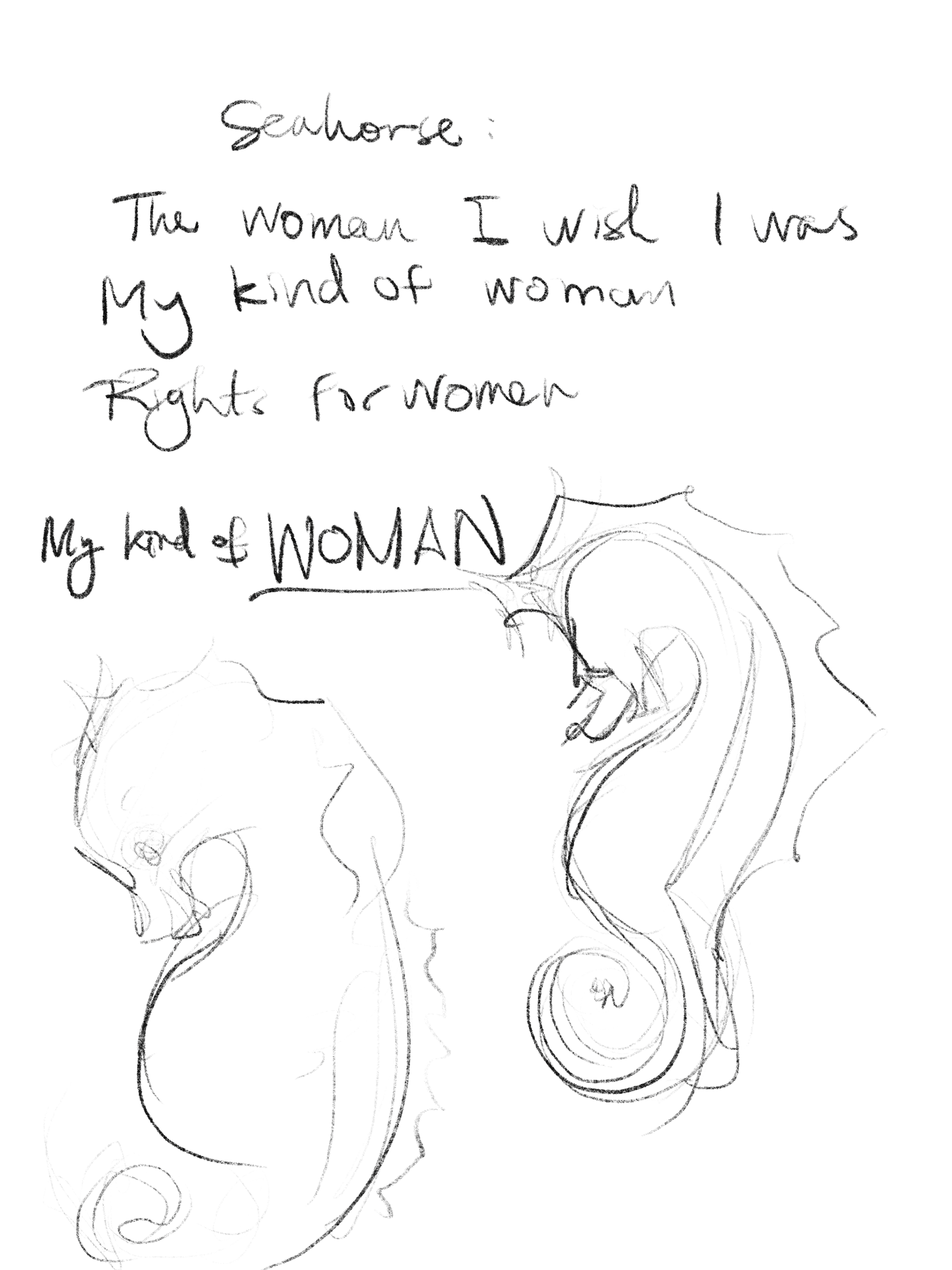
For my research, I wanted to see what other type figures were out there. It was a little hard to think of the right wording to use but I'd find some cool inspiration. I also saved a bunch of snake pictures because I liked the shapes it created. I was thinking between a dancer, a seahorse, or a snake at this point.
Blocked type #1
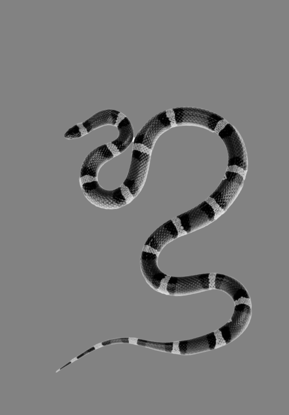


I really thought I was going to end up using the snake because Ioved the white space I could create and curves, but ultimately, it was hard to give it enough dimension.
Blocked type #2


Right off the bat, I knew this seahorse would be challenging, but the thing that got me really inspired was all the cool things I could do with the spine.
Initial computer area study #1
After deciding on the seahorse, I realized how challenging it was going to be to do this swirly tail. I didn't want it to get lost and just look like a big blur. On the left are some different ideas for this problem area.
Initial computer area study #2
Problem area two was the fin. I want it to stick out from the rest of the figure and have some movement in it. Here are three different treatments of this area.
B&W Computer Progressions
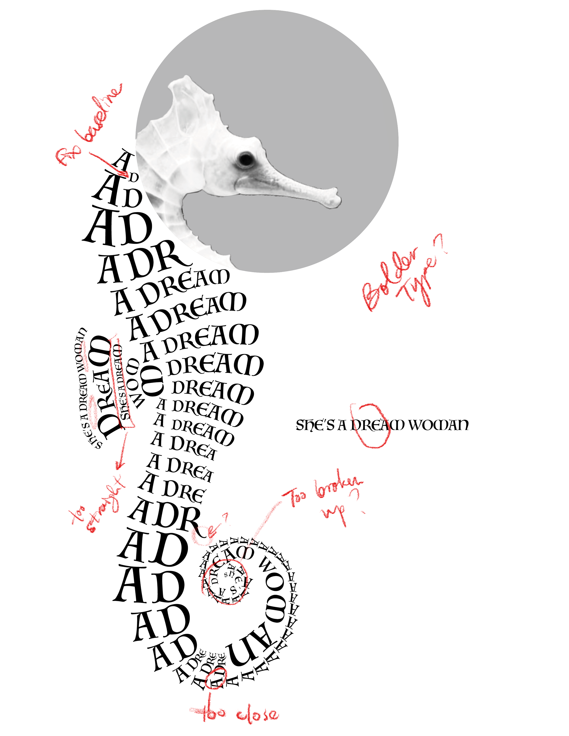
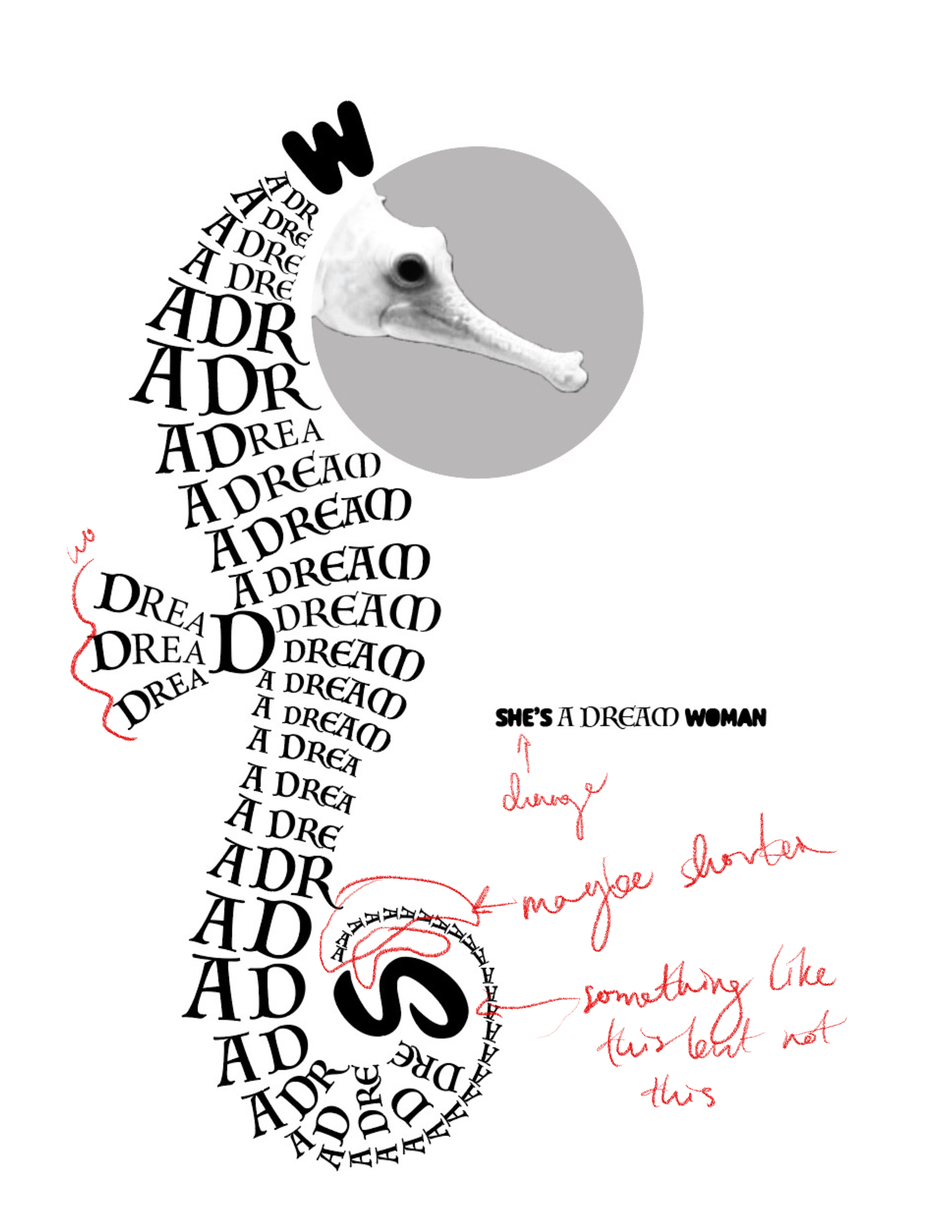
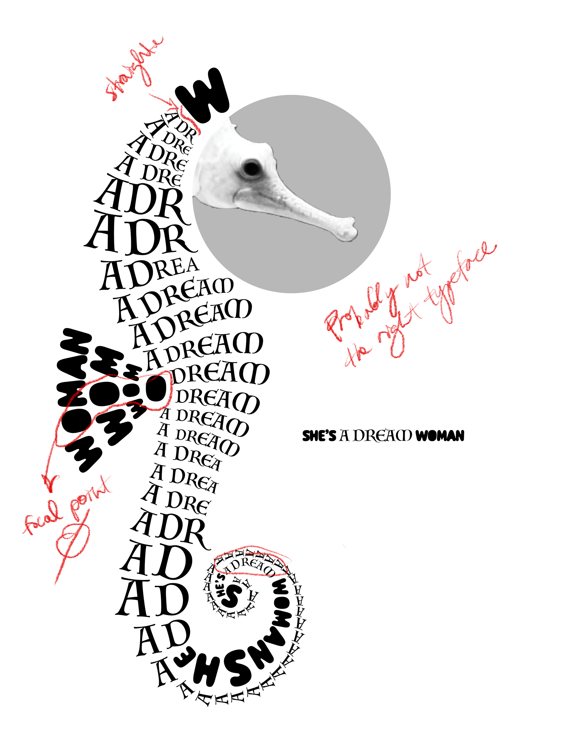
As you can see, at this point, I'm trying a wide variation of things and just not feeling like it was quite there. Actually-I thought this last progression was done and when I took it to class for the critique, realized it wasn't quite there. We love a good critique! So my final version is quite different.
Final Clean Digital Version
At the very end, I ended up making some big changes to the figure but ultimately am glad I did. I added more of a pronounced shape to it, changed one of the main typefaces, and changed the fin and swirl completely. Overall I enjoyed this project and learned to appreciate some of the awesome things you can do with type. I also learned so much about some of the problems this kind of design can present and learning to solve them is a very valuable lesson.
