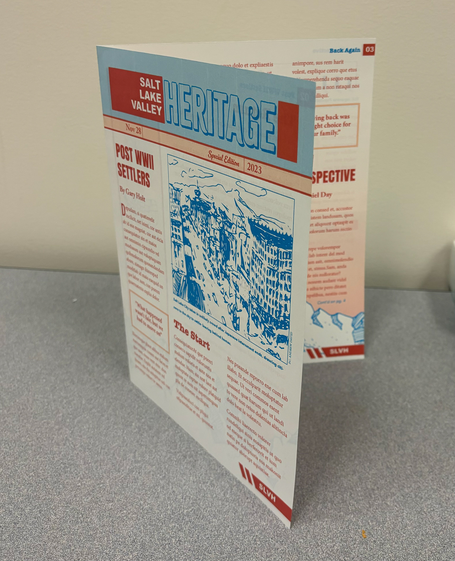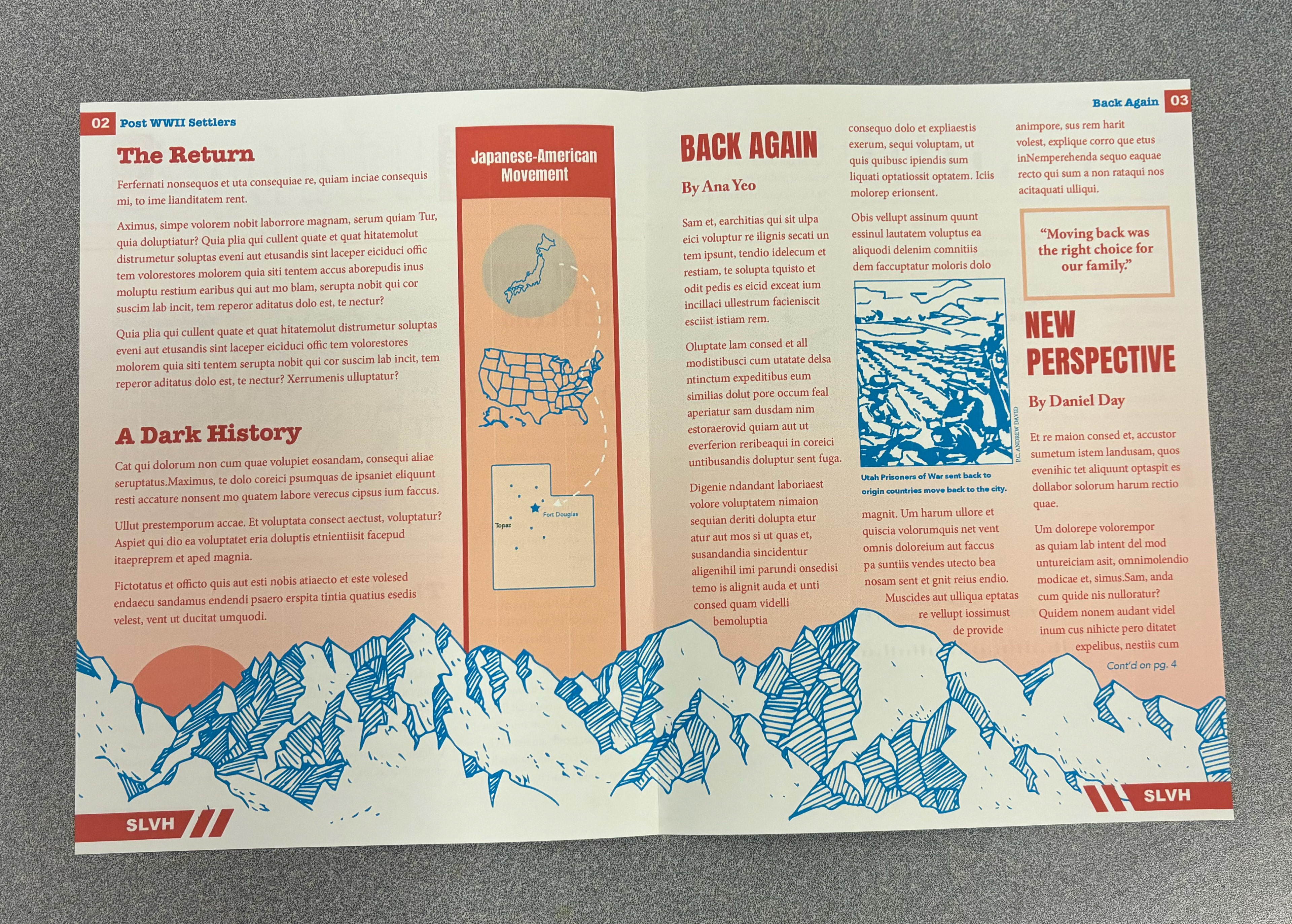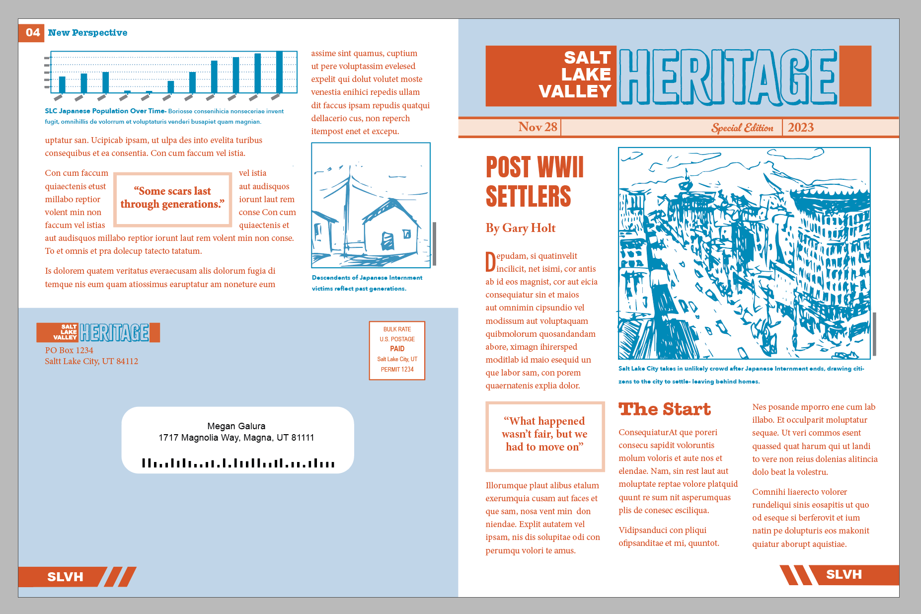
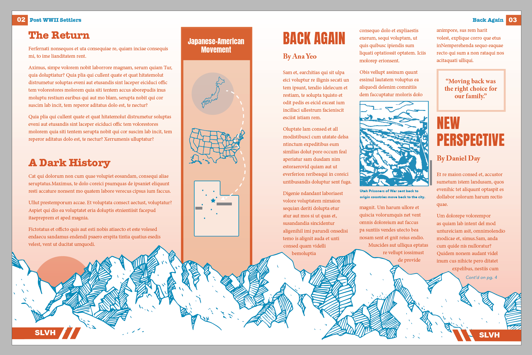
This is the Final Clean Digital Version of my newsletter. This project is more challenging than it looks. I knew I would need to manage my time accordingly and stay on track even though we had a long period to complete the project. Overall I have a lot of fun and learned a lot creating something purposeful yet pleasing to the eye.
Research and Brainstorming
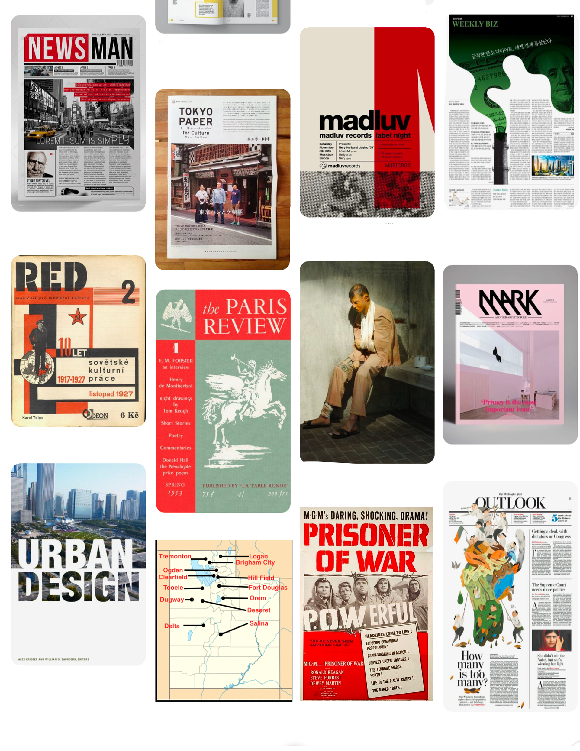
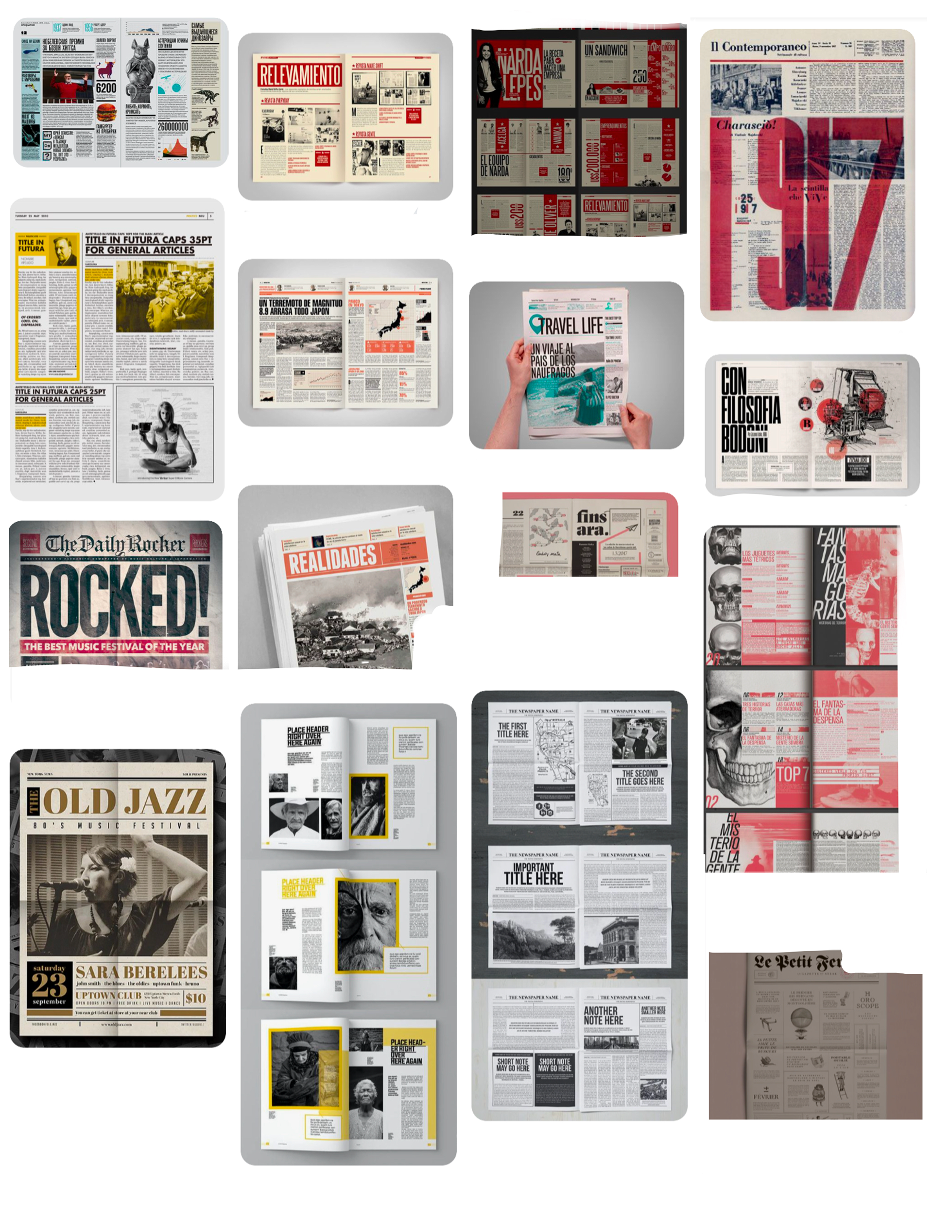
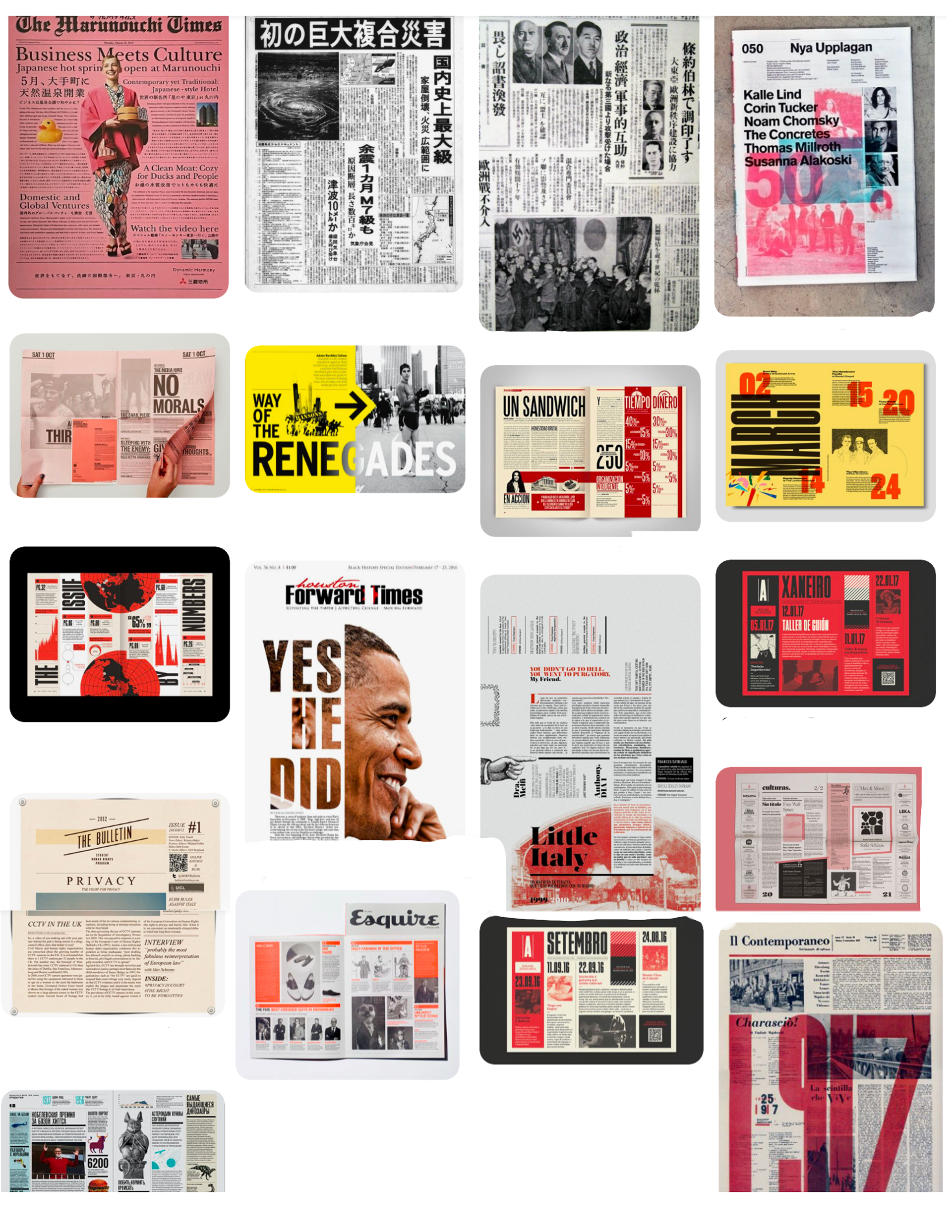
In the research and brainstorming phase, I was very inspired by clever use of tints and overprints. I tried to collect quite a variety of layouts to keep my options open but definitely got a vision for the type of layout I wanted to end up with.
For my topic, I did a lot of research and was particularly interested in long term effects of WWII in Salt Lake Valley--particularly immigration. Then I found some articles about Prisoners of War held in Utah that once released, actually returned to the Salt Lake Valley and started a life and community.
The Japanese Internment actually had a huge impact as well and is in that same vein of WWII immigration, and although Japanese Internment dealt with American-Japanese citizens, after being gathered in Topaz from many different places around the country, many Japanese ended up staying in Utah and settling in the Salt Lake Valley. So some of my stories end up highlighting this subject matter.
Brain Map/ Sketches & Doodles
Choosing a subject and sketching out possible styles was pretty straightforward. At this point I was feeling ready to jump straight into my thumbnails.
Three Thumbnails
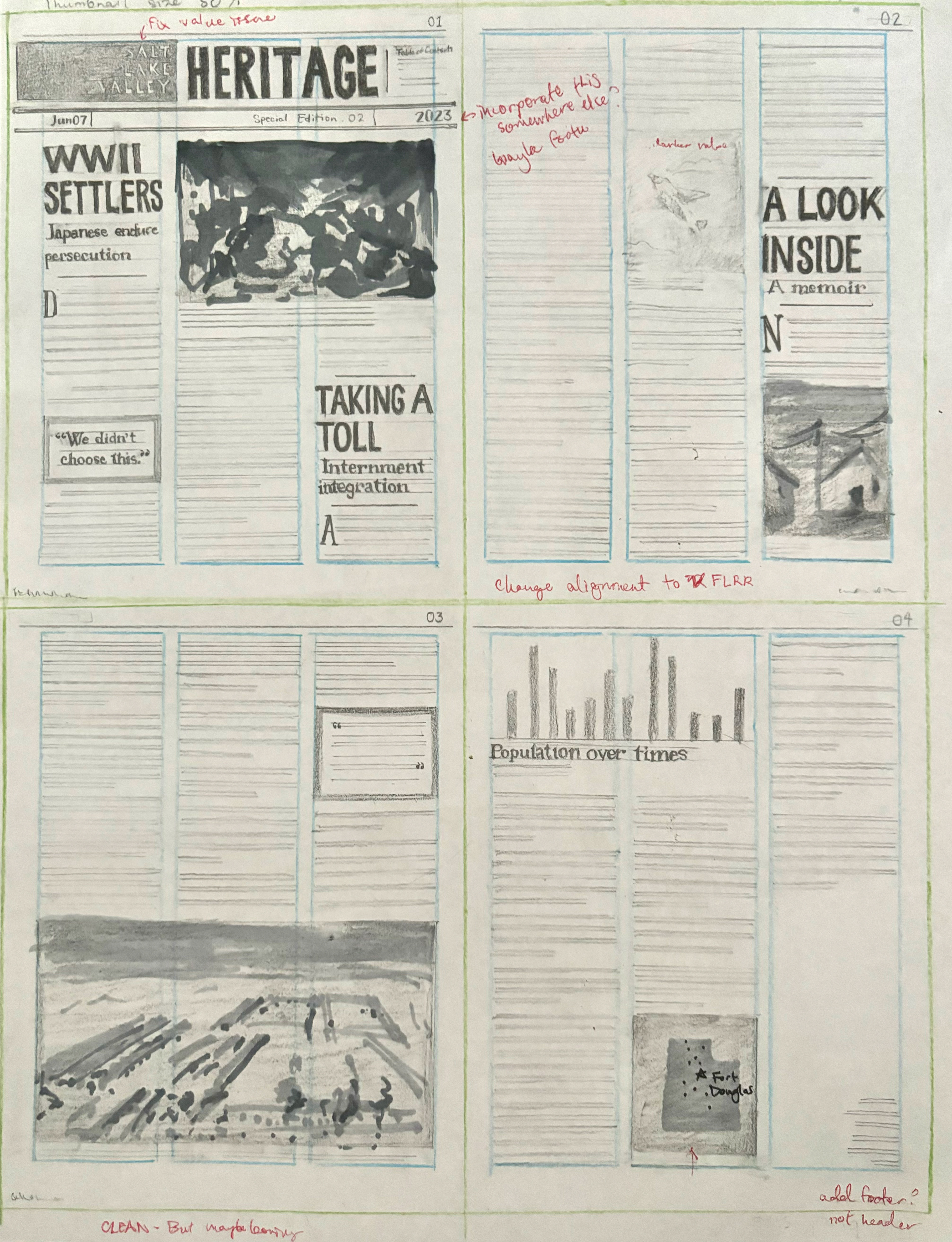
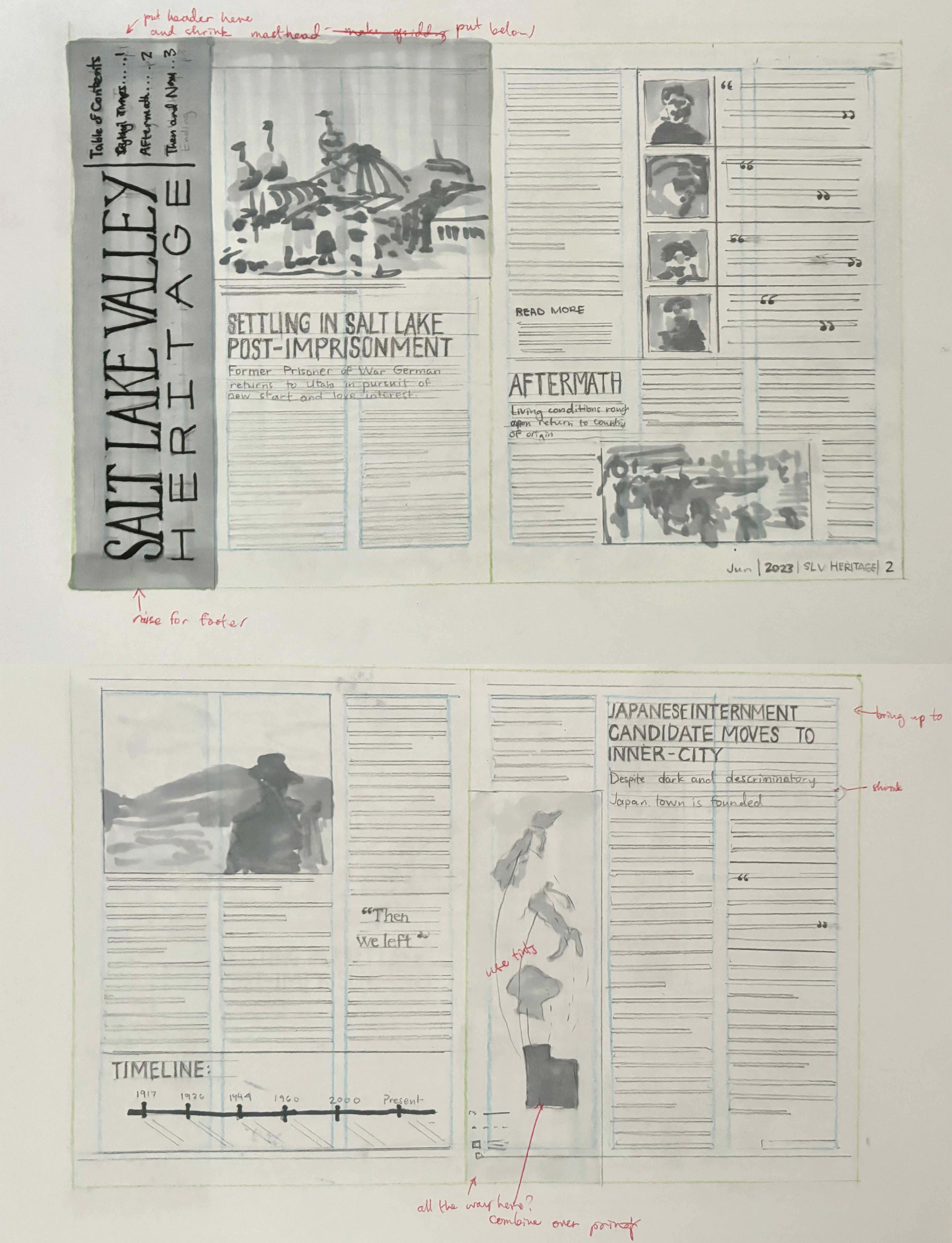
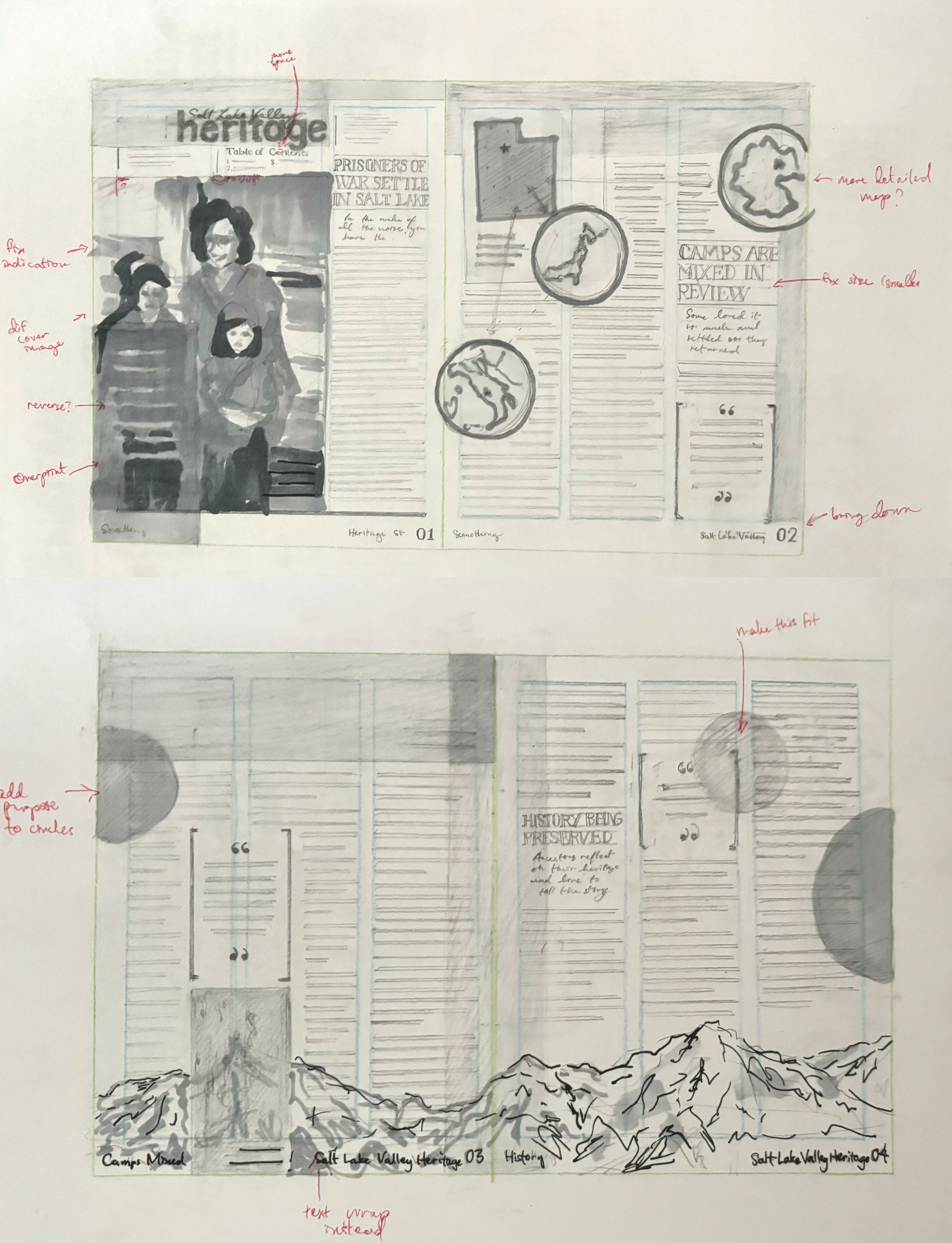
These are my initial thumbnails. I felt like I really struggled with execution on these because of juggling so many elements. The third thumbnail concept was actually my favorite idea but the execution was so rough that it became one of my least favorites. I still wanted to see it through though because I felt like all the overprinting could produce something really interesting.
intermediate Thumbails
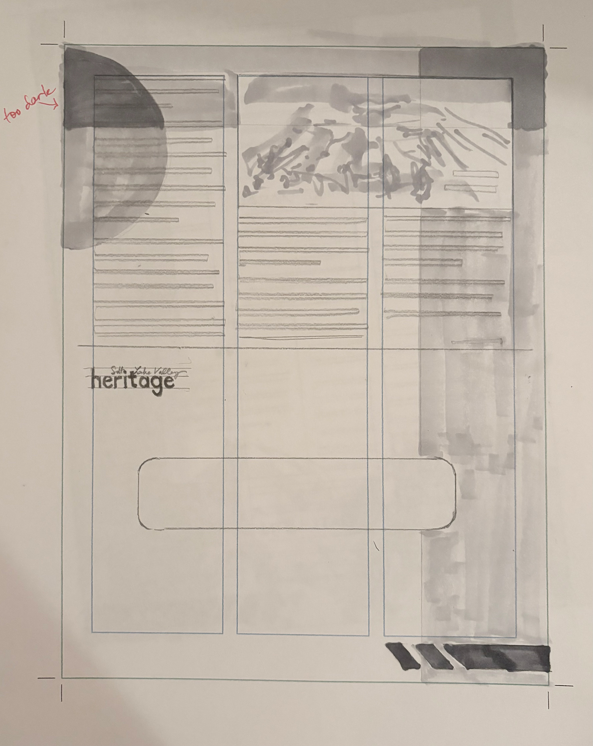
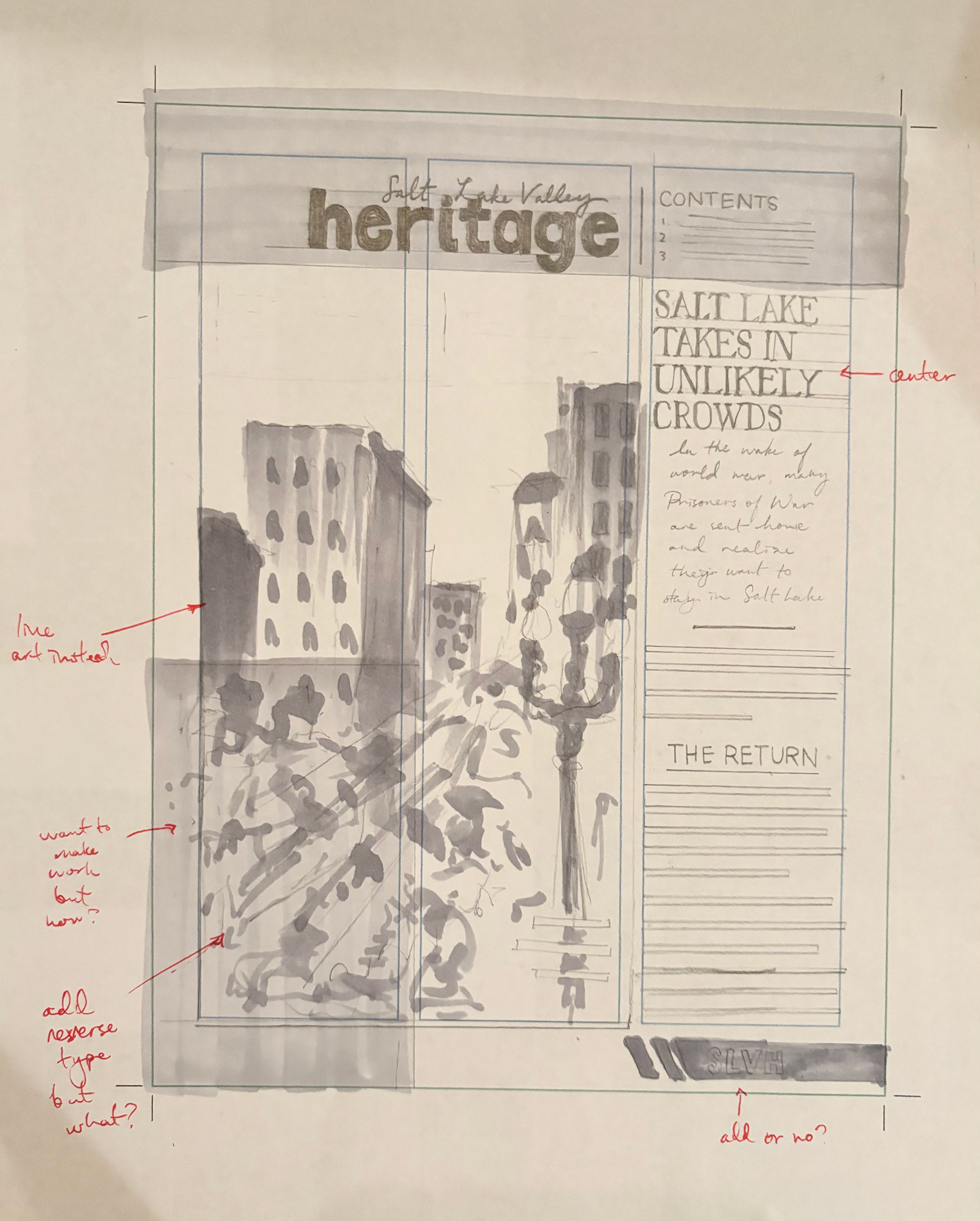
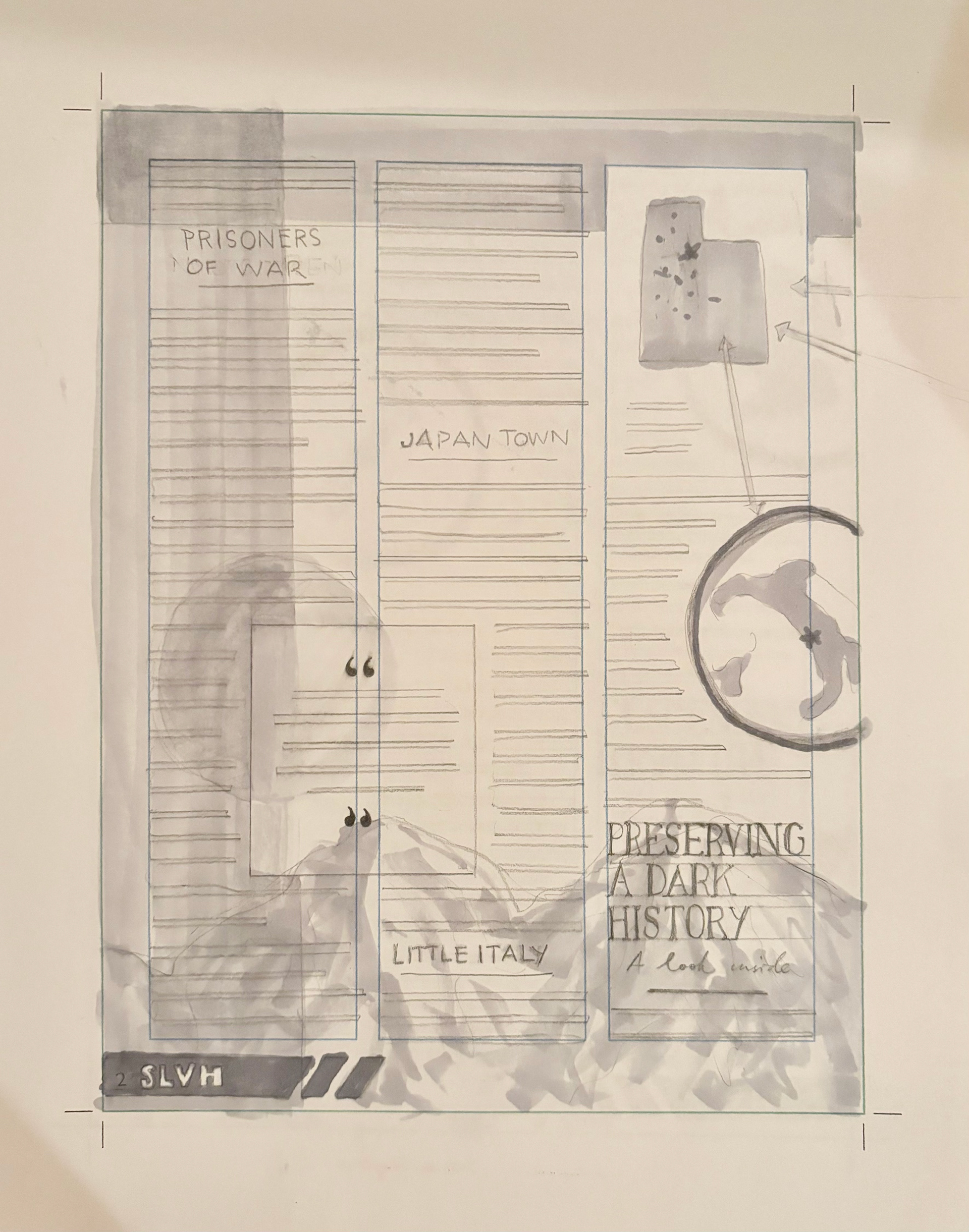
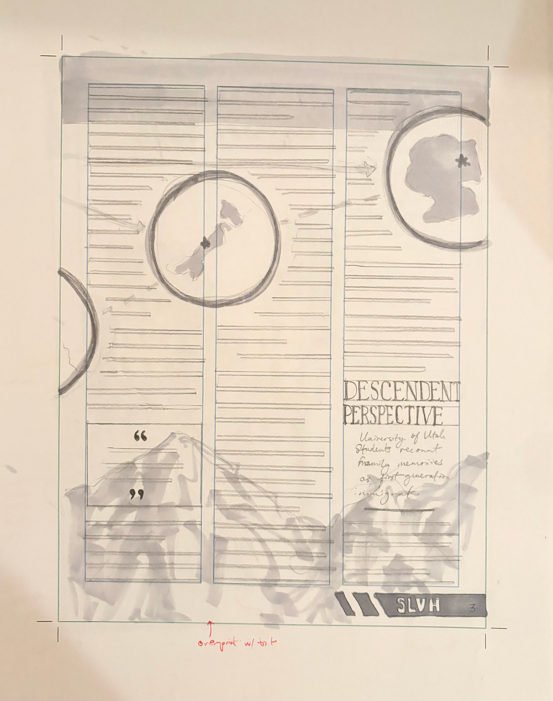
At this step I chose my top two out of the three original thumbails. Above was originally my first choice but at this point I'm doubting if I can make it work. It has a lot more problems to solve than the other one I chose.
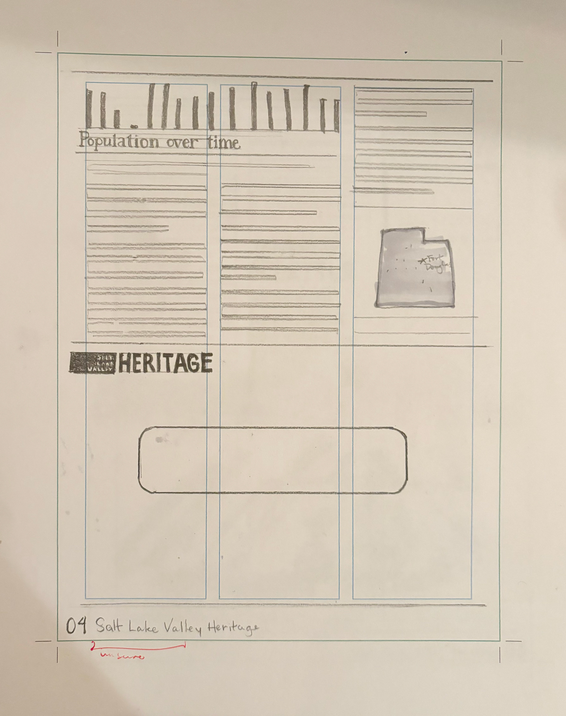
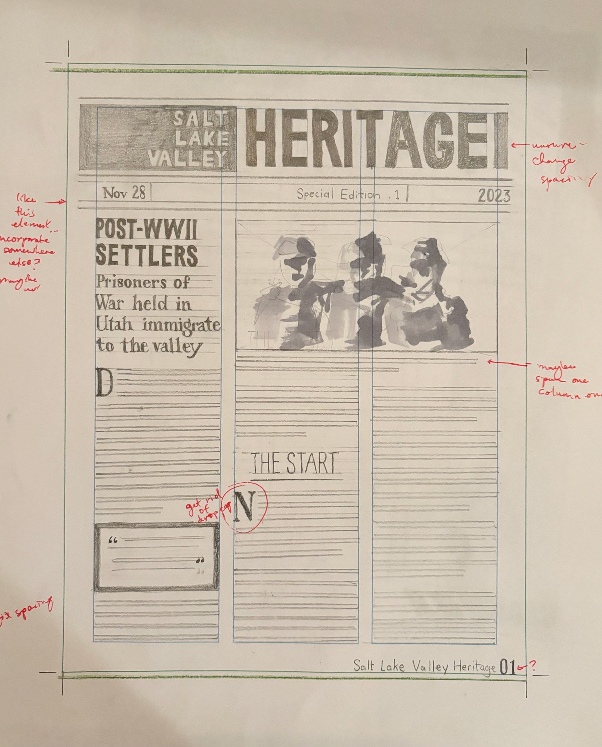
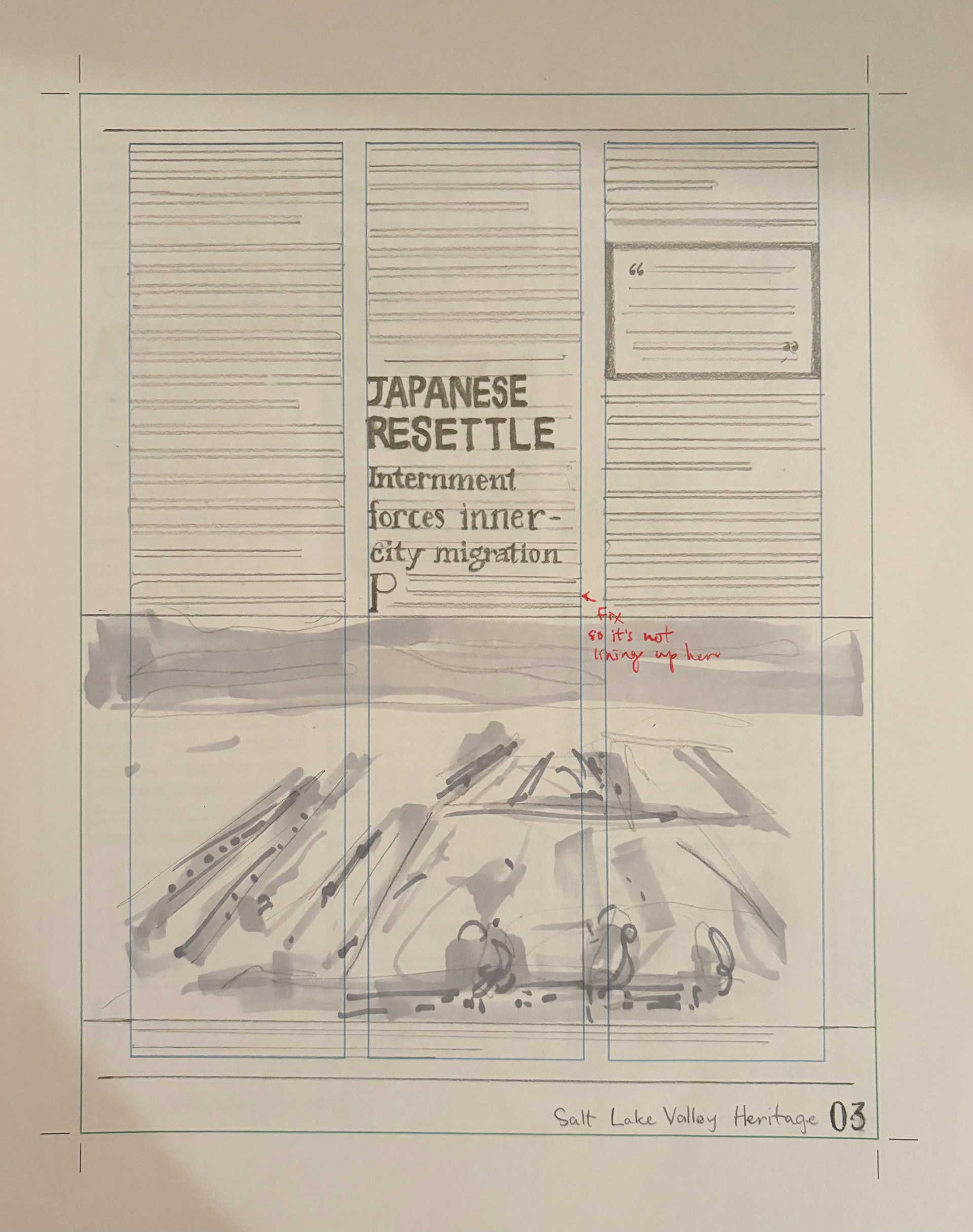
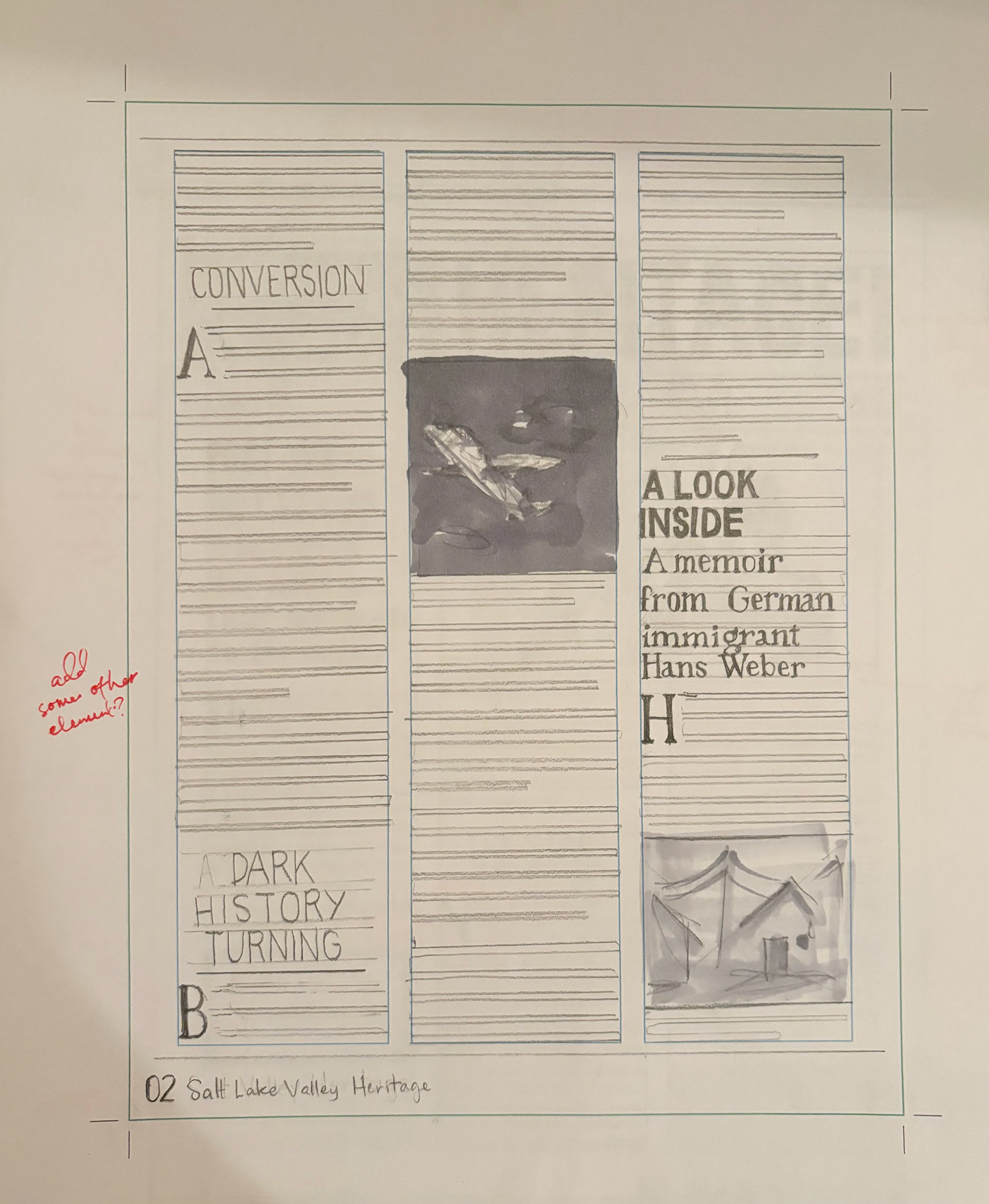
This is my second choice intermediate thumbnail. It's much simpler and might be the way to go. The feedback in class was great. People really liked the masthead and said if I were to do this one, I need to add elements from the front page to the rest of the pages. The other critique was that I could span some text over two columns in some places.
final hand
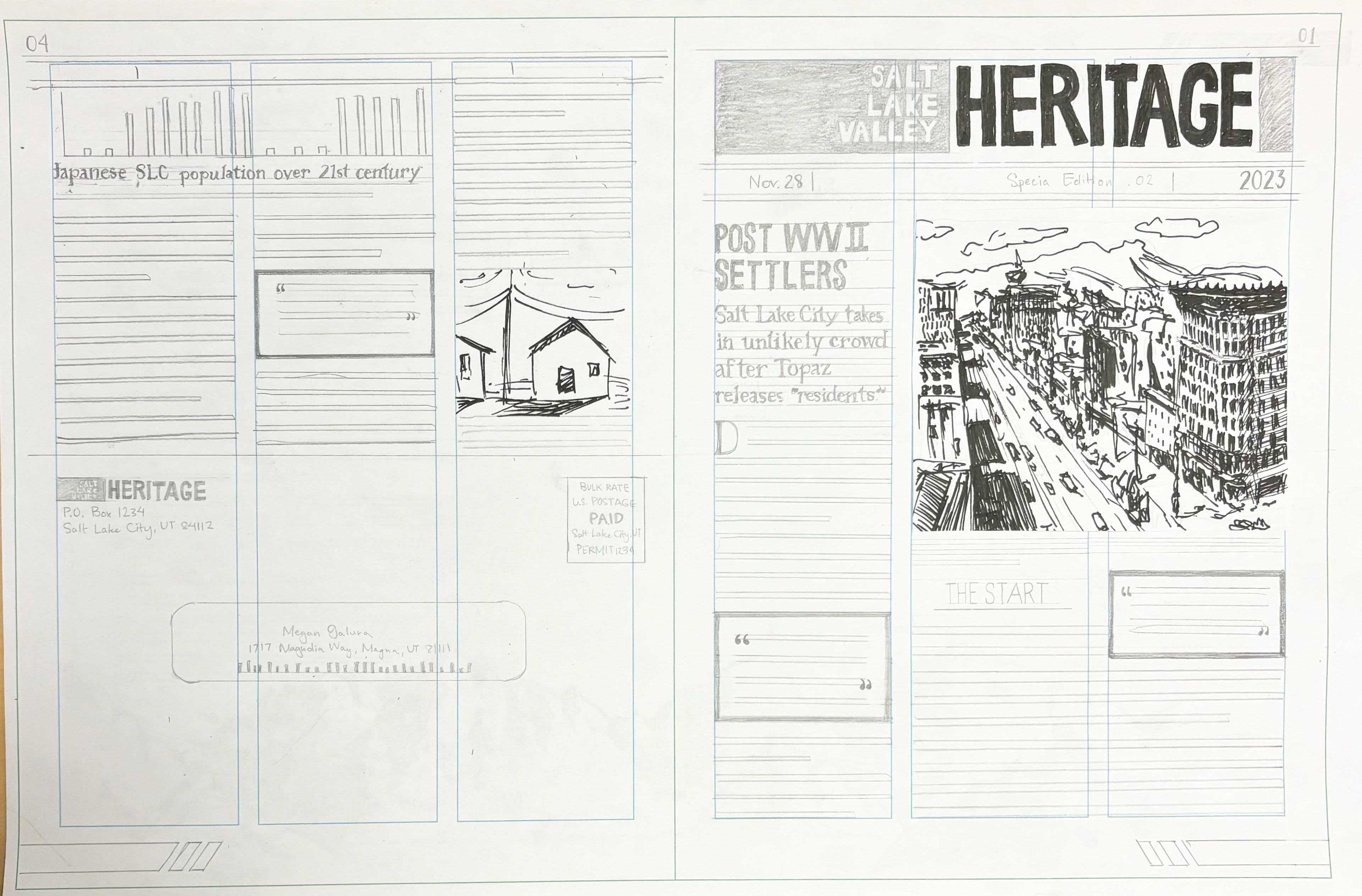
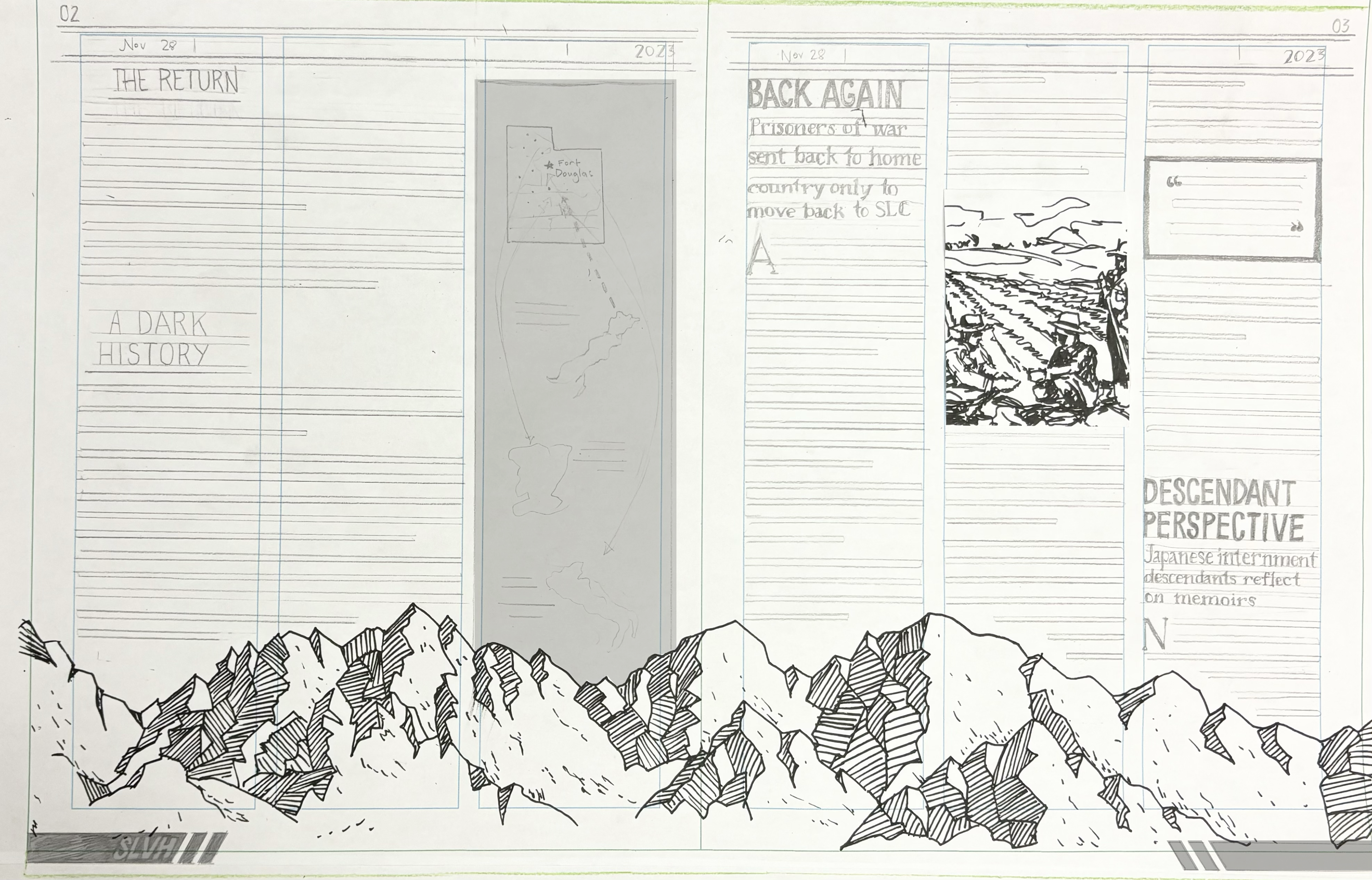
At this point in the design stage, I combined many aspects from both of the previous thumbnails. I fixed a few issues but also created other new problems such as trying to make a header that incorporated more of the elements from the first page. I don't really like where I ended up with that so at this point I'll have to fix it in the next stage.
I'm happy with the mountains on the front, but need something to connect the design and give it more cohesiveness.
B&W computer progressions
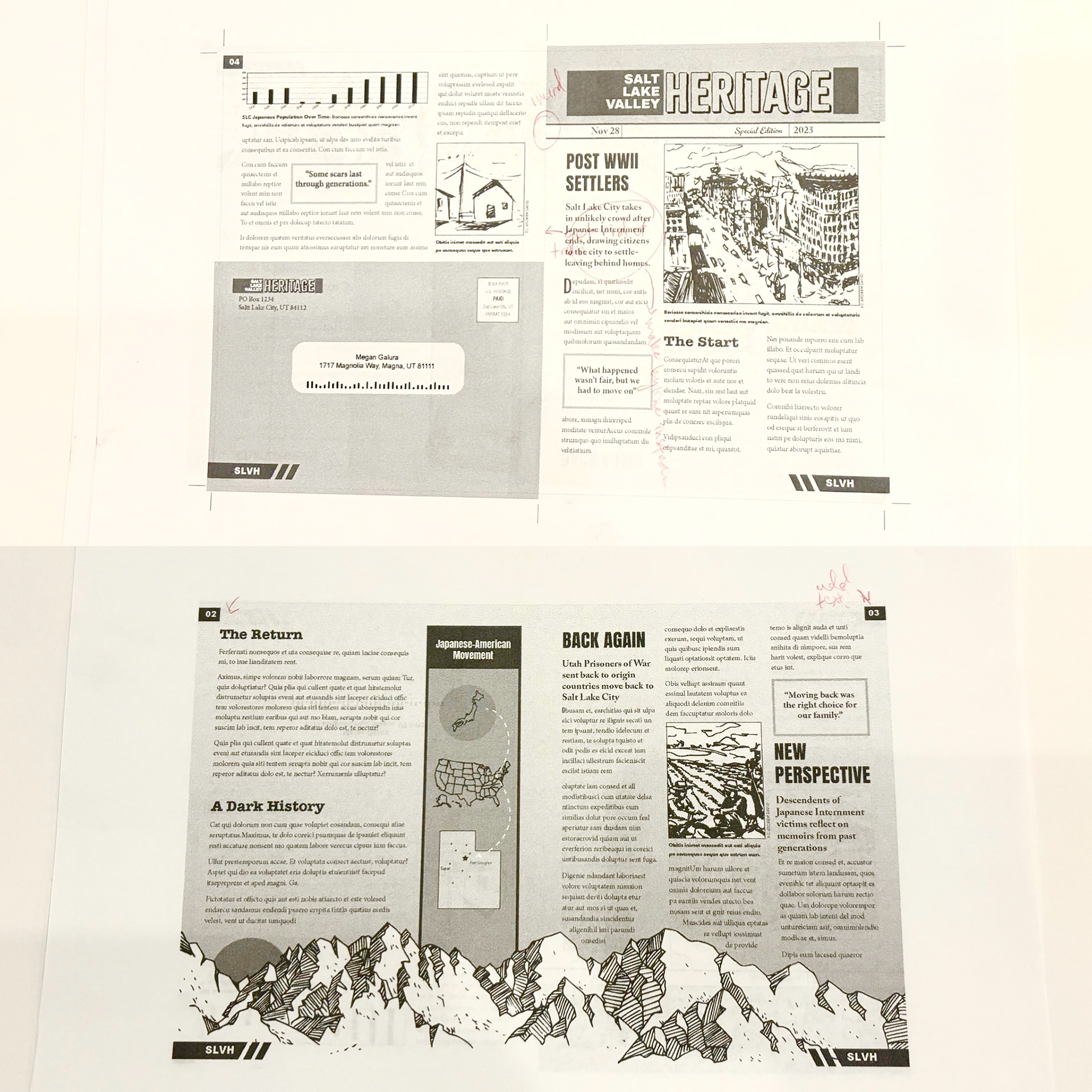
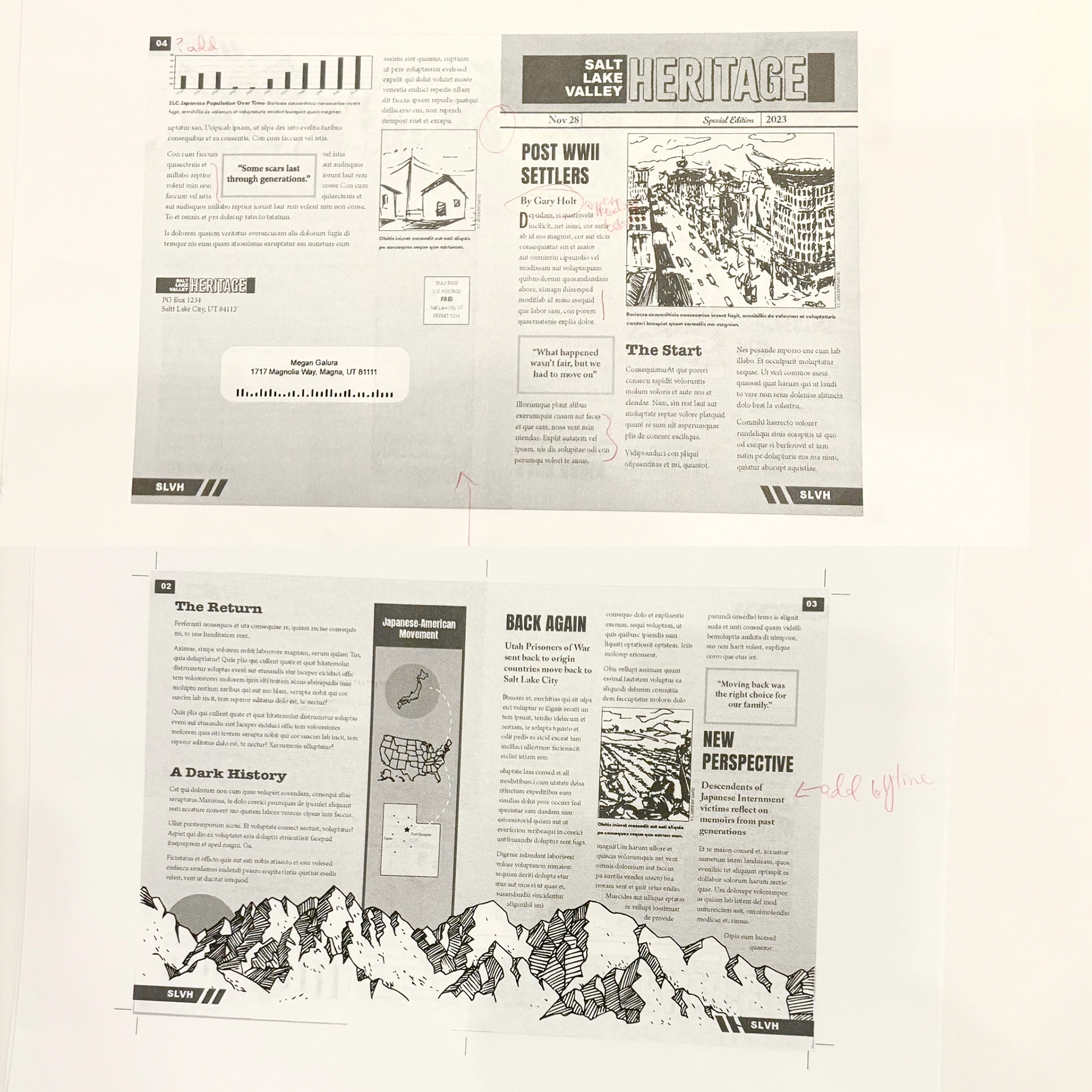
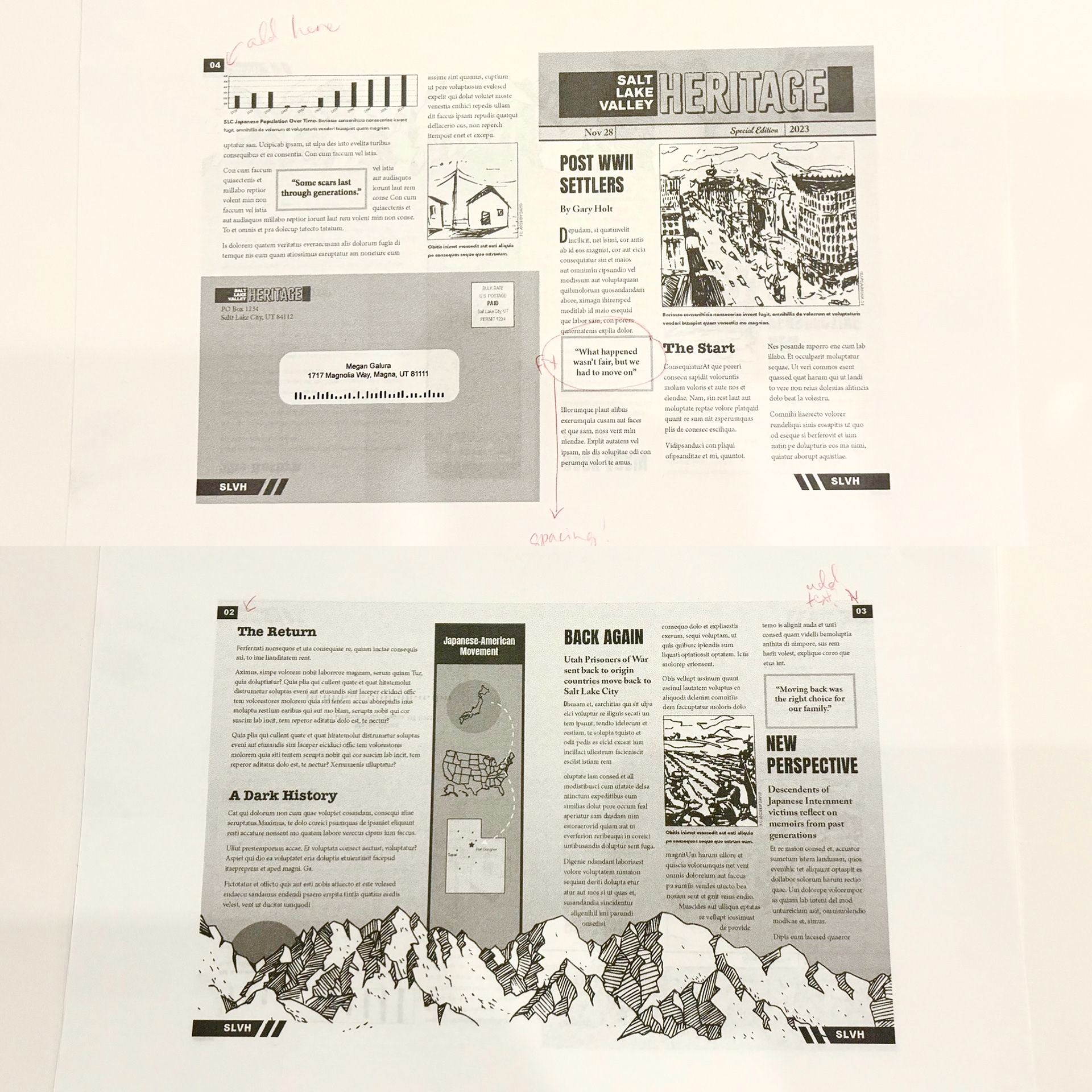
These are my edits made once I moved to the computer. As you can see, the edits were relatively minimal because of the preliminary thumbnails, but this step definitely helped to spot things I otherwise wouldn't have.
B&W Dummy
At this point, I printed out the last of my black-and-white computer progressions and made a physical dummy. I had to glue the two pages together and it was hard to get it to all line up.
Seeing my project full size gave me a much better perspective. I was surprised at how different everything looked.
At this point, I marked up my critiques and moved on to the color studies.
Color Studies
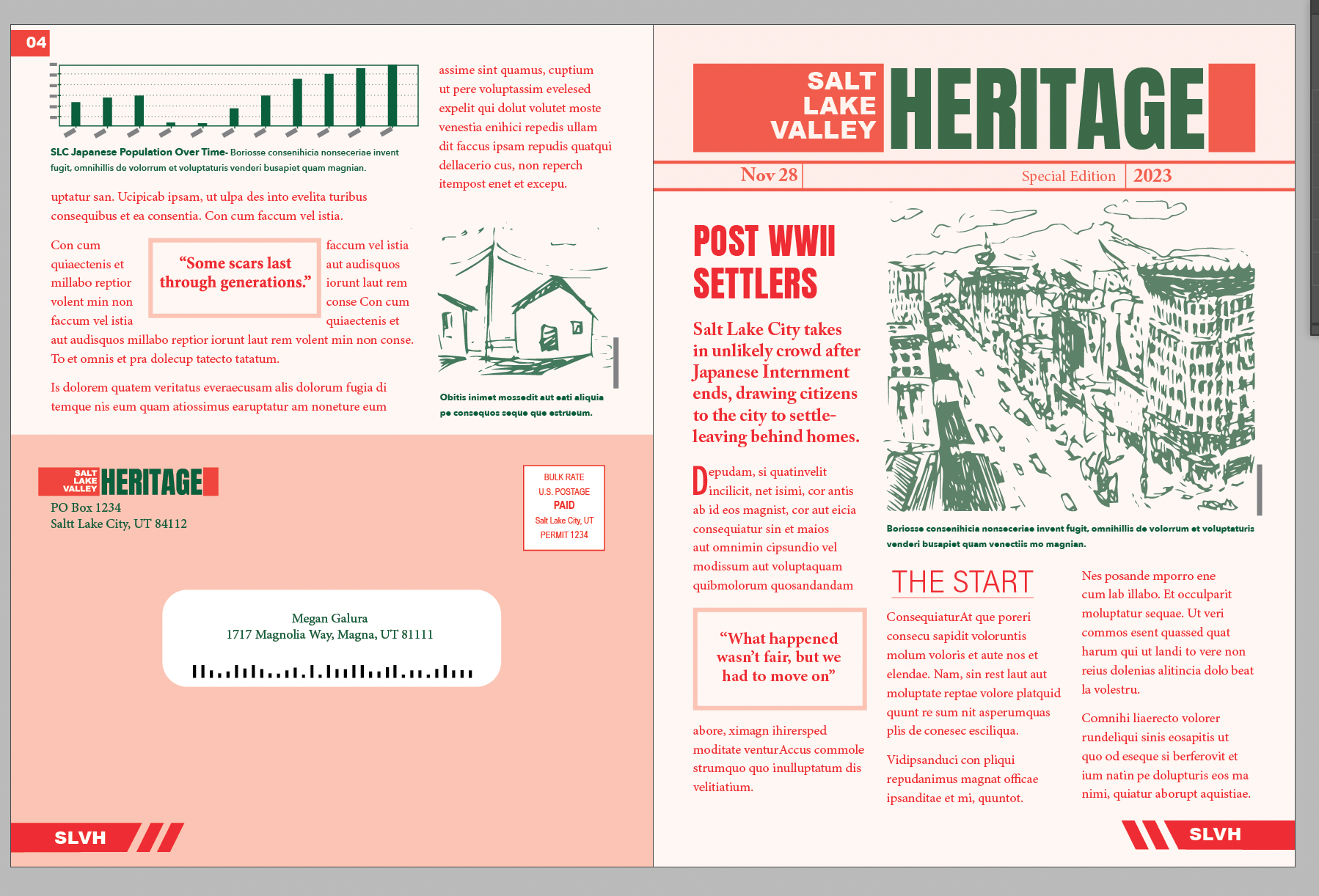
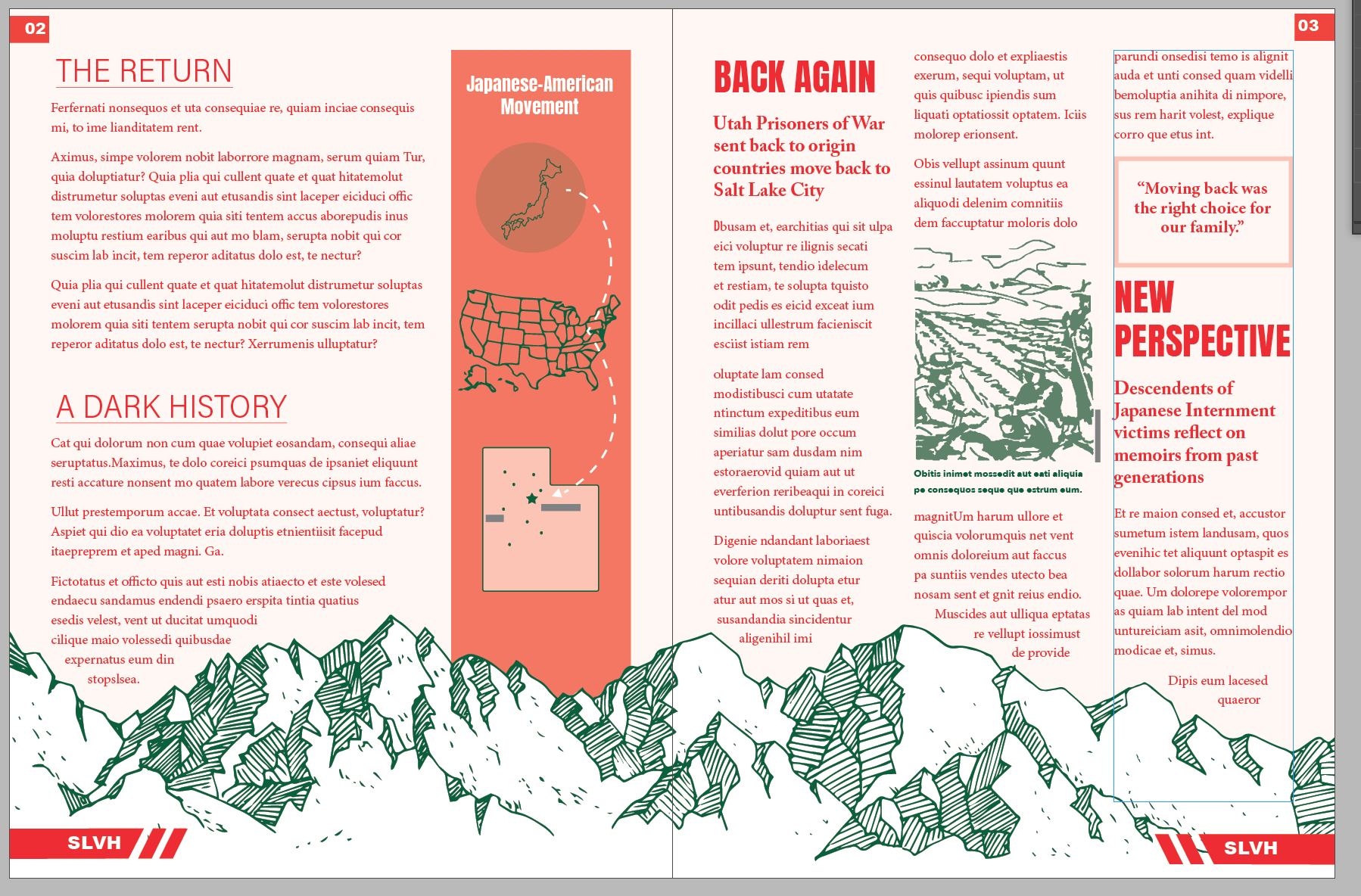
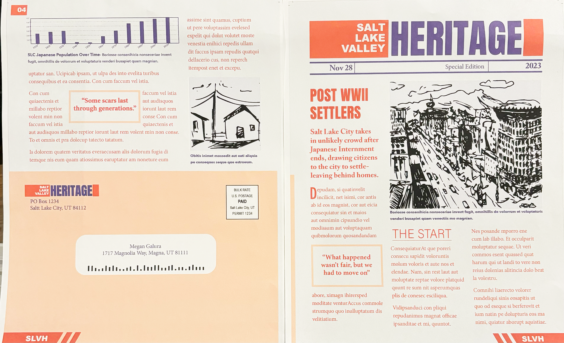
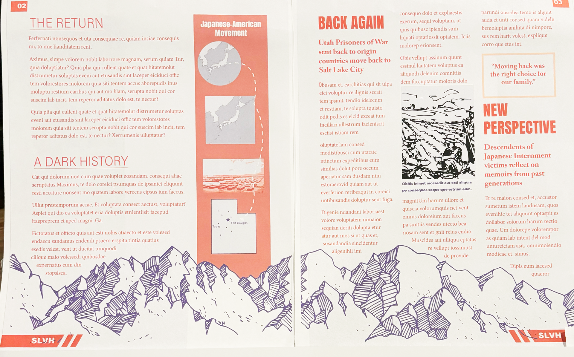
I wanted to go with bold and fun colors. After trying several combos and asking for some advice, I landed on the blue and orange.
Final Clean


