

Overview
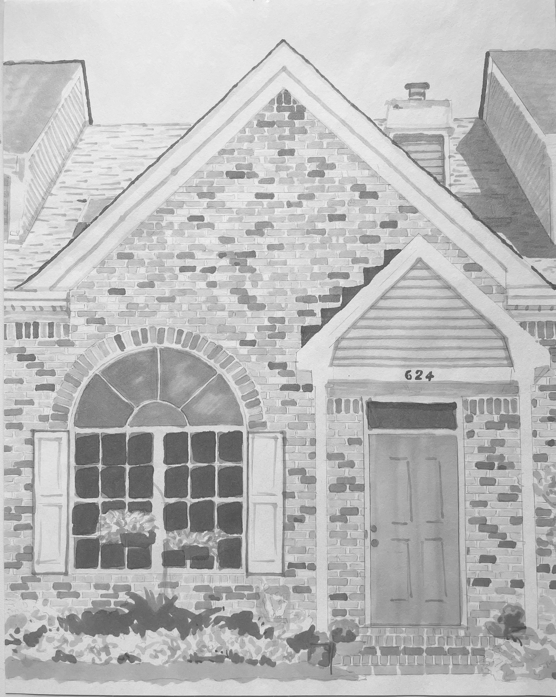
This project was meant to familiarize us with the way we are meant to indicate photos with gray markers for our layouts made by hand in the preliminary stages. The idea is that they are light, loose, and have more white on the page than not.
I definitely went a little too tight with my indications making them more illustrative than not, but it was a good learning experience regardless. I was terrified of the permanency of the markers at first but I feel like I'm getting the hang of it.
Overall, this was by far the fastest assignment of the semester up to this point. The markers are quick and efficient. I can't wait to use them more!
Preliminary work
My first approach to this project was to get a feel for the markers. I tried different pressure amounts, nibs vs. tips, and tint combinations.
My next step was finding images. I got my image options from a stock image website (unsplash.com). I had a really hard time deciding so I printed out multiple options and decided what would be best as I went along.
Image Tracing
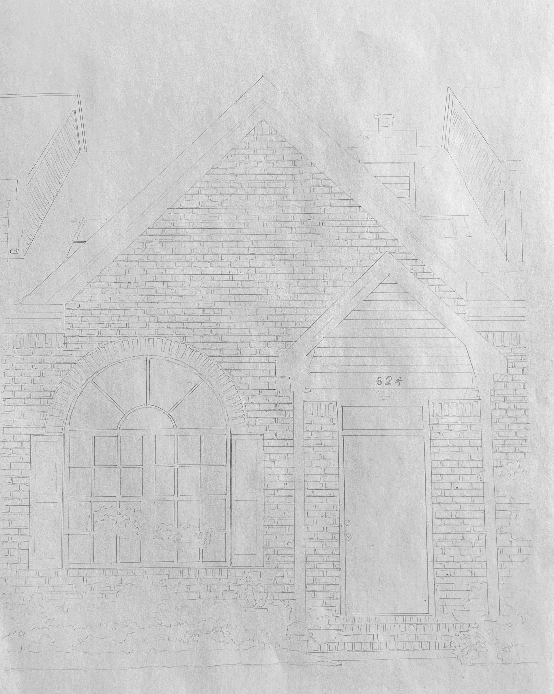
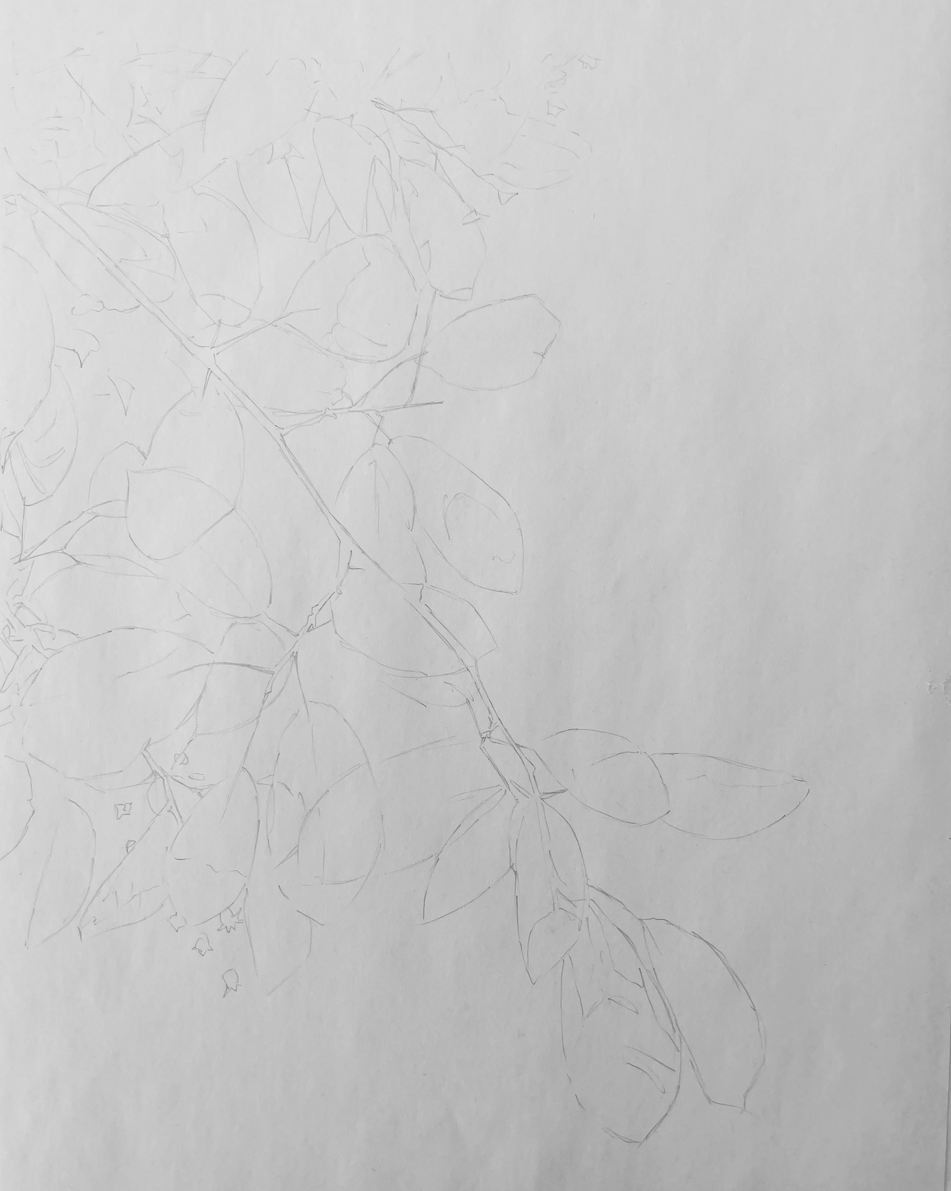
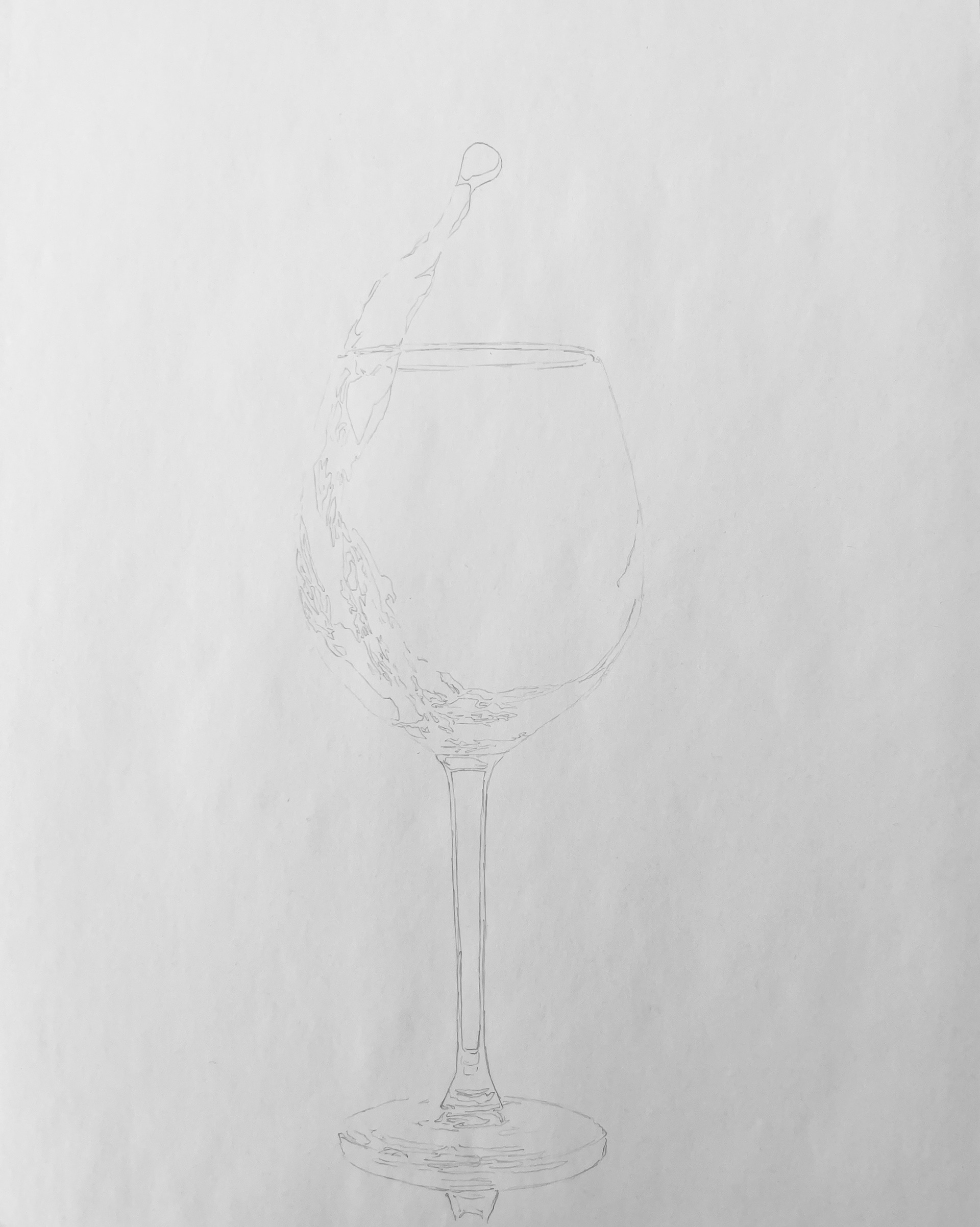
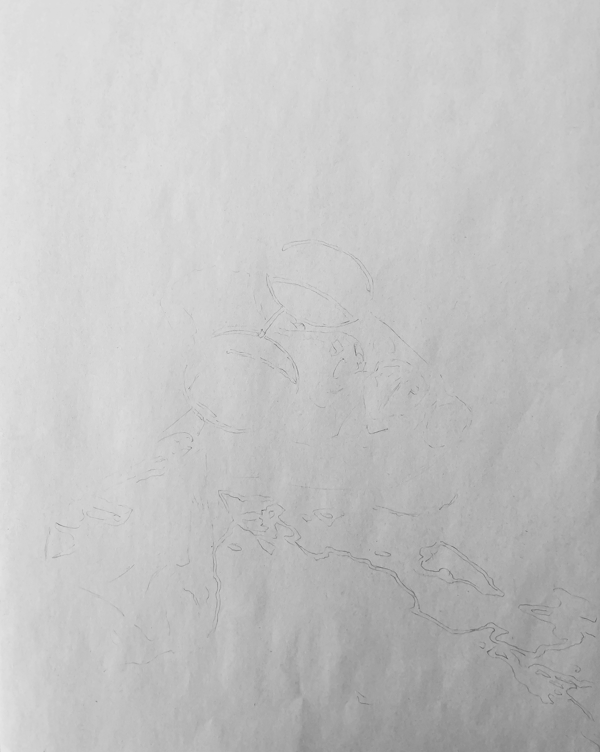
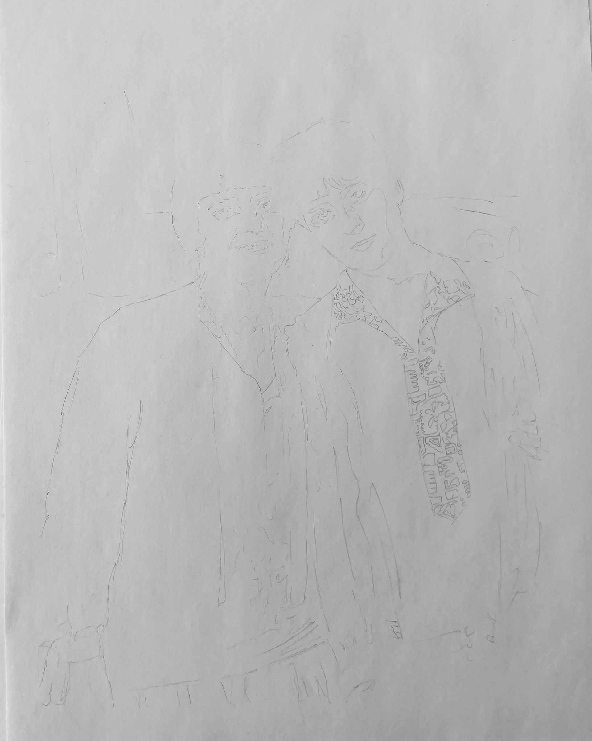
It's a little hard to see the sketches since they were so light, but I didn't want it too dark to show under the marker.
Reference vs. Final
BRICK HOUSE


'I used a T-square and triangle to get straight lines and then freehanded the rest. The highest tint is 60% black and the average tint used is 30%.
GLASS
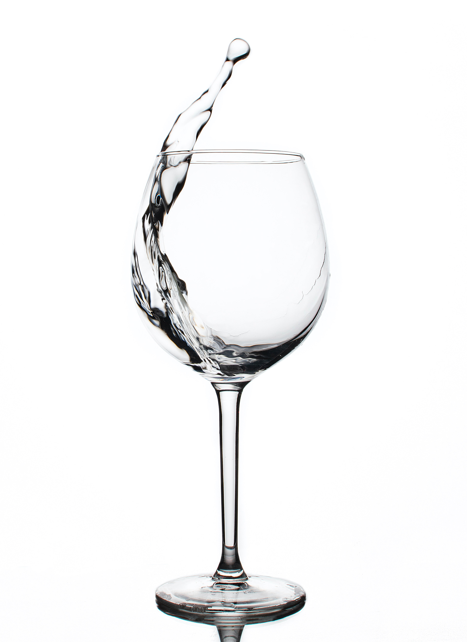
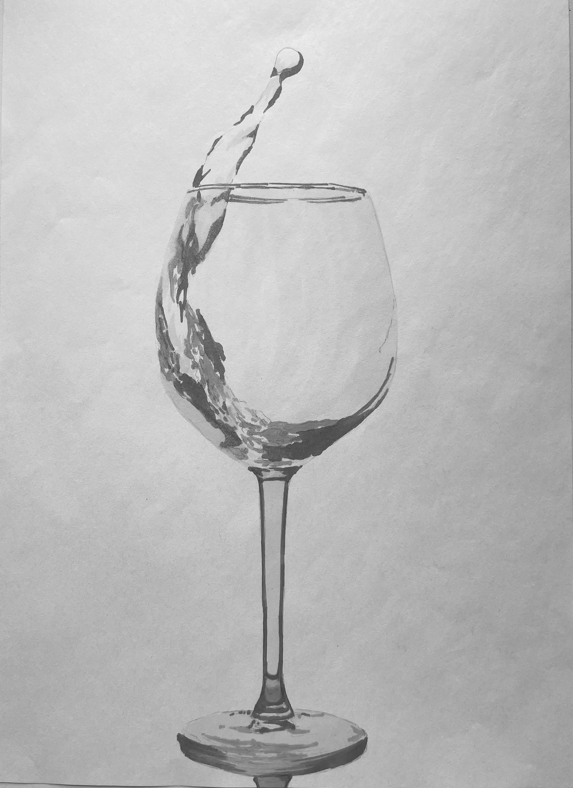
For the glass, I went much lighter than the original. This is where I learned how much markers bleed on the page, but I think it turned out okay considering.
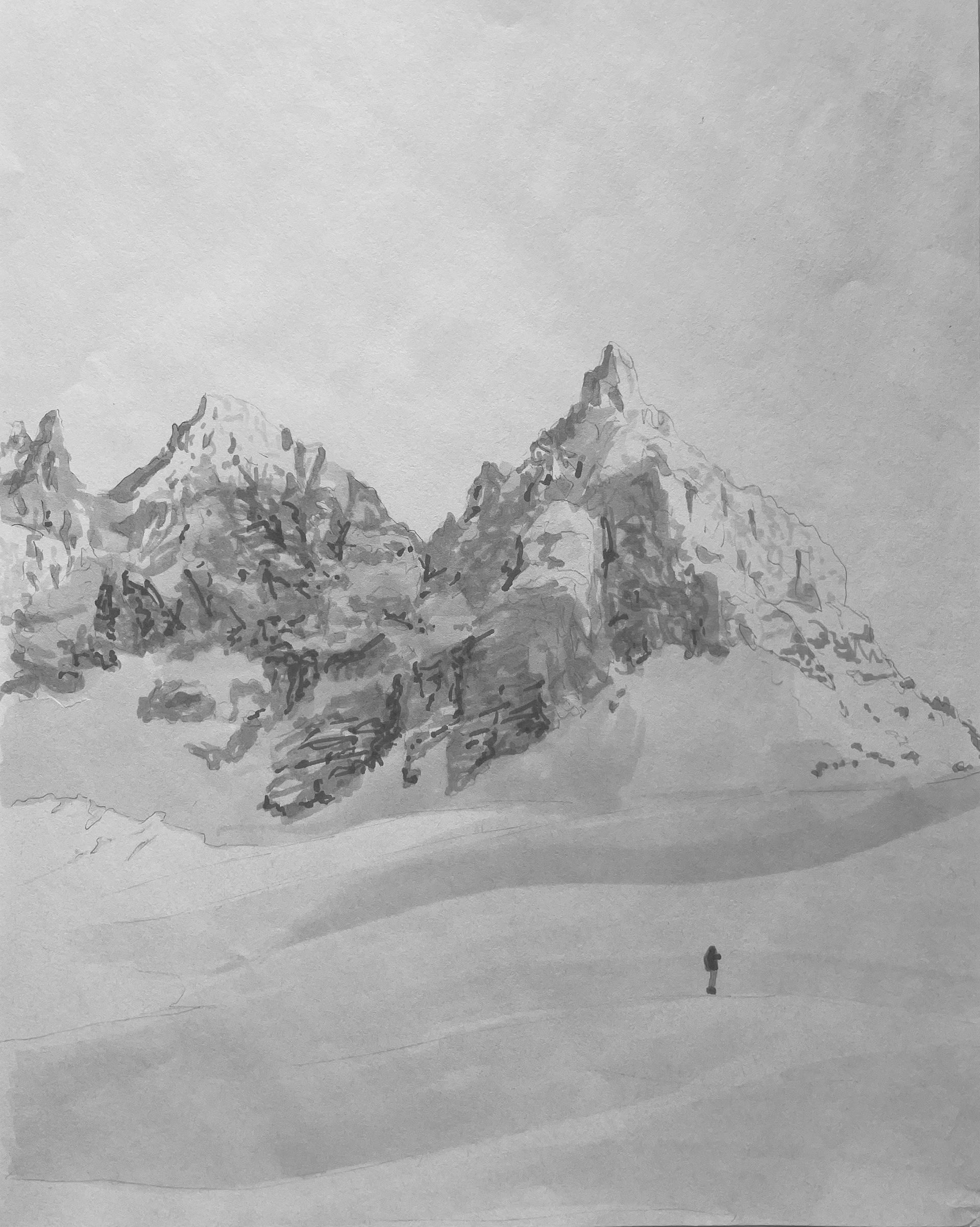
LANDSCAPE
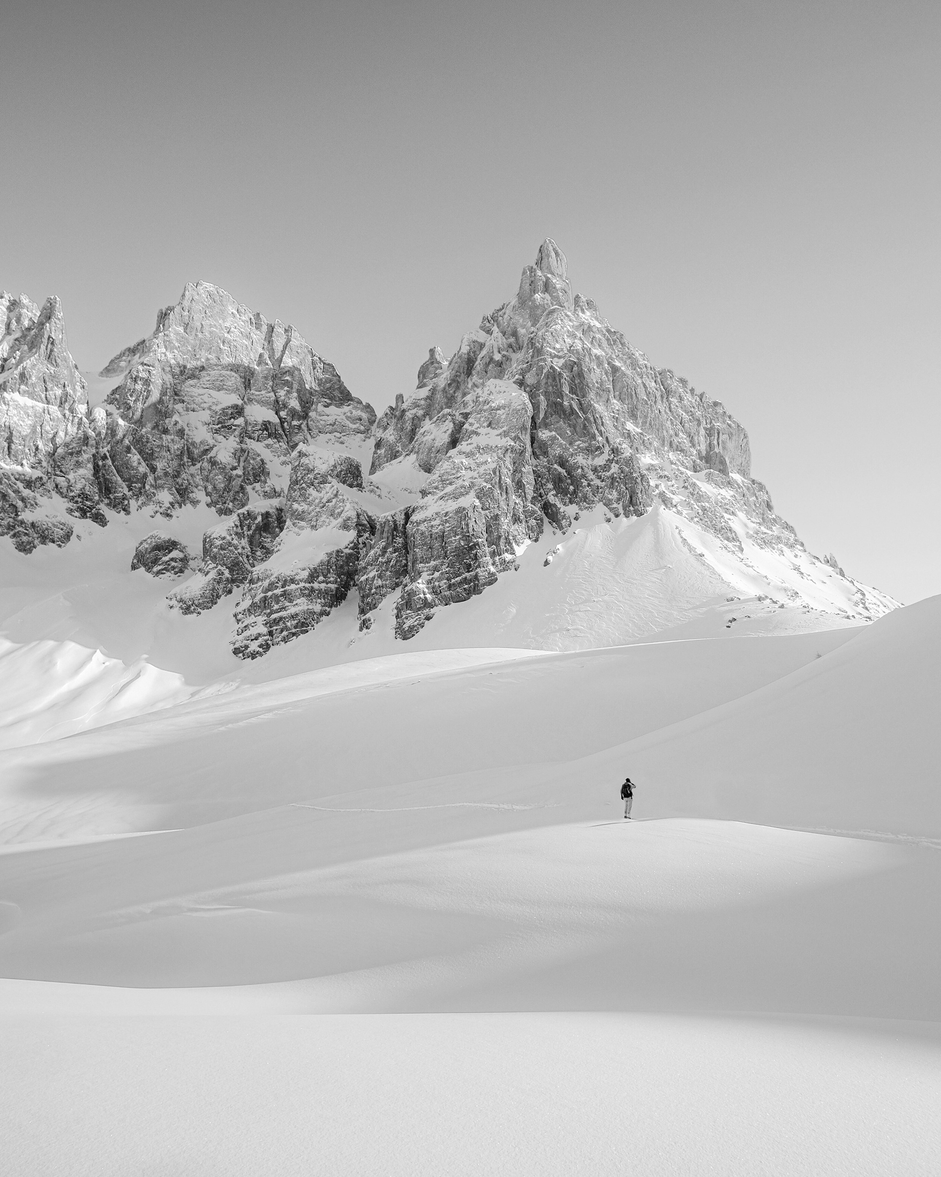

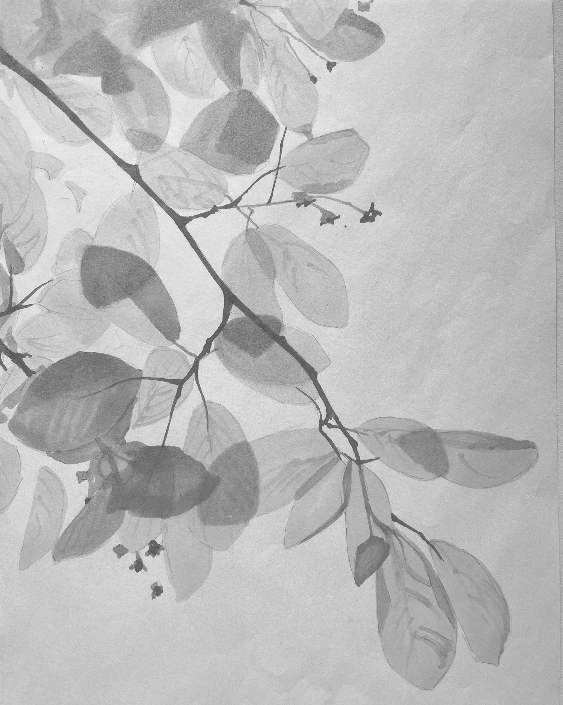
I actually completed a few options for this study. I couldn't decide between plants and different types of scenery. Ultimately I chose to turn in this one because it was a little cleaner than the others.
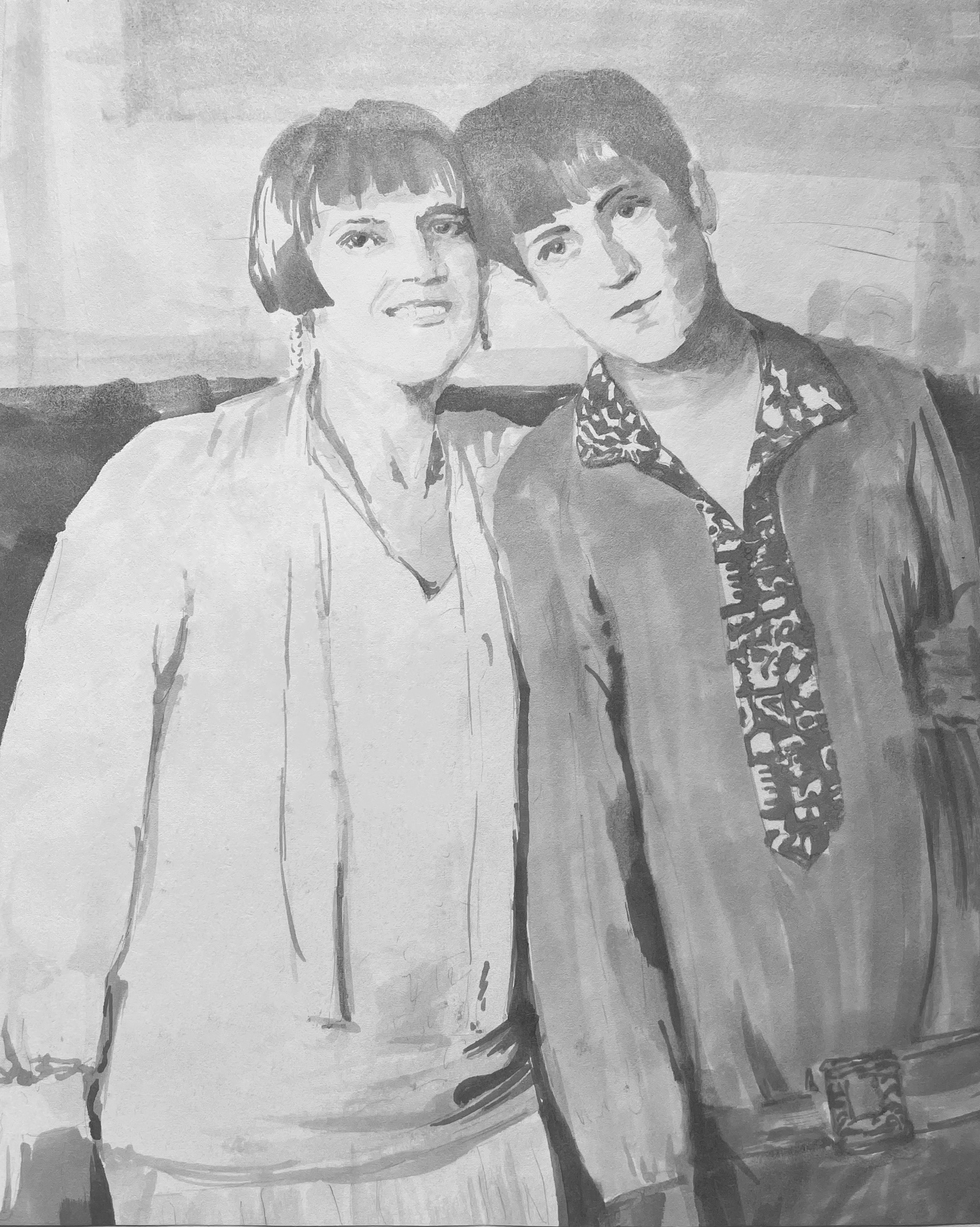
PORTRAIT
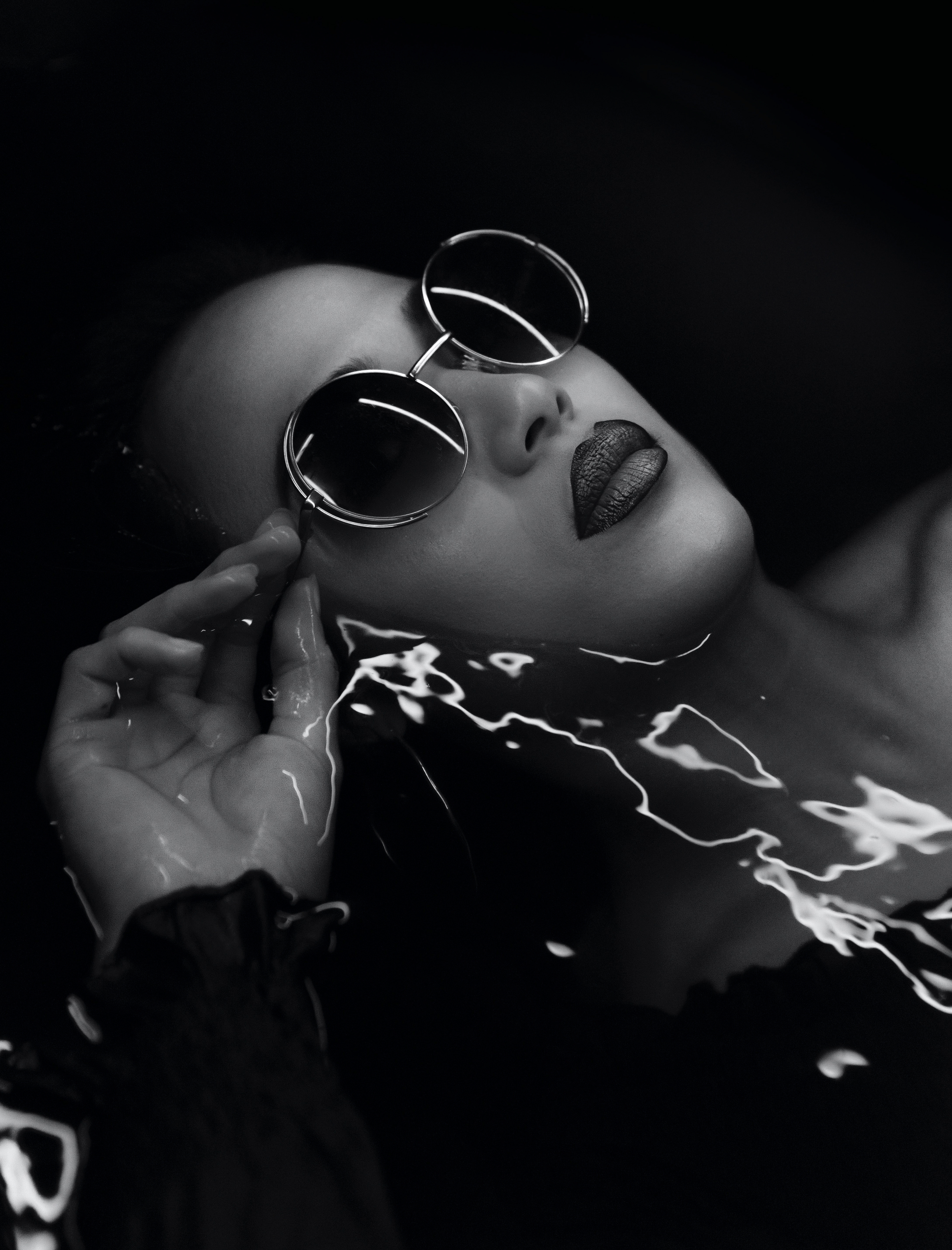
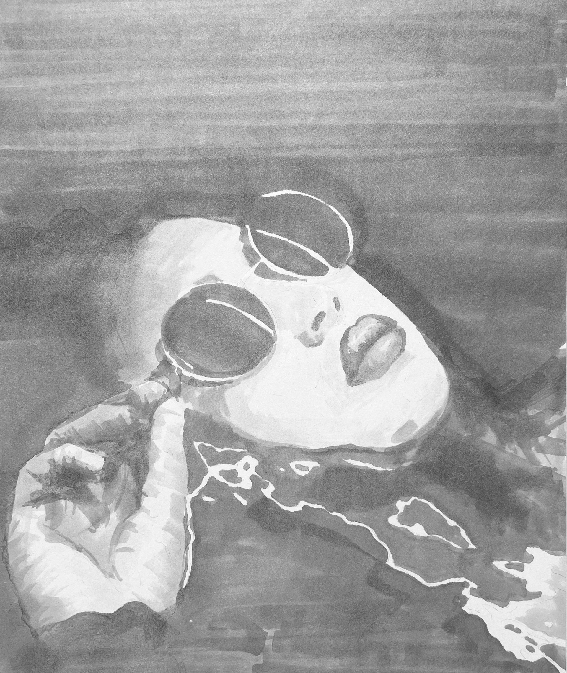
I about had a heart attack completing this one because of the negative space but also because of how delicate portraits can be (and with markers??). But I'm actually okay with how it turned out because I still feel like I kept it really light, despite filling out most of the paper with marker.
This image was near impossible to trace because of how dark it is. I couldn't really see anything through the paper so I had to eyeball the "tracing."
2 WOMEN
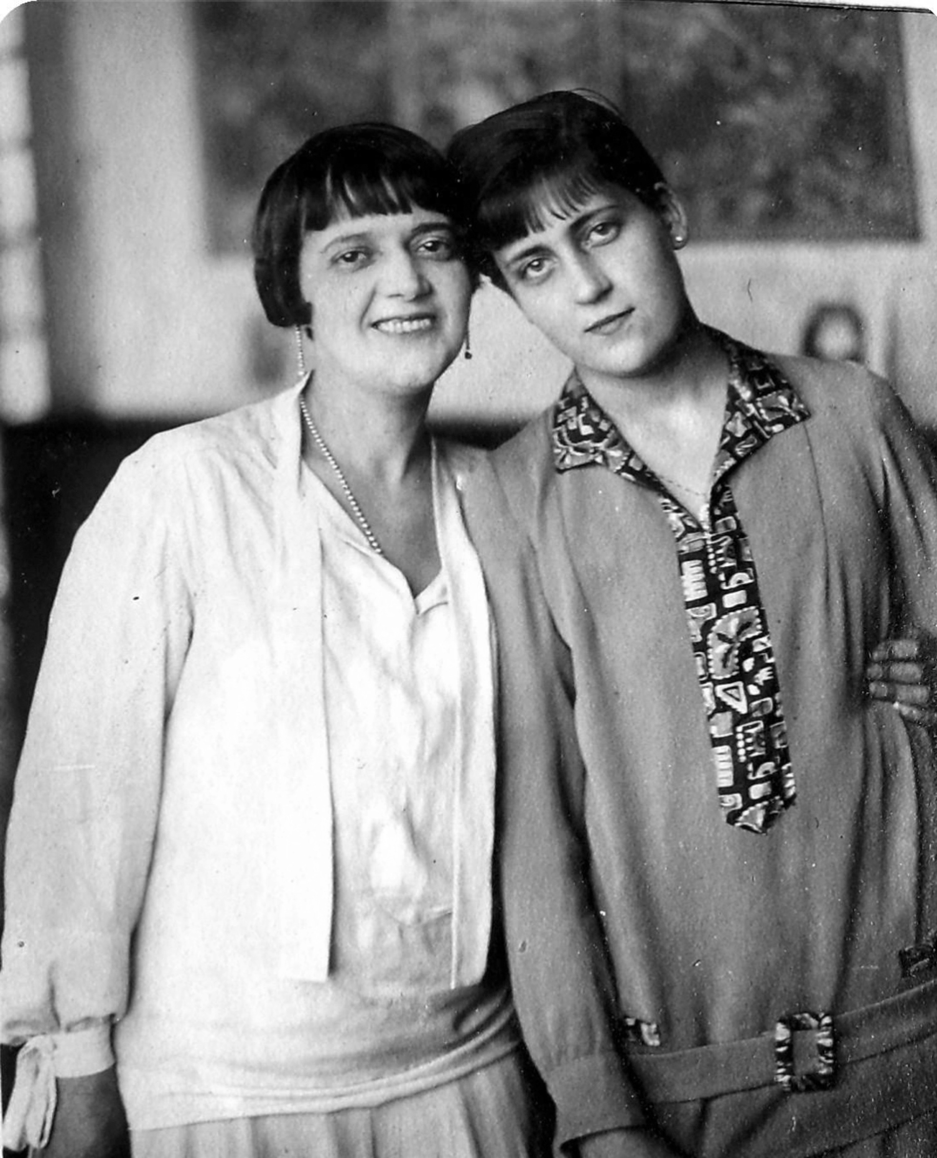

This final image reference was required of all the class. I was dreading it. It's far from perfect, and I regret drawing in the background (or at least coloring it so dark) and the pattern on the dress of woman #2, but I'm glad I was pushed to do it because although challenging, I learned a lot.
I would not have chosen something that ambitious because it's so easy to go wrong and you can't go back once you've made a mark. But I definitely feel like I started figuring out the concept of less is more with this medium. I'm also glad it was the last one so I could practice before.
I wish I had used some of the techniques used in the face and the hair for my previous indications.
Extras
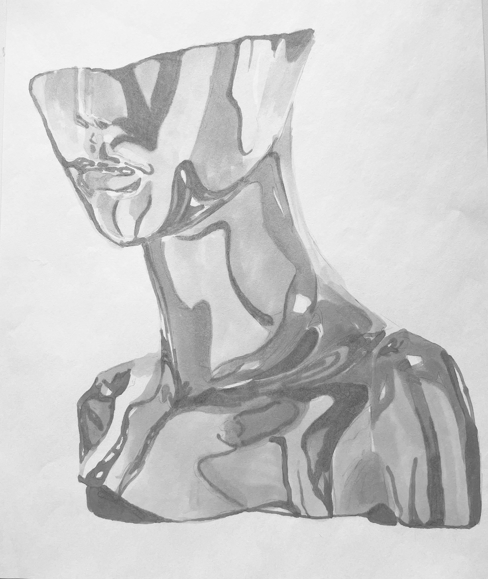
Honorable mentions
