You see: the clean, final image on the left (and multiple versions seen above)
Walk with me through the early rough stages of creating a logo that with no prior experience took me over the course of one month to create.
Ultimately the final symbol ends up communicating the brand through the heart-shaped design (playing on words with the company name "Lovemore") which includes the hidden "LG" inside the heart which stands for "Lovemore Games."
Branding Considerations
There were a few main elements to consider incorporating.
First, it's a game company whose brand is centered around family fun. Colors should be bright but not too young. Type should be playful but not cutesy.
The play on words
Early Ideas/Evolution
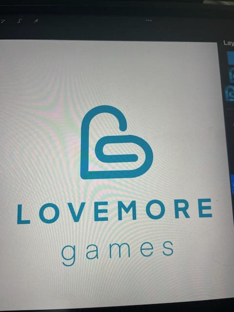
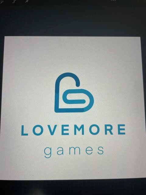

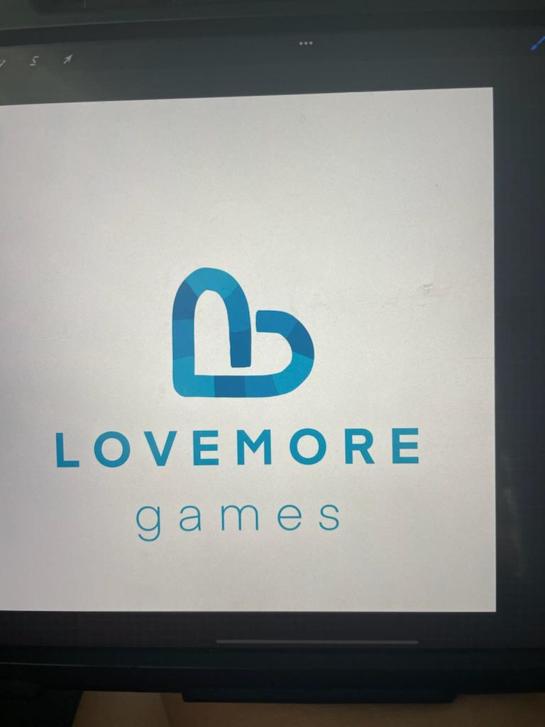
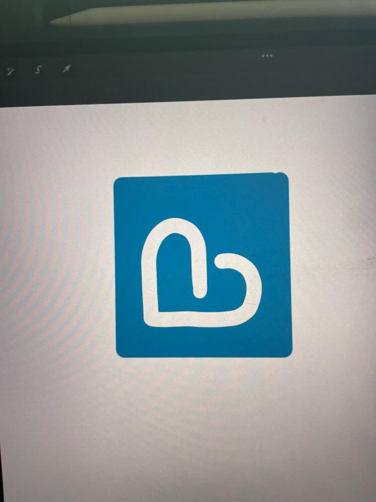
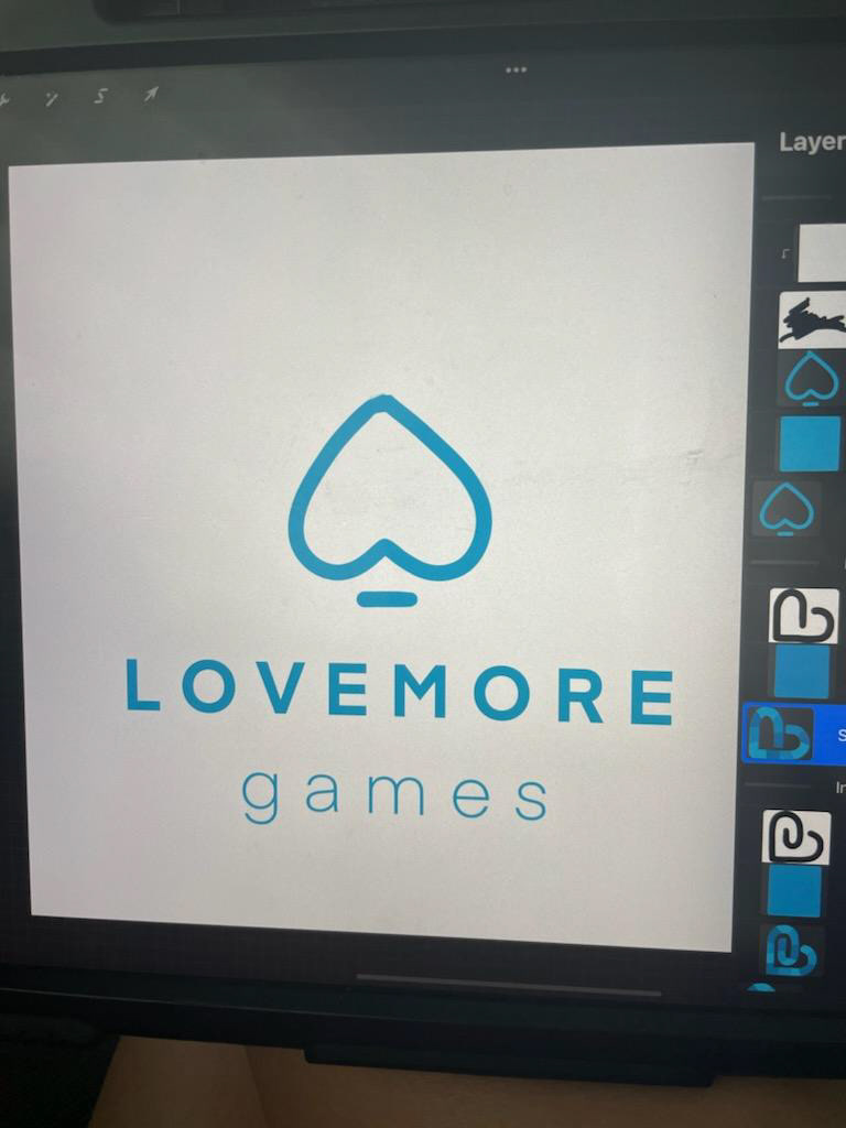
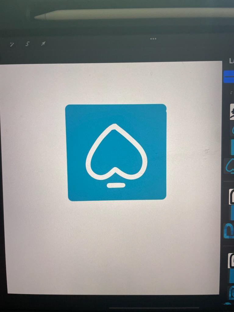
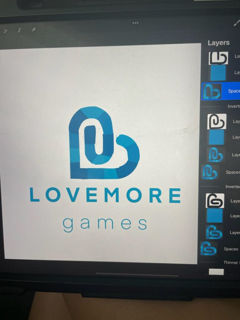
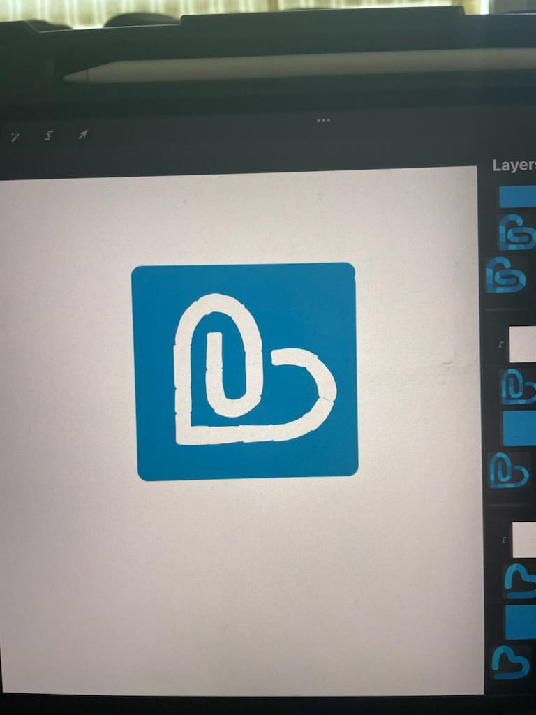
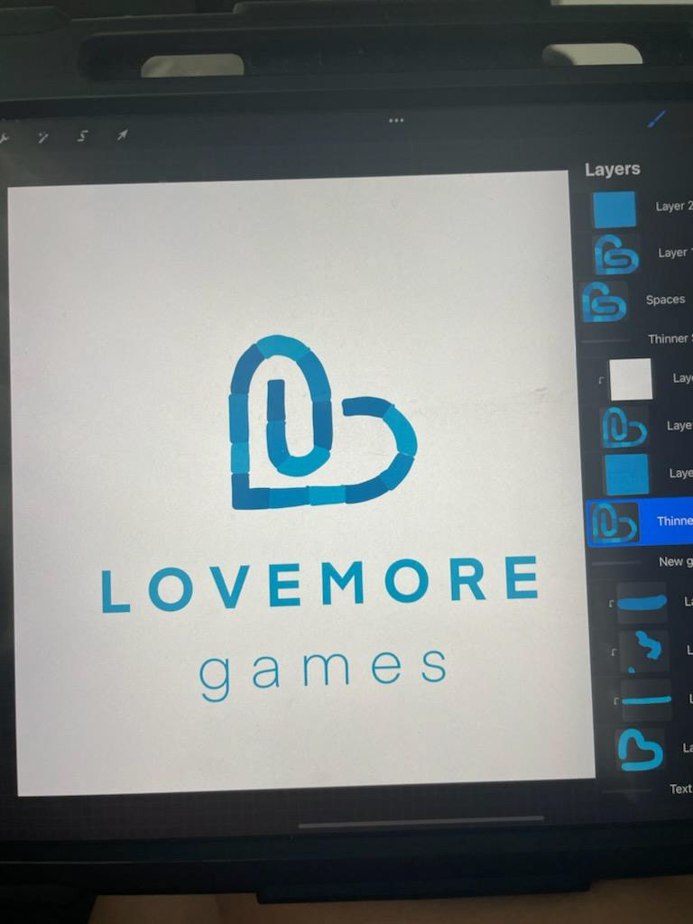
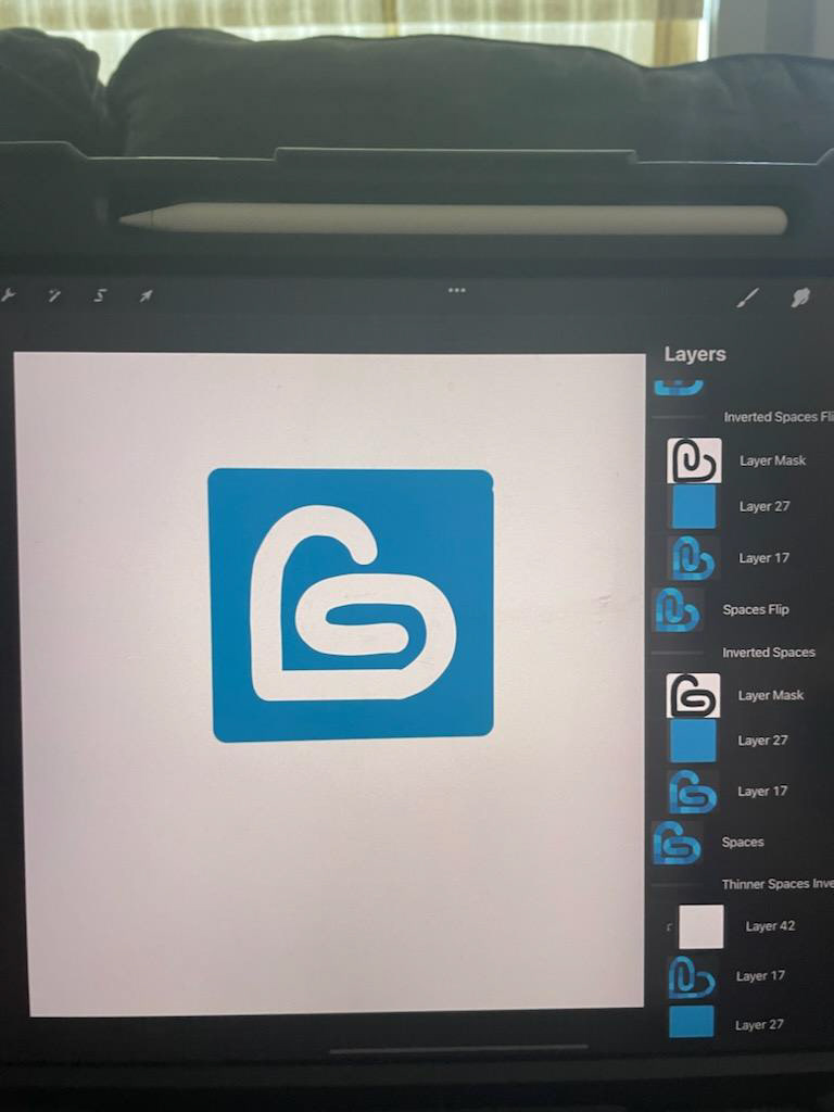
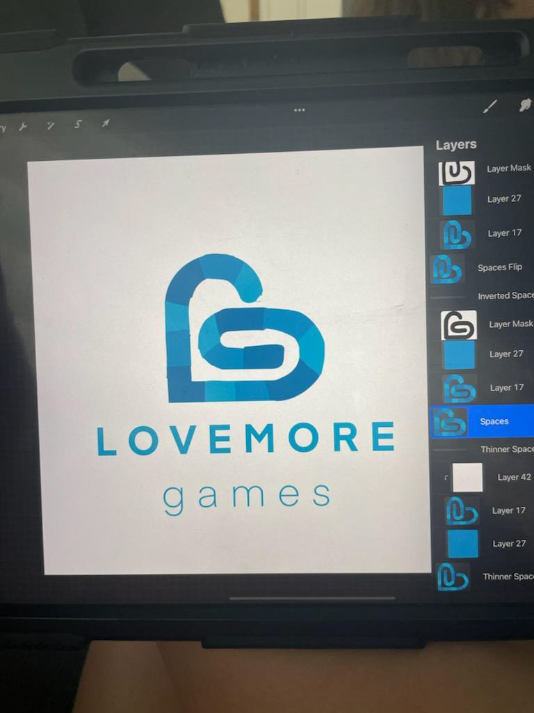
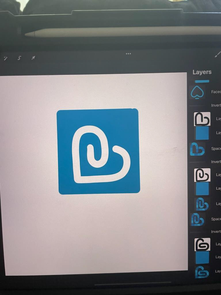
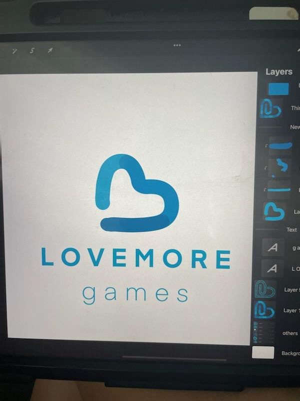
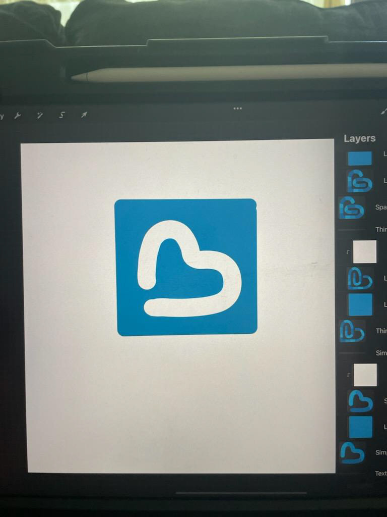
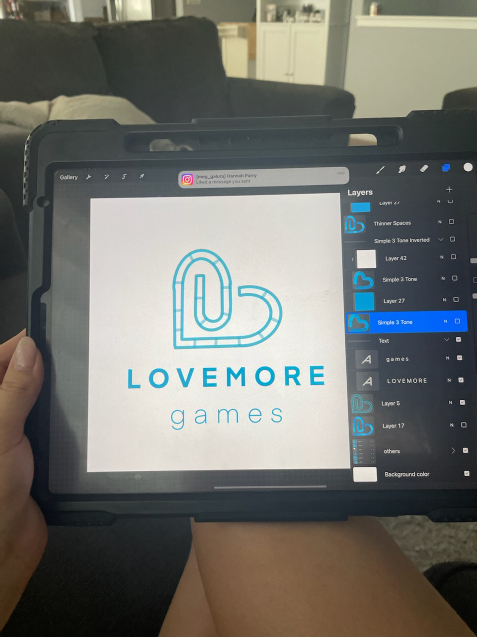

Here you can see how many sketches and thumbnails it took to really flesh this idea out. Each time I felt like I was getting closer and closer, but not there yet. Once I got to the final, I had that feeling of: "This is the one."
