Final Product ➜
Walk through the packaging design process with me!
Create the dieline
Above is a custom box dieline. They may look the same, but the one on the right is slightly smaller as it will be the inside box that the top slides over.
The Magenta is trim lines, Cyan is fold lines, and yellow is the bleed.
Box Design
There is a lot that goes into this box design. I knew I wanted the box to look like an actual waffle, but besides the illustrative aspect, there are several other required elements including:
Front: Company Logo on sides and top, time to play, player amount, ages, Game logo (Top Waffle Calligraphy) on top and all sides.
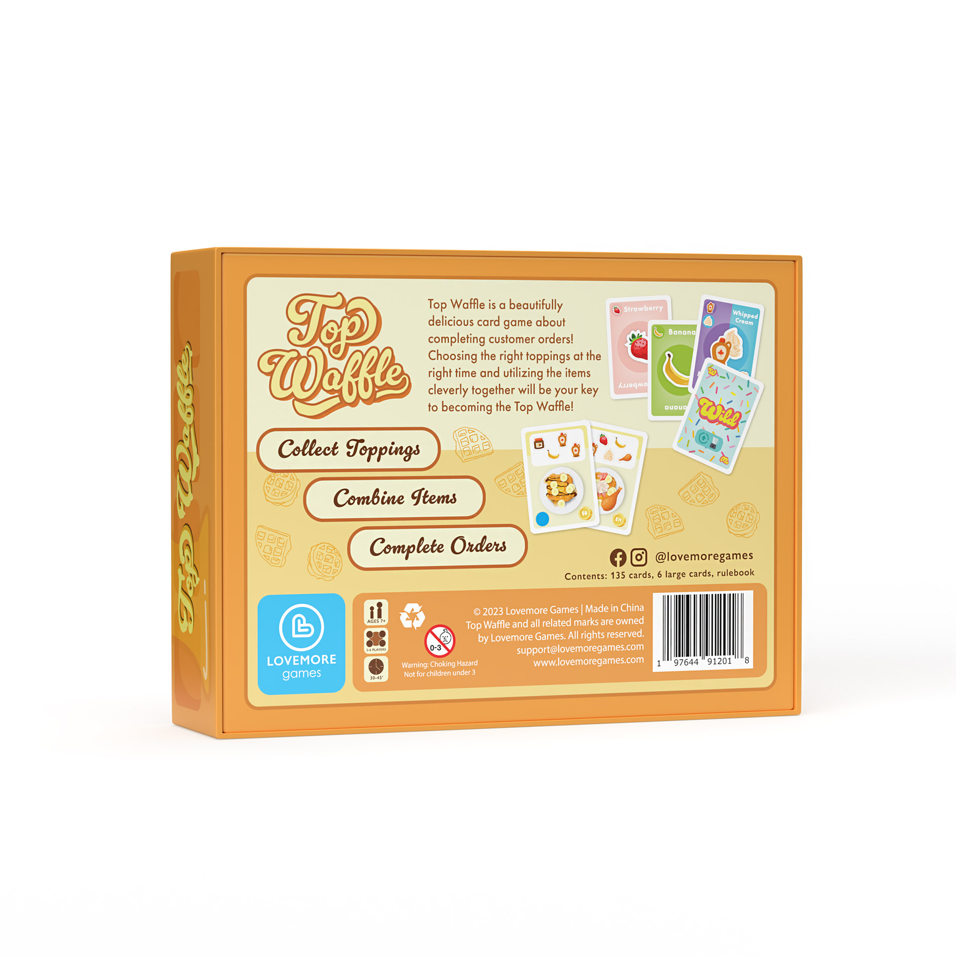
Back: "1, 2, 3" How to play, Game logo, gameplay blurb, card samples, company logo, game specs, recycle symbol, age warning symbol, contents, social media tags, legal info, and barcode.
The back was by far the hardest. It could so easily look cluttered with one wrong move.
Very challenging yet fun experience on the whole!
UV Spot
This effect was so fun to create and turned out as I hoped in the final product. I knew I wanted to make it feel that syrup was dripping down the sides of the box.
The UV spot finish made the area shown in black appear shiny and even has a slightly stickier touch to it which I think is fun for sensory reasons. I knocked out the game logo type instead of just having the UV go over it so that it would kind of pop off of the page and look like it was sitting on top.
The black prints clear obviously, but that is how it needs to be sent to the manufacturer.
Final Product
Yes, we actually sat the box in syrup (it was actually honey because it's brighter and not as runny as syrup)
But check out that UV shine on top!


Digital renderings front and back
