Overview
In the Newspaper Ad Series project, we had to create three similar-looking ads with pre-specified body copy and headlines. We also had to include the logo, an address, and a border. This was a fun and surprisingly challenging project. Overall I'm happy with the organization of it. The overall design isn't my favorite but I learned a lot in the design process.
Research & Brainstorming
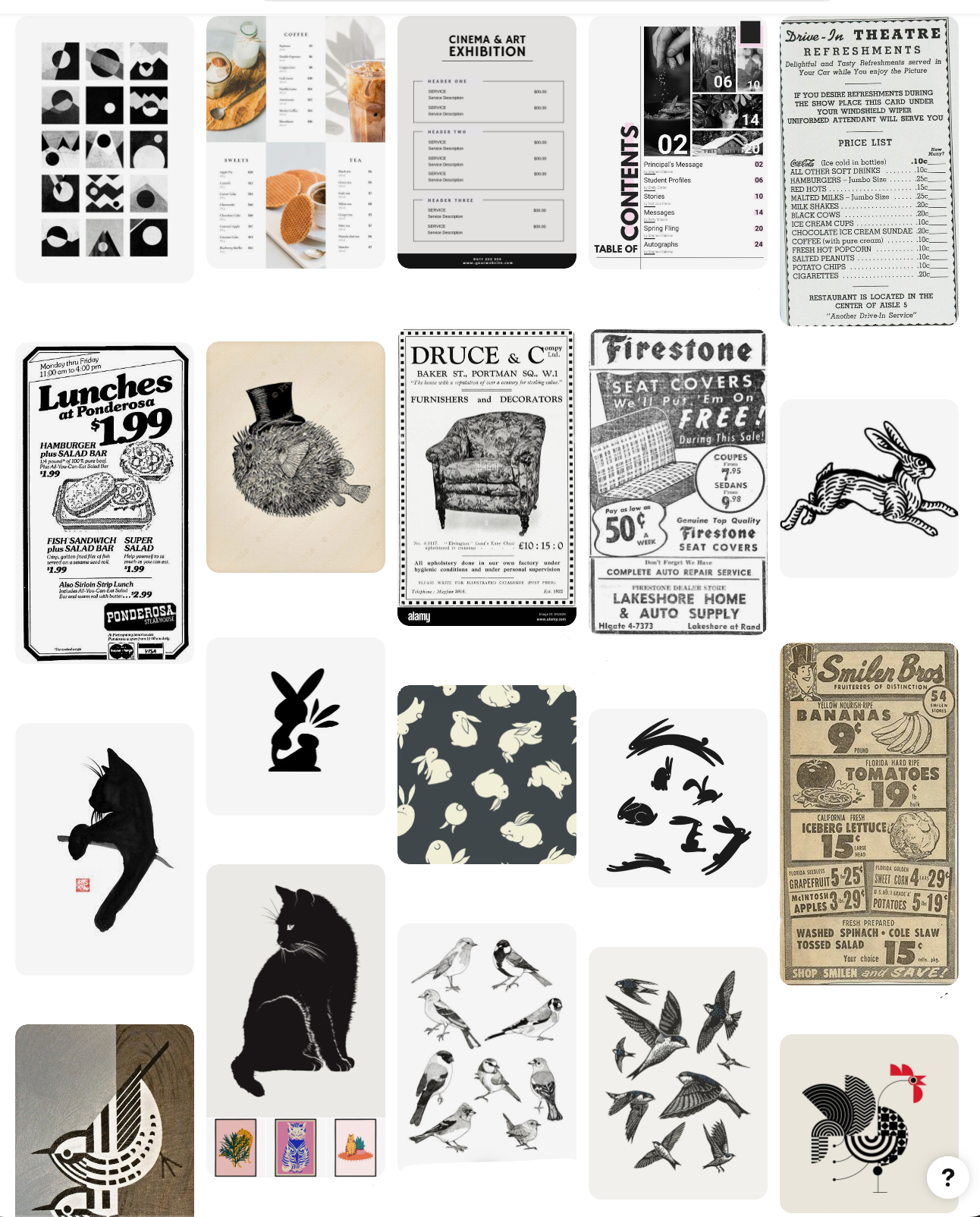


In my research, I spent a lot of time looking at old newspaper ads observing how they use visual hierarchy with lots of elements and only black and white. I also noted how using tints gives an illusion of color.
BRAIN MAPPING
I love this stage because it really shows you visually how many elements you are juggling in a design and helps you break down all your ideas for each aspect.
This is one of my favorite tips I've learned this semester on how to get started on a new design concept.
Sketches & Doodles
At this stage I just let my mind wander and get out on paper a little bit of what I'm visualizing in the brain mapping stage. I love that there is no pressure at this stage.
thumbnails
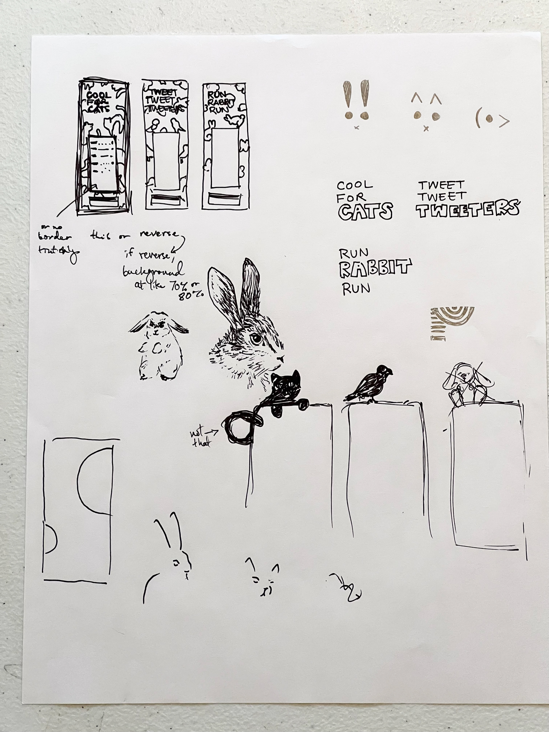
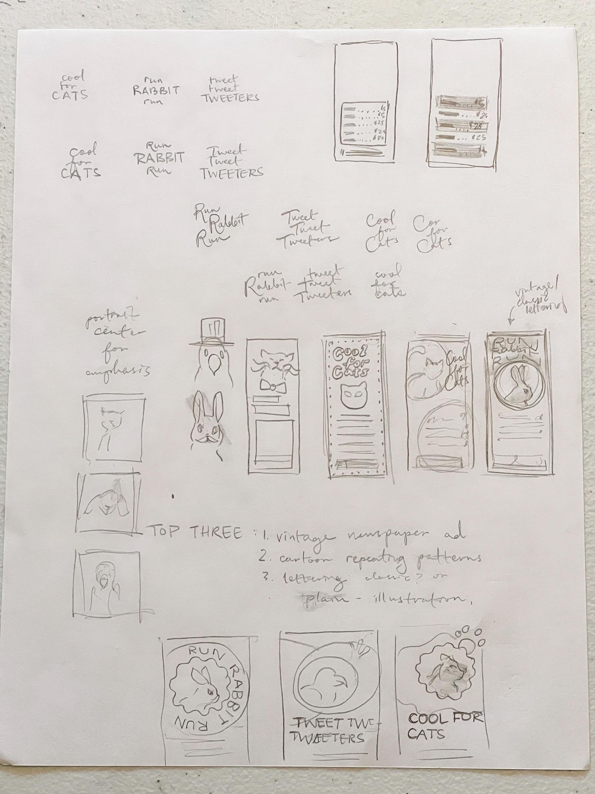
These are my first three initial thumbnails. I had this clear vision of wanting to do some old-fashioned lettering but knew it wasn't practical so I did end up nixing that one.
Then I had another vision in mind for the middle one with the pattern background. I thought I might end up with this one, but then I started creating something totally unique for the third one and really liked where it was going.
In the next stage, I'll refind my top two choices and go from there.
intermediates
This is my intermediate thumbnail for my favorite two out of the three designs. I pretty much kept them the same as my other thumbnails with just minor tweaks.
I really thought I would end up using the thumbnail on the left for my final design choice but I was surprised to pick my second choice.
Final hand
This is my final hand. I had this banner idea for the sale that looked kind of interesting, but I still feel like there are some kinks to work out with it.
There are some spacing issues and it's starting to feel a little busy but at this point I'm ready to try the digital phase.
B&W Computer progressions w/ Markups


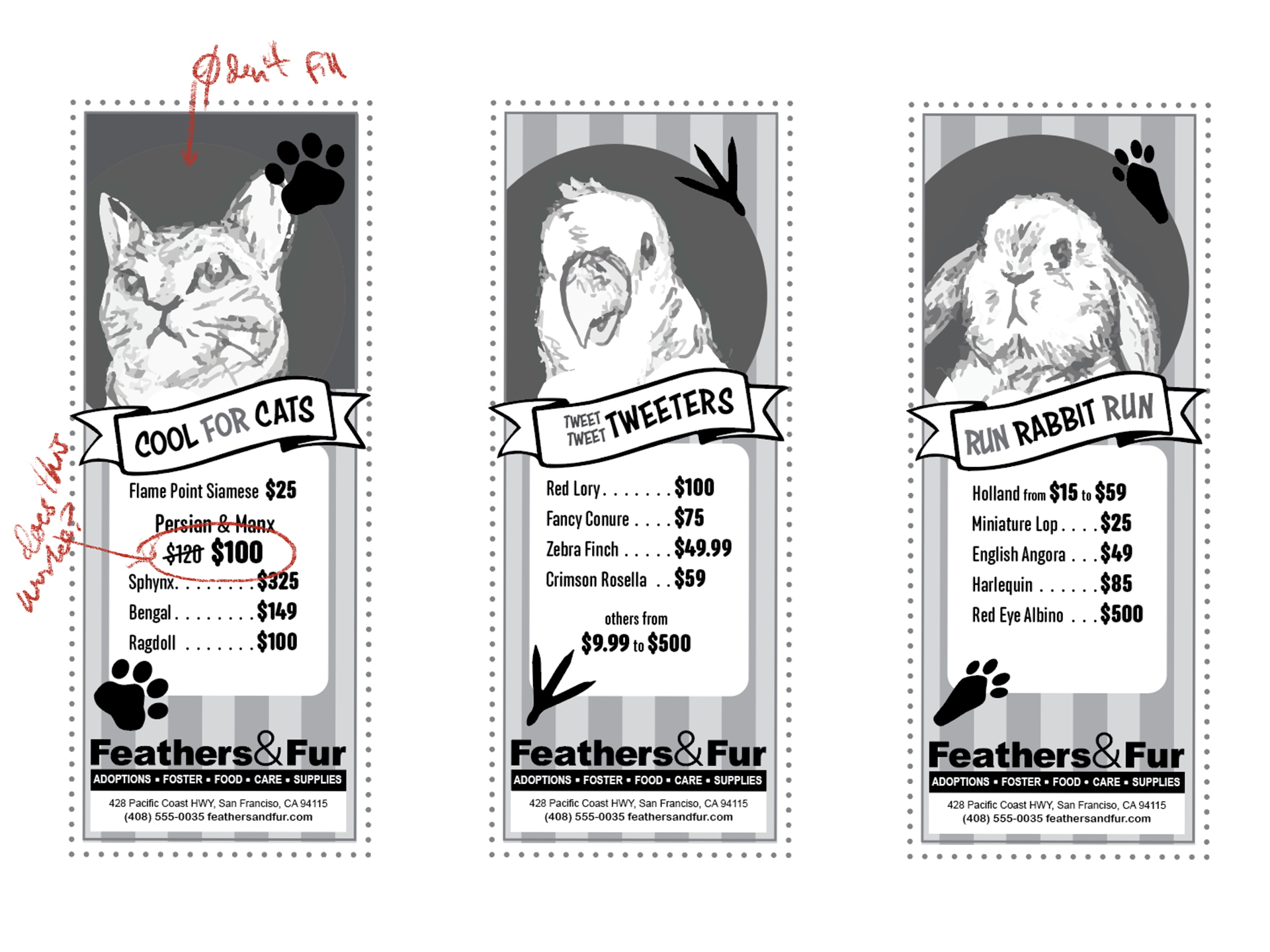
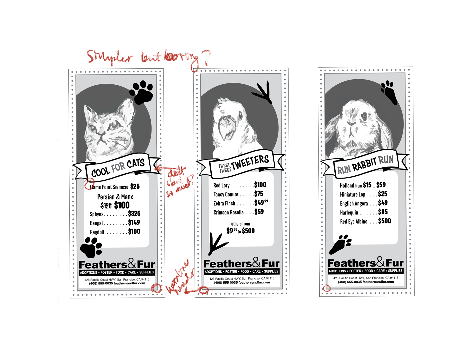
At this point, my design is slowly looking more and more drastically different from my thumbnails. It's not turning out quite how I envisioned and at each reprint, I can see different things that just aren't working even though I want them to. I really wanted to hold on to this idea of the squiggly frame around the animal, but it kept looking like some kind of hat and just didn't work for me. The last thing to go was the stripes but then I wasn't sure if getting rid of them was the right move so I put them back on.
Final Clean digital
Overall, I had a lot of fun. I'm a little bummed that it didn't turn out quite as I hoped, but I think it's legible and the information is organized in a way I'm happy with.
