Overview
For this assignment, we had to create a poster with a quote about education and diversity. It had to be all type, no illustrations or shapes other than type. We also had color samples we had to match as closely as possible.
This was a very challenging project and I learned a lot!
__
Research & Brainstorming
As you can see, my inspiration research was all over the place. I found these images from a variety of sources including books, graphic design websites, a good ol' Google Search, and Pinterest.
I originally was looking for more illustrative type but then found I was really liking just type on it's own.
_______________________
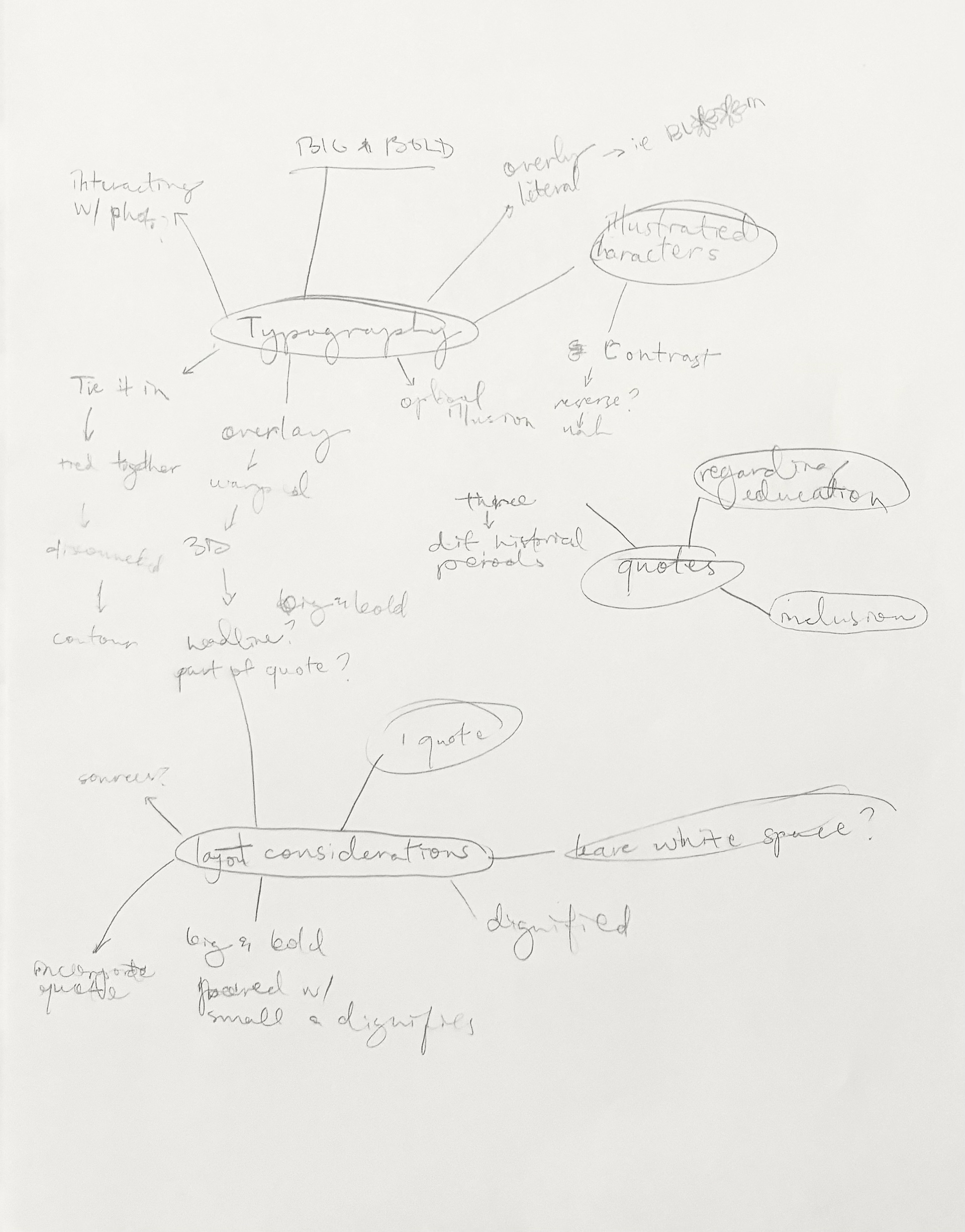
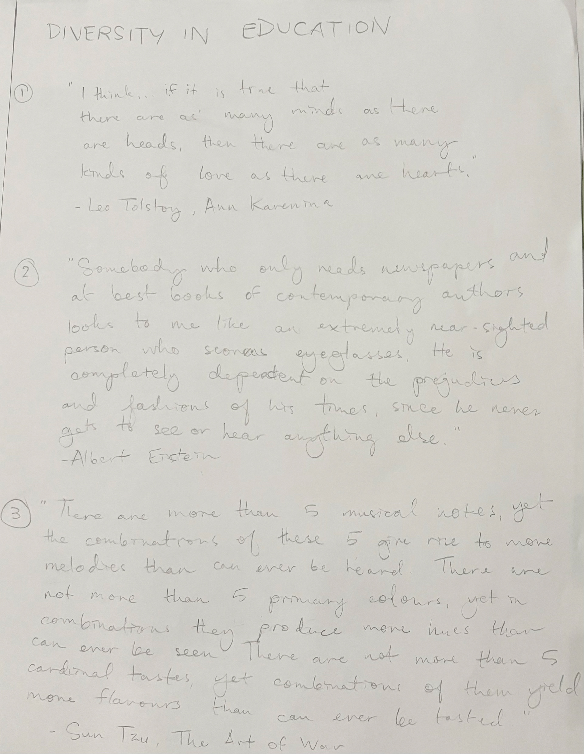
On the left is my brain map and on the right is my original three quotes. I was worried I might have been taking them out of context so I ended up switching gears and interviewing a variety of people around the school including diversity ambassadors, students, and staff. From there I picked three quotes I liked for my 3 thumbnails.
________________________
Sketches & Doodles
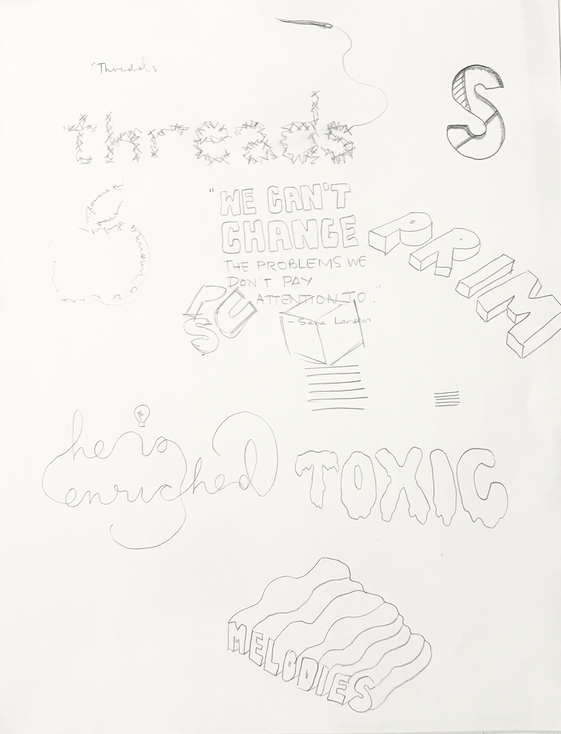
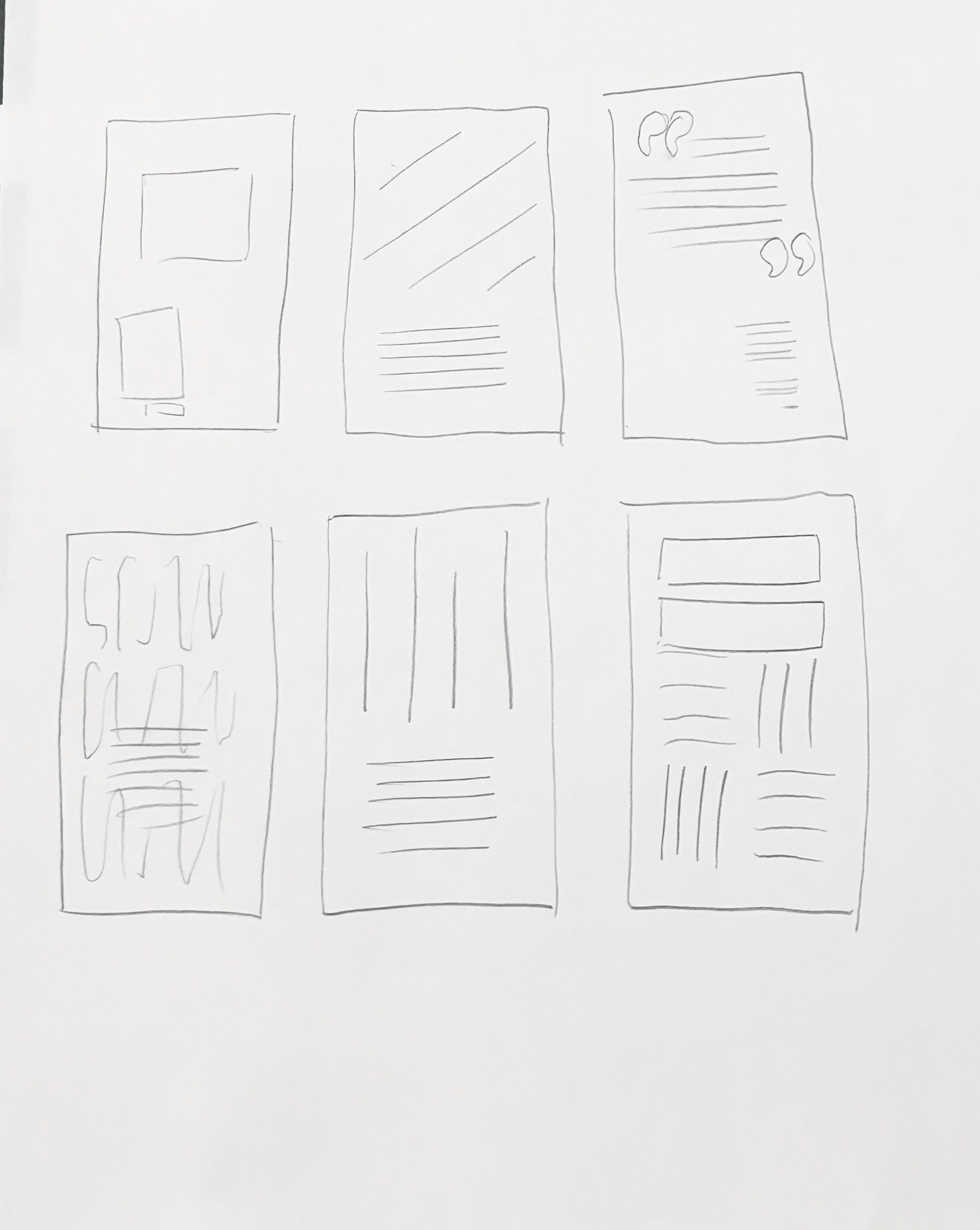
Not too much to see here except that at this point I'm experimenting with some ambitious typography. The second photo is an overall layout. Then I felt ready to move to the next step.
________________________
3 Thumbnails
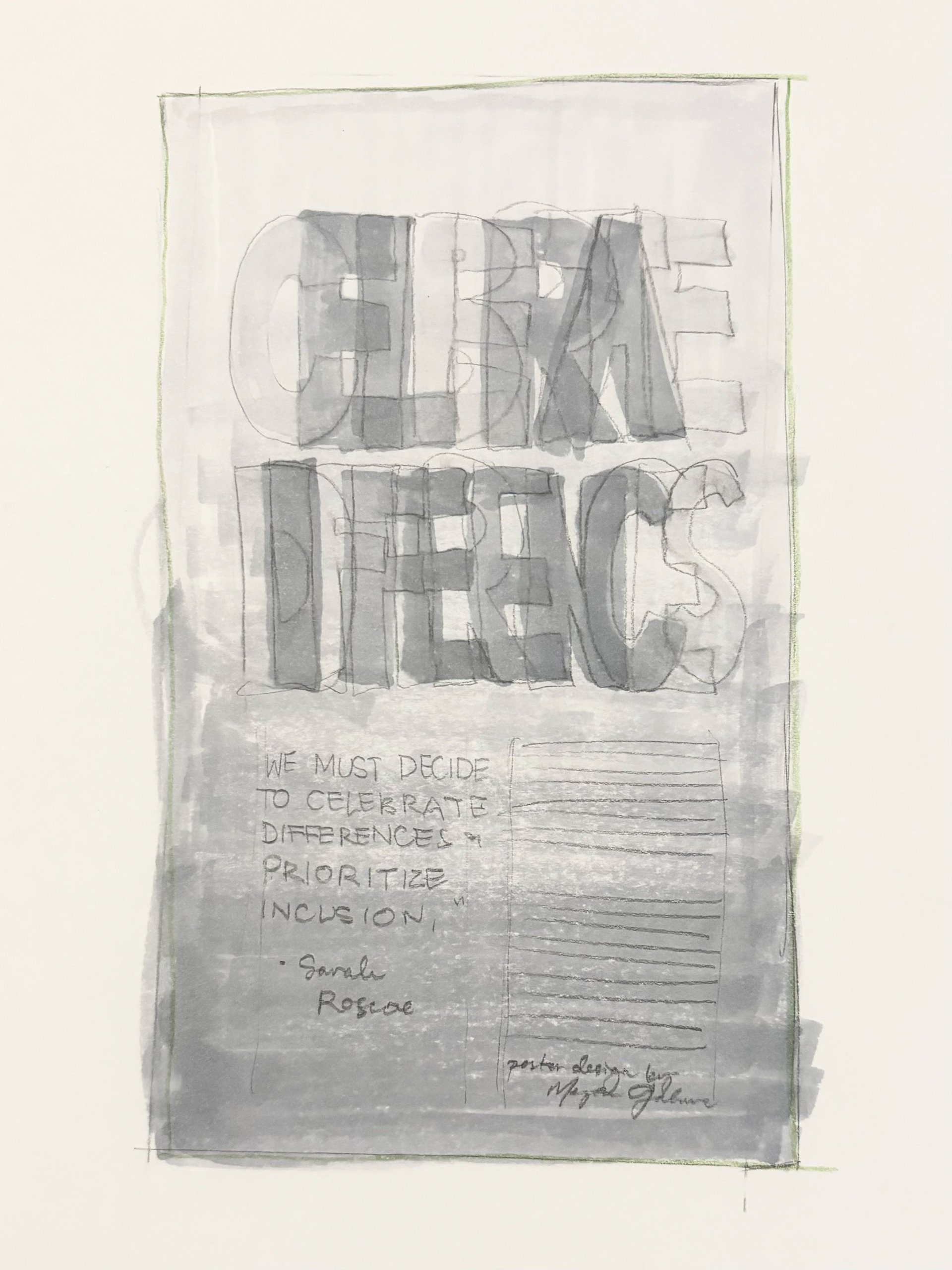
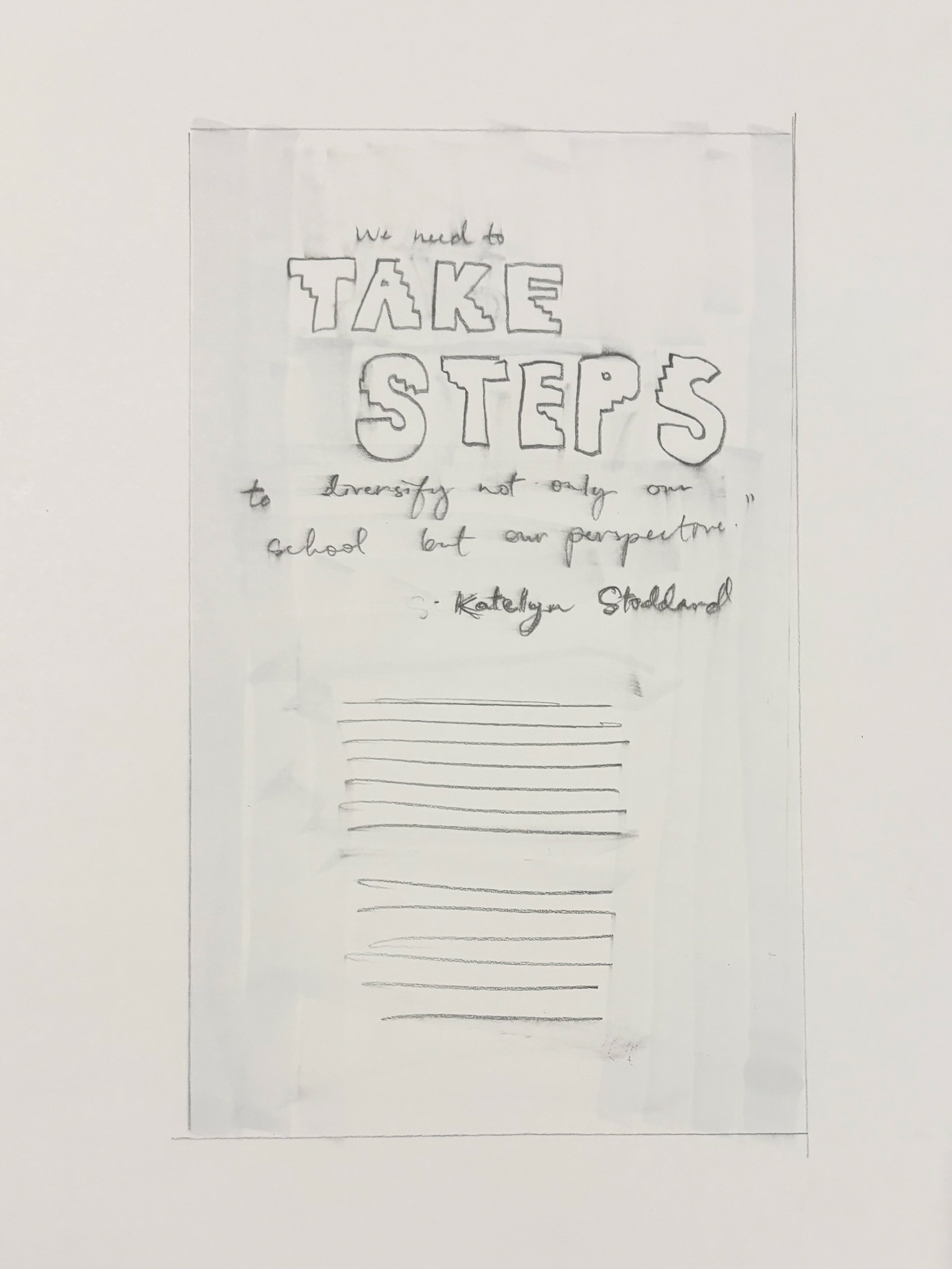
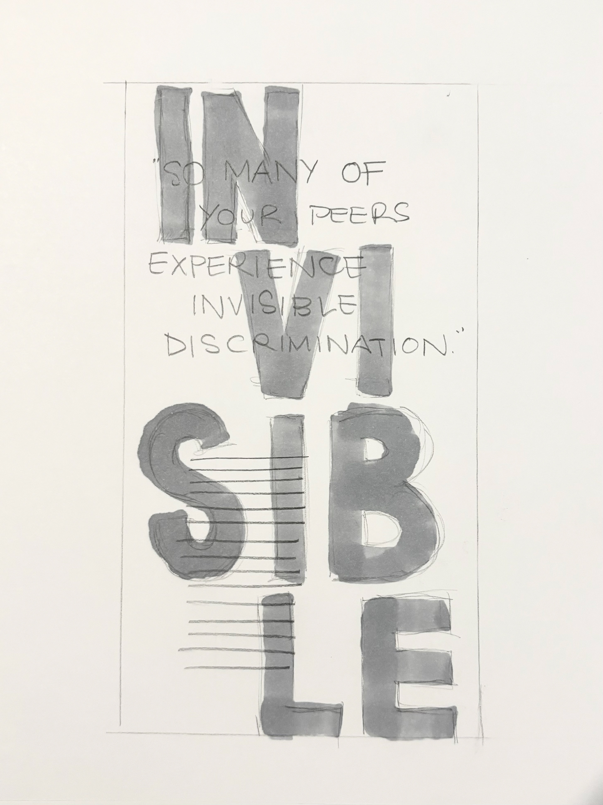
For some reason, I was so intimidated to start thumbnails for this poster design. I felt the pressure of how much space there was to fill and how it needed to be all type. It turned out to not be as scary as I thought and I realized that a poster doesn't necessarily have to be filled with a million things and you can use white space to your advantage because you can go so big with your type and still have legibility and lots of room.
________________________
2 Thumbnails
These are my two picks out of my 3 original thumbnails. I made the "take steps" a little more 3 dimensional and illustrated, but oddly enough I'm really leaning toward the simplicity of the second one.
________________________
1 Final Hand Comp
Of course, I end up going with the one I thought I would like the least. That always happens, doesn't it?
I made a mistake in this one where I put a box around the body text since it's supposed to be only type. But you know what? It didn't even need it.
Overall at this point I'm feeling shy about how simple it is but I'm hoping it will look nice and clean like I think it will when I'm done. Ready to move to the computer now!
________________________
B&W COMPUTER PROGRESSIONS
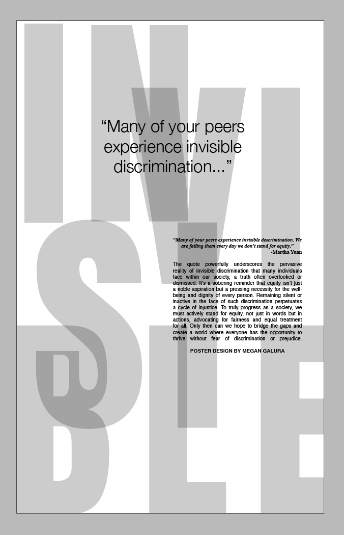
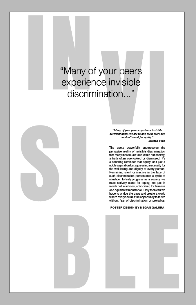
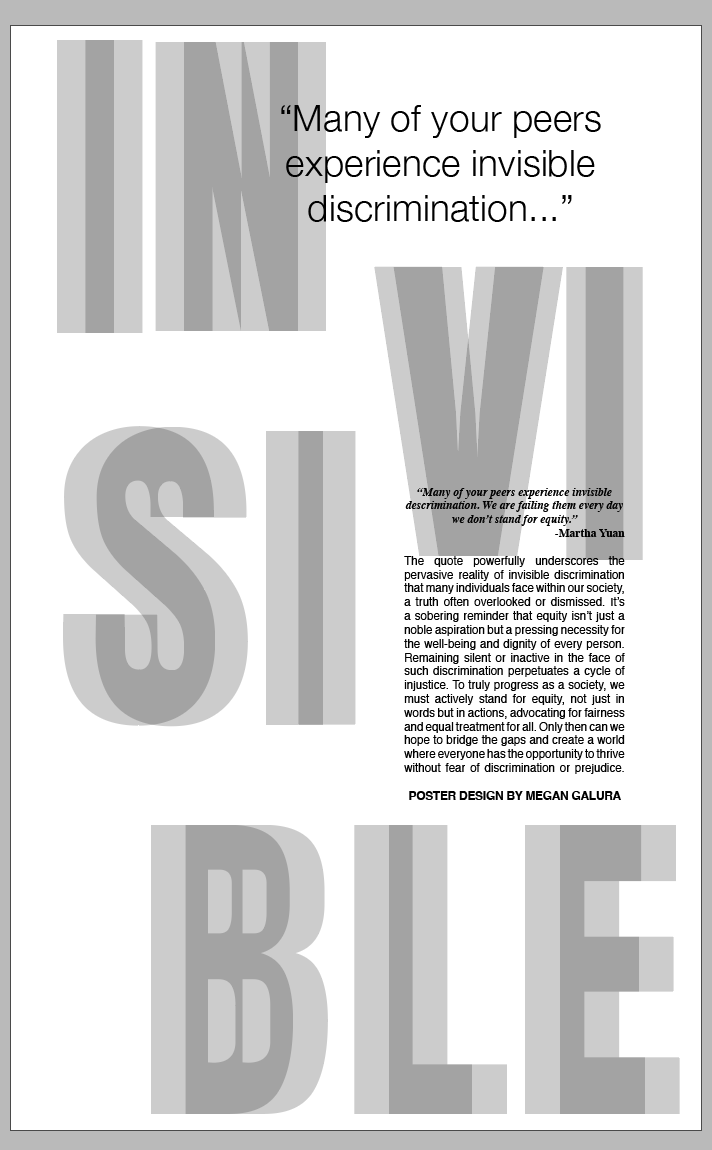
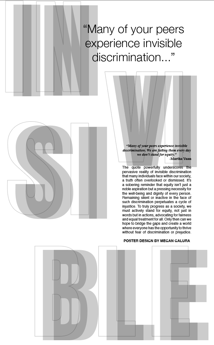
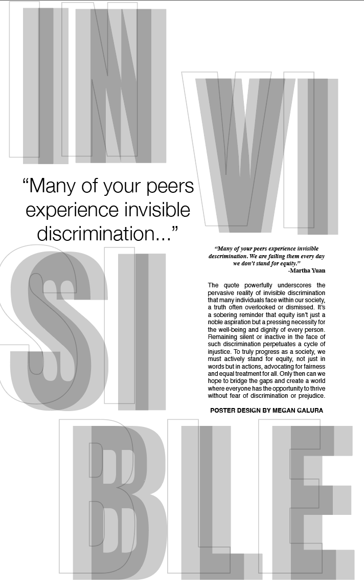
Above you will see the progessions of my digital design in black and white. Looking at them now, I feel like I'm still not quite there.
_______________________
Color Studies & Mini Applications
This is a photo of the color swatches I was given to match. We have to use these colors and pick a fifth one of our own. I'm not going to lie, I was really excited to get these colors.
Now the hard part: matching the color.
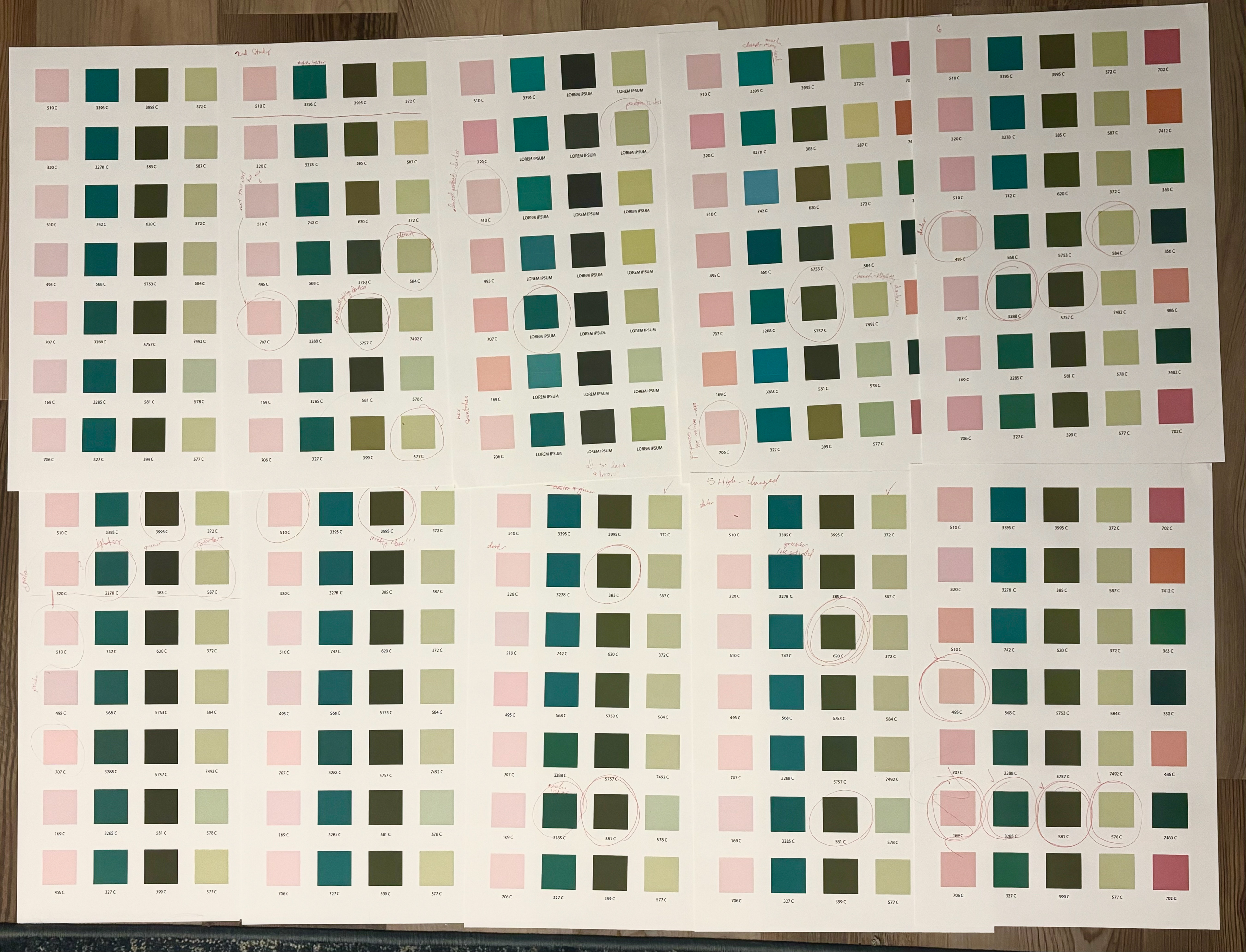

Nailed it the first time! Just kidding.
On the left is the photo of 10 of my printed applications. On the right is the digital screenshot once I started getting close. Honestly I kind of enjoyed this. Don't tell anyone.
__________________
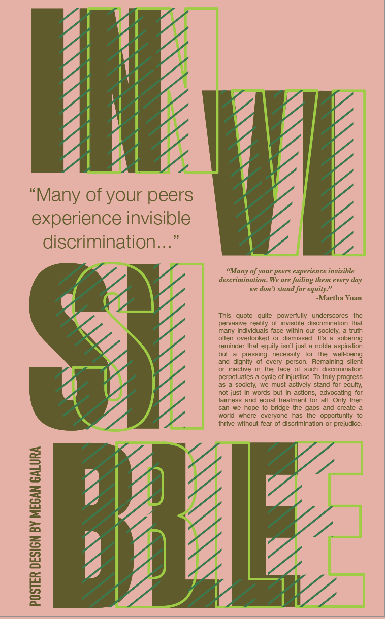
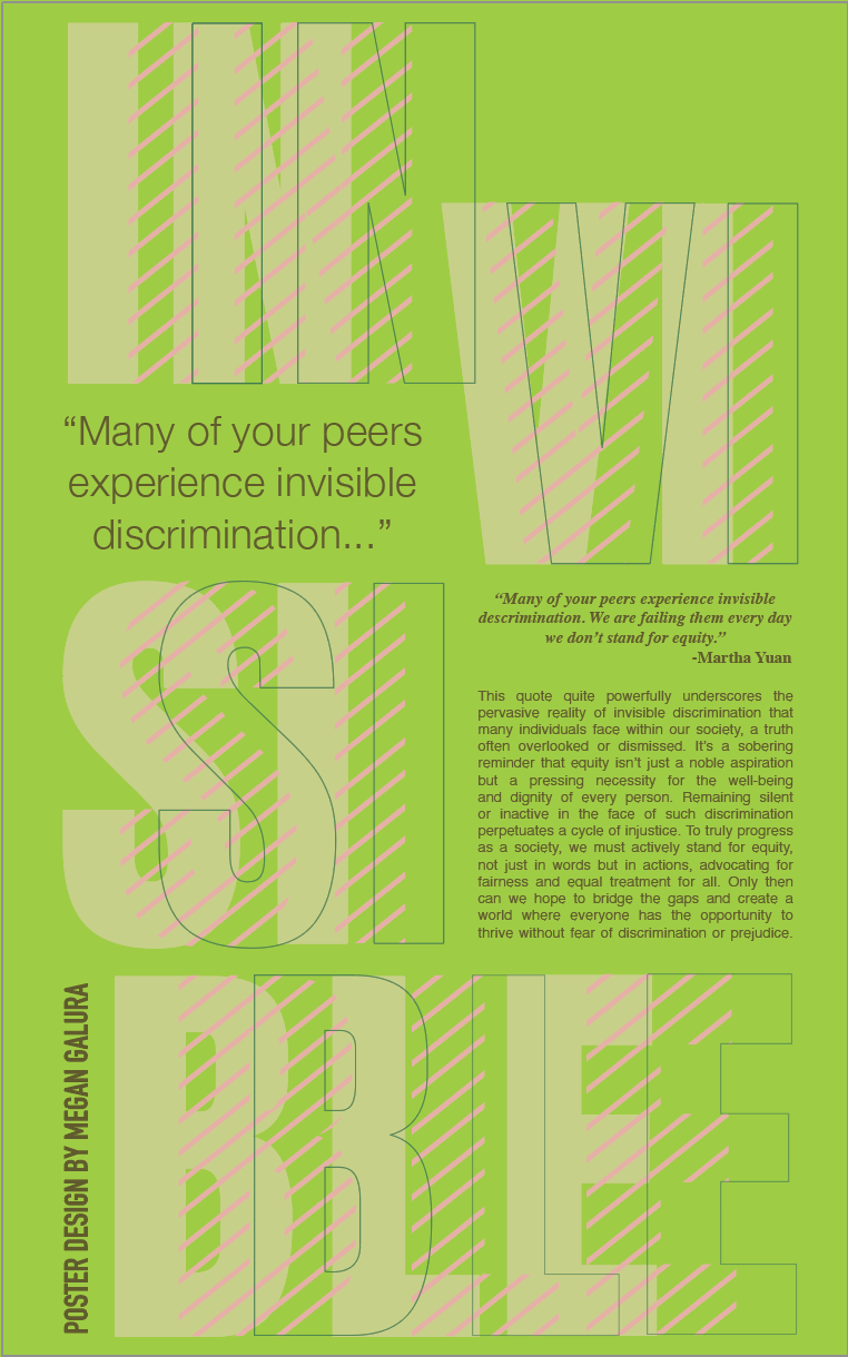
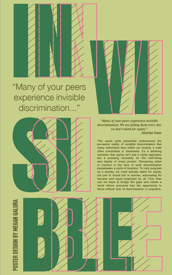
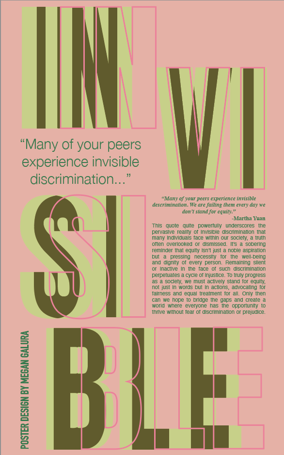
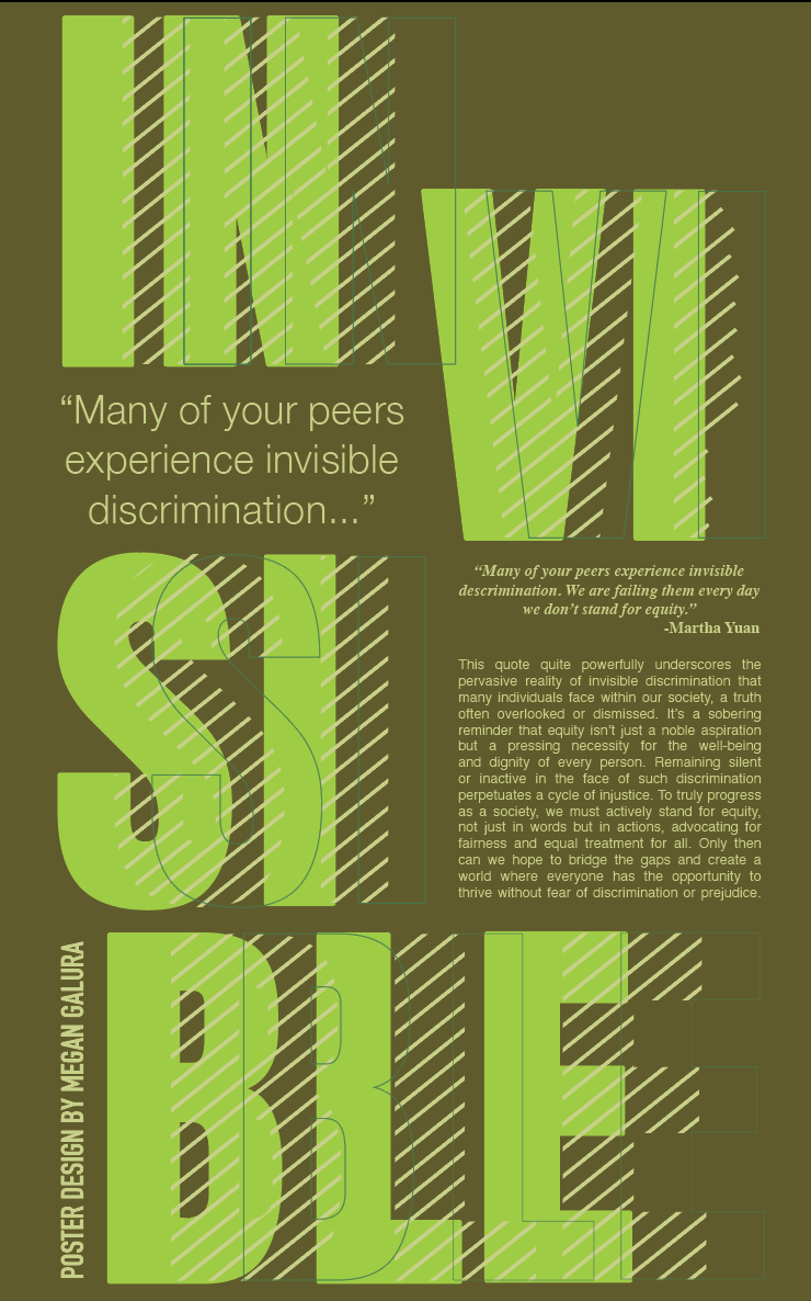
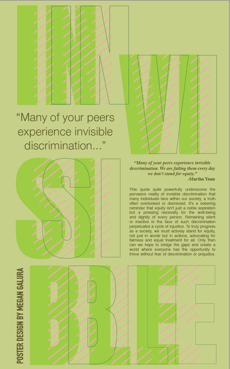
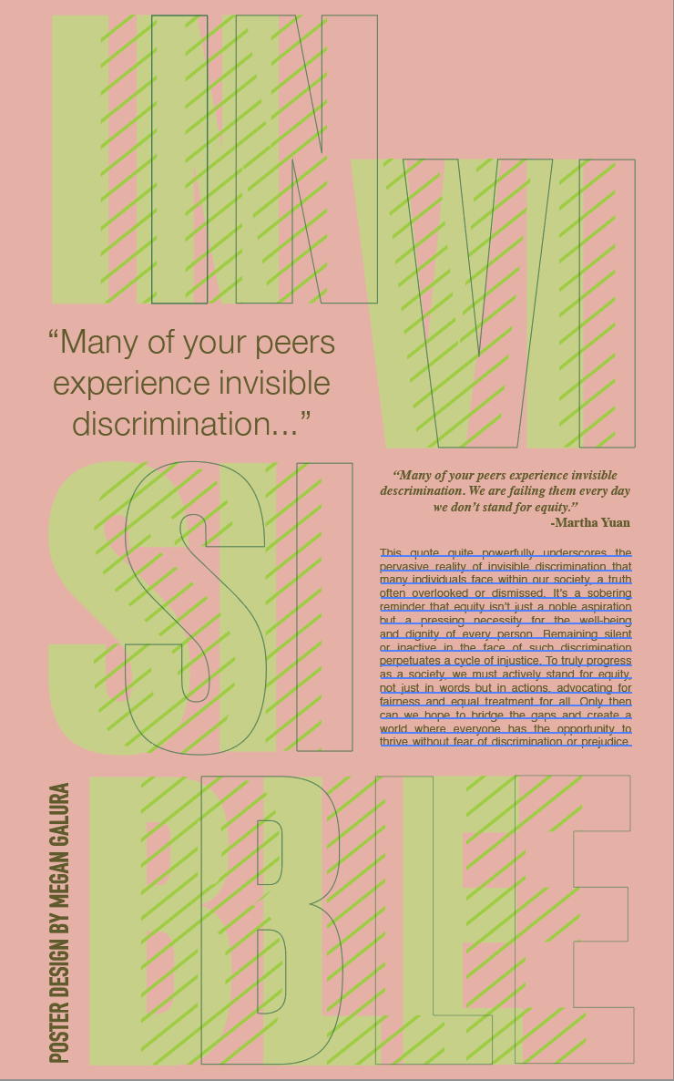
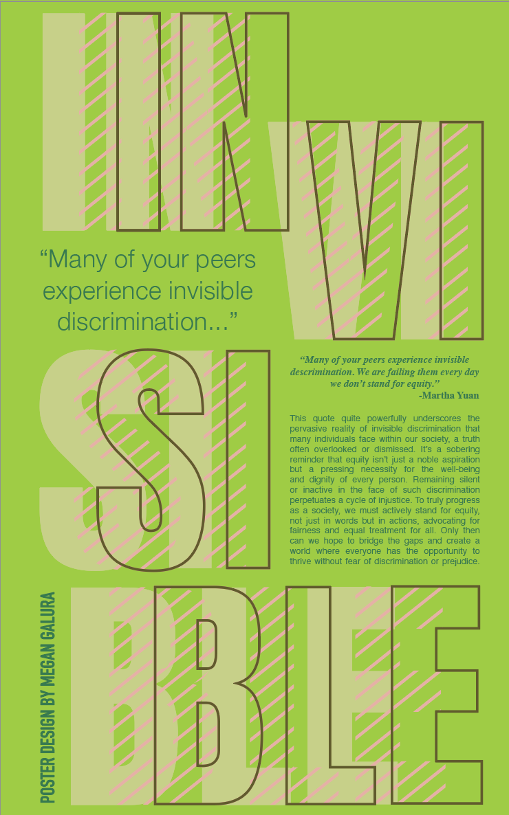
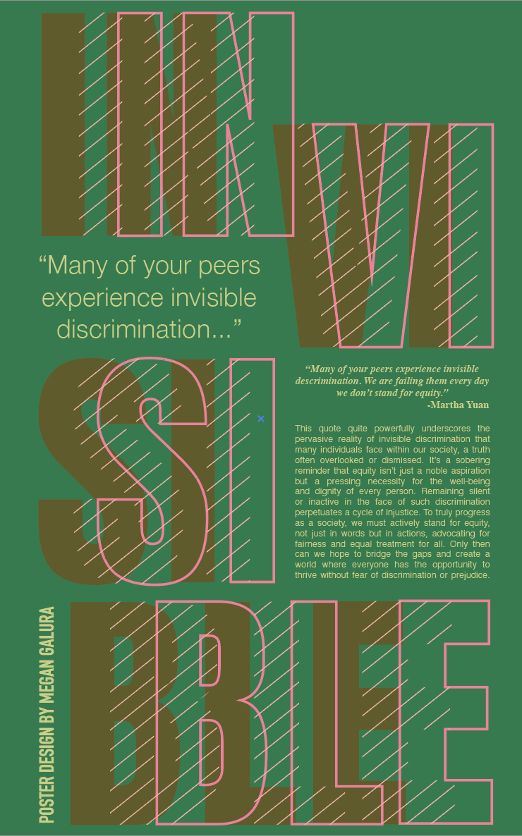
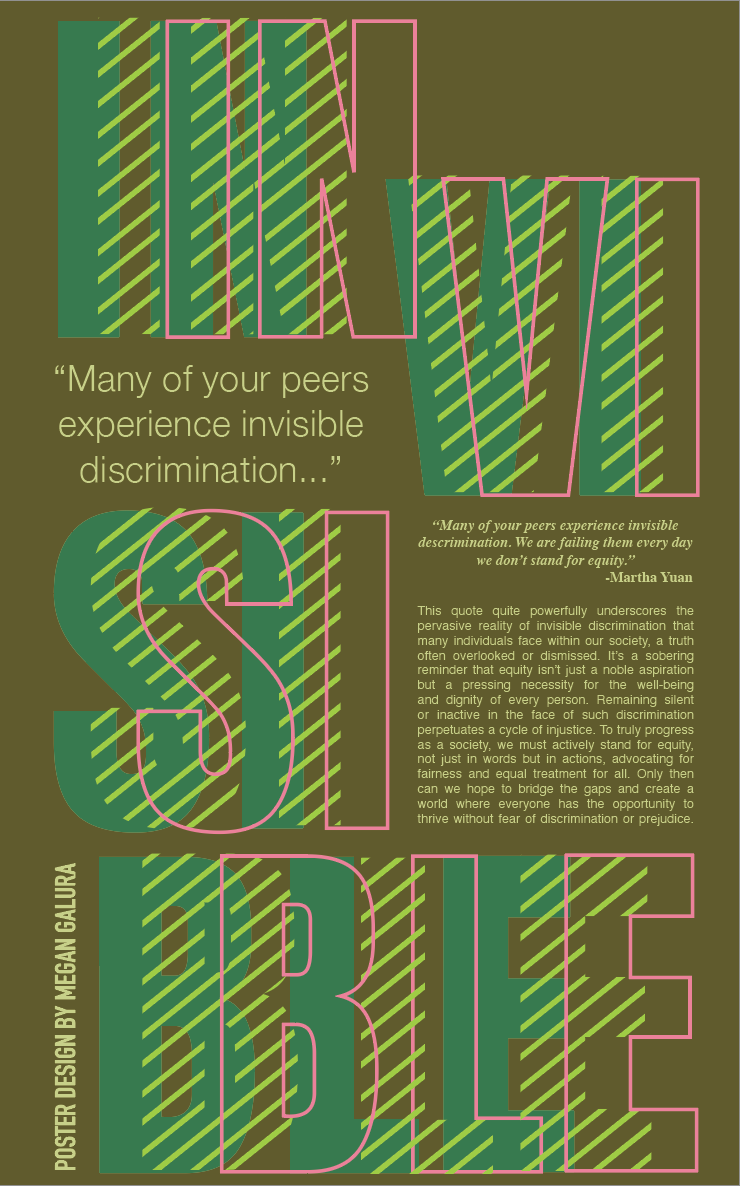
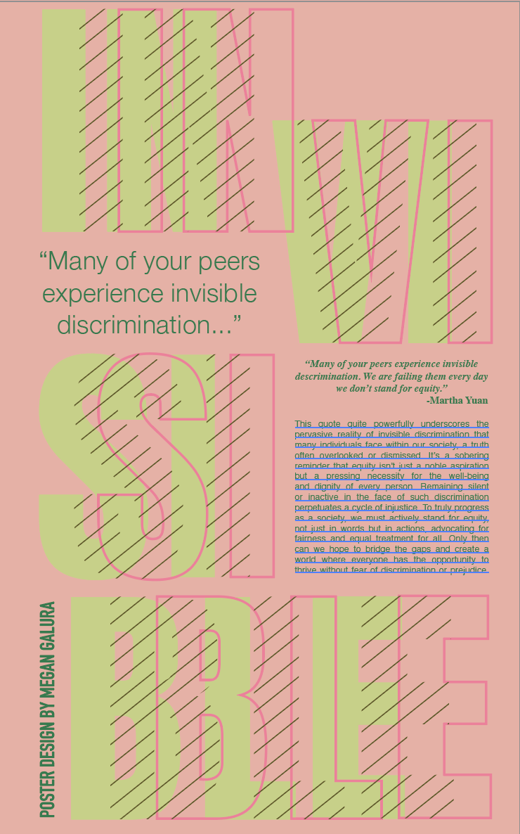
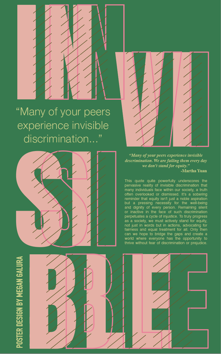
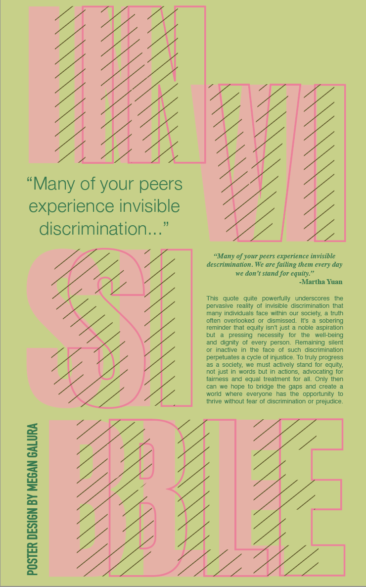
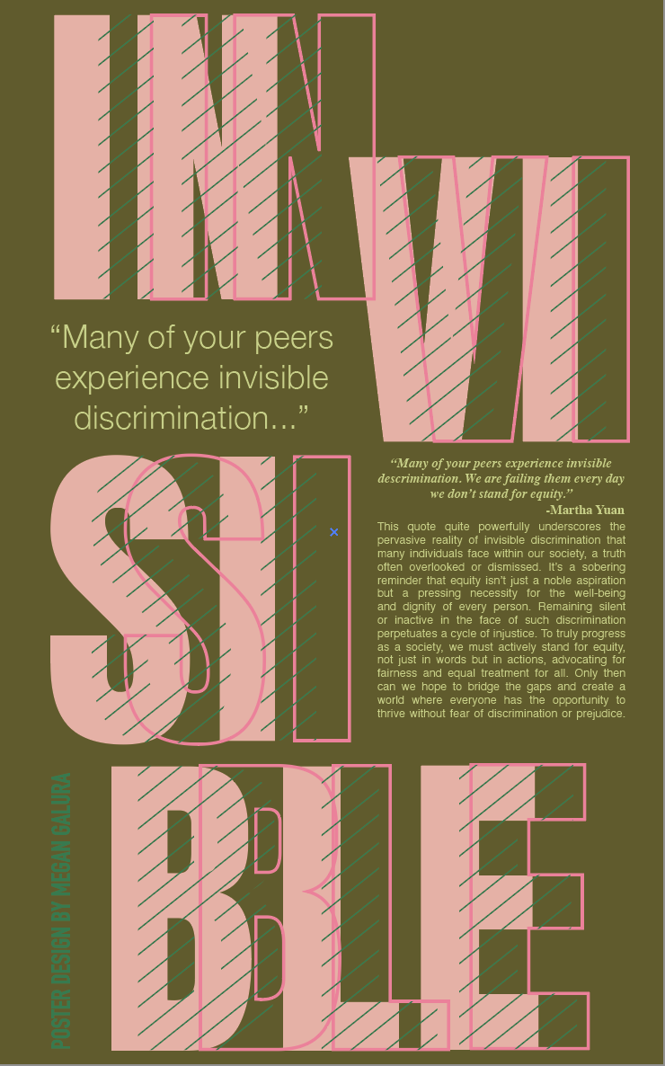
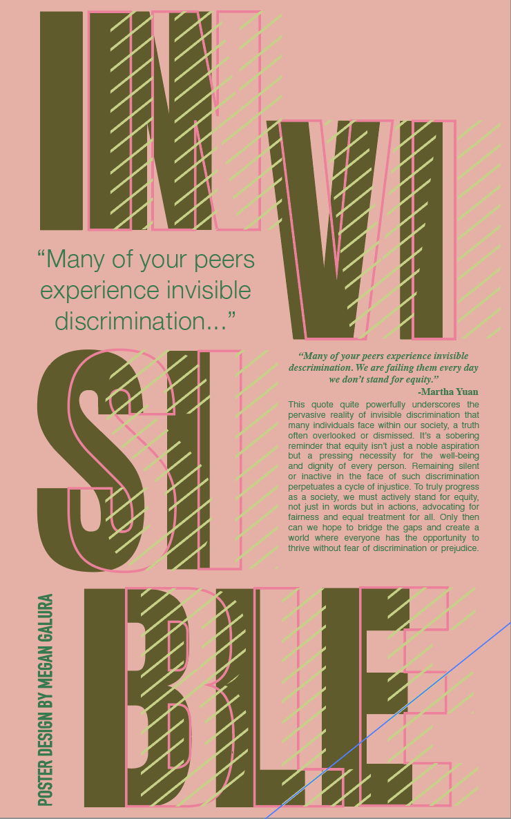
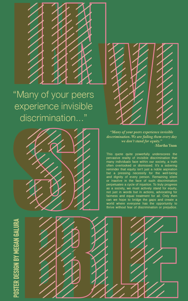
Above are my mini applications. Obviously the design has changed a lot since adding color. At this point I'm going a bit crazy... Will I pick the right one? Probably not. Is it none of them and I'm missing something glaringly obvious? Well, I'll find out in the critique I suppose. In the fourth photo on the top row, you can see that I tried the original
Final Clean
